The Second Quanzhou Industrial Tourism Special Exhibition
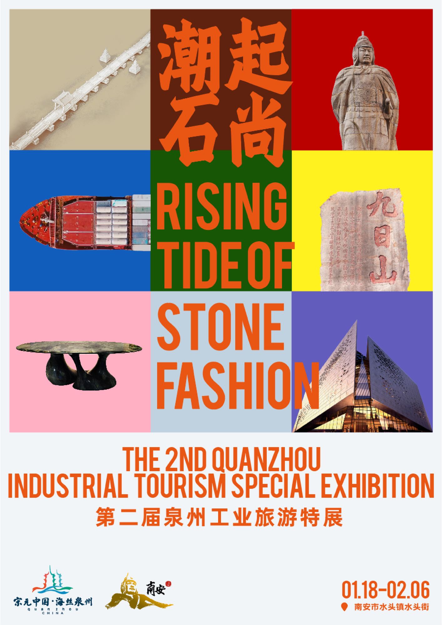
Main visual exhibition
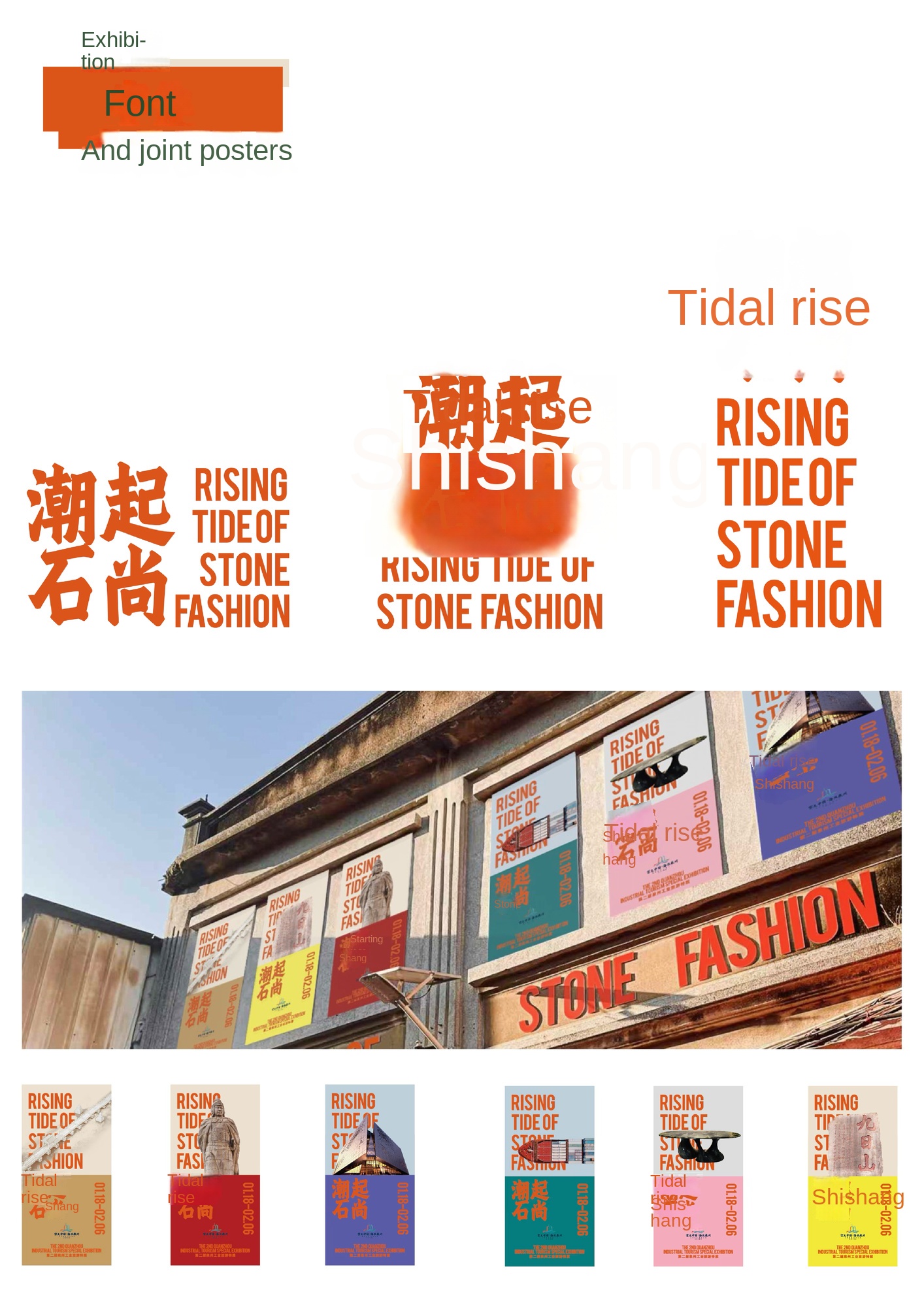
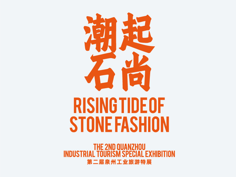
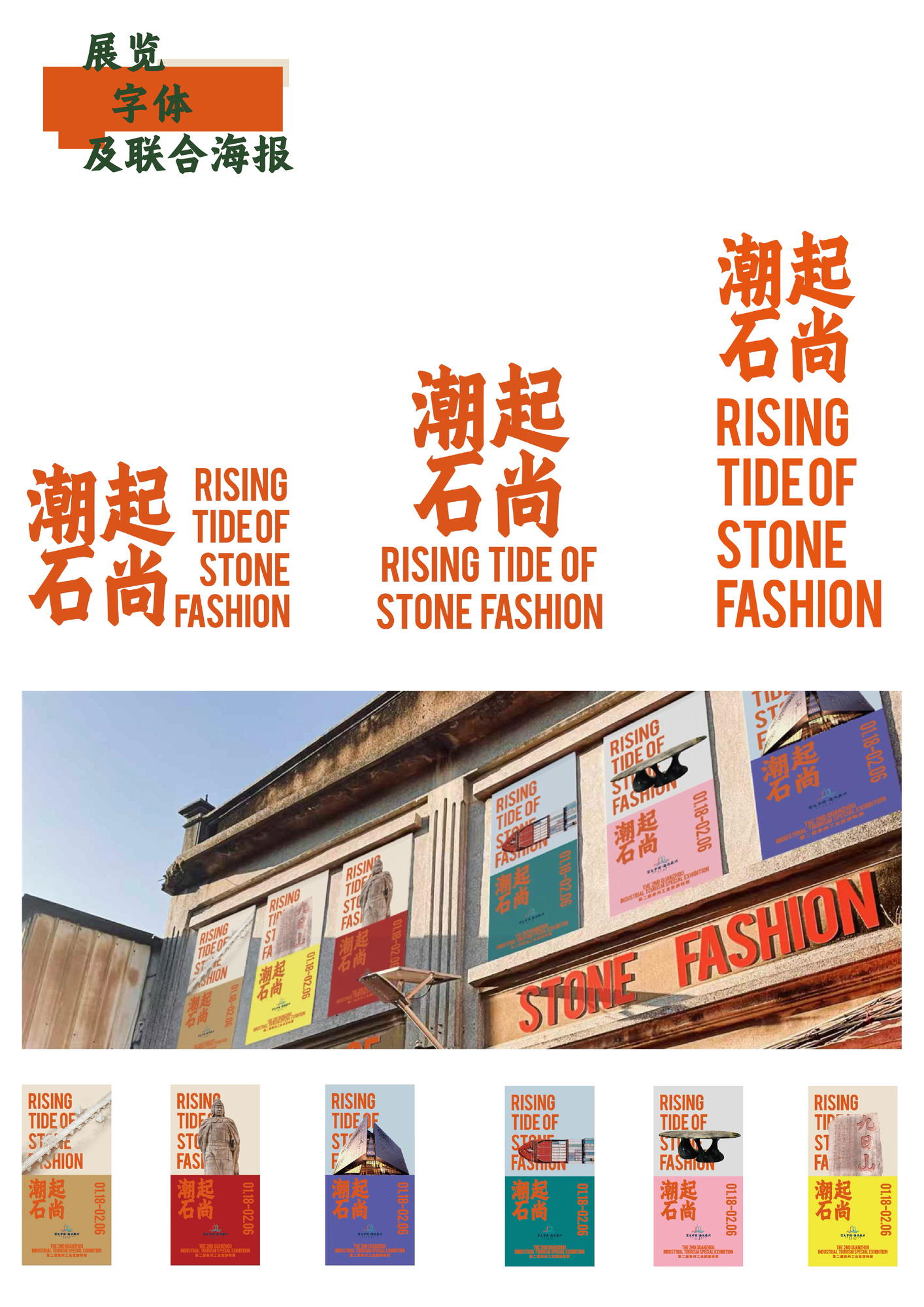
Exhibition Fonts and Joint Posters

Exhibition and Main Exhibition
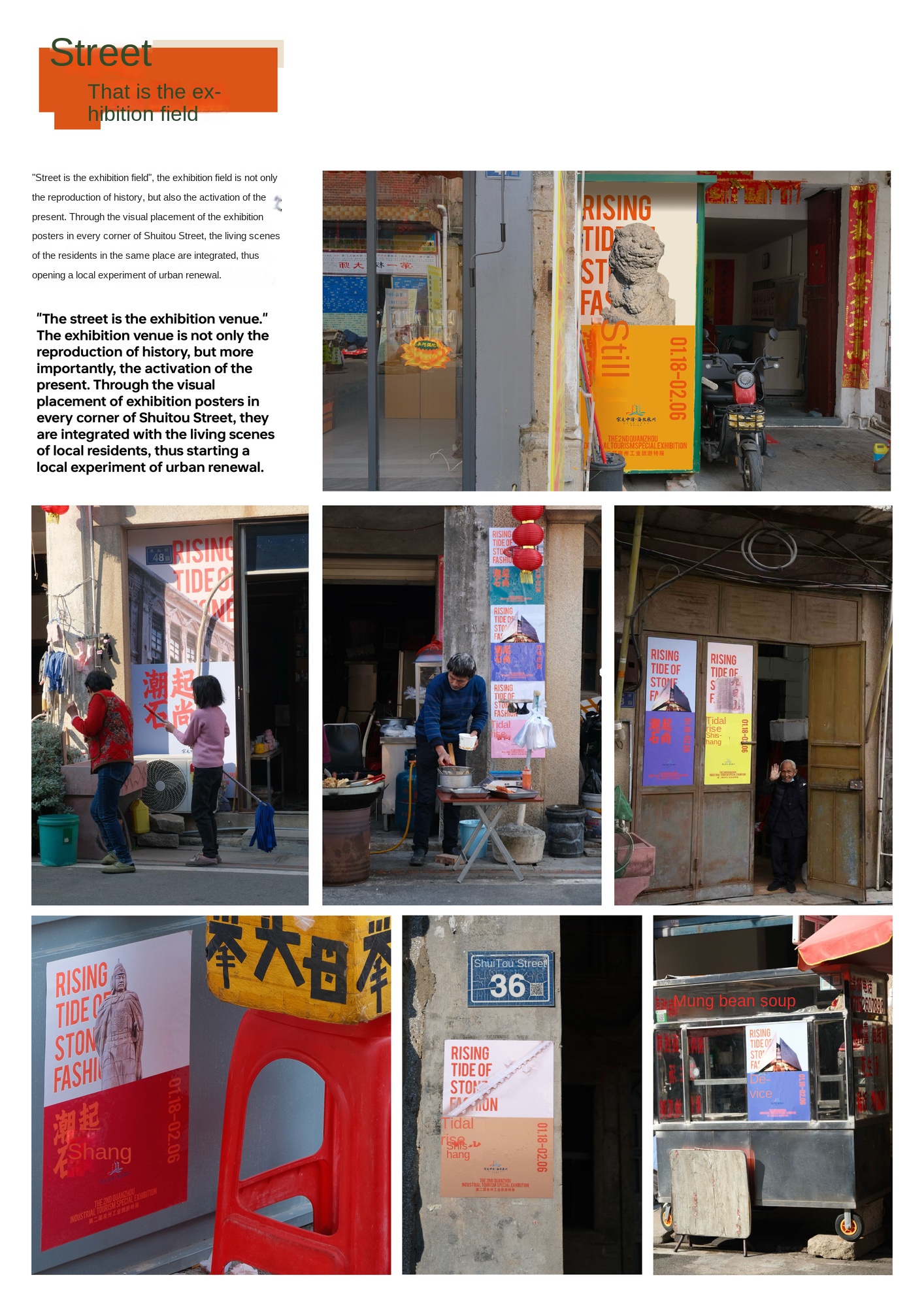
Street is Exhibition
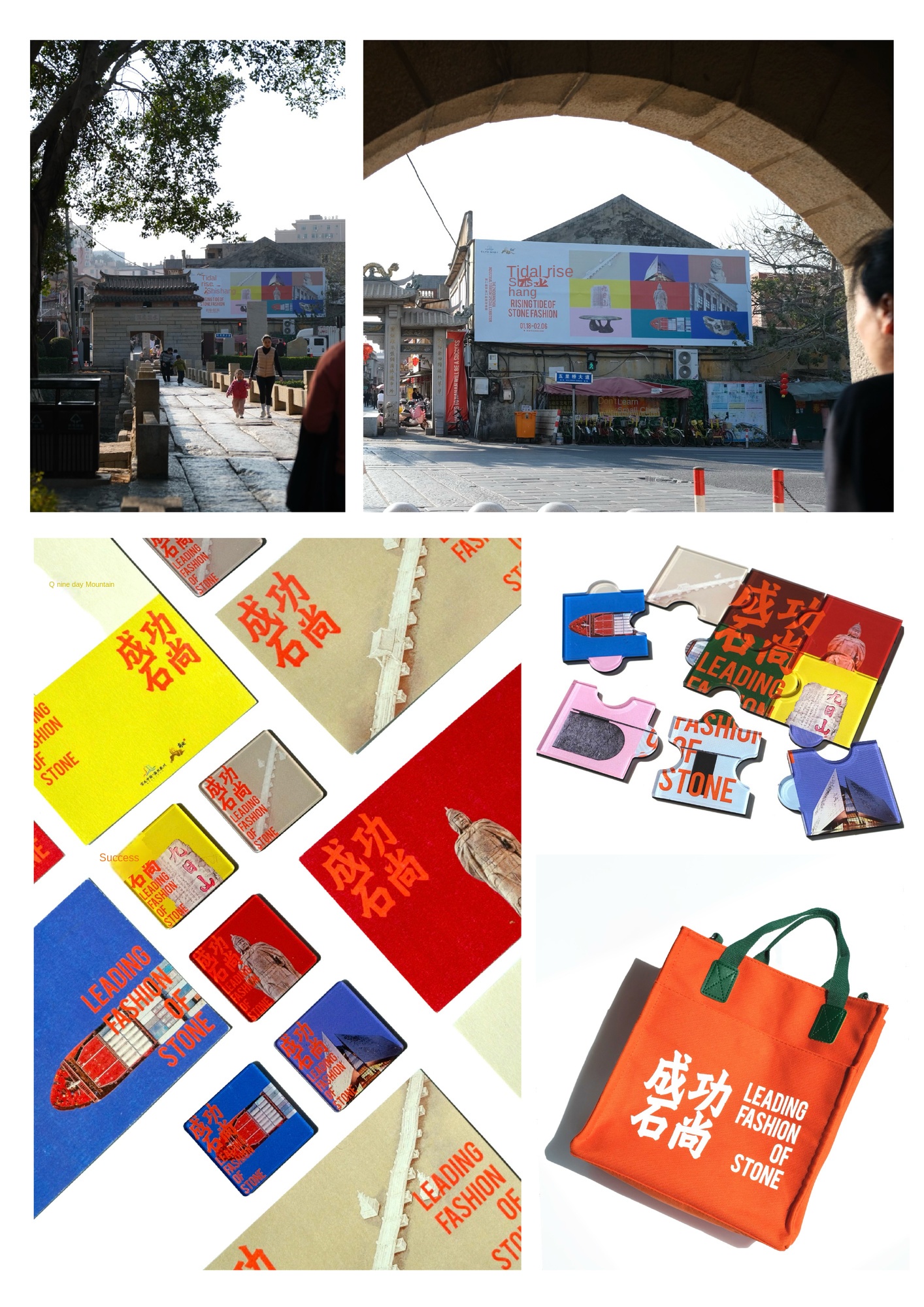
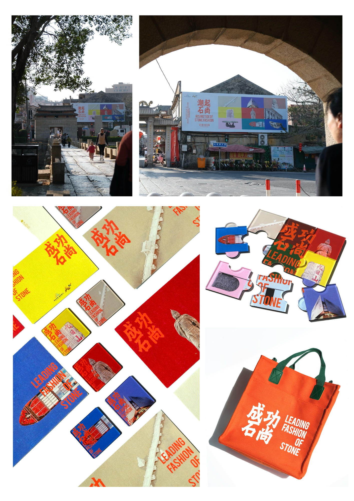
Street is the exhibition hall, cultural and creative products.
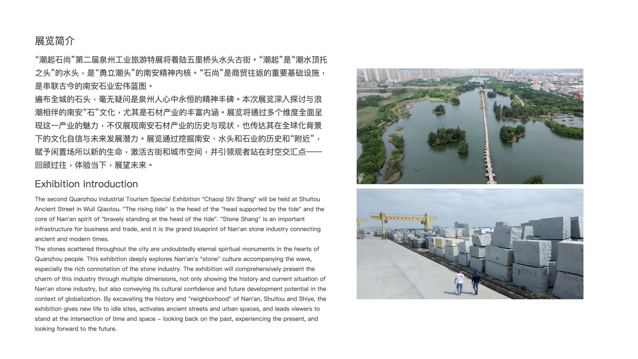
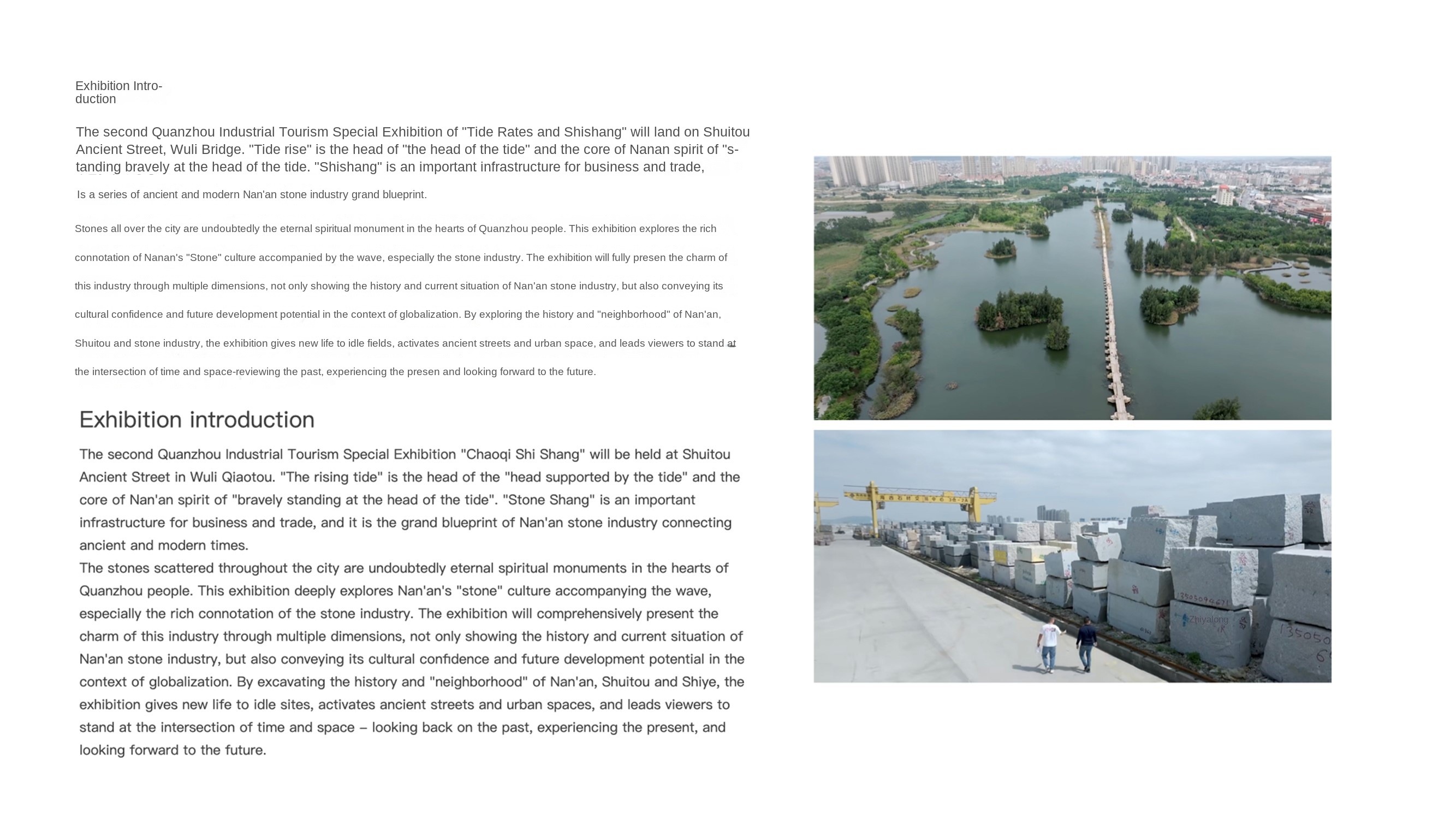
The second industrial tourism exhibition is located in Shuitou Street, Nan'an City. The exhibition is based on marine culture and world heritage culture. It reviews Nan'an stone industry from a global perspective. It presents the profound cultural heritage and industrial upgrading process of "successful Nan'an" from the aspects of historical memory, navigation process, urban construction and industrial development, combined with Quanzhou's industrial tourism boutique route. The exhibition is sponsored by the Quanzhou Municipal Bureau of Culture, Radio, Television and Tourism and the Nan'an Municipal People's Government.
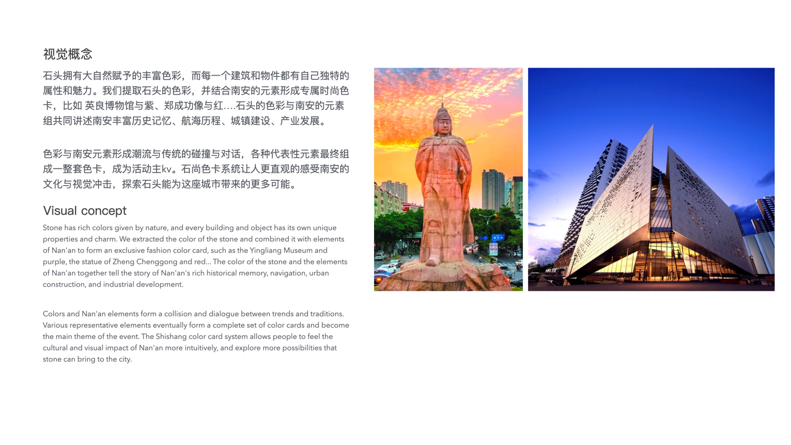
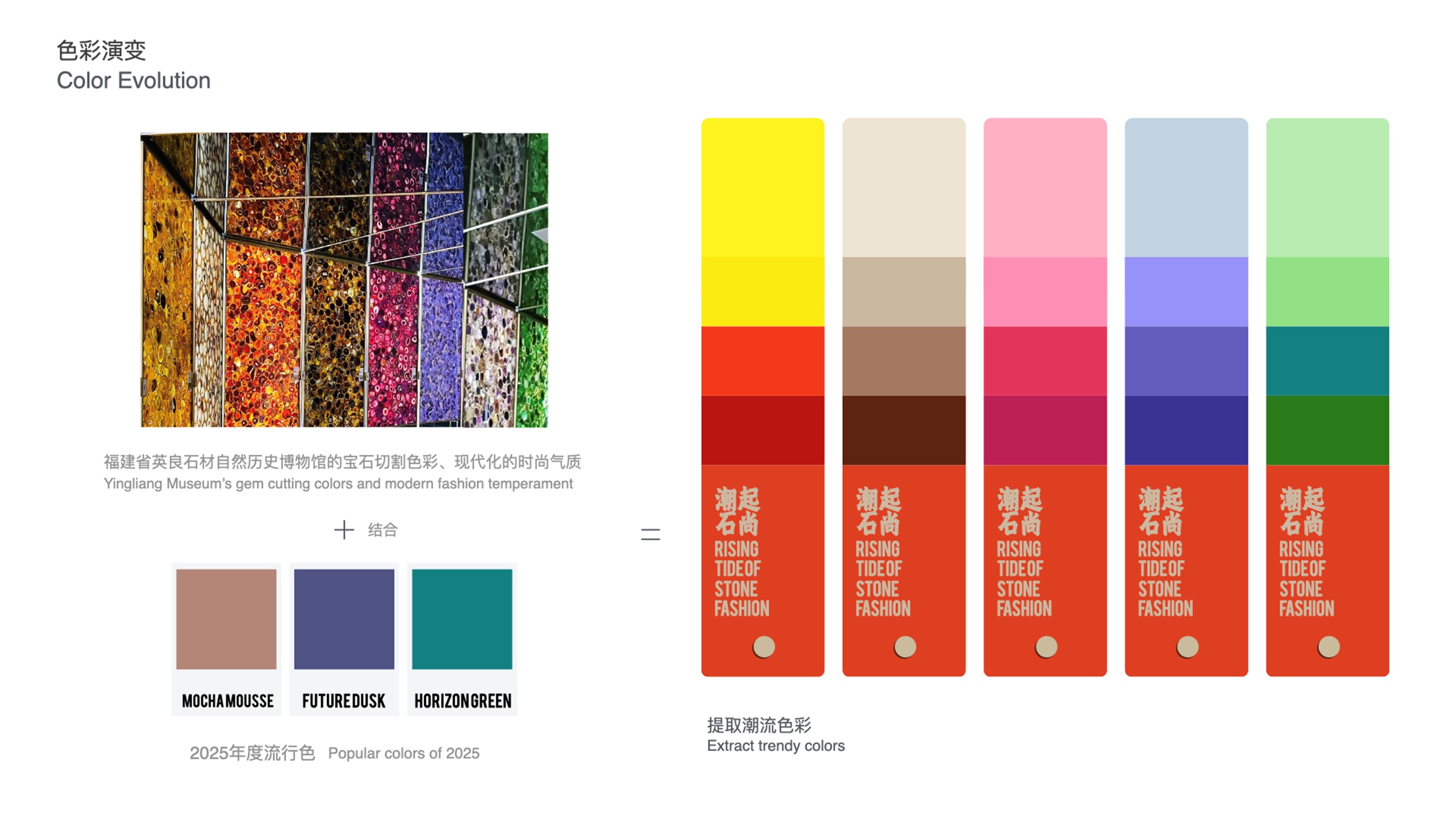
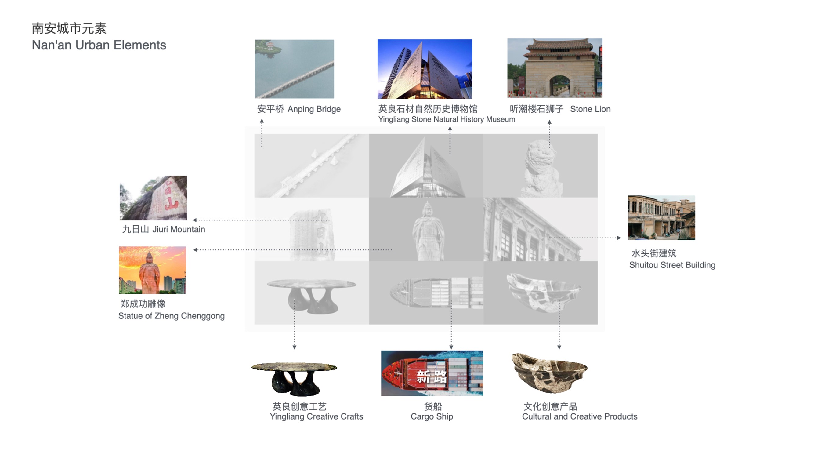
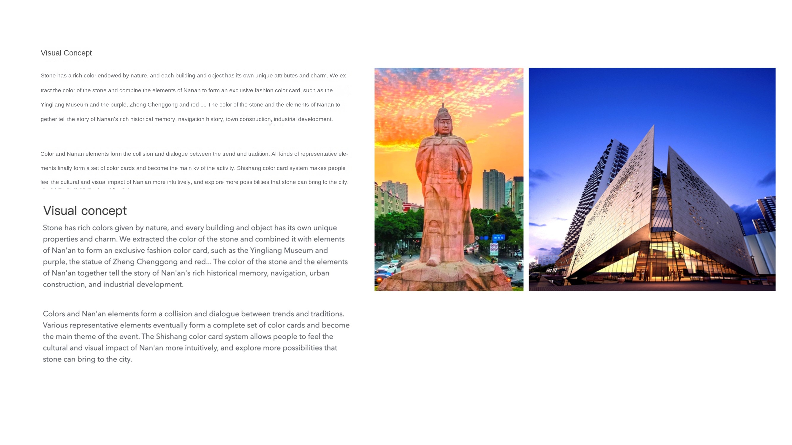
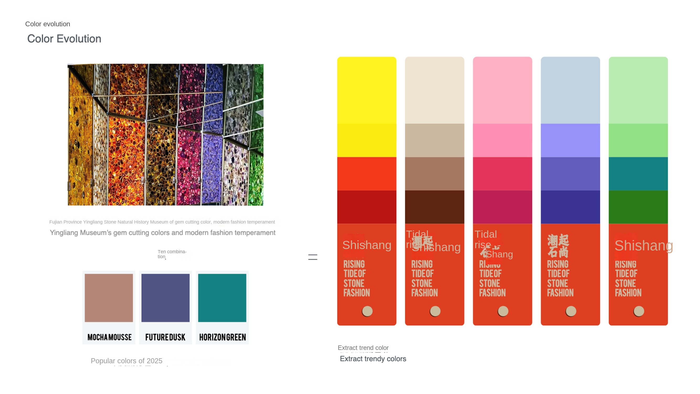
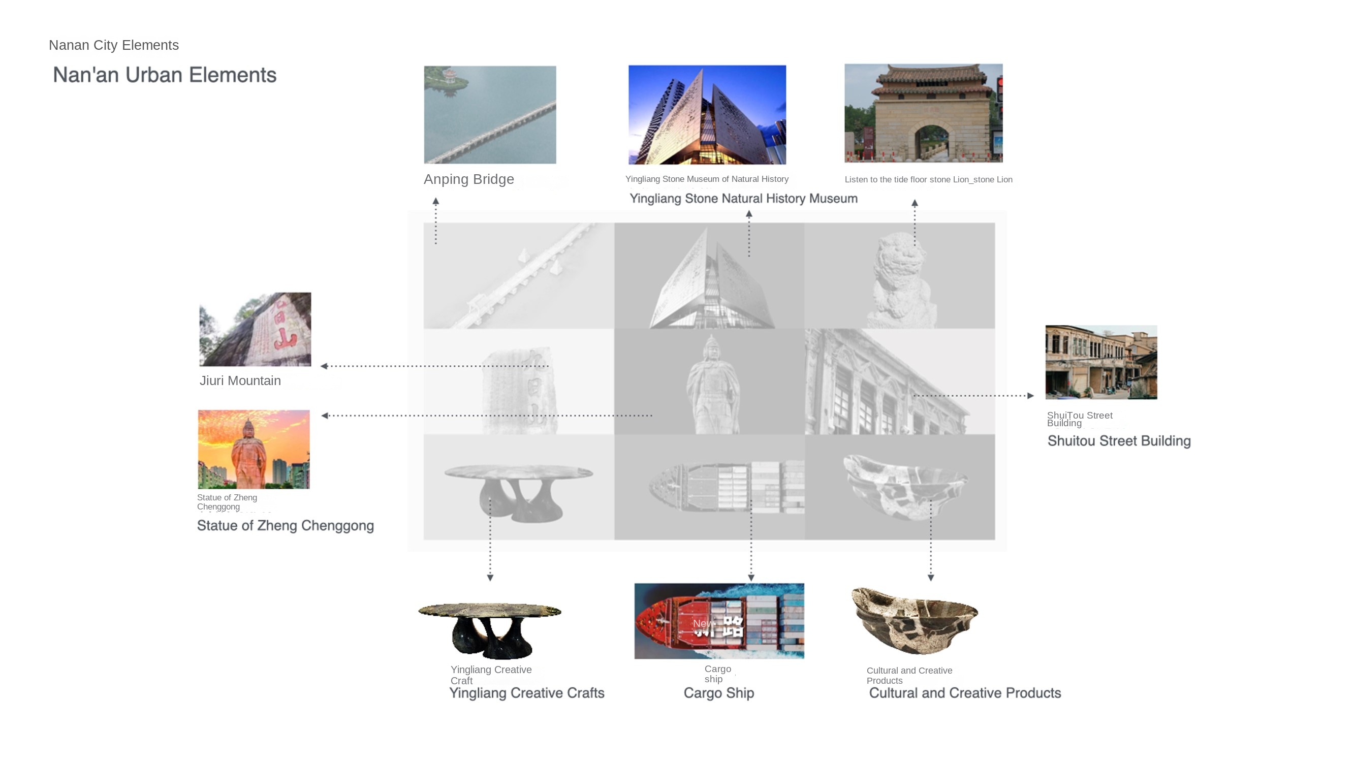
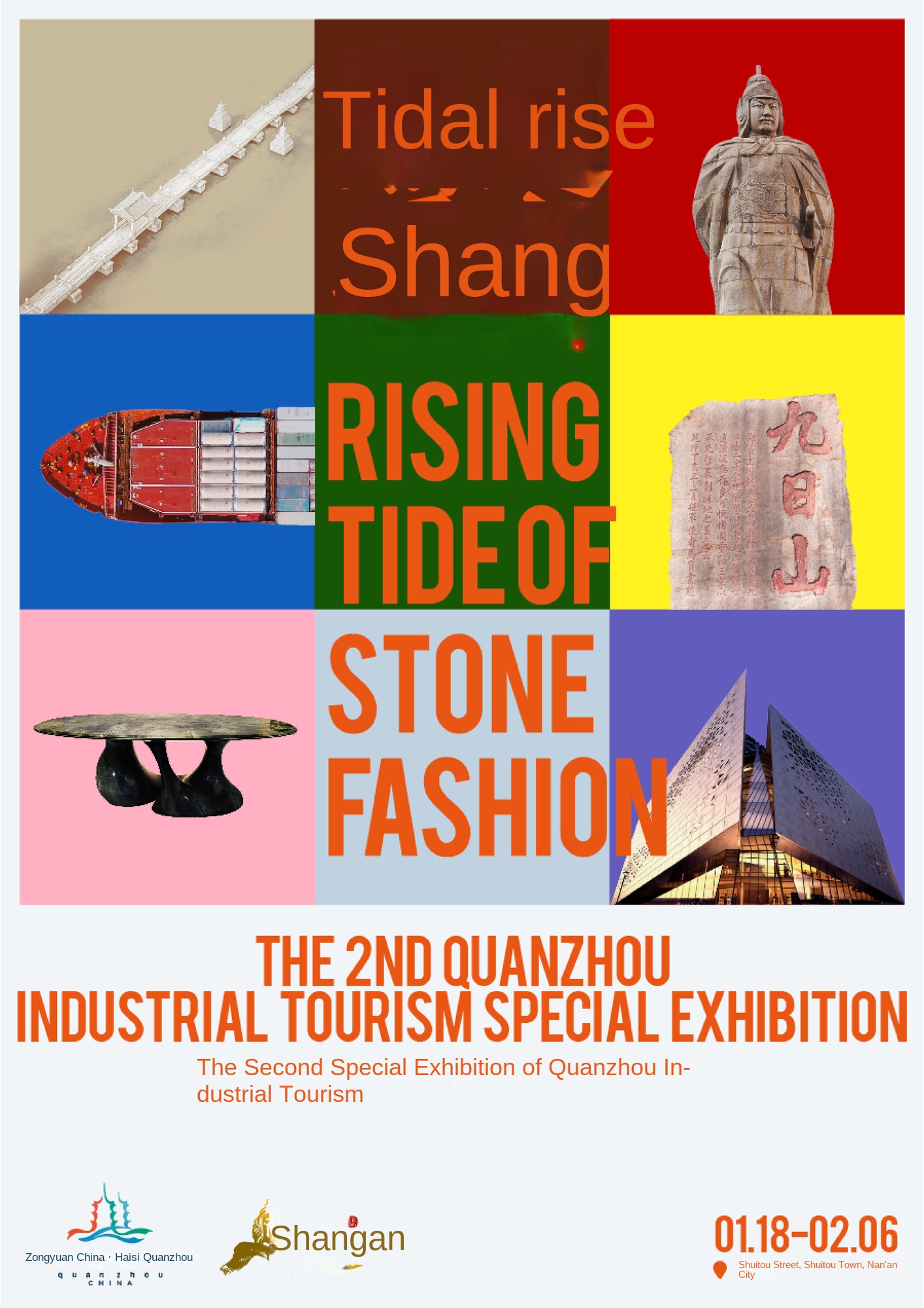
Stone has a rich color endowed by nature, and each building and object has its own unique attributes and charm. We extract the color of the stone and combine the elements of Nanan to form an exclusive fashion color card, such as Yingliang Museum and Purple, Zheng Chenggong and Red.... The color of the stone and the element group of Nan'an tell the rich historical memory, navigation history, town construction and industrial development of Nan'an.
color and nanan elements form the collision and dialogue between the trend and tradition. all kinds of representative elements finally form a set of color cards and become the main kv of the activity. Shishang color card system makes people feel the cultural and visual impact of Nan'an more intuitively, and explore more possibilities that stone can bring to the city.
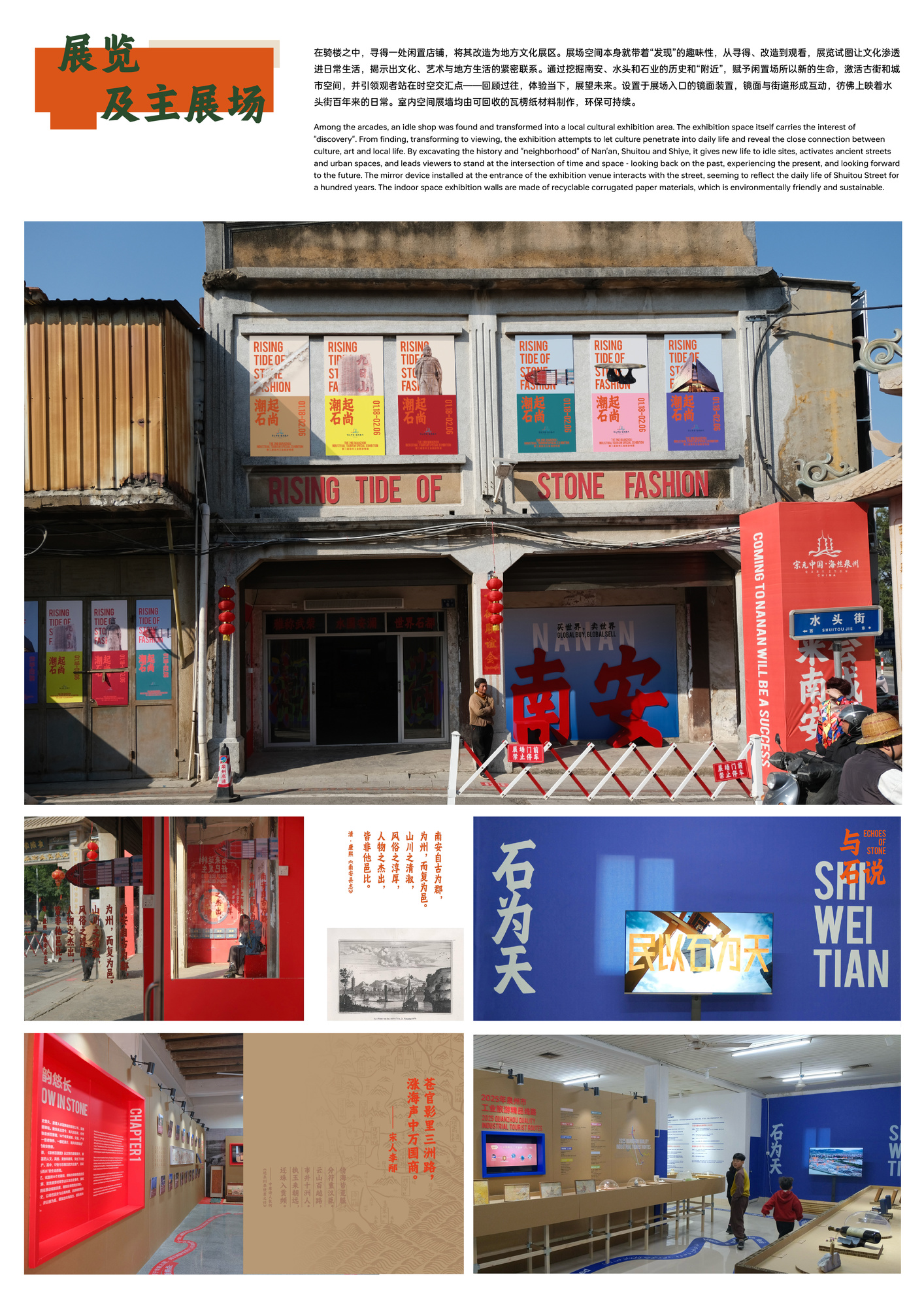
The exhibition can be in any place. In this exhibition, our practice is "the street is the exhibition hall". In the arcade, we found an idle shop and transformed it into a local cultural exhibition area. The exhibition space itself has the interest of "discovery". From finding, transforming to watching, the exhibition tries to let culture penetrate into daily life and reveal the close relationship between culture, art and local life. By excavating the history and "neighborhood" of Nan'an, Shuitou and Stone Industry, it gives new life to idle fields, activates ancient streets and urban spaces, and leads viewers to stand at the intersection of time and space-reviewing the past, experiencing the present and looking forward to the future.
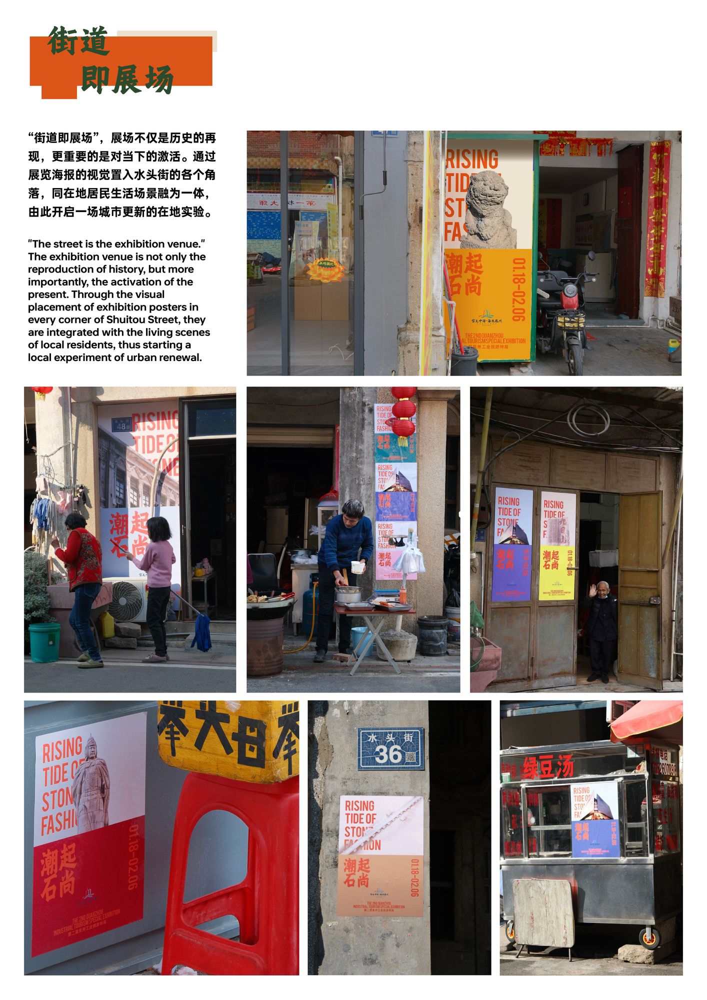
The exhibition hall is not only the reproduction of history, but also the activation of the present. Through the visual placement of the exhibition posters in every corner of Shuitou Street, the living scenes of the residents in the same place are integrated, thus opening a local experiment of urban renewal.
Focus on brand VI, product vision, logo design, exhibition design and binding design. At the same time, the studio members also hope to cut into more social issues from the perspective of visual design. Therefore, in addition to commercial design, we have also participated in many creations in the fields of natural education, biodiversity, rural construction, and regional cultural exploration. The works were selected in "APD Asia-Pacific Design Yearbook", "TDC Tokyo Font Club", "GDC Graphic Design in China", "Jin Daiqiang Design Award" and so on. We believe that designers are translators, understanding and mining the project/brand connotation, and then reconstructing its translation into visual language, creating communication and connecting everything with design.
