O2H TEA Brand Identity
O2H TEA from concept to brand visual identity system, material design summary.
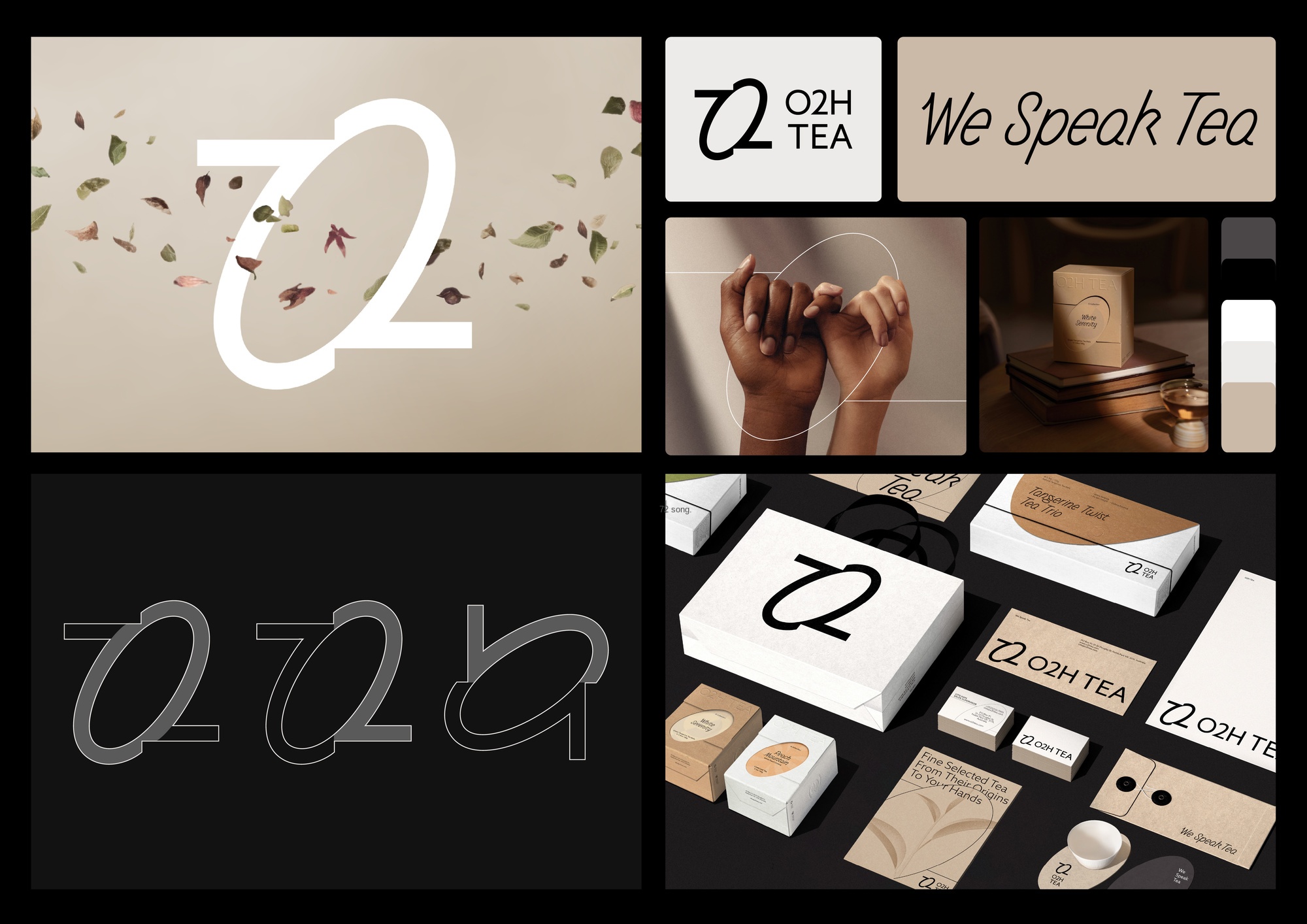
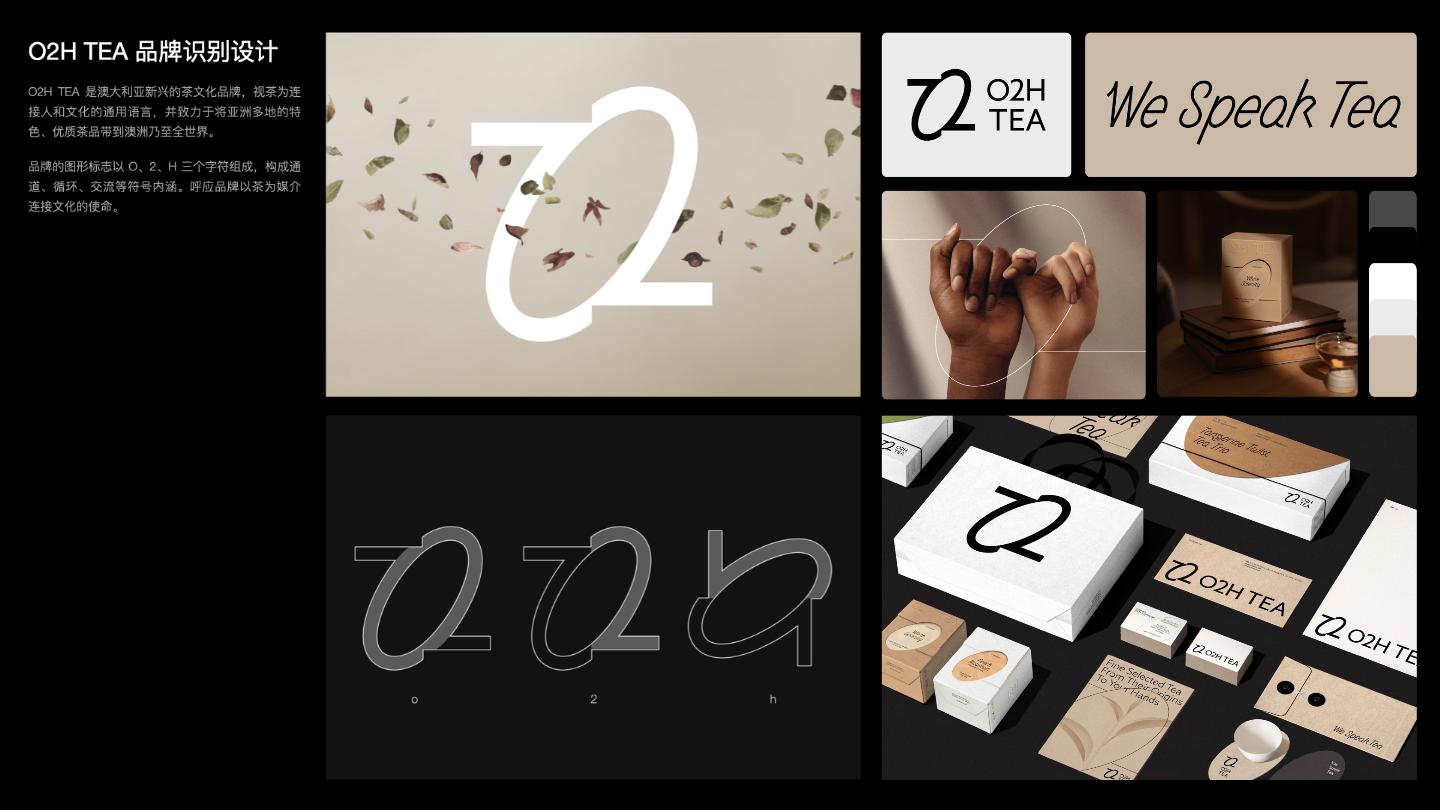
O2H TEA - Identity System Overview
Overview of recognition systems and application effects.
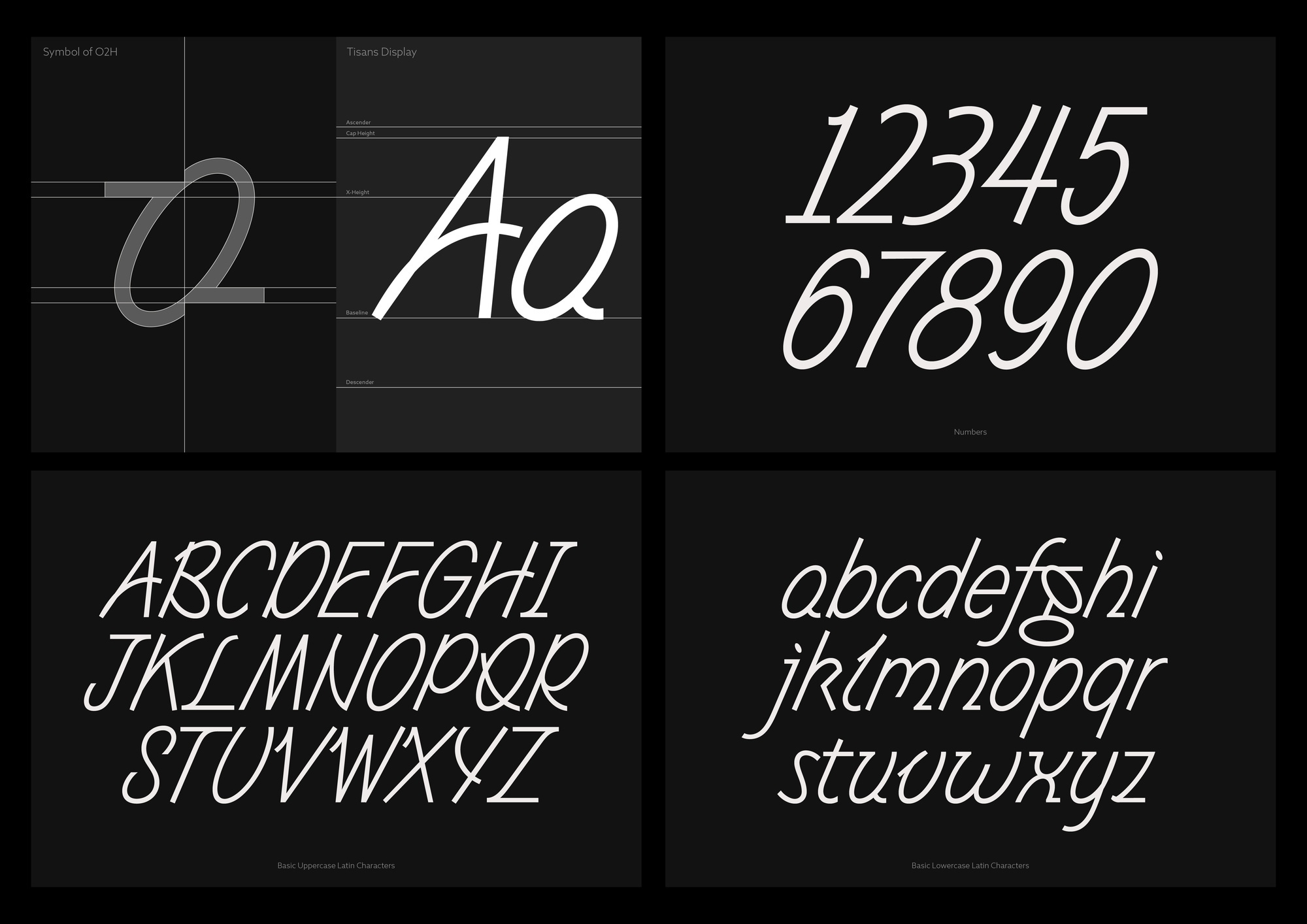
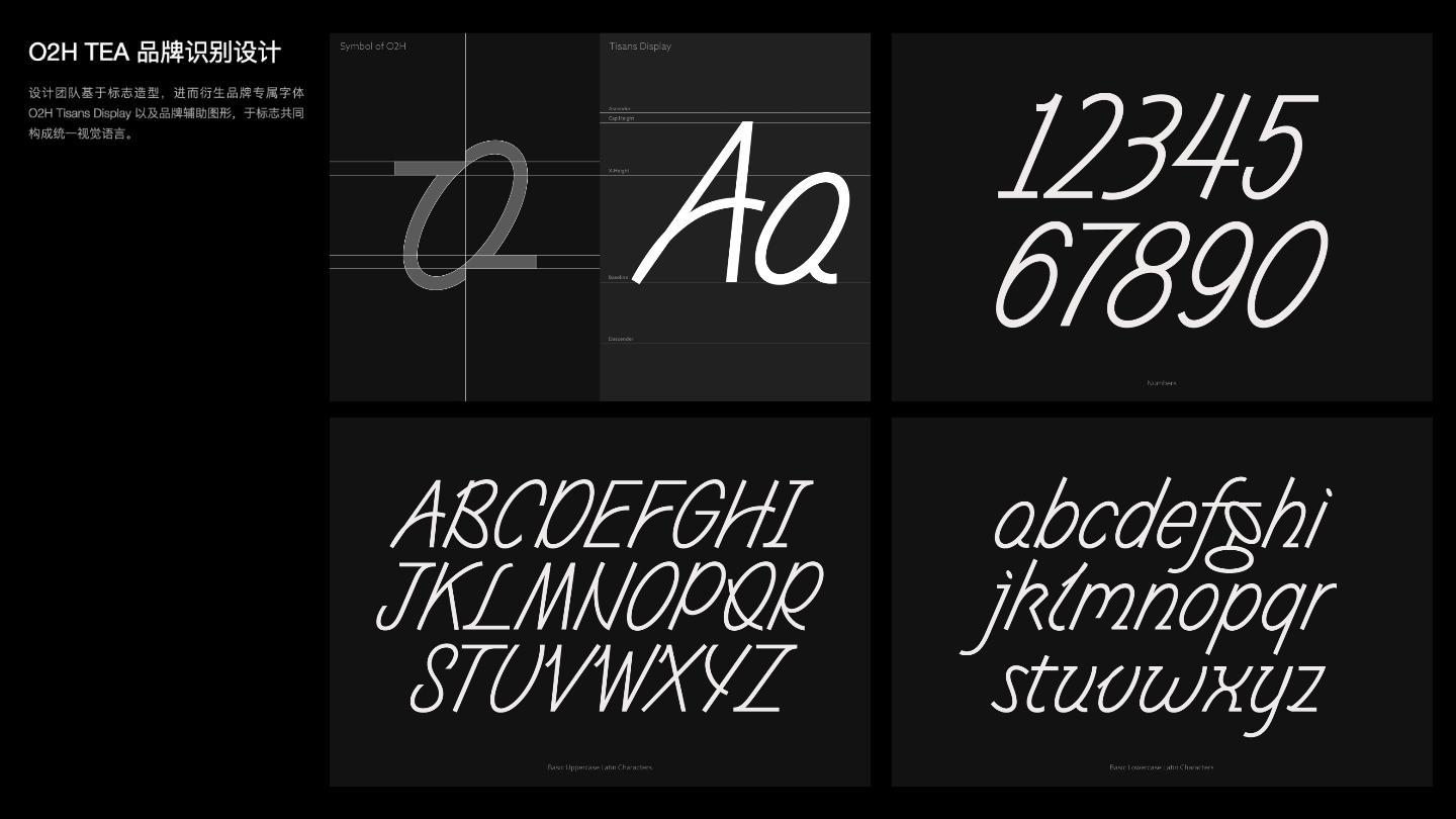
O2H TEA - Custom Typeface
Tisans Display, a Western font derived from the logo styling of O2H TEA.

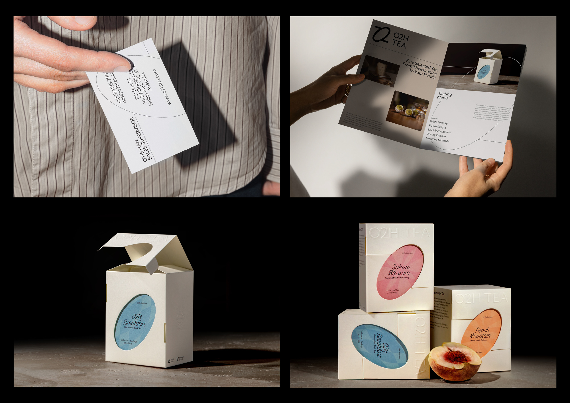
O2H TEA - Print and Packaging
Part of the material and tea single product packaging.
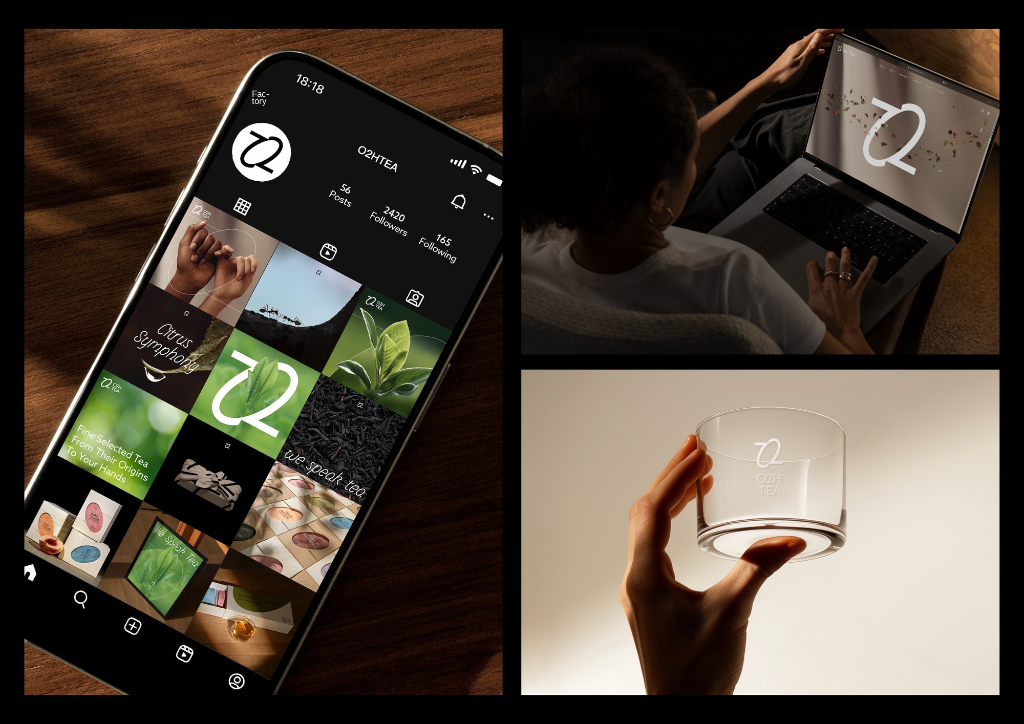
O2H TEA - Experience
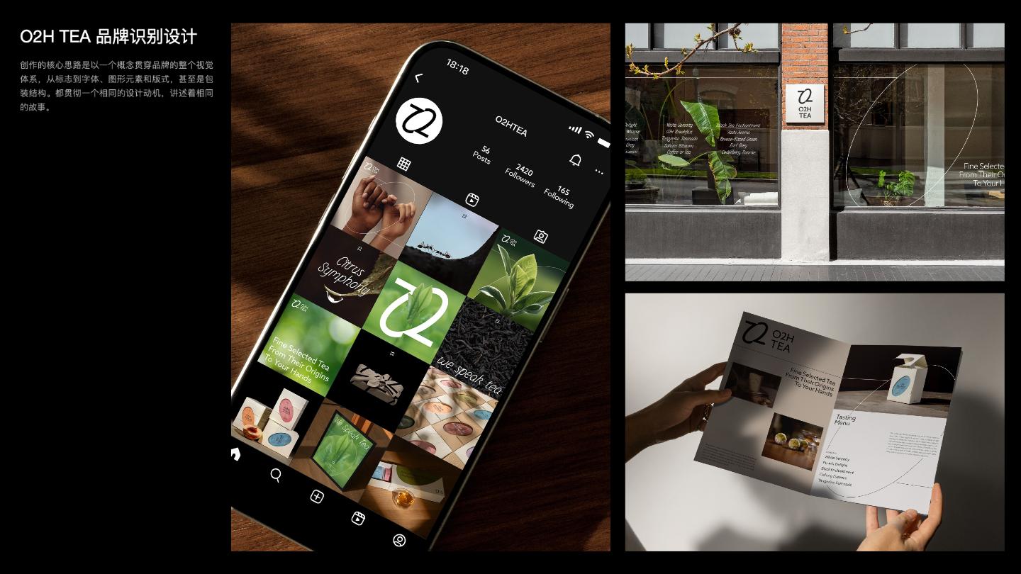
Online presentation effects and tea sets.
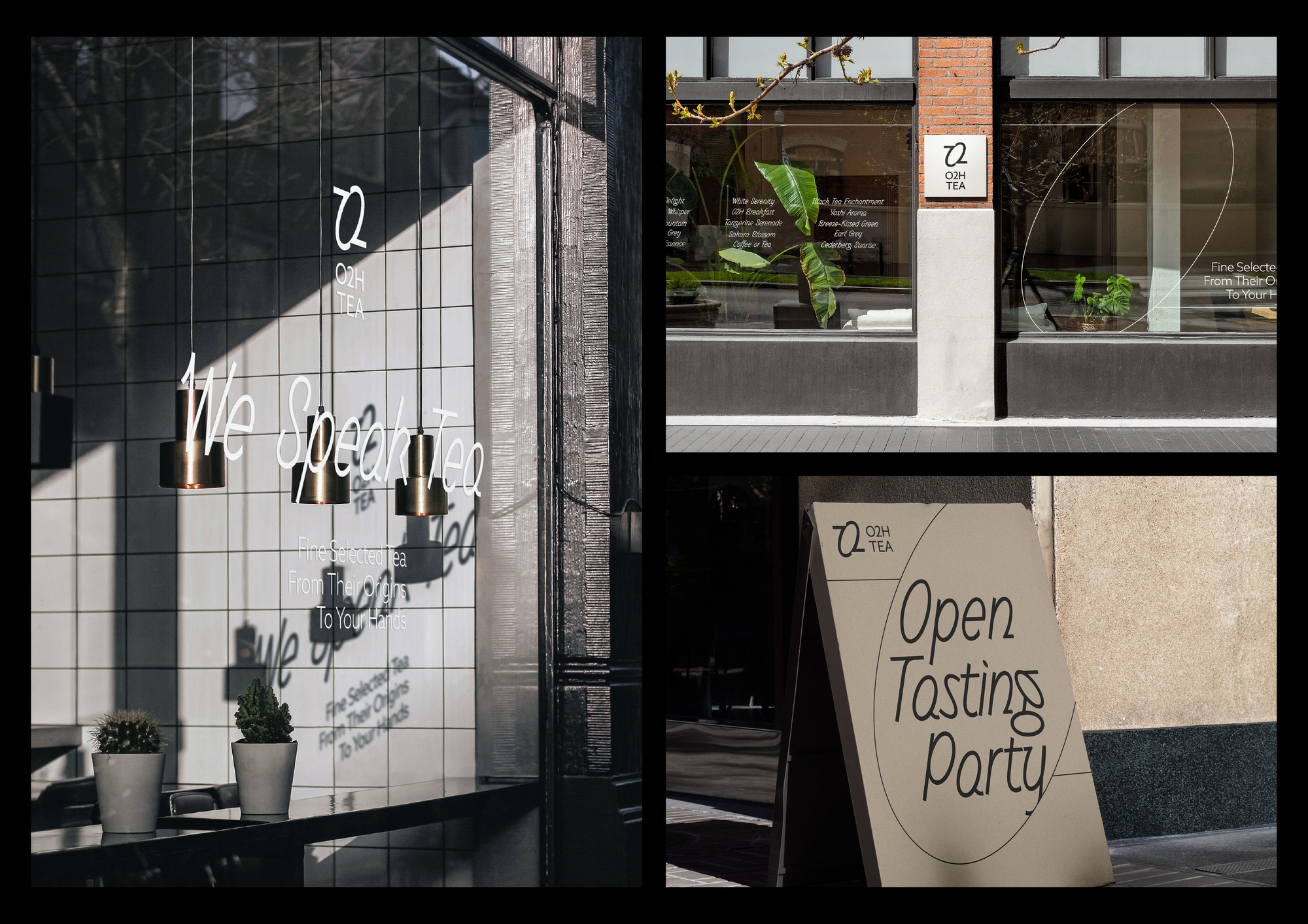
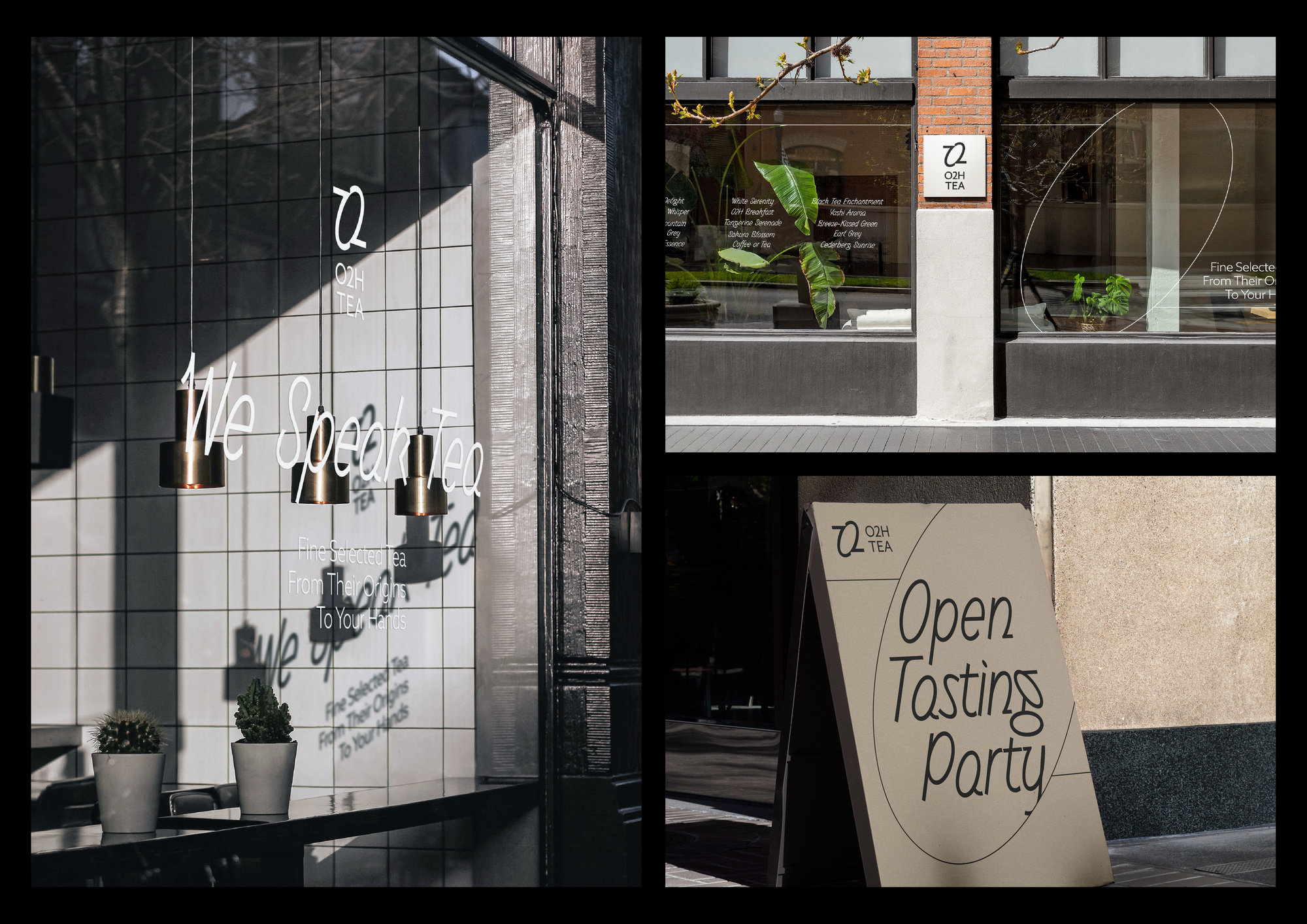
O2H TEA - Storefront
Showcase, A- shaped standing plate offline presentation effect
O2H TEA for 2025 Design Values
Design Description
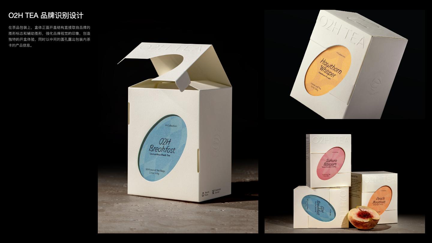
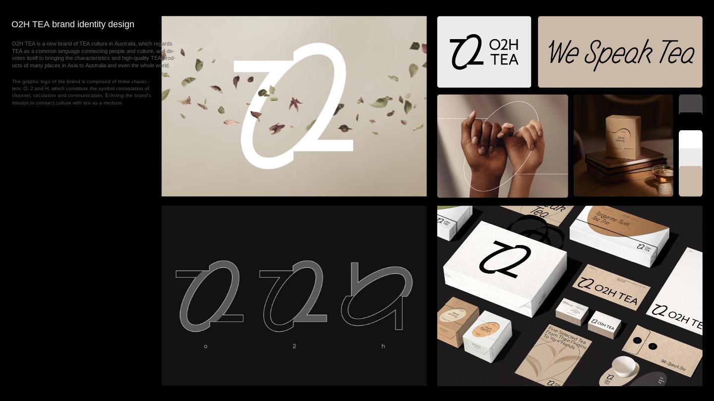
O2H TEA is a new tea culture brand in Australia. It regards tea as a common language connecting people and culture, and is committed to bringing the characteristics and high-quality tea products of many Asian places to Australia and even the world. The graphic logo of the brand is composed of three characters, O, 2 and H, which constitute the connotation of symbols such as channel, circulation and communication. Based on the logo shape, the derivative brand exclusive font O2H Tisans Display and the brand auxiliary graphics, together constitute a unified visual language. On the tea packaging, the front opening structure of the box body is directly taken from the graphic logo and auxiliary graphics of the brand to strengthen the impression of the brand logo, and at the same time, the product information of the tea card in the package is exposed by the round hole in the middle.
The core idea of the creation is to use a concept throughout the brand's entire visual system, from the logo to the font, graphic elements and layout, and even the packaging structure. They all follow the same design motivation and tell the same story. The brand identity design of O2H TEA reinterprets the heritage of oriental tea culture, and promotes cultural dialogue and exchange through modern design techniques to the international market. Demonstrate the dual pursuit of Chinese design in innovation and cultural exchange. The design project not only enhances the brand value, but also opens up new possibilities for the spread and development of Oriental tea culture overseas.
Reasonable foul is a diversified international team, founded in Shenzhen by Liu Junjie and Hu Tinghao in 2022. Now distributed in Shenzhen, Taipei and Paris. Focus on creativity and design to empower the brand to go to sea, localization, development and change. Firmly believe in creating reasonable fouls, the essence of creativity.
