


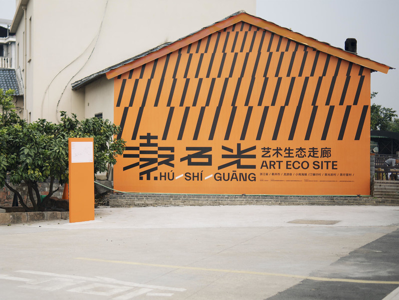
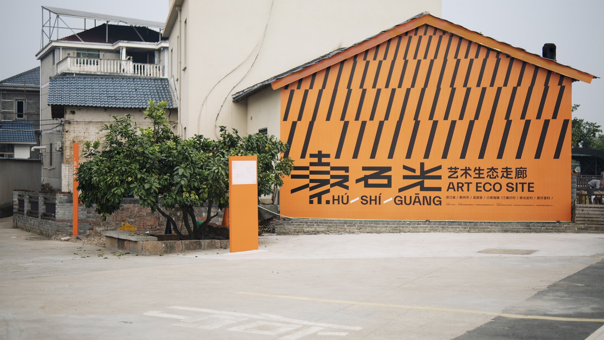
Village Entrance Main Vision
IMG_7398
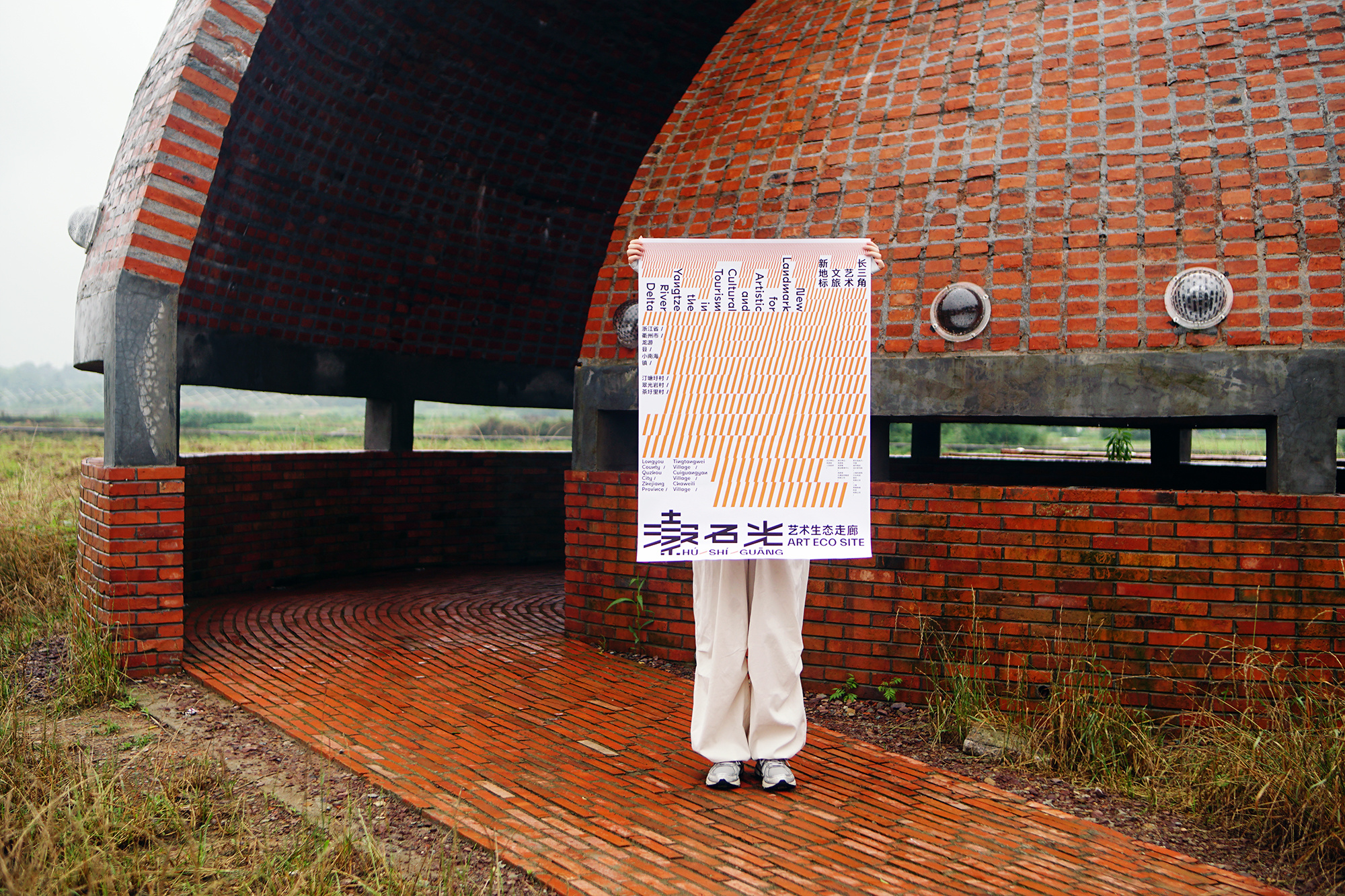

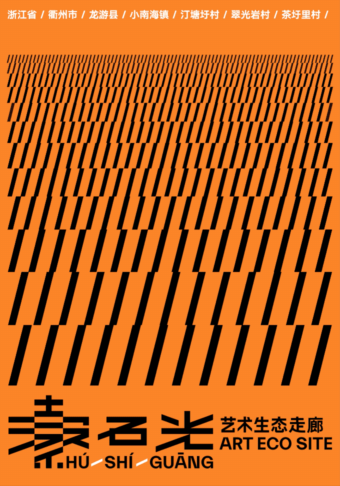
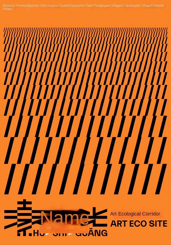
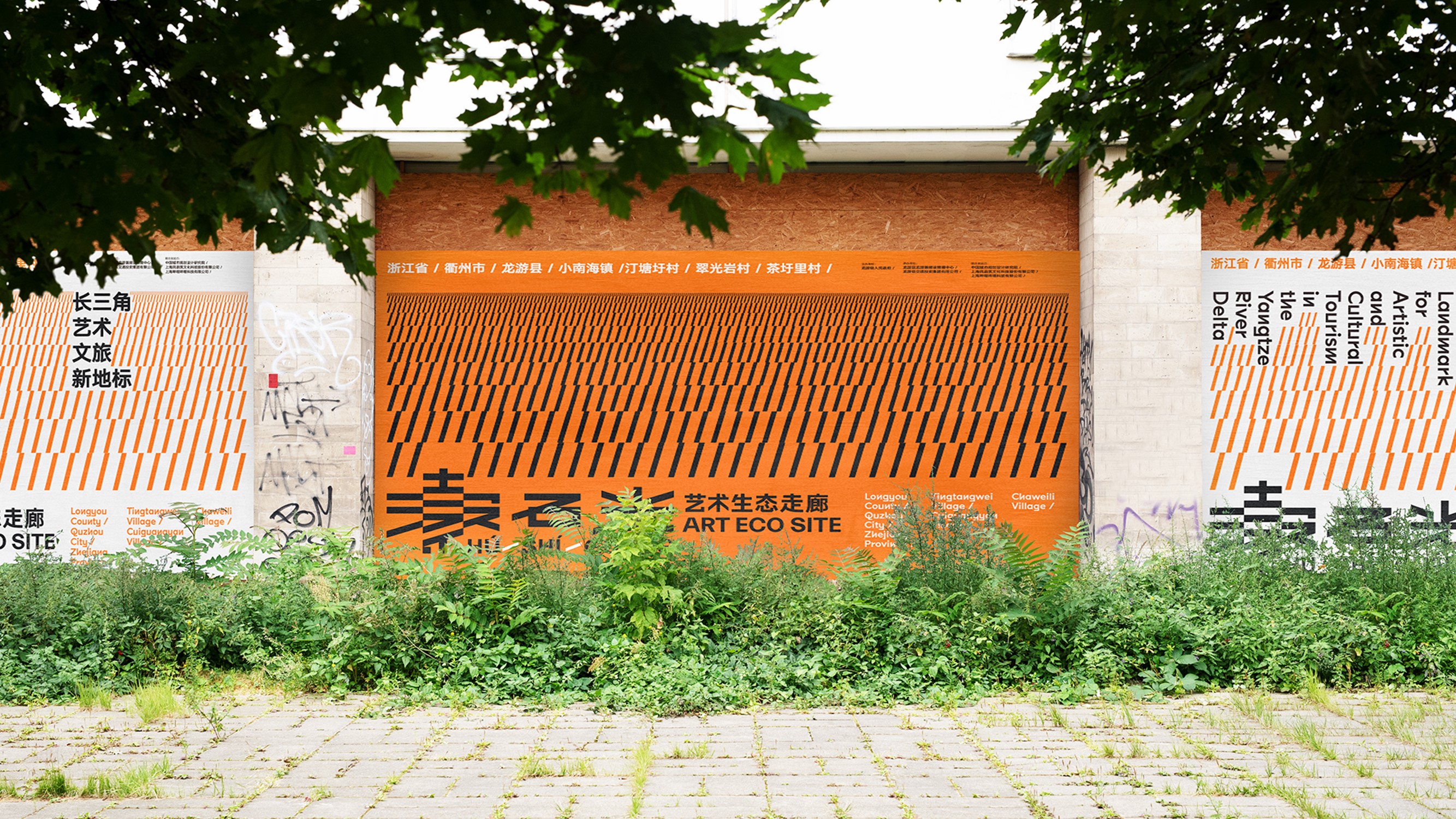
Stone Light-Art Ecological Corridor Poster

spatial vision

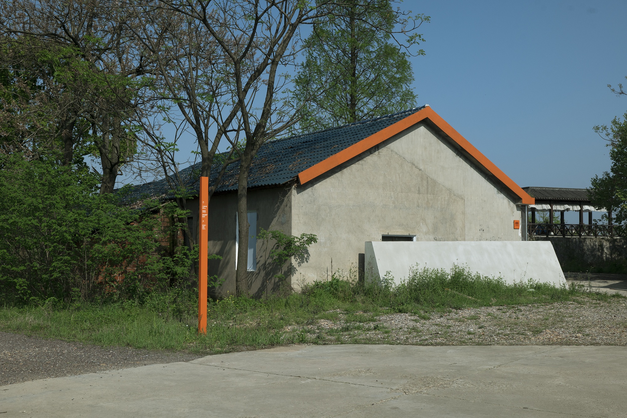
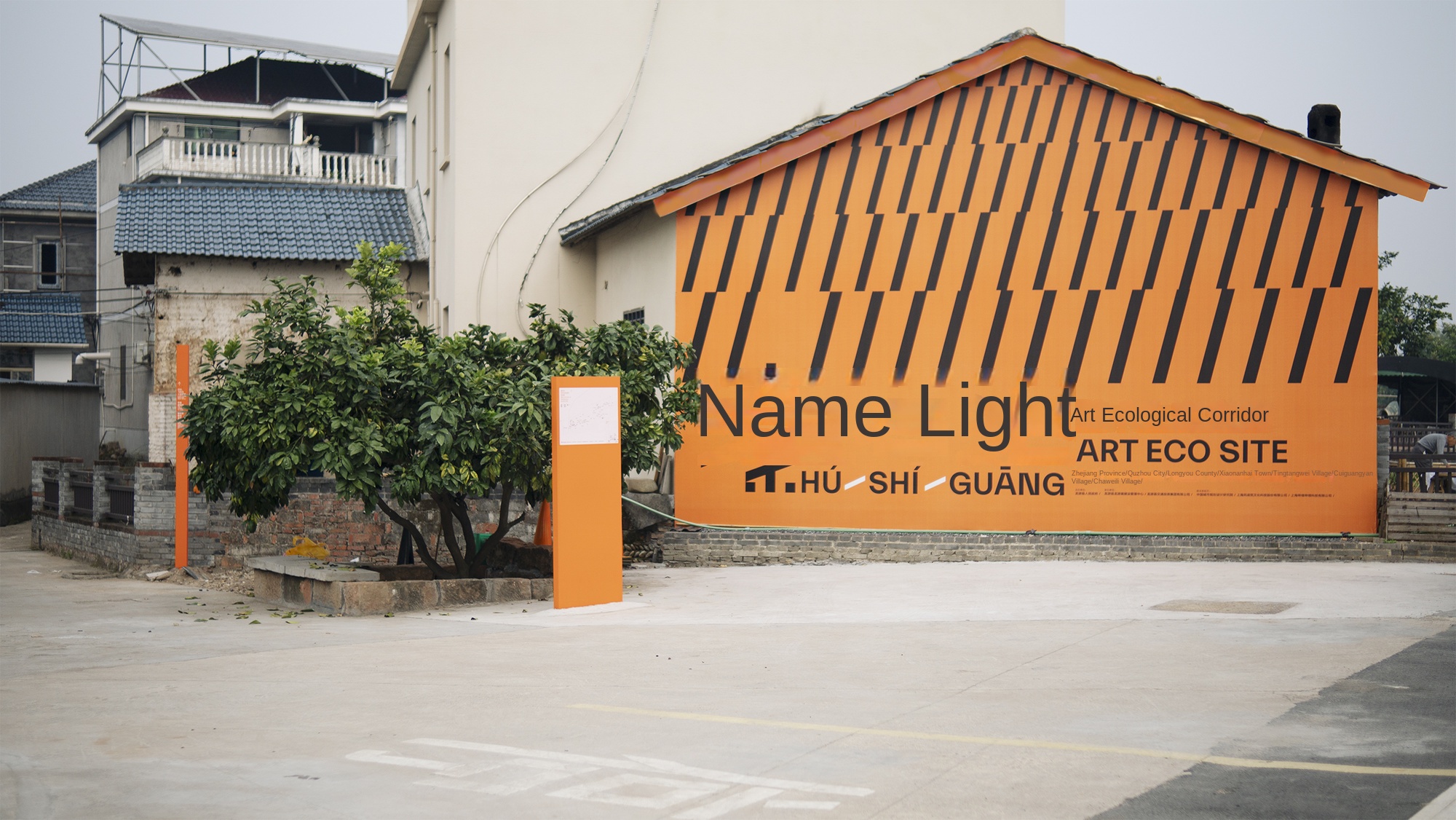
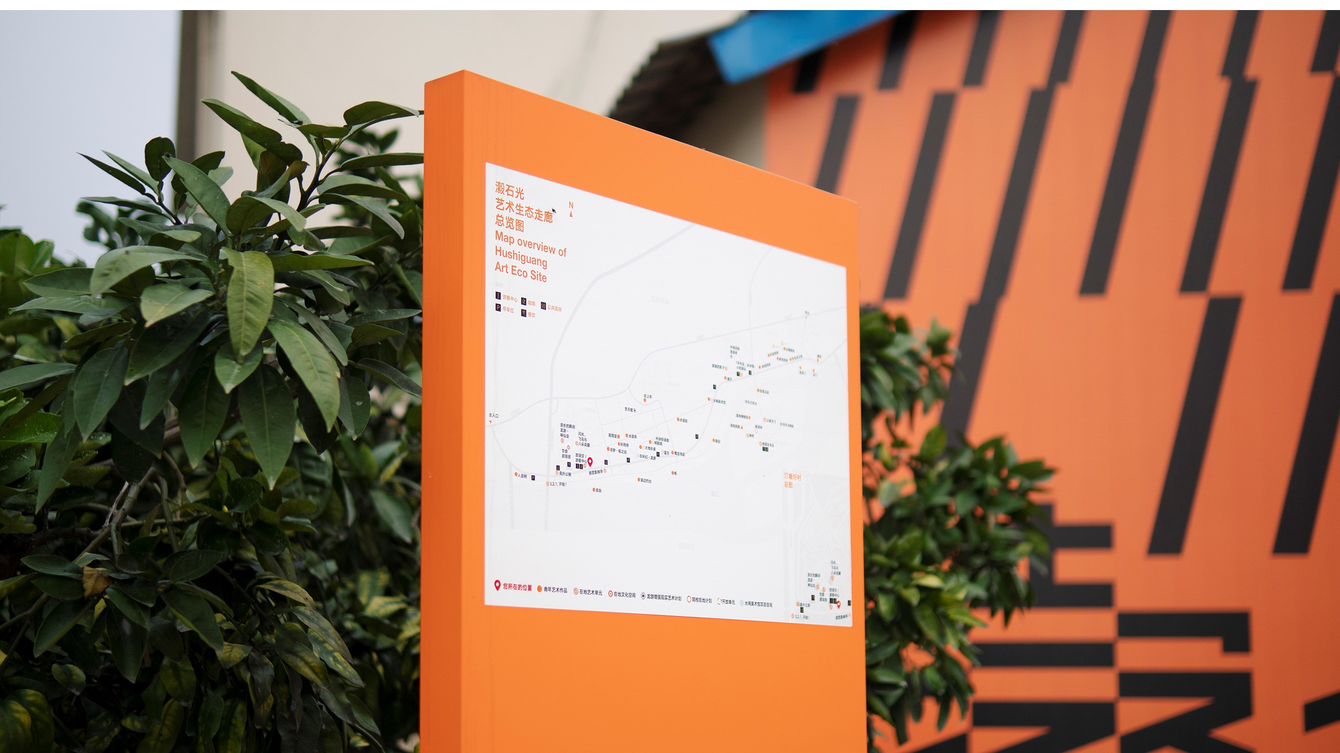
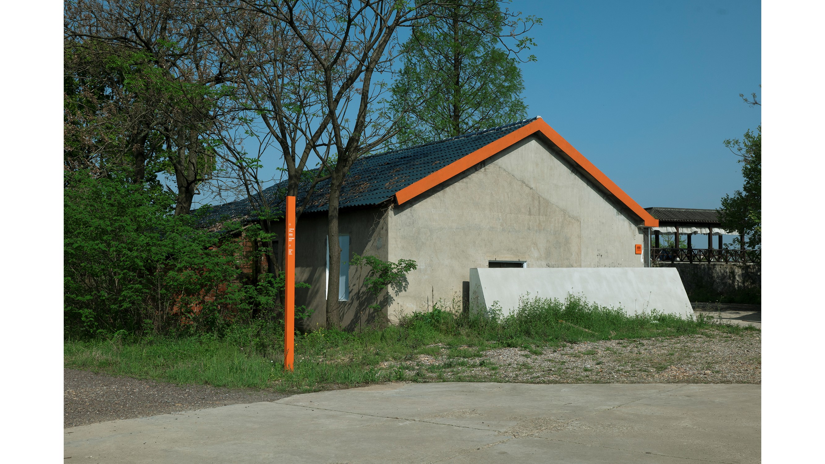
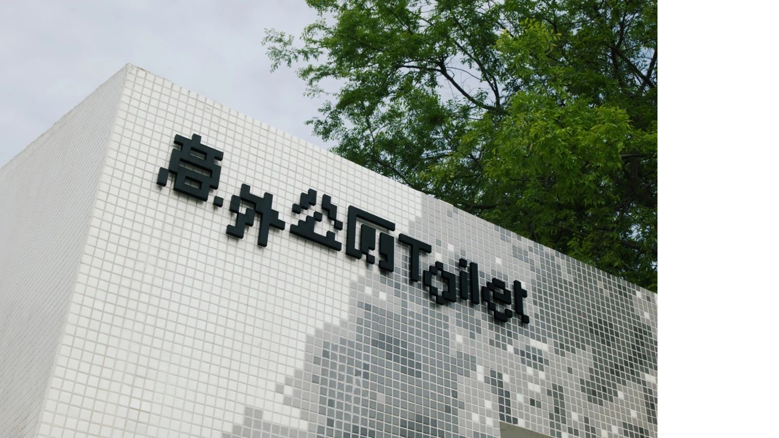
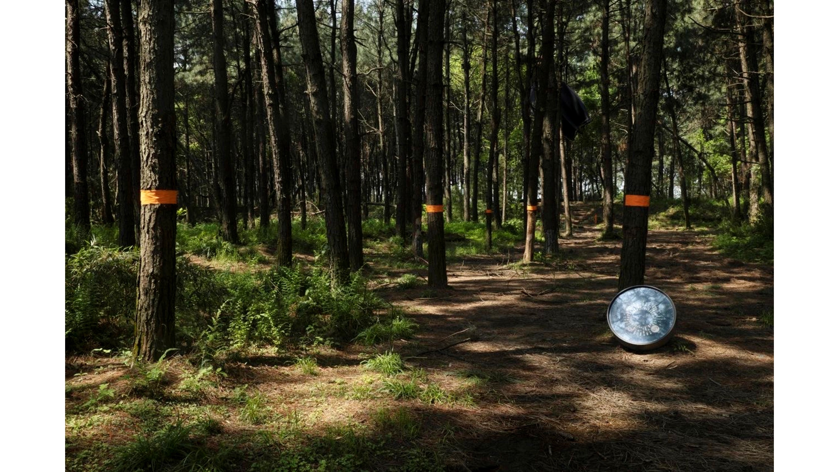
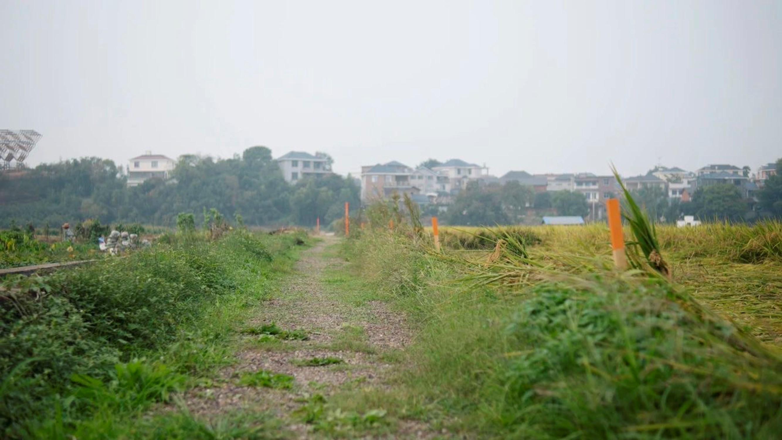
Guide system direction indication
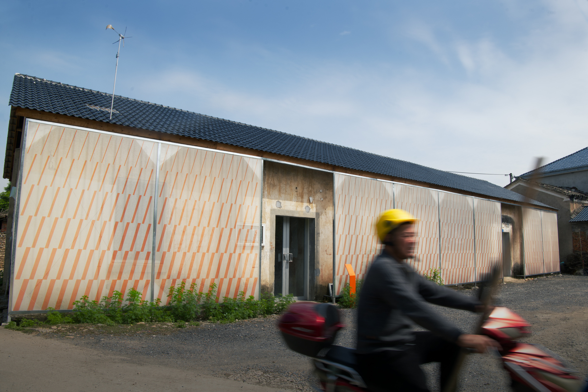
Visual dynamic display film


Introduction
The Stone Light Ecological Art Corridor Project is located on the banks of the Longyou River and is a local innovative practice with art as the medium. The project is jointly initiated by China Urban Planning and Design Institute, Shanghai Fengyuzhu Culture and Technology Co., Ltd., and Shanghai Bilibili Technology Co., Ltd., aiming at Longyou, the main spatial structure of urban and rural development in Longyou County, bringing together aspiring young people in the fields of planning, architecture, exhibition planning, art, landscape, etc., from discussion, creation to practice and construction in the way of group policy, group design and group creation, to create a "dragon tour model" for the integration of urban and rural areas in China in the new era-stone light art ecological corridor.
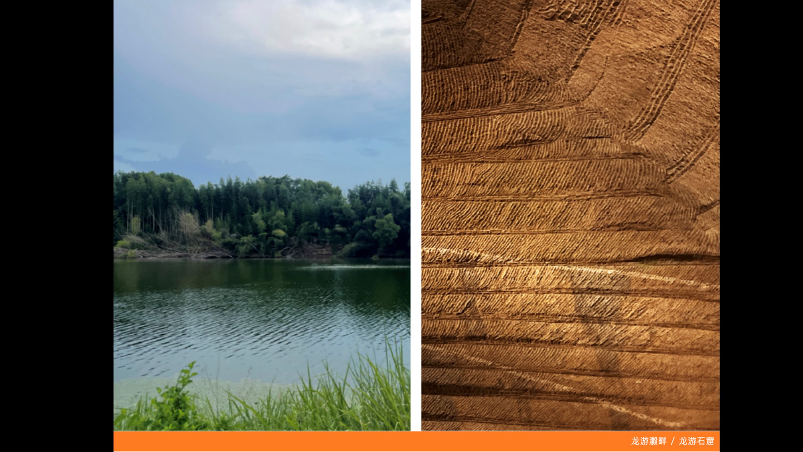
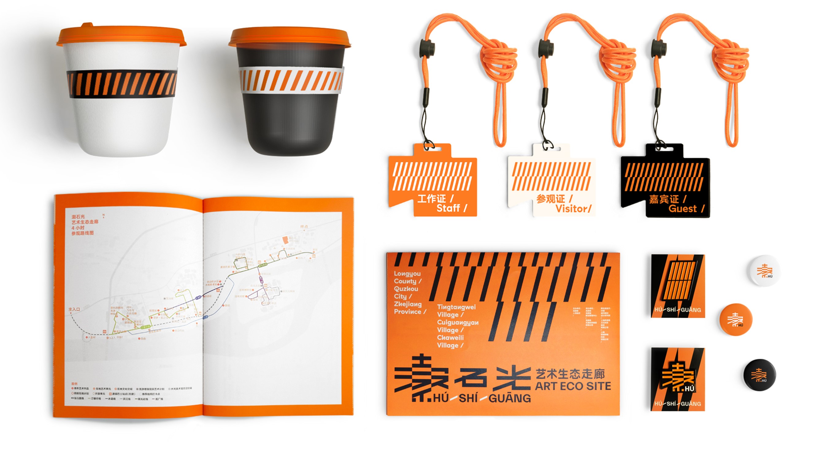
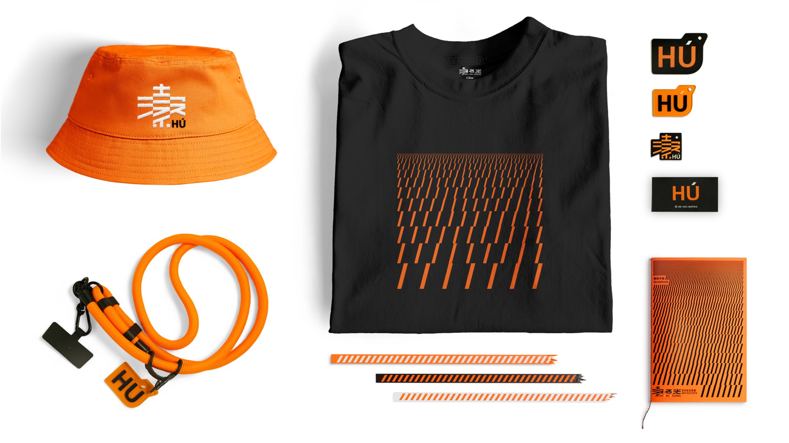
The word "Luo" is rare and unique. It refers specifically to the section of Qujiang River flowing through Longyou. Because this section of river is full of water, just like the texture of silk "Luo", it is named after it. From the design point of view, the Chinese character "ling" is naturally communicative and unique because of its unique concept and complicated strokes, so it is listed as the primary focus of our design. Another source of vision comes from the ripples of the stone water and the unique array chisels of the Longyou Grottoes. These two intentions form a clever coupling in vision and finally become the precious visual symbol of stone light-"/". In the subsequent extension design, we also expanded and extended this small meta-symbol to discover its infinite possibilities, thus forming the unique visual system of the stone light.
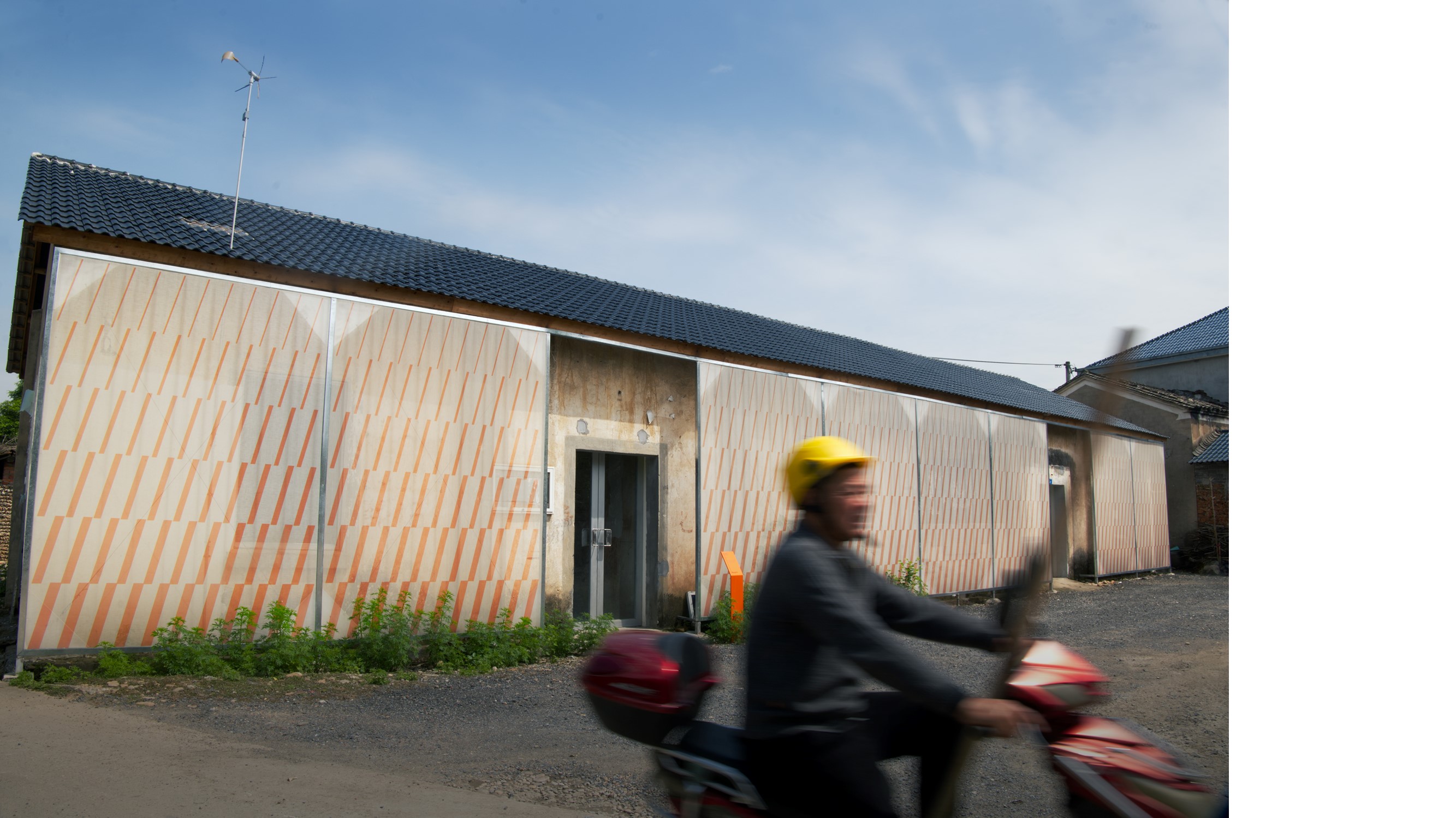
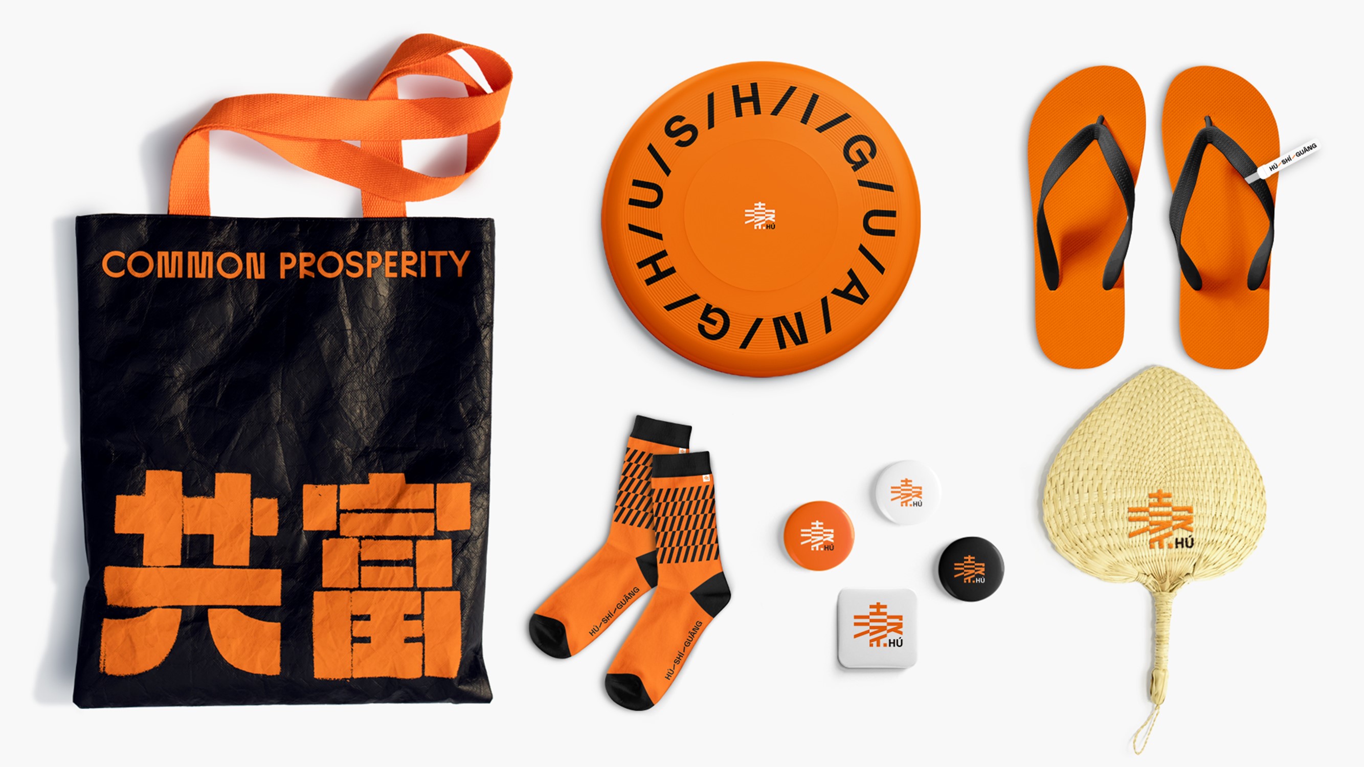
In terms of color, we have chosen bright and vibrant orange as the main color of the brand, hoping to strengthen the difference and recognition in the industry. In the setting off of nature surrounded by green, orange as the leading brand has also been highlighted, further strengthening the functionality of the guide.
In the process of thinking about the design, we try to reflect the local value of Longyou, and extract the elements that villagers are accustomed to in the environment. As the inspiration of the design, on the one hand, it increases the local people's sense of identity with the project, on the other hand, it also introduces the characteristics of Longyou to the outside world, which opens a window for everyone to have a deeper understanding of Longyou. We hope to use the simplest visual element-color, as the embellishment of the entire route, and use bright orange as a visual cue to tell tourists that "there is also scenery here", and at the same time further strengthen the role of vision in the entire space.
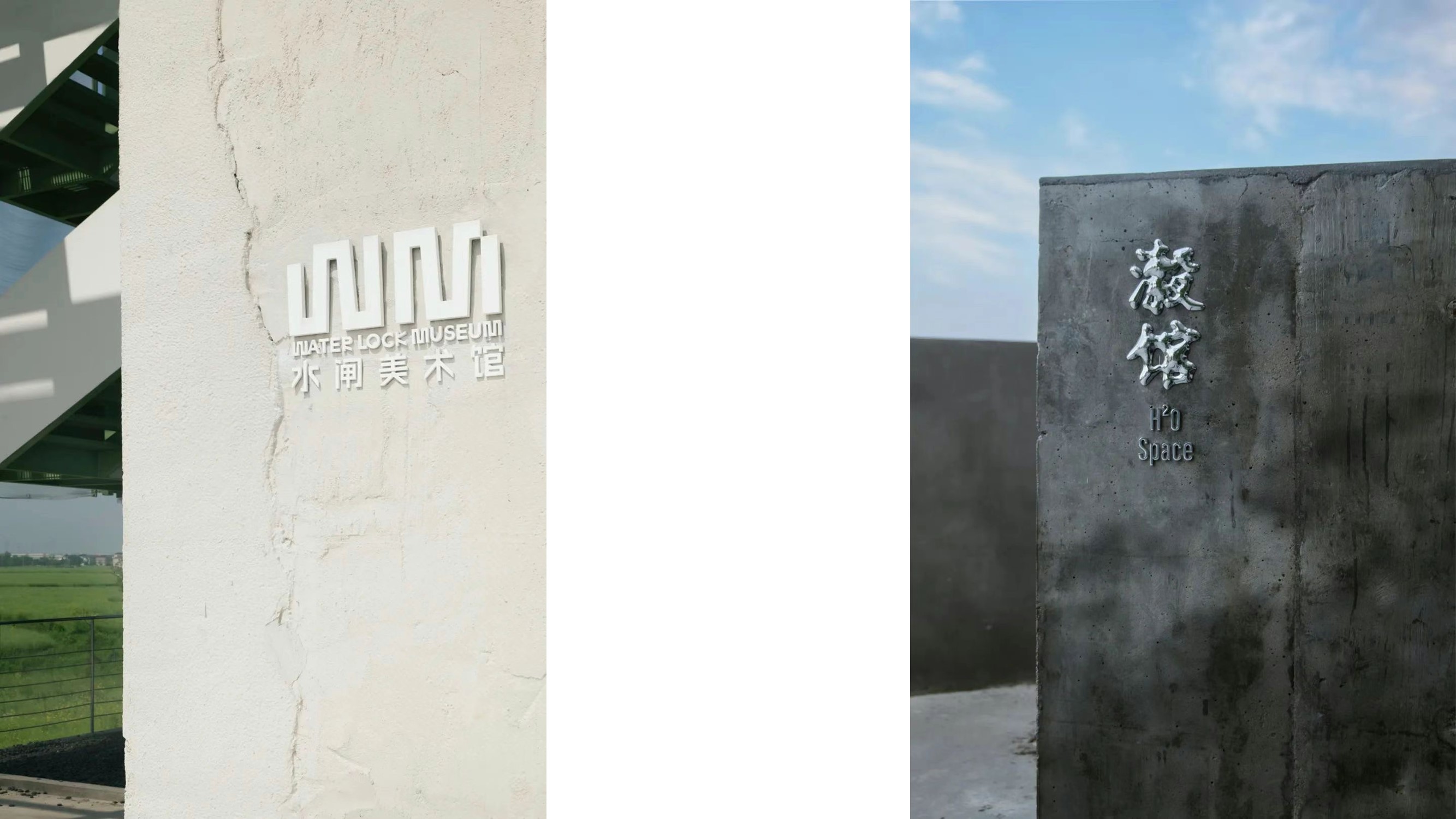
Throughout the tour, the dots are dotted with exquisite architectural spaces, and we have also customized unique logos for these works. In the design of the logo, we have added a lot of ingenuity, tailored to each architectural design according to the appearance, material, environment and other characteristics of the building itself. The form and texture of the logo and the building itself have a wonderful chemical reaction, or fusion, Or contrast, making the logo and the building set off each other and complement each other.
In the stone light project, we hope to intervene in nature with design, highlight the characteristics of the project, integrate into the local environment, and show the value of Longyou visual symbols as much as possible in the co-creation of villages and towns, nature and design, so as to keep the uniqueness of the place.
jpgDesign (hundreds of grams of brand design) is a focus on the subject context and social practice of design groups. Since its establishment in 2021, it has focused on visual strategy and media practice, taking action as the source of design, seeking conceptual breakthroughs and formal innovation, and exploring visual tension and design boundaries.

