


Haoge and Guangkai a1
Haoge and Guangkai a2
Haoge and Guangkai a3
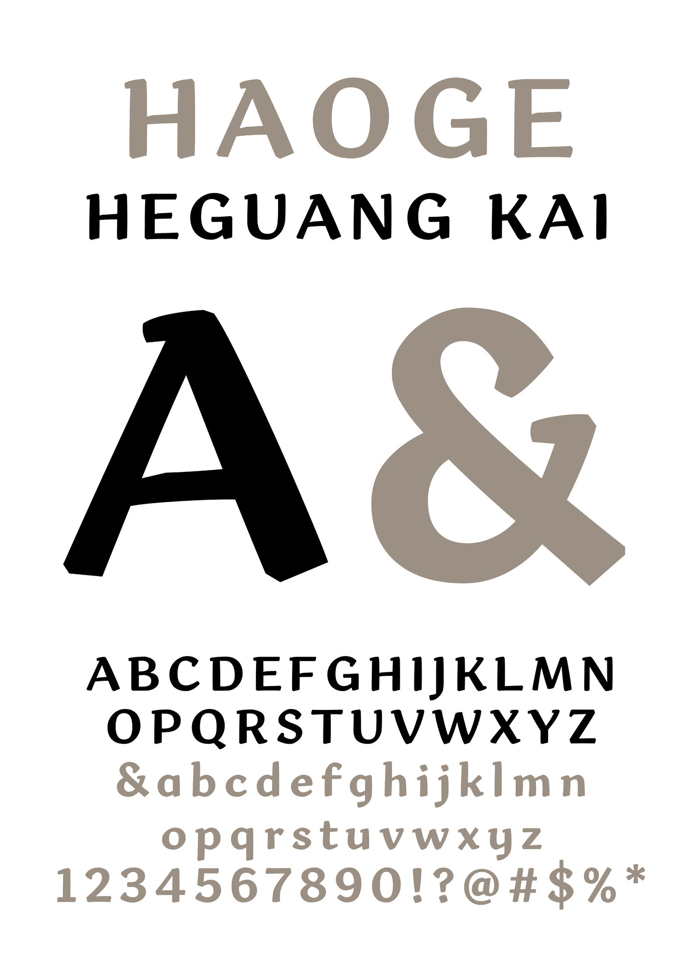

Haoge and Guangkai a4
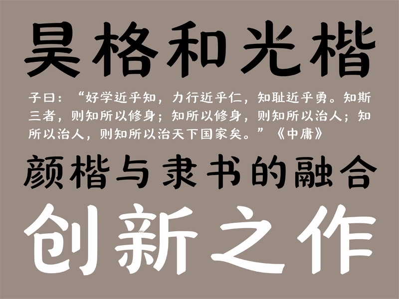
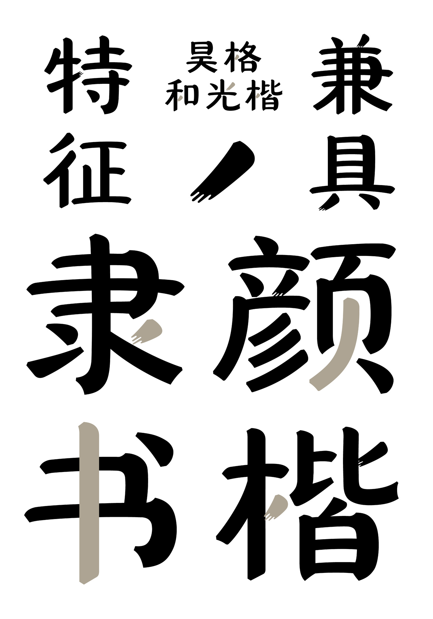
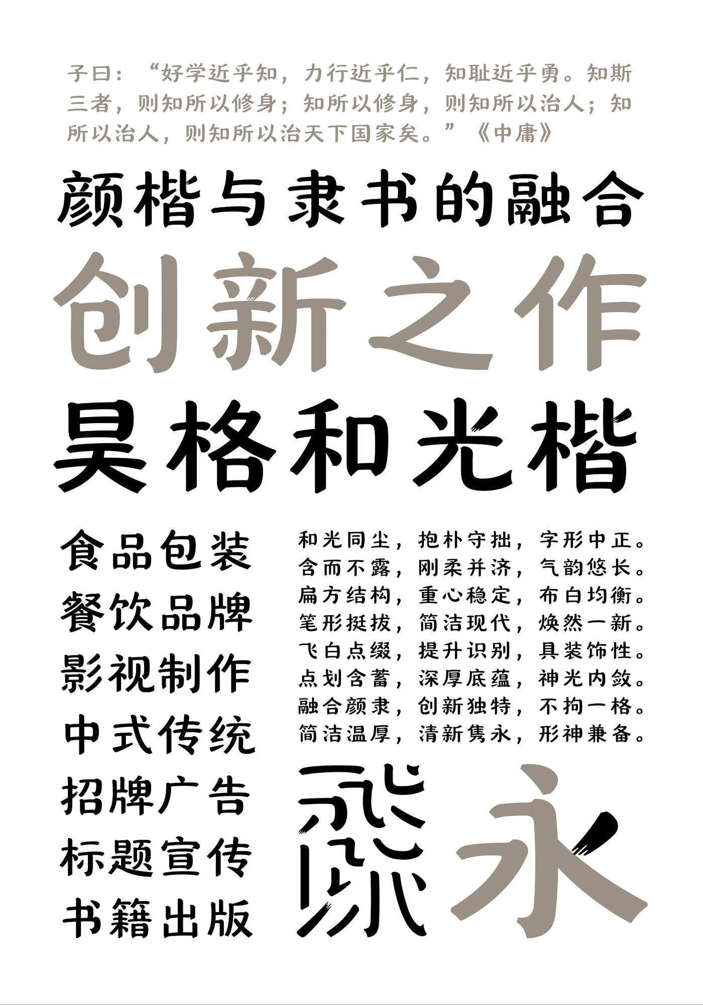
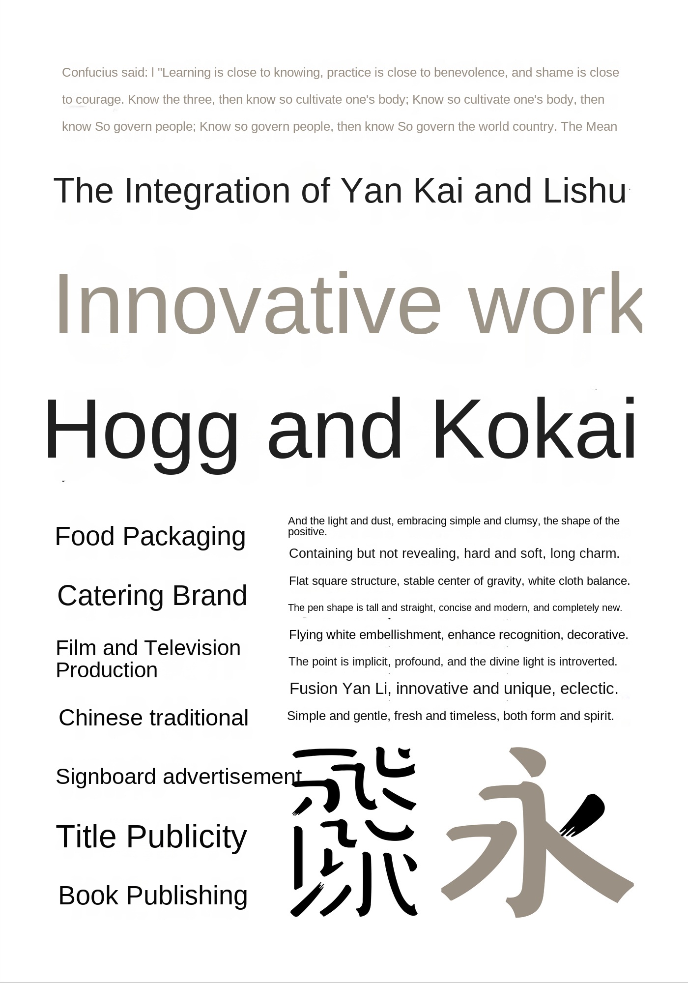
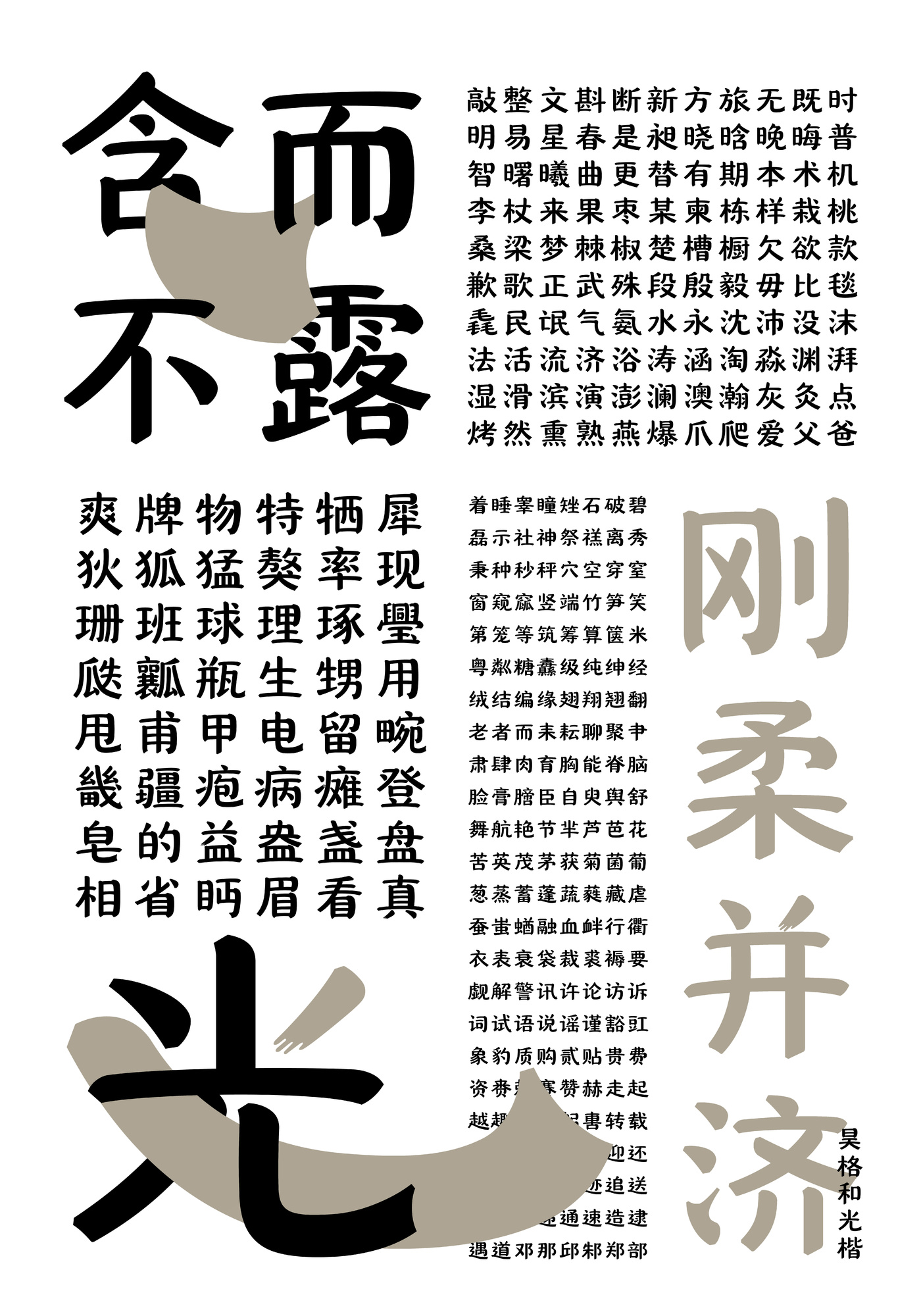
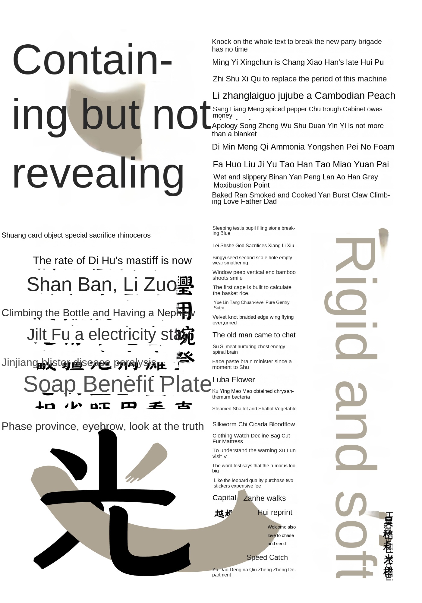
Hao Ge and Guangkai are innovative fonts with the characteristics of both Yan Kai and official script. Structurally, the literal is flat, the center of gravity is moderate, the cloth is balanced and the knot is stable. In the shape of the pen, it is tall and straight, and the starting and turning of the pen is boldly summarized on the basis of Yan Kai, making it concise, modern and brand-new. In details, some strokes boldly use flying white to enhance the recognition and decoration. Hoge and Guangkai are both rigid and flexible, suitable for food packaging, catering brands, film and television production, Chinese traditional products, signs advertising, title publicity, book publishing and many other use scenarios.
In our creative practice, we take the lines of the official script and the rigorous structure of Yan Kai as the starting point, and repeatedly try to find new ways of expression at the intermittent and turning points of the strokes. Special attention is paid to the breathing sense of brush strokes and the overall rhythm of the glyph, thus striking a balance between artistry and readability.
Based on traditional Chinese calligraphy, the strokes and structures are improved through modern design techniques, showing the dialogue between tradition and the present. Hao Ge and Guangkai have good readability and aesthetics in the mass media such as textbook publishing and cultural propaganda, which can improve the social attention to the aesthetics of Chinese characters. It enables the integration and re-creation of the two classic calligraphy forms of Lishu and Yan Kai, and injects new vitality into the protection and promotion of traditional calligraphy culture.
Gao Dingzi, find Hao Ge. Hao Ge Gao Ding Zi takes "learning for the past" as its mission, focuses on the design and research of advanced customization of characters, focuses on the fields of character library, font and character art, integrates traditional culture and cutting-edge technology with innovative design, provides unique high-determination solutions for brand characters, empowers brand assets and helps cultural dissemination. At the same time, we actively participate in curation, publishing and education, and are committed to promoting the development of the industry and industry. The core team of the company has more than 20 years of rich experience and fruitful results in the aspects of text high determination, brand planning, research and education, and has launched dozens of professional fonts.

