


Haoge Chelate Black 01
Haoge Chelate Black 02
Haoge Black 03

Haoge Chelate Black 04
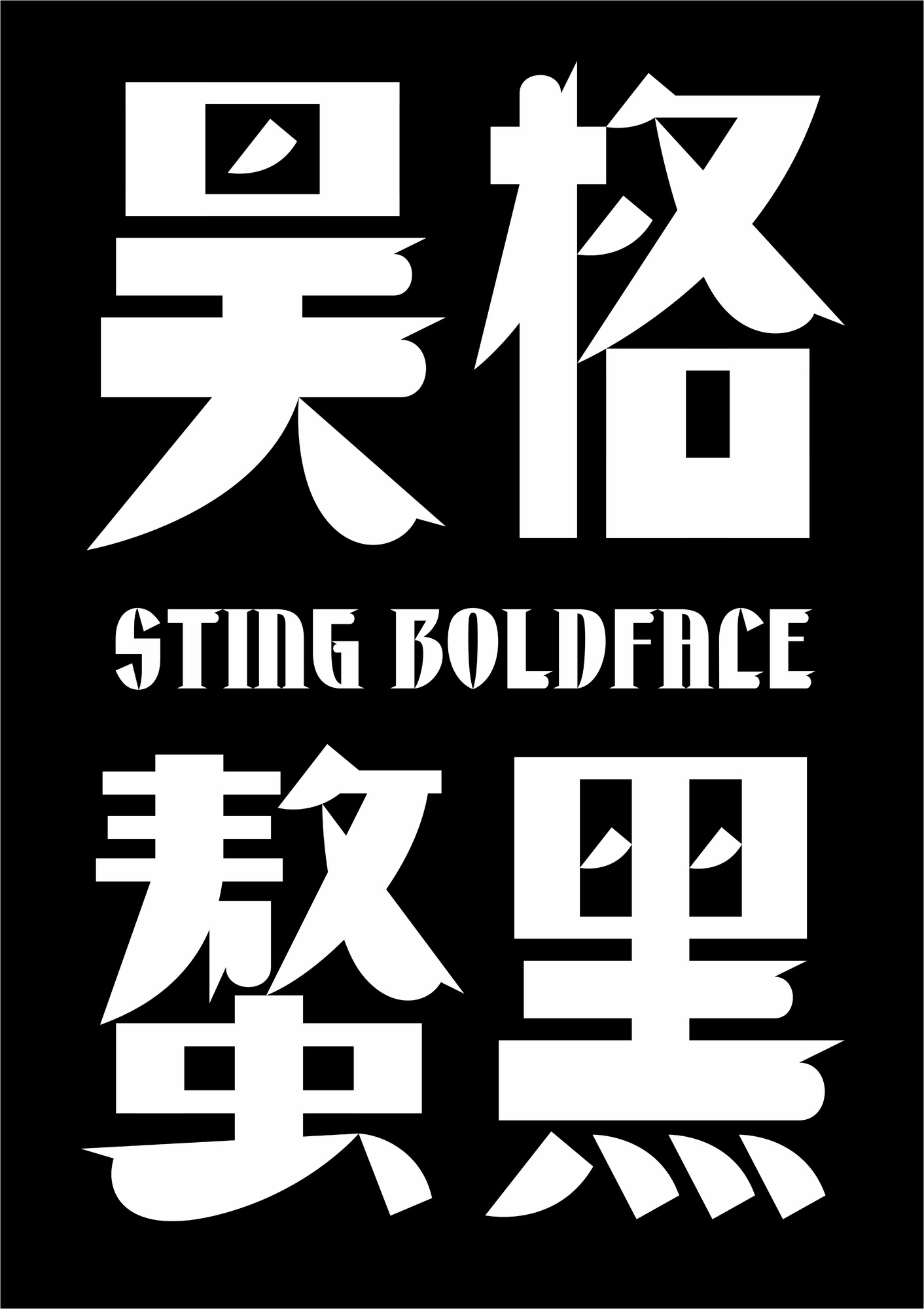
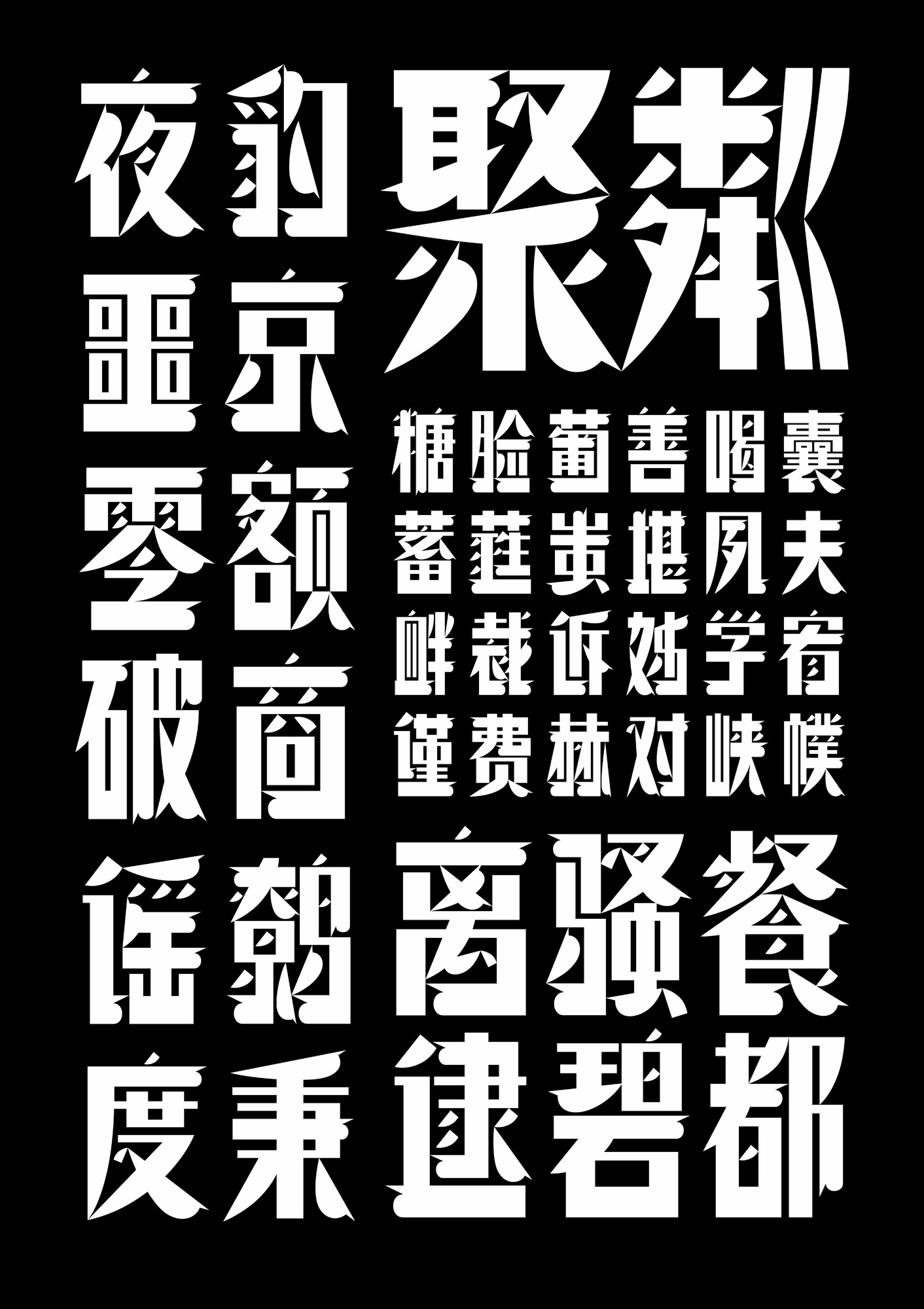
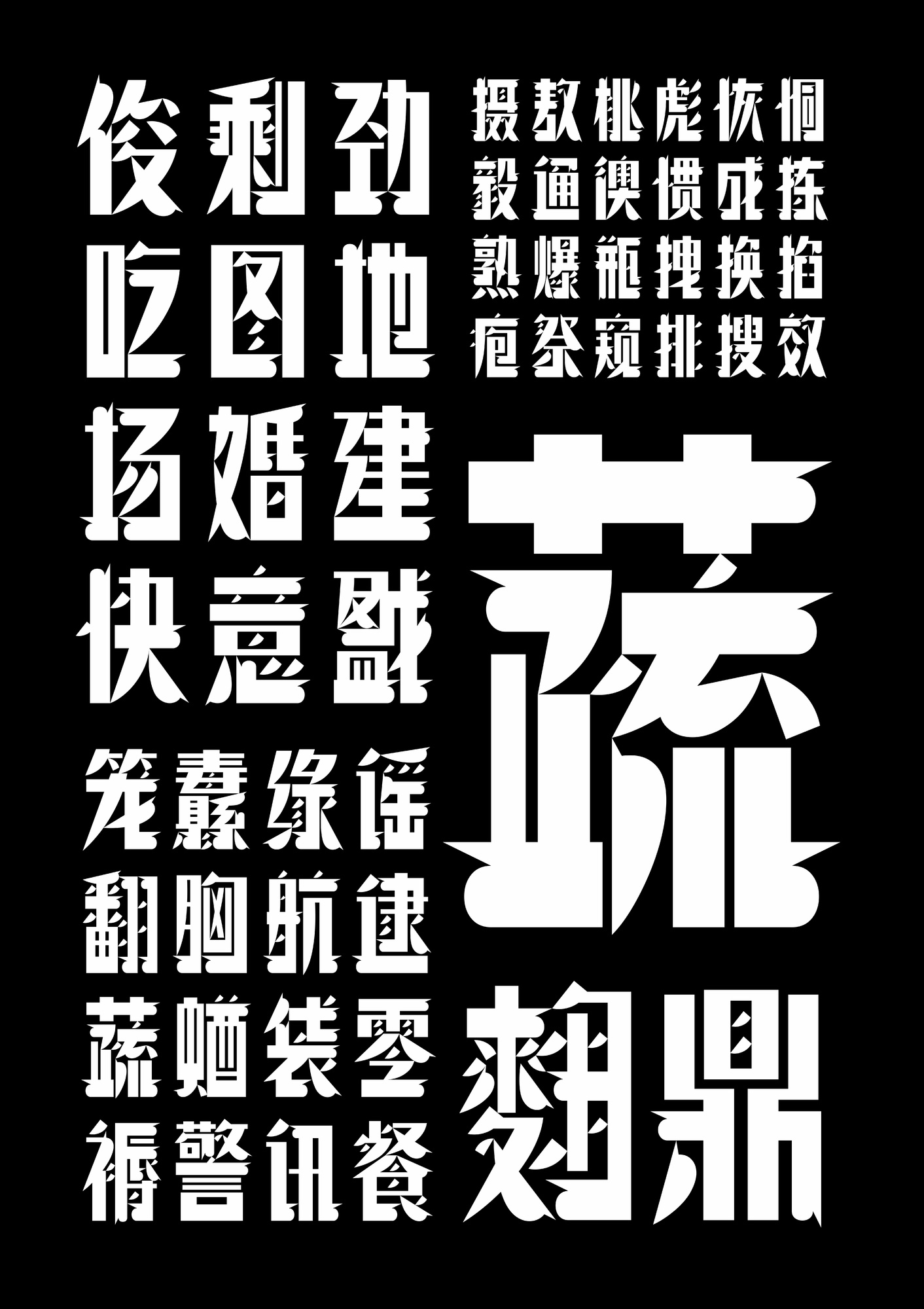
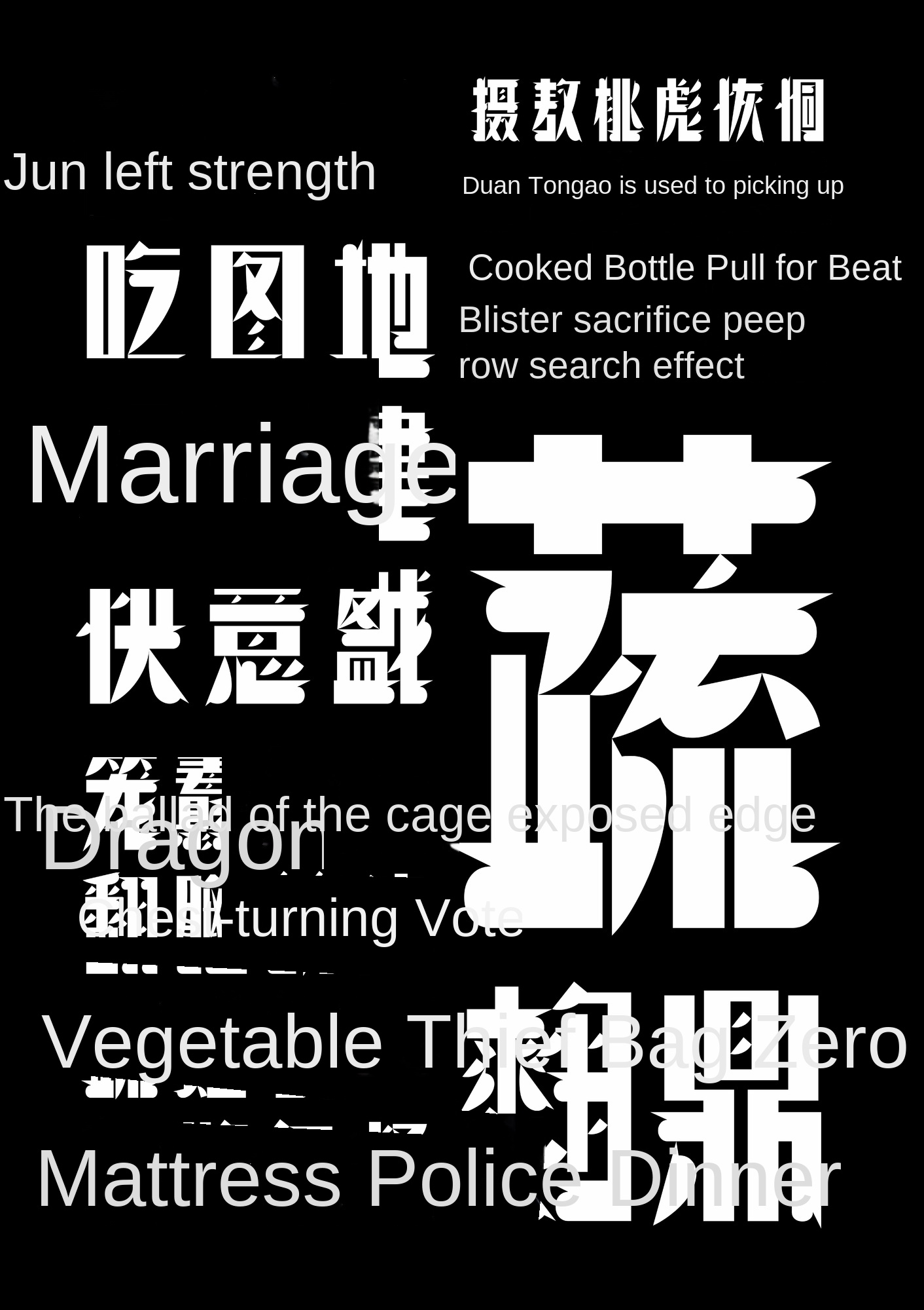
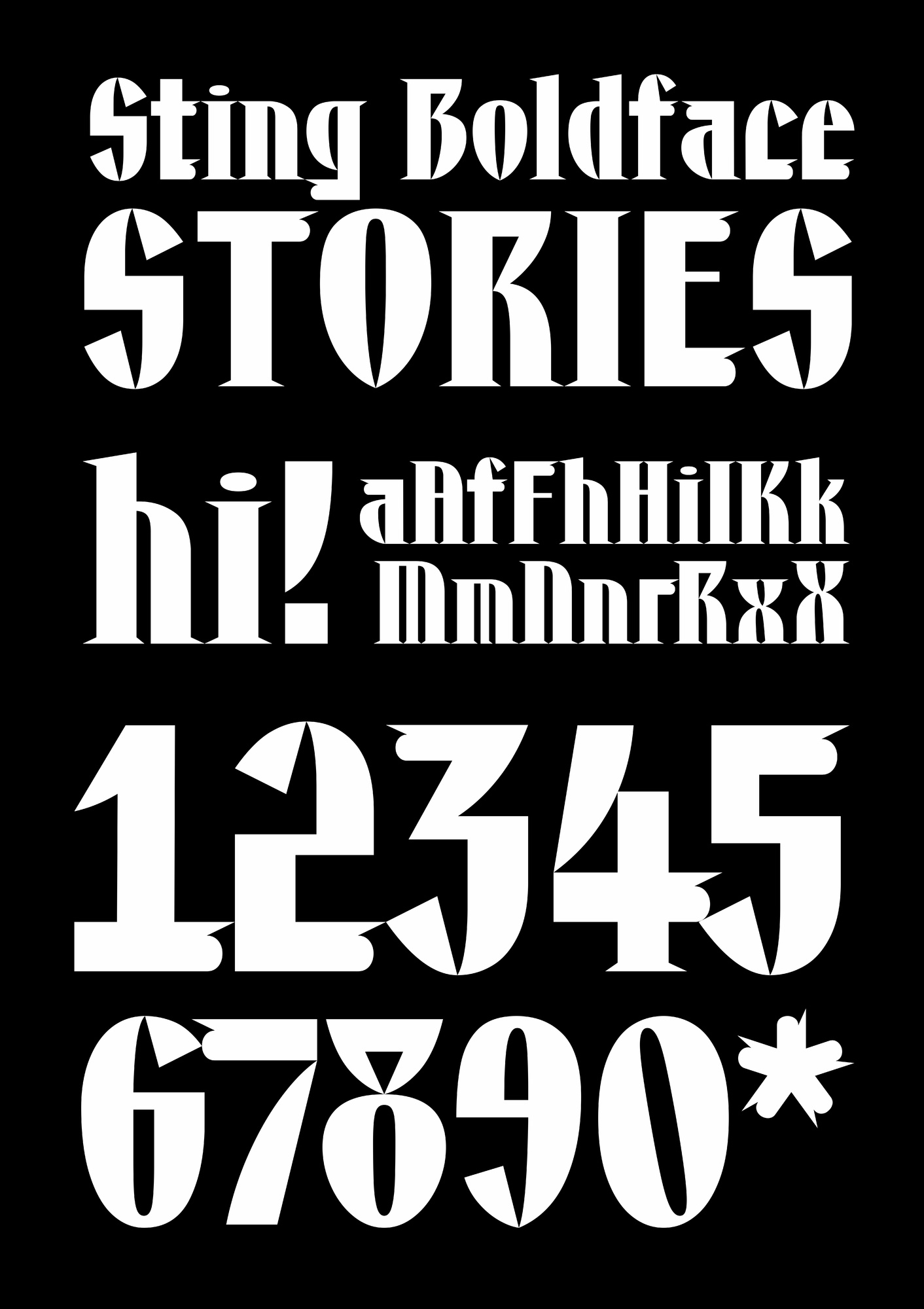
New in whetstone, the first show, Hao Ge chelate black is an innovative bold body that breaks up and reshapes the characteristics of the Republic of China's fine arts. Structurally, the essay shape changes flexibly, breaking the traditional font unified character, center of gravity, middle palace, etc. On the pen shape, the shape of the claw thorn is integrated, with exaggerated horizontal and vertical ratio, scattered but not disorderly points, bringing the visual impact and tension of the back of the paper. In details, the point-to-point feature is unique and corresponding. Haoge's claw black is clean and interesting, it is a font with both traditional culture and the characteristics of the times. It is suitable for cultural and creative products, brand image, food packaging, film and television production, book publishing, news headlines, e-commerce promotion, art exhibitions, traditional Chinese signboard shops and many other usage scenarios.
When designing "Haoge Chelate Black", we studied a large number of poster fonts and fine art characters of the Republic of China, extracted the core elements from its lines, transitions and configurations, and then combined with the minimalist and sharp futuristic style to reinterpret the glyphs.
As an early attempt of Chinese modern graphic design, the Republic of China's fine art characters have historical significance for the development of contemporary fonts; combining them with the sense of the future, it shows the design path of combining Chinese and Western and diversified blending. In the modern visual system, "black" can be applied to new brands, digital media, etc., to provide contemporary society with both retro and avant-garde aesthetic experience. By reproducing the visual genes of the Republic of China, it triggers the public's review of that period of history and culture, and makes the traditional culture rejuvenated in the contemporary environment through the expression of futurism.
Gao Dingzi, find Hao Ge. Hao Ge Gao Ding Zi takes "learning for the past" as its mission, focuses on the design and research of advanced customization of characters, focuses on the fields of character library, font and character art, integrates traditional culture and cutting-edge technology with innovative design, provides unique high-determination solutions for brand characters, empowers brand assets and helps cultural dissemination. At the same time, we actively participate in curation, publishing and education, and are committed to promoting the development of the industry and industry. The core team of the company has more than 20 years of rich experience and fruitful results in the aspects of text high determination, brand planning, research and education, and has launched dozens of professional fonts.

