


Poster of PARAGON BOOK GALLERY 1
Poster of PARAGON BOOK GALLERY 2
Poster of PARAGON BOOK GALLERY 3

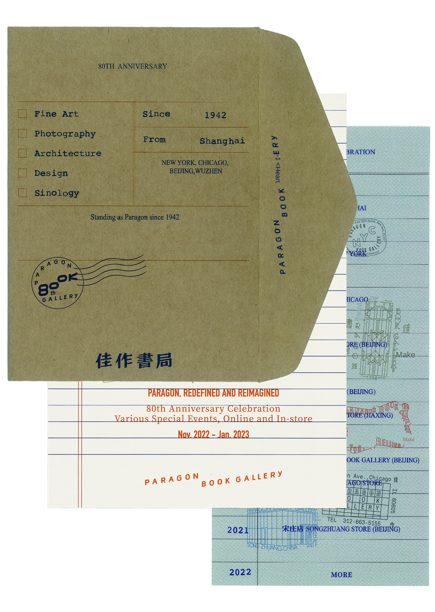
Poster for the 80th Anniversary of PARAGON BOOK GALLERY 1

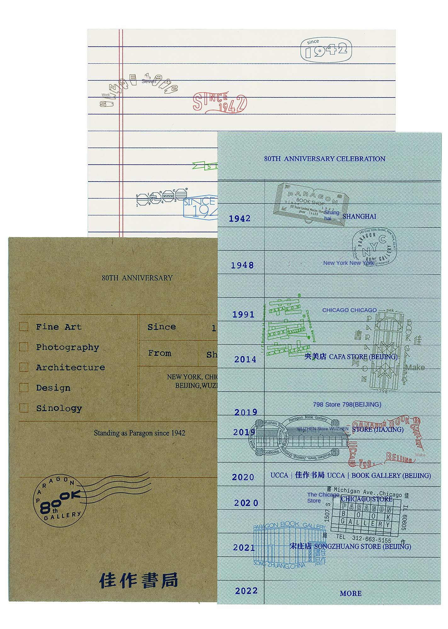
Poster for the 80th Anniversary of PARAGON BOOK GALLERY 2
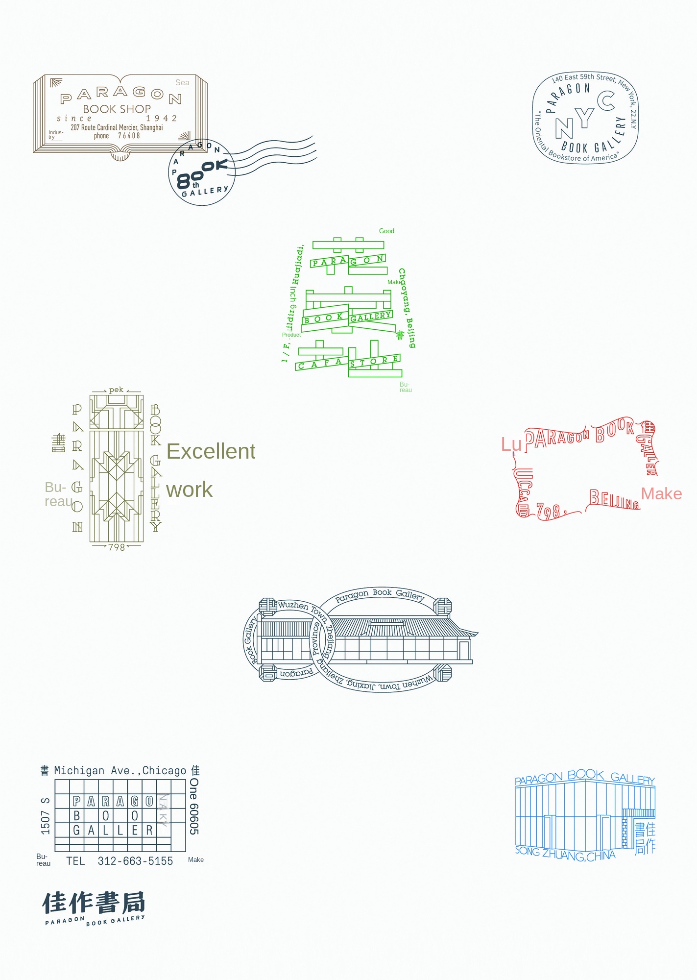
The dynamic display of the logo of the excellent book store
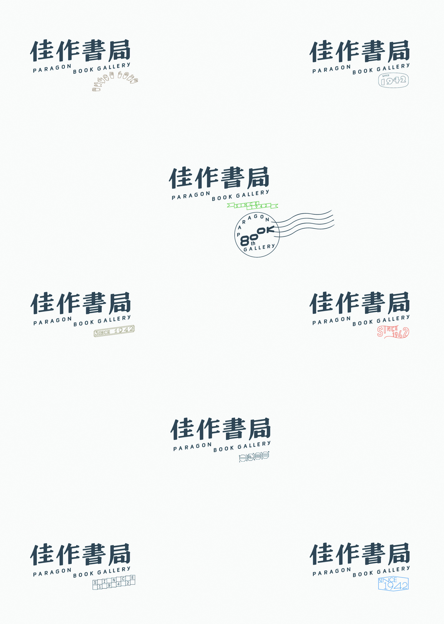
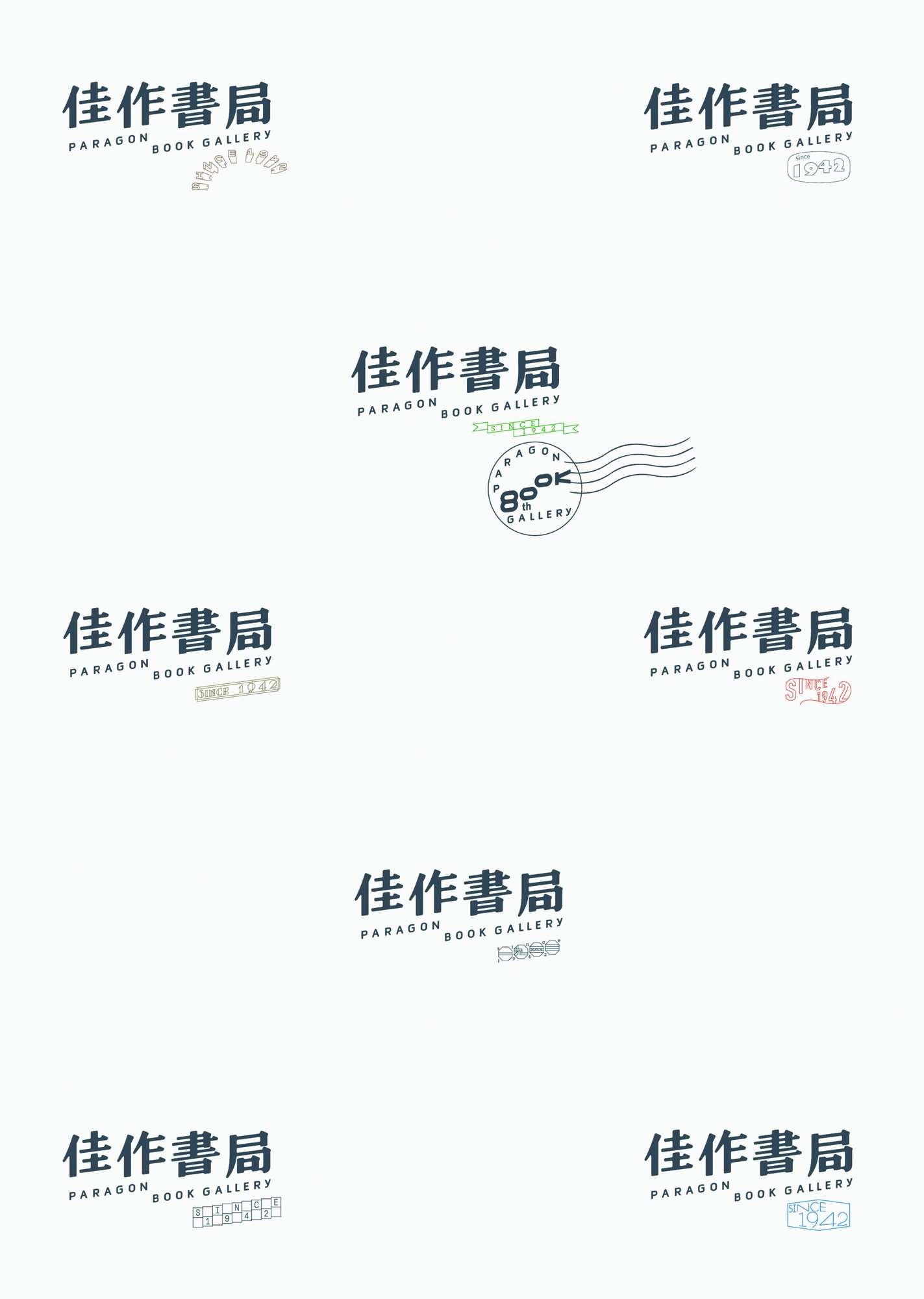
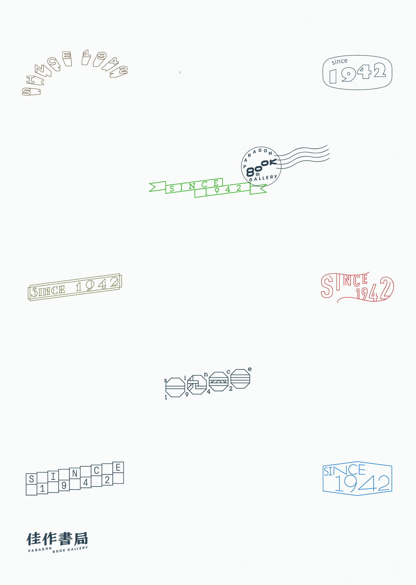
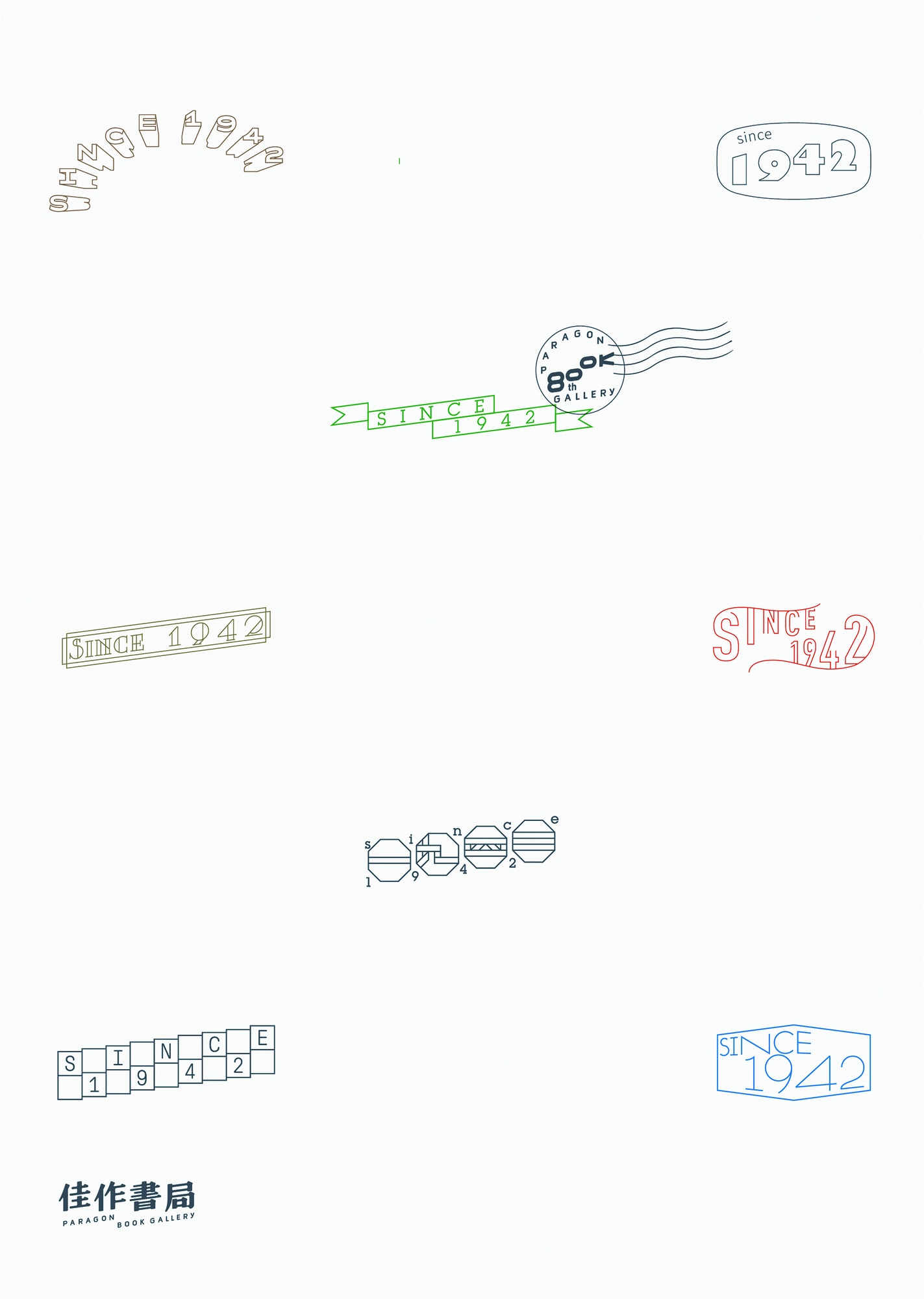
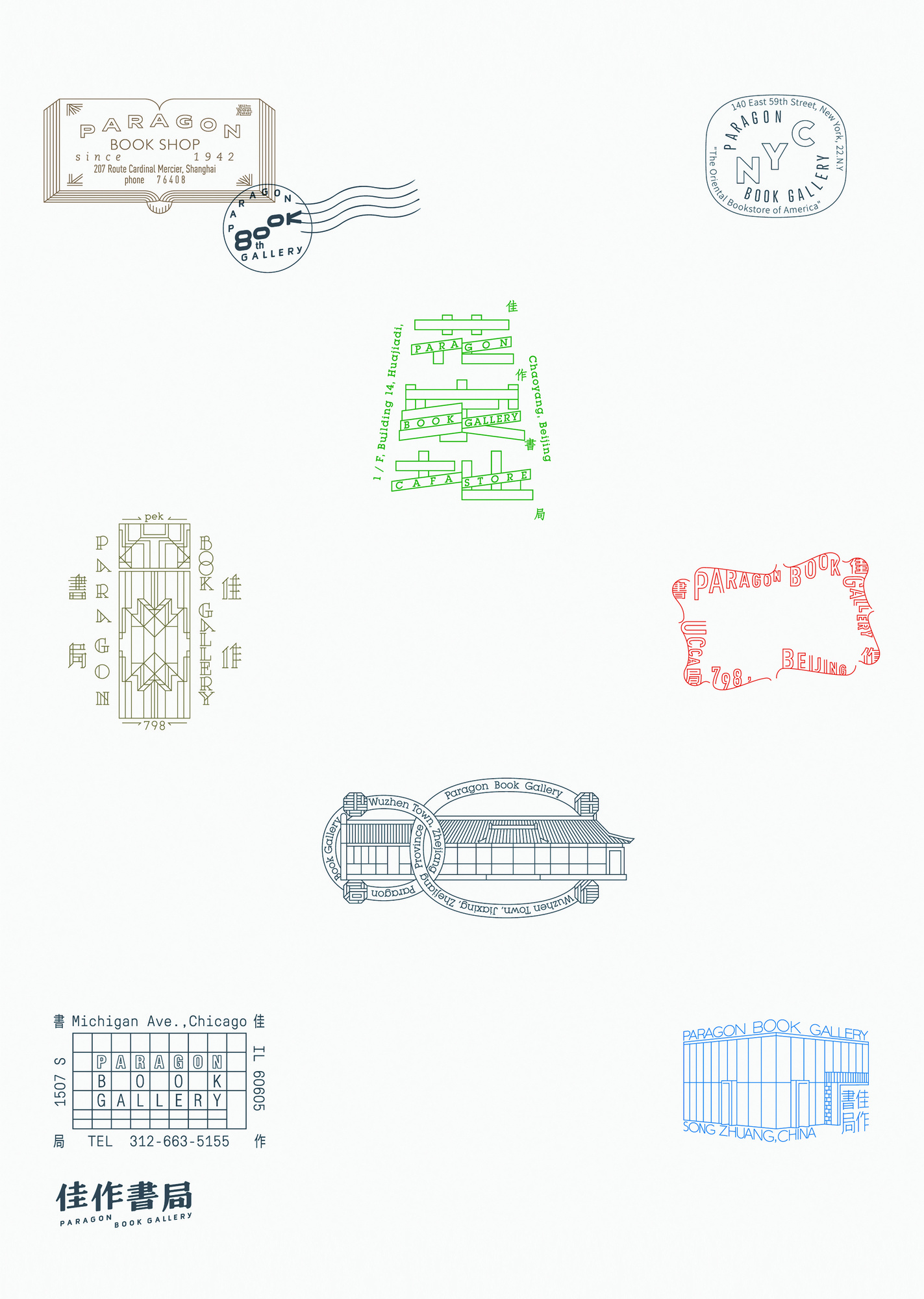
This project is a brand visual upgrade. We participated in the formulation of brand visual strategy, brand visual material design, font design and dynamic effect design. Jiaozuo Bookstore was founded in Shanghai in 1942. The new visual image design aims to give the brand the precipitation of time. Therefore, the old Shanghai signboard art characters with era symbols are selected as the basic font and style to extend. Through the arrangement of Chinese and English fonts, the design team makes the text or phrase form a visual dislocation before and after, as if it were a classification label with a sense of order. At the same time, a set of visual rules has been established for the different store characteristics of the brand, with different forms of auxiliary fonts and graphic chapters for stylized interpretation.
The brand of Jiaruzuo Bookstore focuses on the introduction, translation and publication of Chinese and foreign art books, and continues to hold art and cultural activities. It was founded in Shanghai in 1942, transferred to new york and Chicago successively, returned to China in 2024, and grew up in many places in Beijing, Wuzhen in Zhejiang and Qinhuangdao in Hebei. In the discussion of brand vision strategy, we believe that the 80th anniversary is very rare and unique for a Chinese cultural brand, and the rich history from China to overseas and back to China should be recorded and known. Therefore, we hope that in the brand visual construction, the new image needs to give the brand academic and historical sense, and at the same time, it should also establish emotional resonance with readers with a more modern appearance.
In the specific design work, we through the font design and text arrangement, so that the text or phrase between the formation of the front and back of the visual dislocation, as if a sense of order "classification labels". At the same time, we added "Since 1942" to the corner of the logo to strengthen the brand's history. In addition, in order to make the brand vision compatible with the architectural modeling of bookstore space in different regions and reflect the culture of different regions, we have designed a set of rules for fonts and graphic chapters for the stores that exist in history and are currently operating. Under this premise, when Jiasuozuo Bookstore opens any new store in China or overseas in the future, we will continue to develop the brand visual system for the brand and re-customize the new graphic extension.
StudioTODO is a visual design firm, TODO corresponds to the design plan and process, while to do also has the behavior for the show, which is a topic that designers need to think about all the time-what is the motivation of design? The firm provides visual design services for brands, art and culture, and space projects. We focus on the brand construction, artistic expression and space experience in the project, and advocate "visual communication, communication carries aesthetics 」. Through the analysis of the text behind the project, the concept is defined, and the information and emotion are transmitted in a tactile and perceptible way.

