


Design of Logo System for Shenzhen Dashahe Sports Center (1)

Design of Logo System for Shenzhen Dashahe Sports Center (2)
Shenzhen Dashahe Sports Center Logo System Design (3)
Logo System Design of Shenzhen Dasha River Sports Center (4)


Design of Logo System for Shenzhen Dasha River Sports Center (5)


Design of Logo System for Shenzhen Dashahe Sports Center
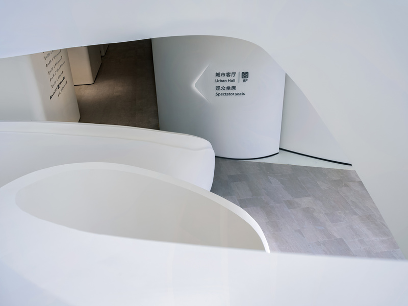
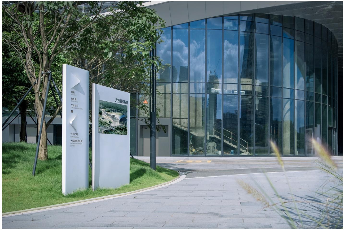
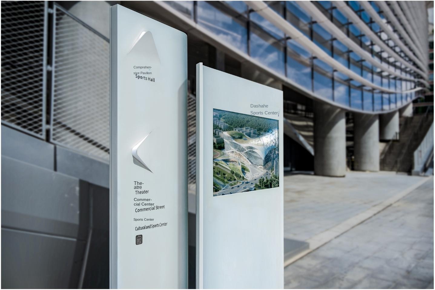
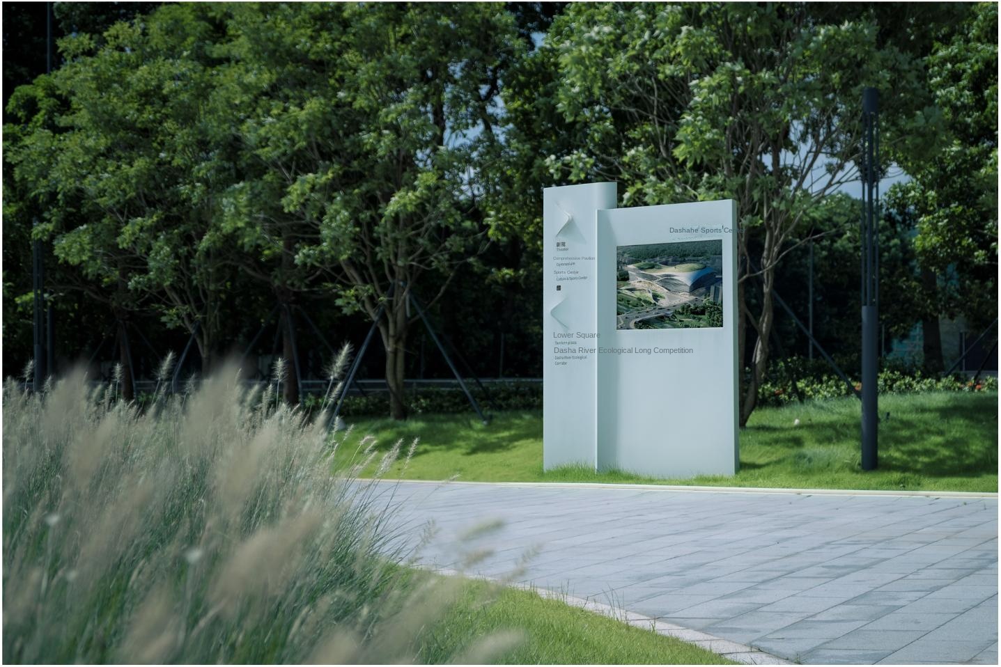
Dashahe Cultural and Sports Center adopts the design concept of "fold", and forms a continuous architectural form inside and outside by means of extrusion and lifting. While dissolving the rigid sense of the building, it also produces flexible space and different from the traditional traffic lines.
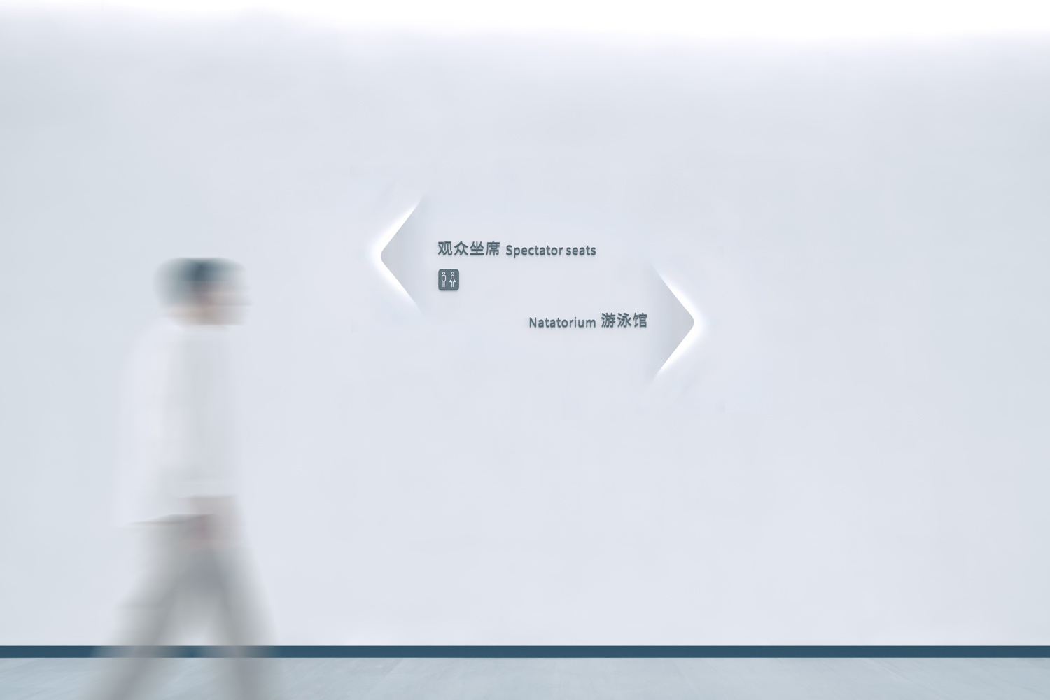
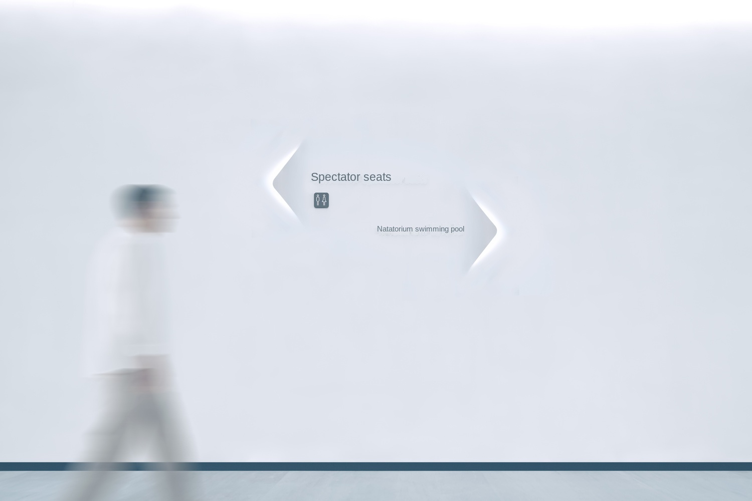
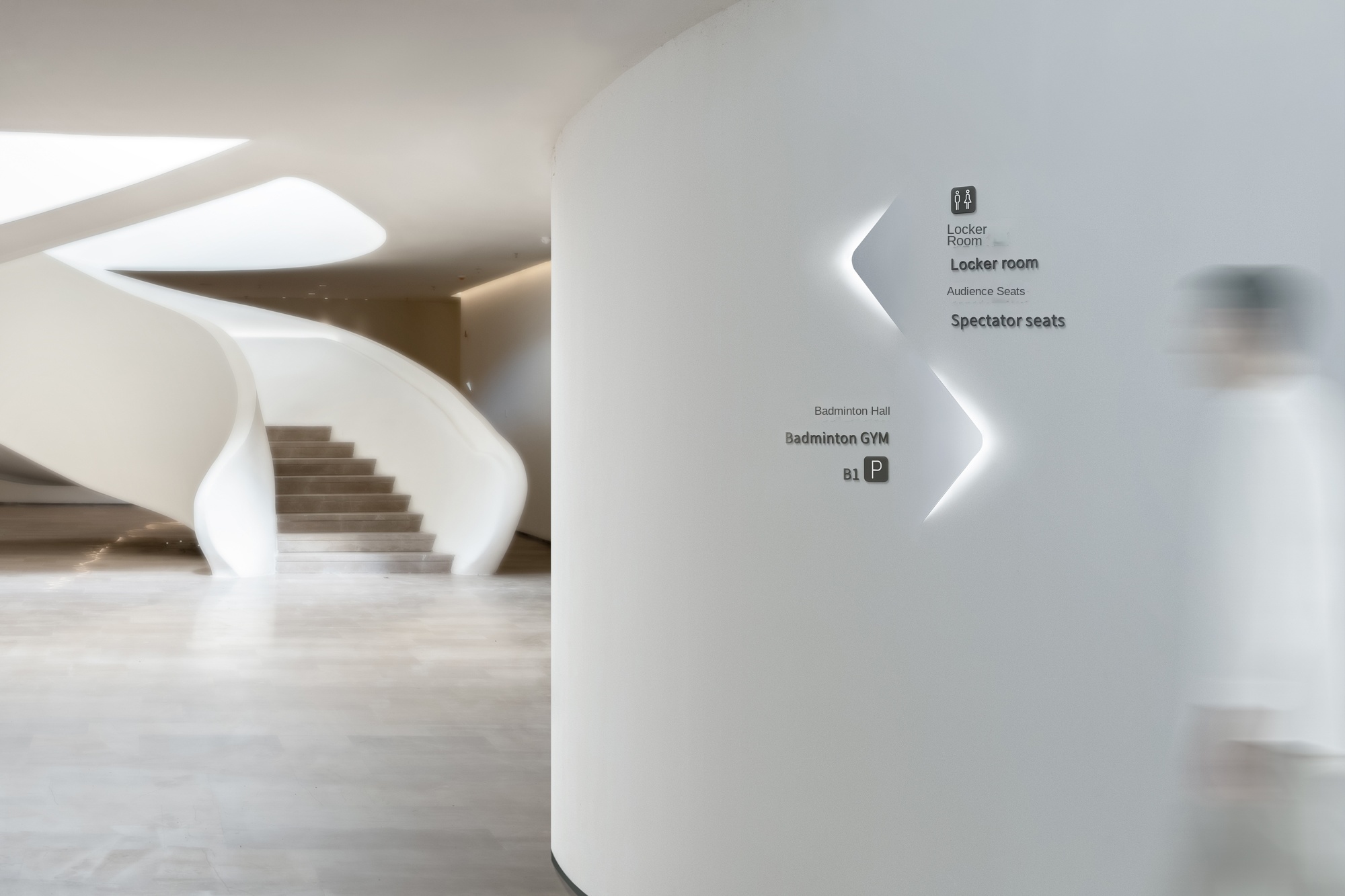
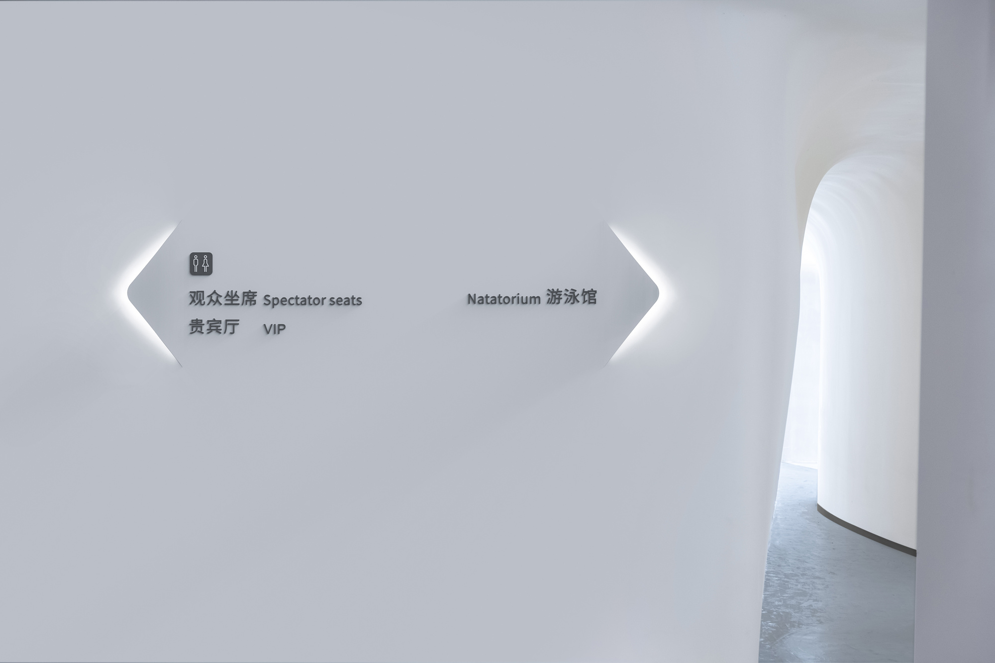
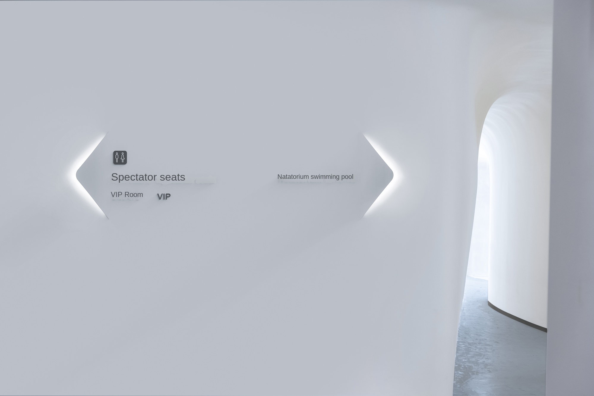
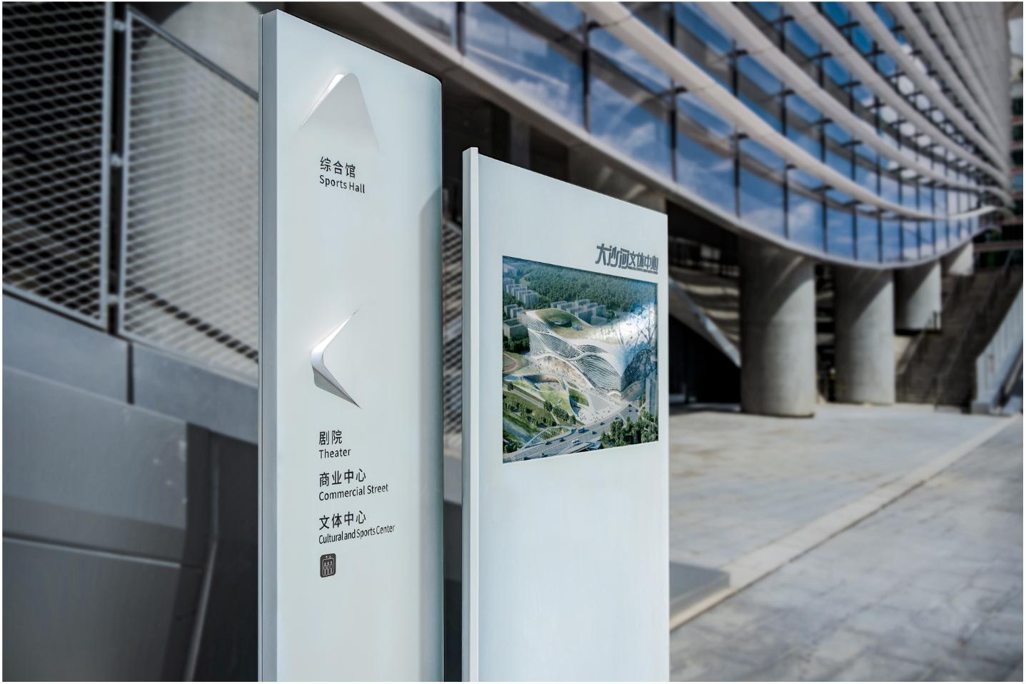
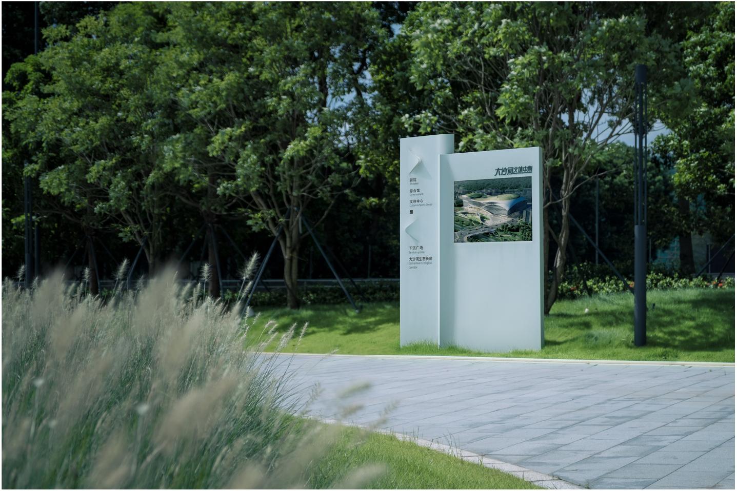
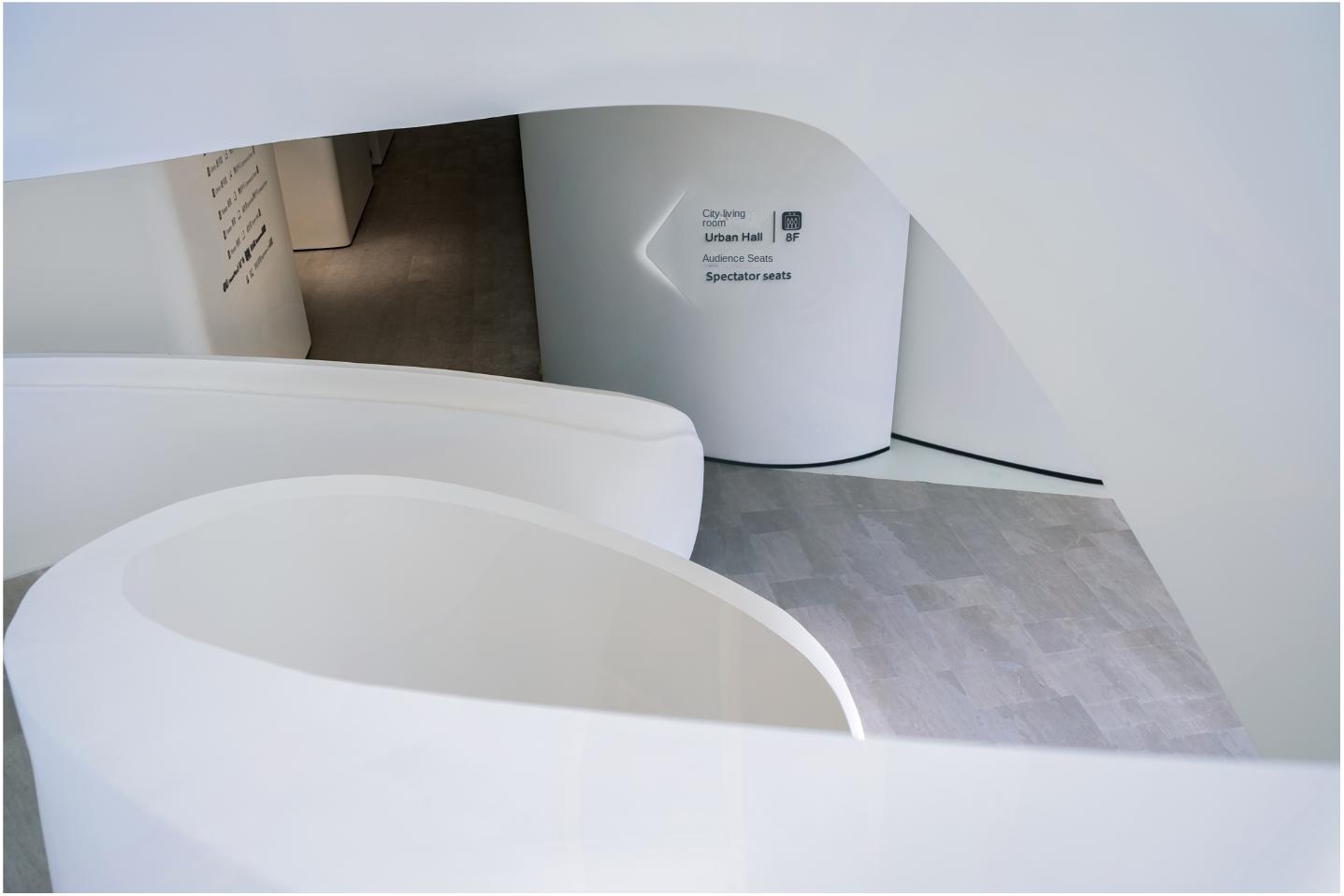
In such an environment, a single standardized identification is difficult to meet the needs, the spatial conditions of each node are different, and the information combination of the identification system needs to be highly adaptable.
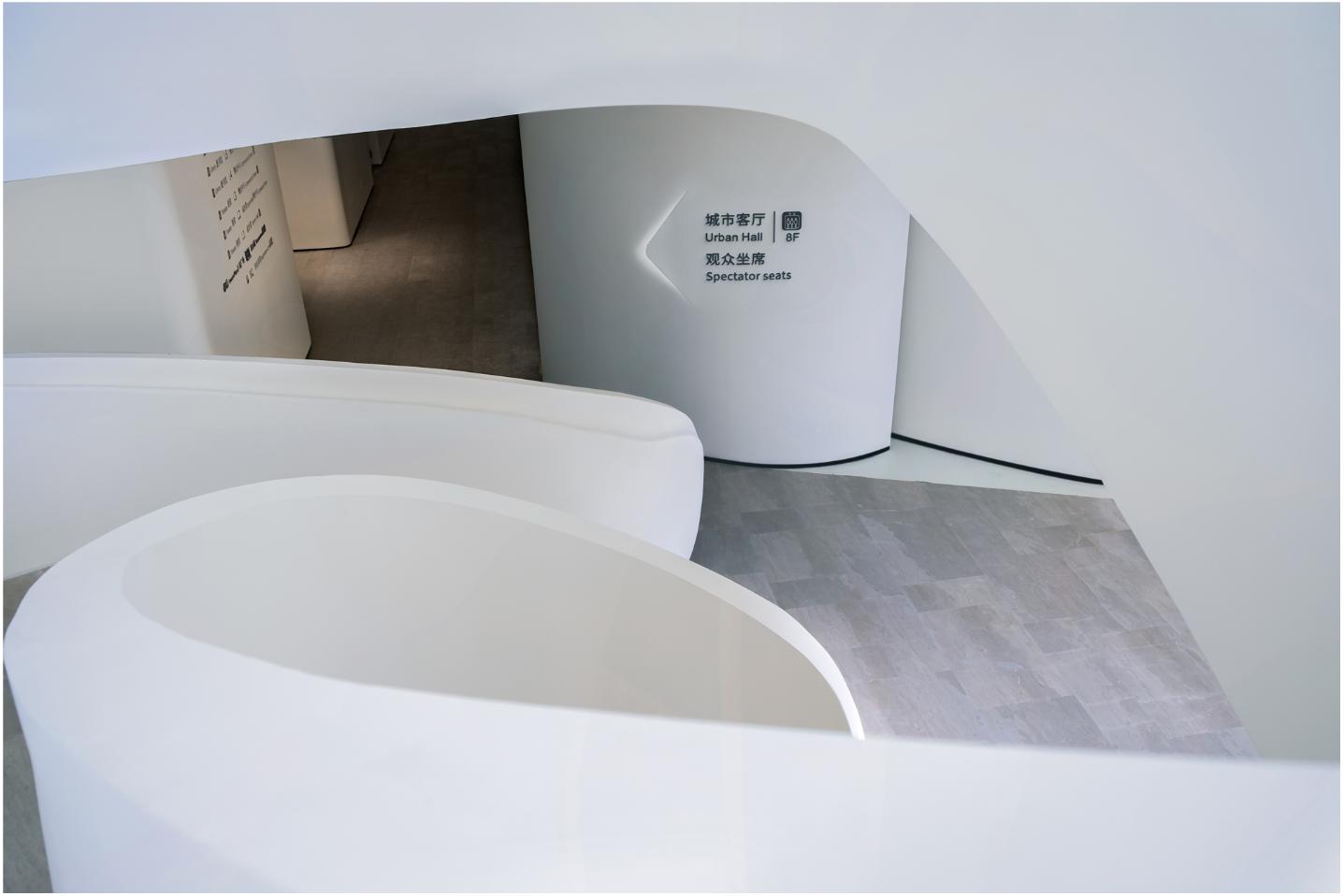
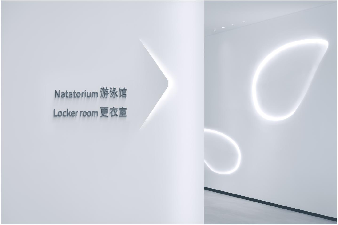
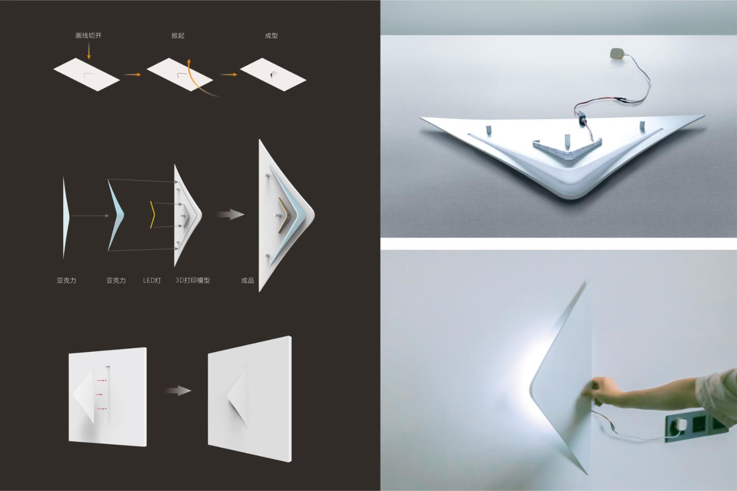
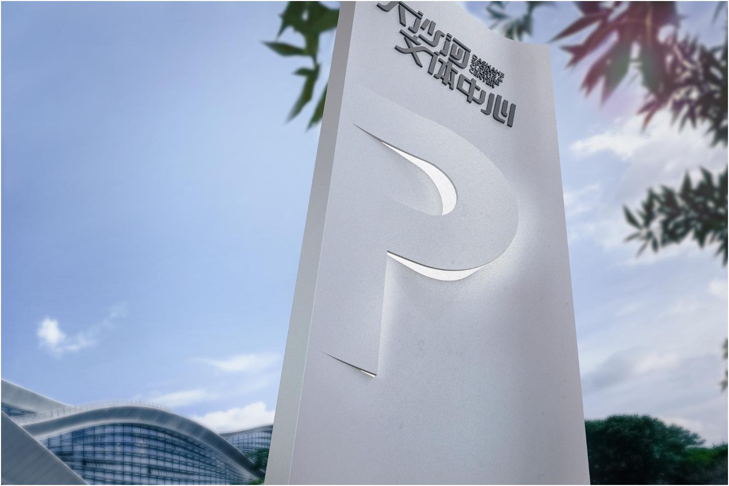
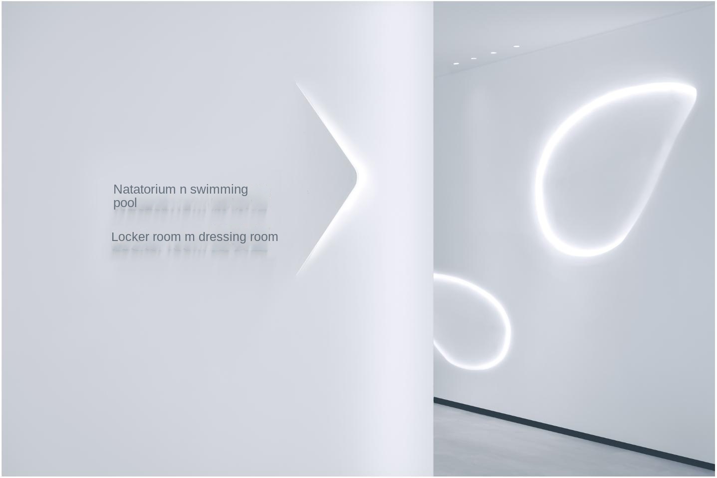
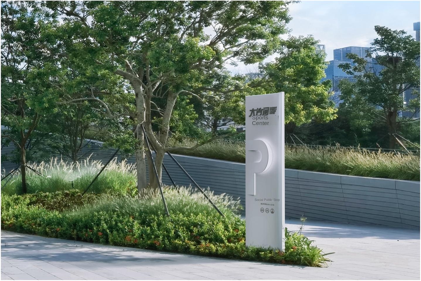
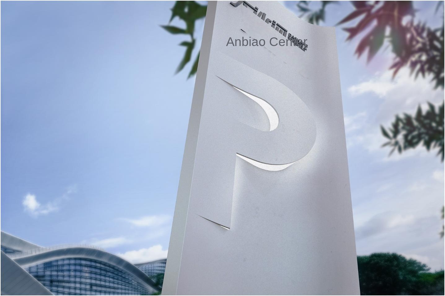
The logo design relies on the undulating situation of the surrounding Tanglang Mountain, continuing the intention of the landscape cascade, forming a gentle and elegant form, echoing the architectural language. The "arrow" in the logo is presented in a form of cutting and rolling from the wall, which not only maintains the simplicity and high readability of the text information, but also allows the shape of the arrow to coexist harmoniously with the rounded arc surface in the space, forming an elegant dialogue with the overall space.
This restrained and elegant expression not only respects the language of space, but also surprises people in details. The visual simplicity is behind the extremely high challenge to the process requirements and the complex coordination of design and construction.
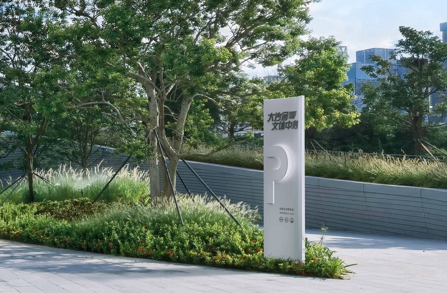
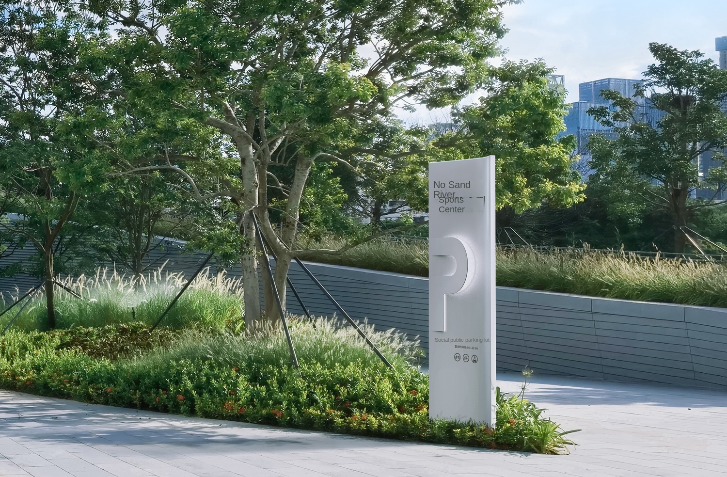
Unlike the regular "factory-site installation" process, this identification system is involved in the early stages of the project. Through close cooperation with the building construction team, we preset the power supply, formwork and installation parts in advance. It ensures that the identification system is integrated with the wall and coating in the final presentation, and truly realizes the original intention of the design.
Blend the same design language to compose a smart and elegant space movement together. Let every visitor can experience the unique space aesthetics and have a more comfortable and convenient space experience.
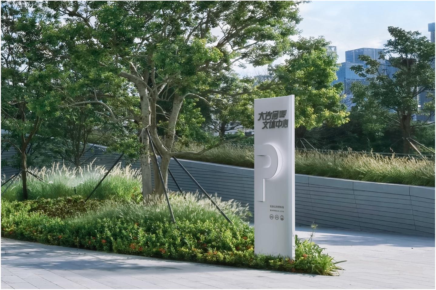
The completion of Dashahe Cultural and Sports Center will greatly improve the level of cultural and sports facilities in the northern area of Nanshan District, provide residents with more cultural and sports choices, and improve the overall quality of life. At the same time, as a new landmark building, it will become an important business card of Nanshan in the future, further enhancing the attractiveness of the region. For the surrounding residents, this is not only a good opportunity to improve the quality of life, but also a major project that reflects urban development and people's livelihood care.
Shenzhen Shanghang Design Co., Ltd. was founded in 2001 and is headquartered in Shenzhen, Guangdong. It is a professional organization focusing on environmental visual management and integrated design. For more than 20 years, Upline has always adhered to the core concept of "high efficiency, innovation, change, and standardization", providing full-chain services from strategic planning, graphic design, industrial design, environmental space layout, to process structure and construction management. The company is committed to creating an aesthetic space experience, injecting artistic value into guide design, and has successfully created iconic projects in many cities across the country.

