


1
2
3
4
5
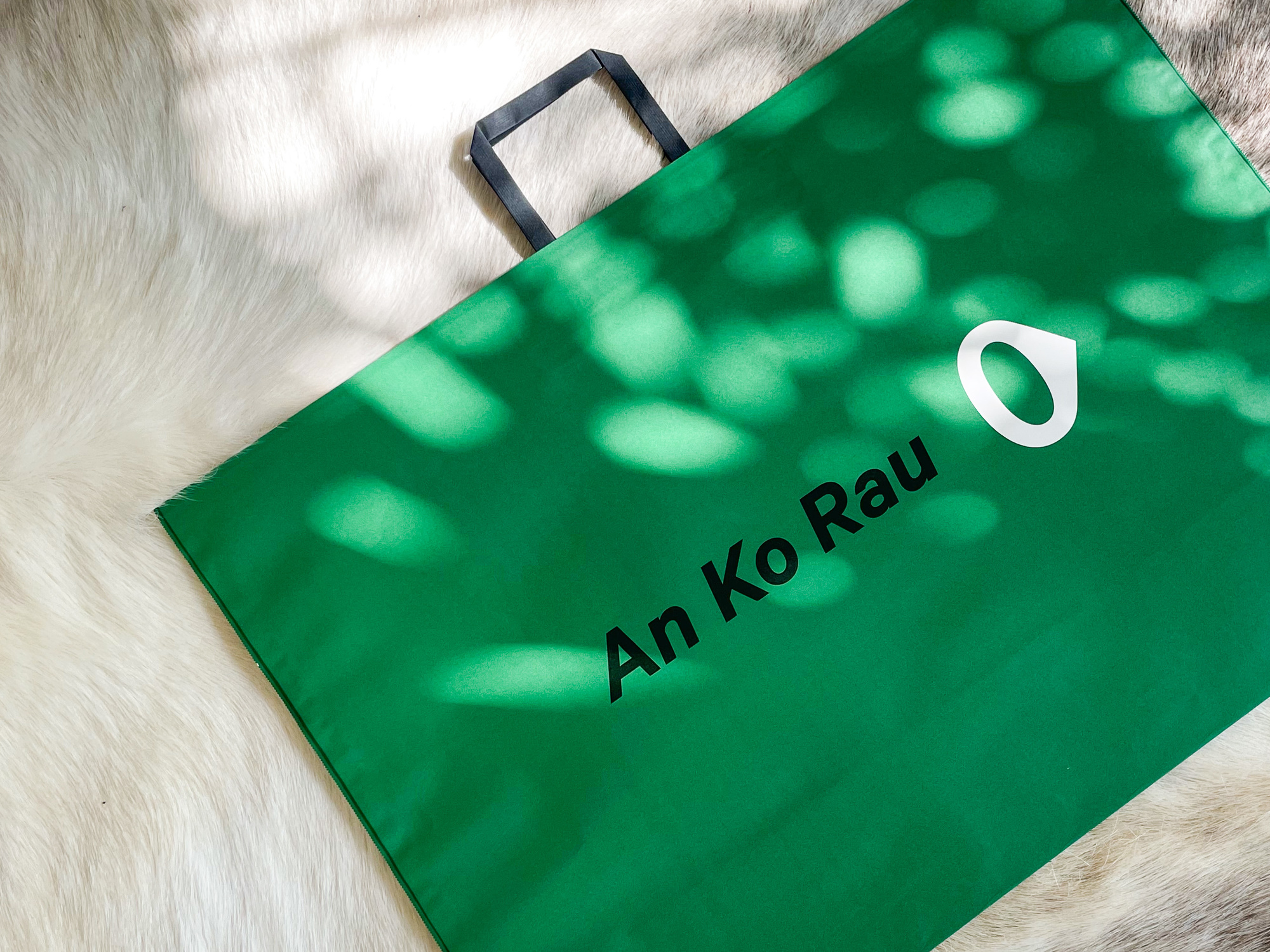
An ko Rau,世界语中“恒动”的意思,有循环和持续着的含义。最初,符号“0”的灵感取自运动秒表计时。现在“0”被符号化,表达从静止到运动、不断发展和进步。运动,源于静止,归于零,前进但不快进。周而复始,动静自在。
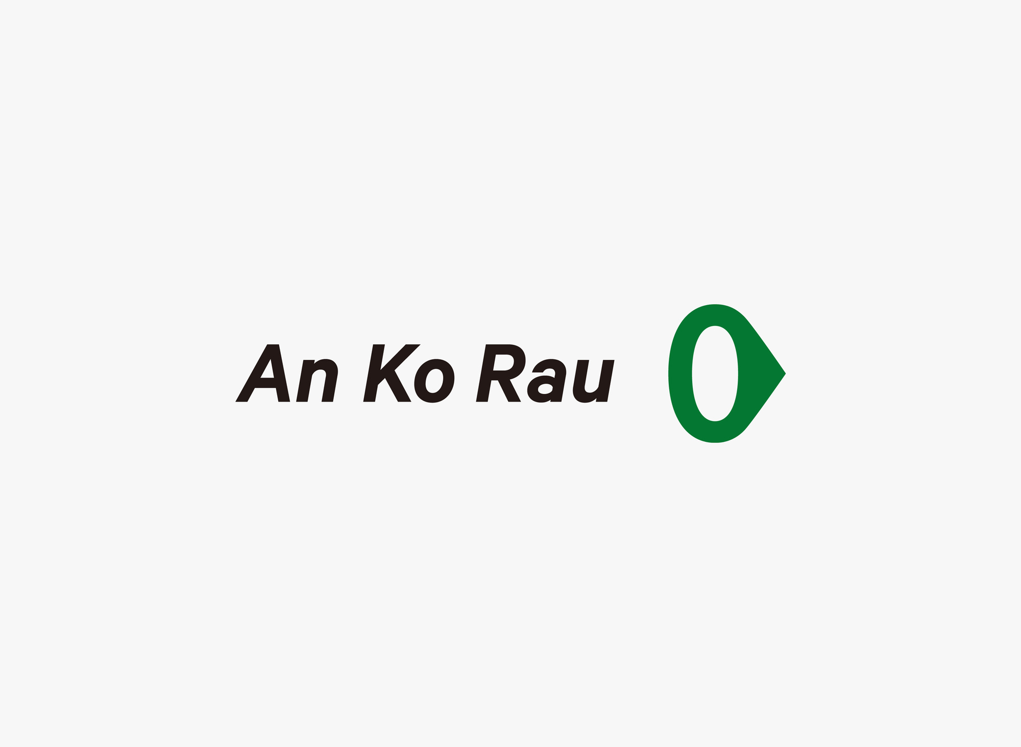
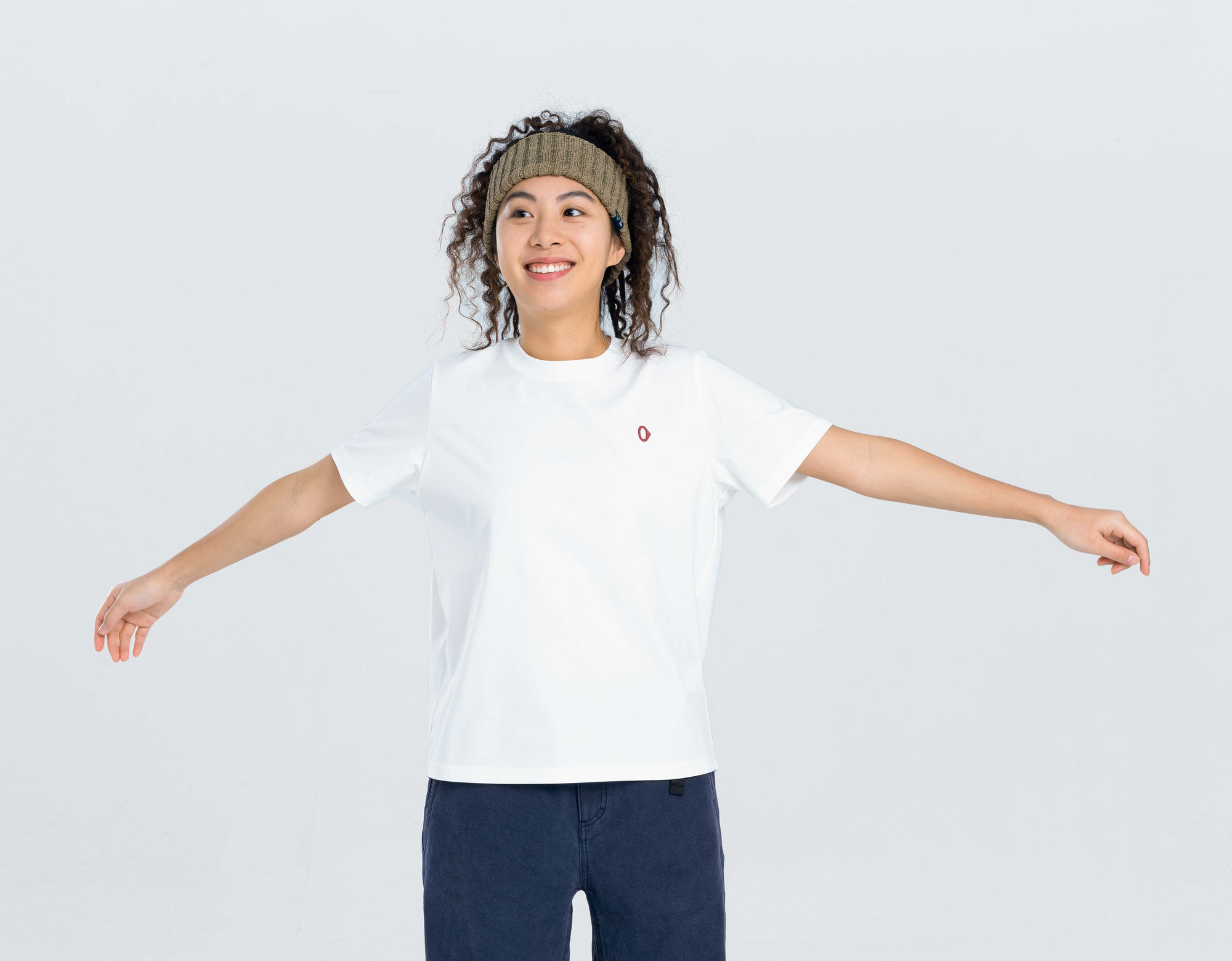
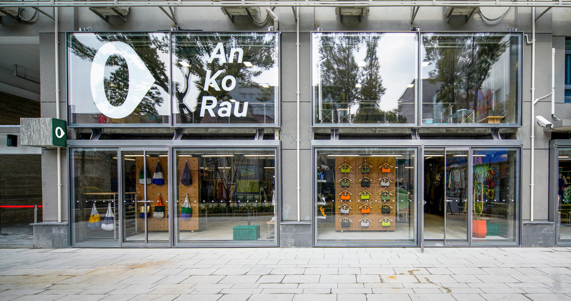
An Ko Rau 0 的5个颜色代表着An Ko Rau 0的5个产品系列。他们有着截然不同的设计目的以满足都市人群多样化的生活方式,例如日常生活,休闲运动以及户外活动。
An ko Rau, “eternal movement” in Esperanto, it means cyclic and continuous. Initially, the "0" is inspired by the sports stopwatch. But now, "0" is symbolized to represent the status from static to movement, continuous development, and progress. Movement, from static to moving, and return to zero eventually, pacing forward but not fast forward. Repeatedly, moving and still.
The five colors of An Ko Rau 0 represent five product lines of An Ko Rau 0. They serve distinctive design purposed so that urbanites’ diverse lifestyles, such as living, sporting, and outdoor activities can be fulfilled.
N/A
702design是一间具有探索性的设计机构。从生活中发现新鲜与趣味,并保持质疑以及独立思考,以实验的方式支持设计实践,让设计在生活中发挥更大的作用。

