


MEGA SUEN-1
MEGA SUEN-2
MEGA SUEN-3
MEGA SUEN-4
MEGA SUEN-5
MEGA SUEN-6
MEGA SUEN-7
MEGA SUEN是一个年轻的中国男装品牌,创立于2016年。
男性在不同环境与不同的人所构建友谊或亲密关系,致使男性自身呈现出截然不同的性别气质,并且这些转变都是在普普通通的日常生活中自然展现的。
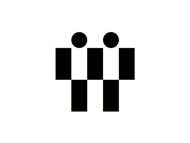
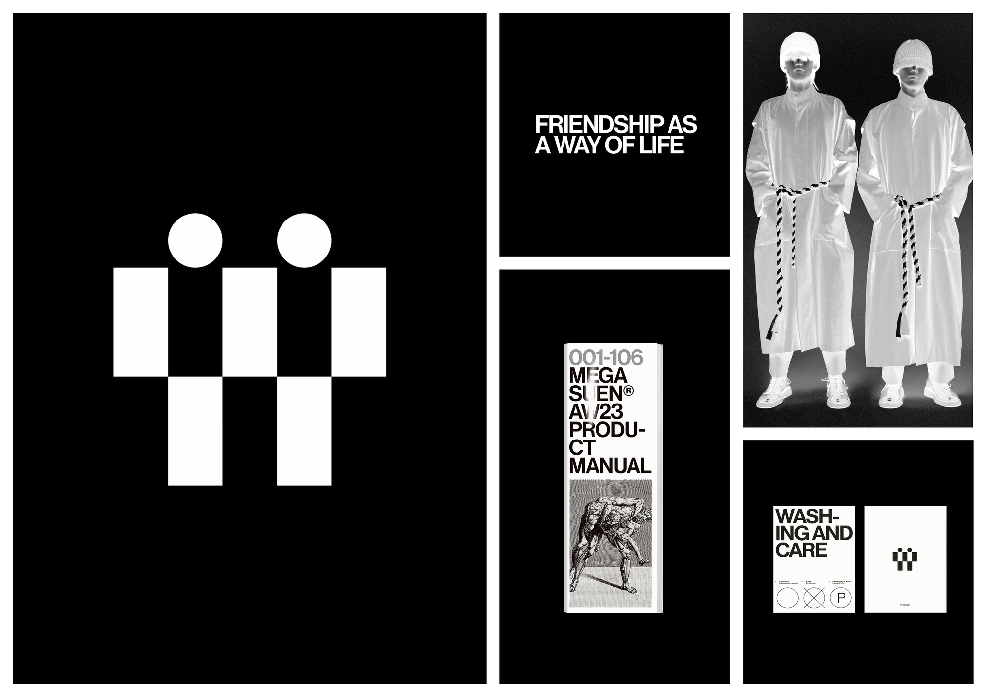
MEGA SUEN所希望尝试的,就是将这种由日常生活中的“实在关系”所建构的,有关性别气质的有趣故事描绘出来。品牌将福柯于1981年在《性吟步履》杂志所发表的“友谊作为生活方式”作为视觉展开的核心概念,因此整个项目便是在“平实”,“友谊”,“关系”等关键词中展开。
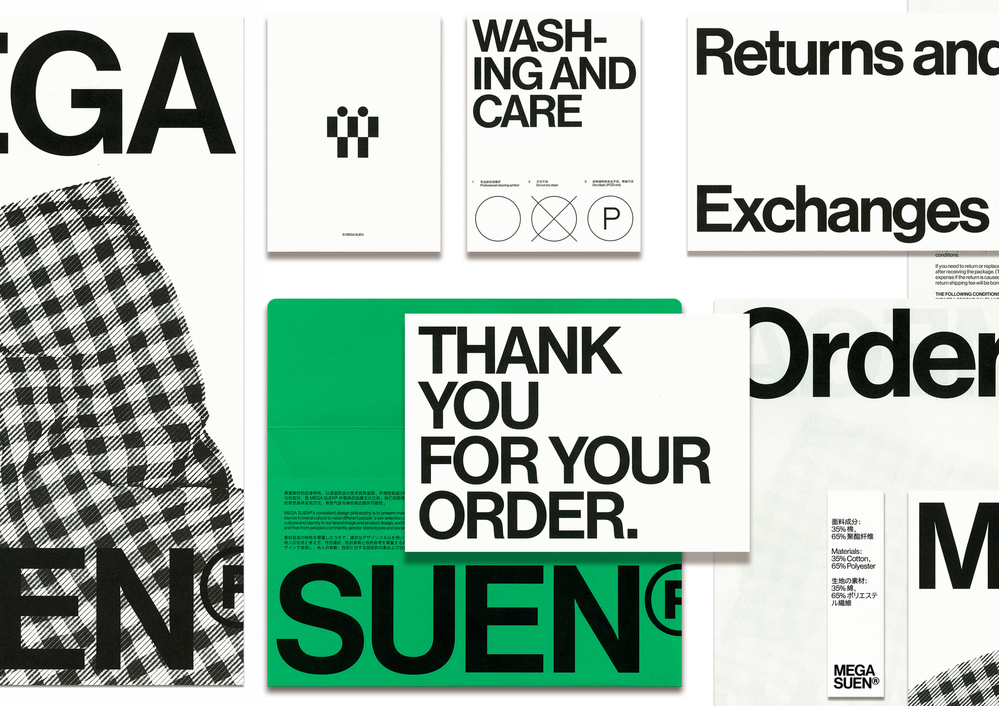
对 Mega Suen 的身份围绕“自然”、“友谊”和“关系”这三个词定义了时尚品牌的全部意义。这是对品牌的一次非正式、友好和信息量丰富的改造,退货表格、保养标签和公司的标志类型以平易近人且引人注目的方式呈现。“我们总是花很多时间向他人解释一些事情,比如在描述情况或提出观点时,然而,我们发现 Mega Suen 的设计理念来自于品牌本身:信息就是表达。”
MEGA SUEN is a young menswear brand established in Beijing, 2016.
Men themselves present a quite different air of sensitivity and vulnerability by making friendship or intimacy with different people in different scenes. All the changes happen naturally in daily life.
MEGA SUEN aims to describe this kind of interesting story about gender makings words, which is constructed by these ‘true relationships’. The brand takes the quote ‘Friendship as a way of life’ (Michel Foucault, 1981, published in《Le Gai Pied》) as the heart of the visual matters, hence the project comes with the keywords ‘Natural’,’Friendship’ and ‘Relationship’.
The identity for Mega Suen navigates around the pillars of “natural”, “friendship” and “relationship” – the three words that define what the fashion brand is all about. It’s an informal, friendly and highly informative rework of the brand, where return forms, care labels and the company's logo type is presented in an approachable and eye-catching manner. “We always spend a lot of time explaining something to others, like when describing a situation or making a point of view, however, we find that the design concept for Mega Suen comes from the brand itself; the information is the expression.”
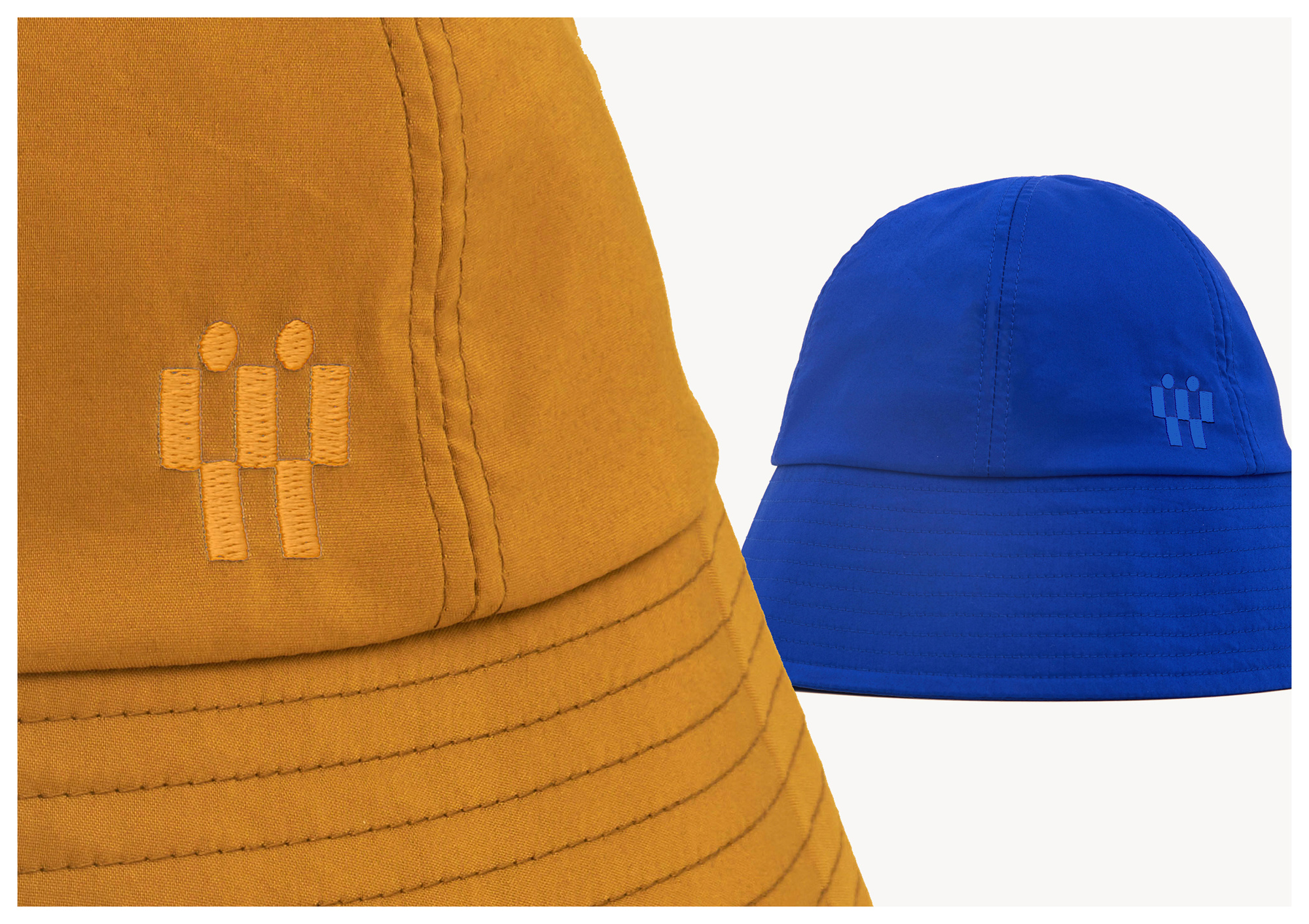
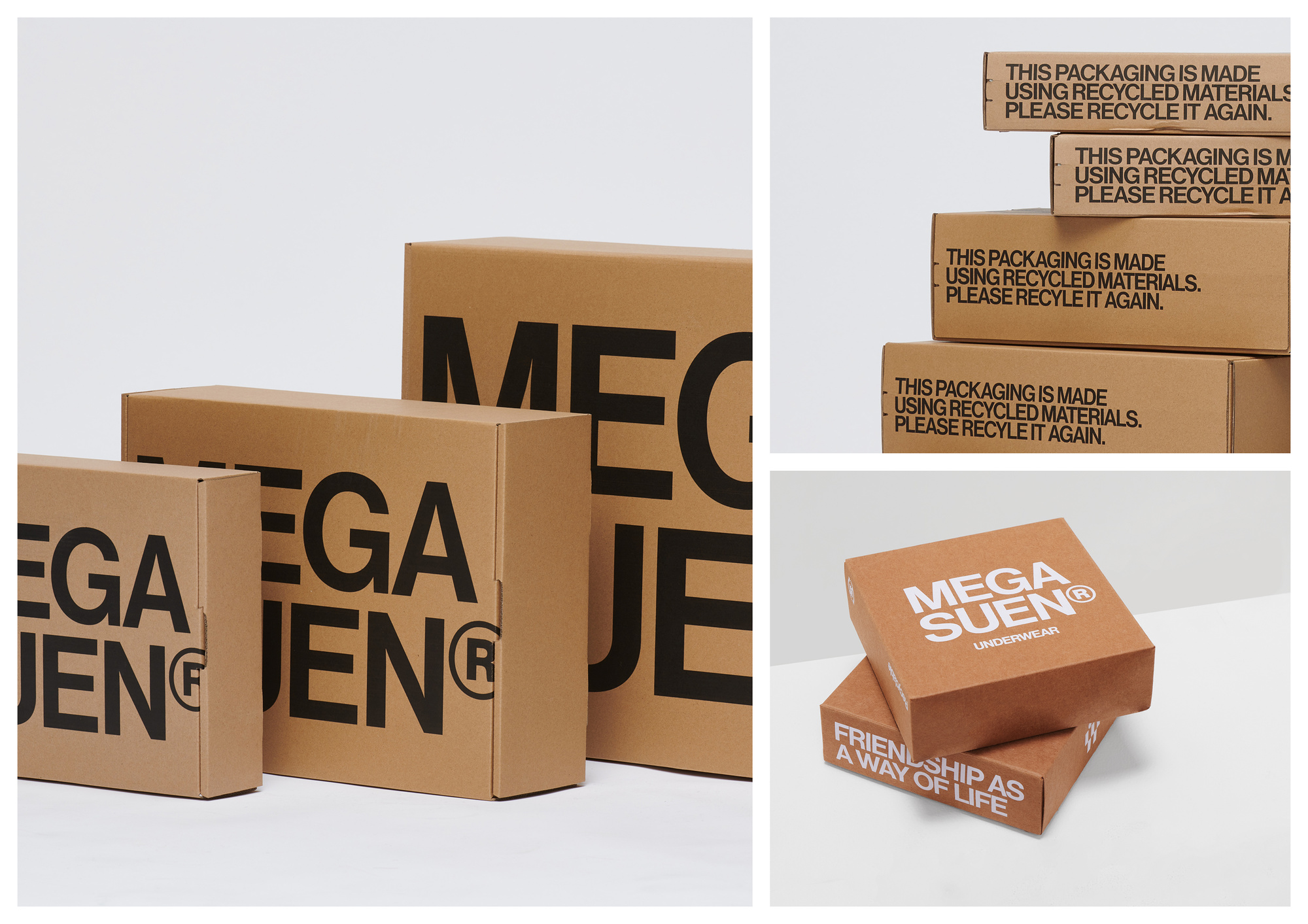
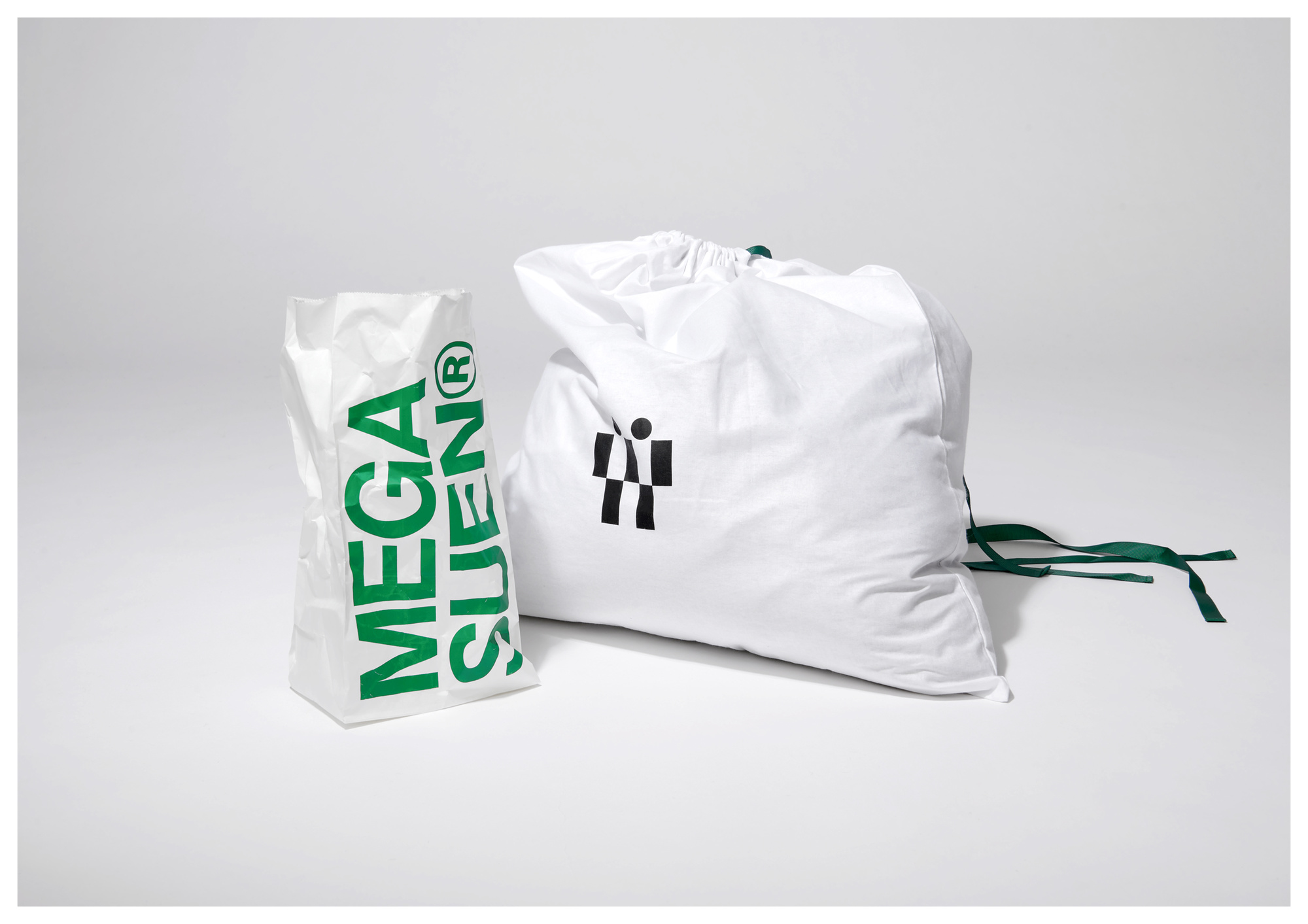
UDL 为该项目选择了戏剧性的视觉基调,所有微妙感和极简主义美学都被抛到背景中。例如,标志大胆而傲慢,几乎傲慢地展示在其所有门店中,无论是包含所有额外细节的信封、订单表格还是艺术海报。洗涤和保养说明也同样突出,并且“在封面上放置得很好”。这是一种通过强调内容来描述酒店的方式。
这种夸张的语言贯穿整个品牌,这意味着大胆的绿色和橙色色调与醒目的图形和清晰的字体相得益彰。信封尤其体现了这种基调——但它应该如此,因为它是客户收到包裹时首先看到的东西。信封的打开和关闭结构有助于观众阅读,首先你可以看到信封上的标志和标题,然后你会看到里面的品牌介绍。
We opted for a dramatic visual tone with the project, where all sense of subtleties and minimalist aesthetics are thrown into the background. For example, the logo is bold and brash, displayed almost arrogantly – but utterly effectively – across all of its outlets, be it an envelope housing all of the extra details, an order form or an artful poster. The washing and care instructions, too, are equally as heightened, and placed on the cover greatly. It’s a way to describe the property by underlining the content.
This exaggerated language runs throughout the entire branding, meaning that a bold palette of green and orange runs coherently with punchy graphics and legible fonts. The envelope, in particular, channels this tone – but so it should, as it's the first thing a customer will see when they receive a package. The opening and closing structure of the envelope helps the audience read, first you can see the logo and titles on the envelope, and then you can notice the brand introduction inside.
UDL是一家多合伙人团队、多学科的设计工作室,提供品牌形象、工业产品、包装、数字艺术、美术指导等多个方向的设计及咨询服务。 我们的设计由好奇心、创造力、爱和技术构成。 UDL is a design and creative studio. We provide design and consulting services to clients from both commercial and cultural fields. You can get to know us through our past works. We design with curiosity, creativity, love, and technology. We strive for excellence.

