


MEGA SUEN-1

MEGA SUEN-2

MEGA SUEN-3

MEGA SUEN-4

MEGA SUEN-5
MEGA SUEN-6
MEGA SUEN-7
MEGA SUEN is a young Chinese menswear brand founded in 2016.
Men build friendships or intimate relationships with different people in different environments, resulting in men themselves showing completely different gender temperament, and these changes are naturally displayed in ordinary daily life.
What MEGA SUEN hopes to try is to depict this interesting story about gender temperament constructed by the "real relationship" in daily life. The brand takes "friendship as a way of life" published by Foucault in 1981 in the magazine "sex song step" as the core concept of visual development, so the whole project is carried out in the key words such as "plain", "friendship" and "relationship.
Mega Suen's identity is defined around the words "nature," "friendship," and "relationship. This is an informal, friendly and informative reinvention of the brand, with return forms, maintenance labels and company logo types presented in an approachable and compelling way. "We always spend a lot of time explaining things to others, such as when describing a situation or making a point, however, we find that Mega Suen's design philosophy comes from the brand itself: the message is the expression."
MEGA SUEN is a young menswear brand established in Beijing, 2016.
Men themselves present a quite different air of sensitivity and vulnerability by making friendship or intimacy with different people in different scenes. All the changes happen naturally in daily life.
MEGA SUEN Aims to describe this kind of interesting story about gender makings words, which is constructed by these 'true relationships ships'. The brand takes the quote 'Friendship as a way of life' (Michel Foucault, 1981, published in "Le Gai Pied") as the heart of the keywords 'and the visual matters'.
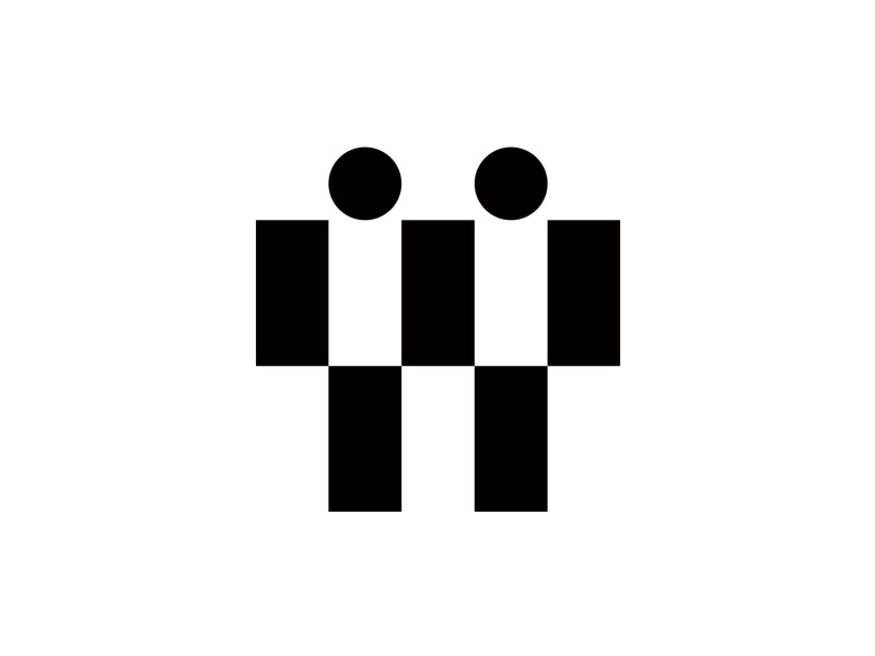
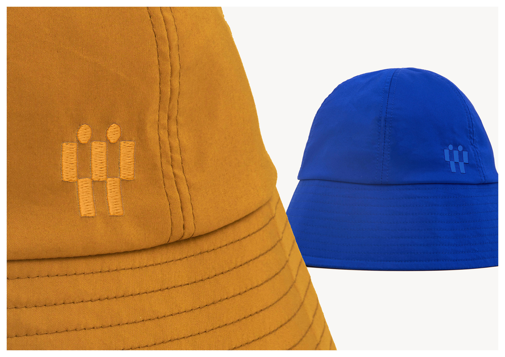
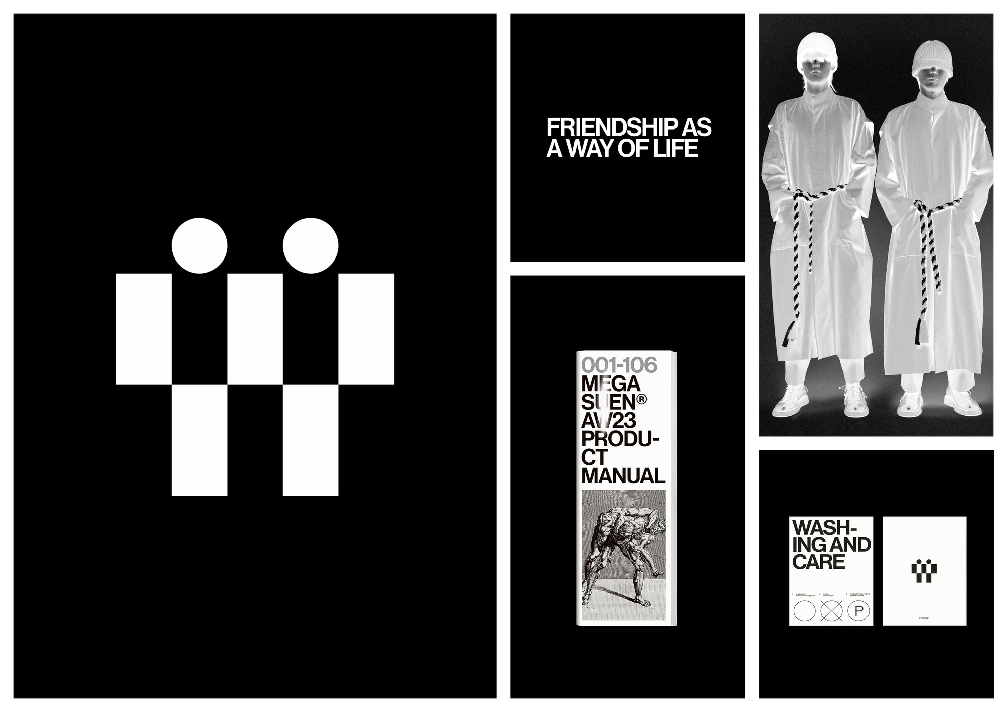
The identity for Mega Suen navigates around the pillars of “natural”, “friendship” and “relationship” - the three words that define what the fashion brand is all about. It's an informal, friendly and highly informative rework of the brand, where return forms, care labels and the company's logo type is presented in an approachable and eye-catching manner. “We always spend a lot of time explaining something to others, like when describing a situation or making a point of view, however, we find that the design concept for Mega Suen comes from the brand itself; the information is the expression ."
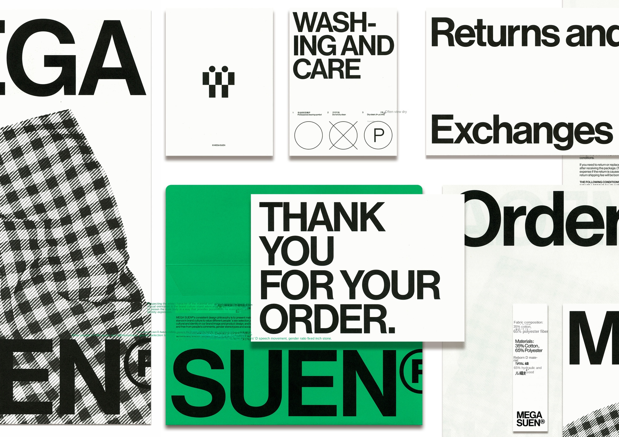
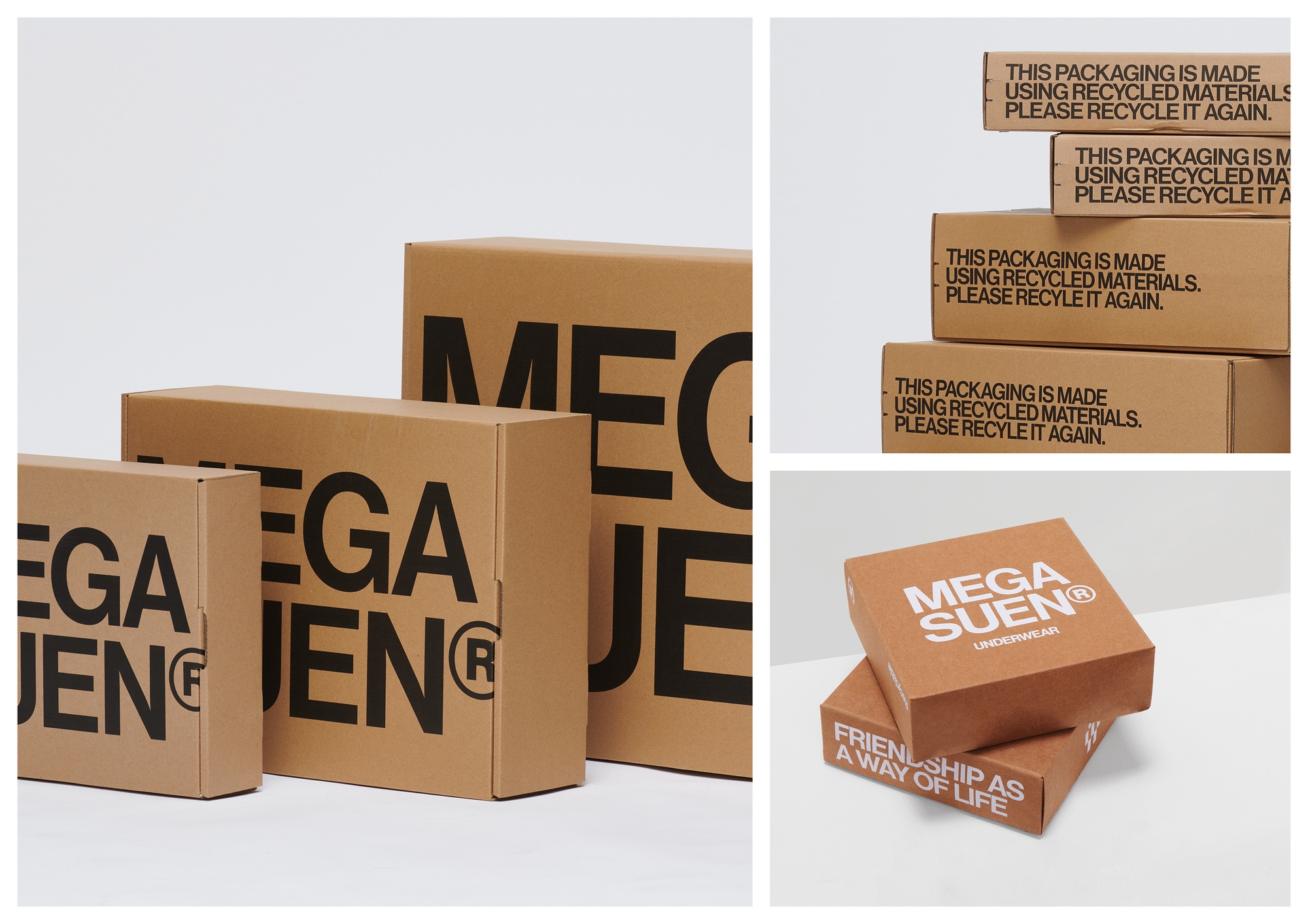
UDL chose a dramatic visual tone for the project, with all the subtlety and minimalist aesthetics thrown into the background. The logo, for example, is bold and arrogant and almost arrogantly displayed in all its stores, whether it's an envelope with all the extra details, an order form or an artistic poster. Washing and care instructions are equally prominent and "well placed on the cover". This is a way to describe a hotel by emphasizing the content.
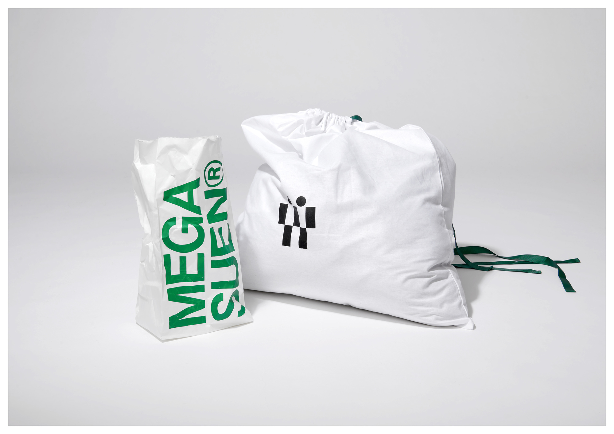
This exaggerated language runs through the brand, which means bold green and orange hues complement the striking graphics and crisp typeface. The envelope in particular reflects this tone-but it should be, because it is the first thing the customer sees when they receive the package. The opening and closing structure of the envelope helps the audience to read. First you can see the logo and title on the envelope, and then you will see the brand introduction inside.
We opted for a dramatic visual tone with the project, where all sense of subtleties and minimalist aesthetics are thrown into the background. For example, the logo is bold and brash, displayed almost arrogantly - but utterly effectively - across all of its outlets, be it an envelope housing all of the extra details, an order form or an artful poster. The washing and care instructions, too, are equally as heightened, and placed on the cover greatly. It's a way to describe the property by underlining the content.
This exaggerated language runs throughout the entire branding, meaning that a bold palette of green and orange runs coherently with punchy graphics and legible fonts. The envelope, in particular, channels this tone - but so it should, as it's the first thing a customer will see when they receive a package. The opening and closing structure of the envelope helps the audience read, first you can see the logo and titles on the envelope, and then you can notice the brand introduction inside.
UDL is a multi-partner team, multi-disciplinary design studio, providing brand image, industrial products, packaging, digital art, art direction and other directions of design and consulting services.
Our designs are made of curiosity, creativity, love and technology.
UDL is a design and creative studio.
We provide design and consulting services to clients from both commercial and cultural fields.
You can get to know us through our past works.
We design with curiosity, creativity, love, and technology.
We strive for excellence.

