


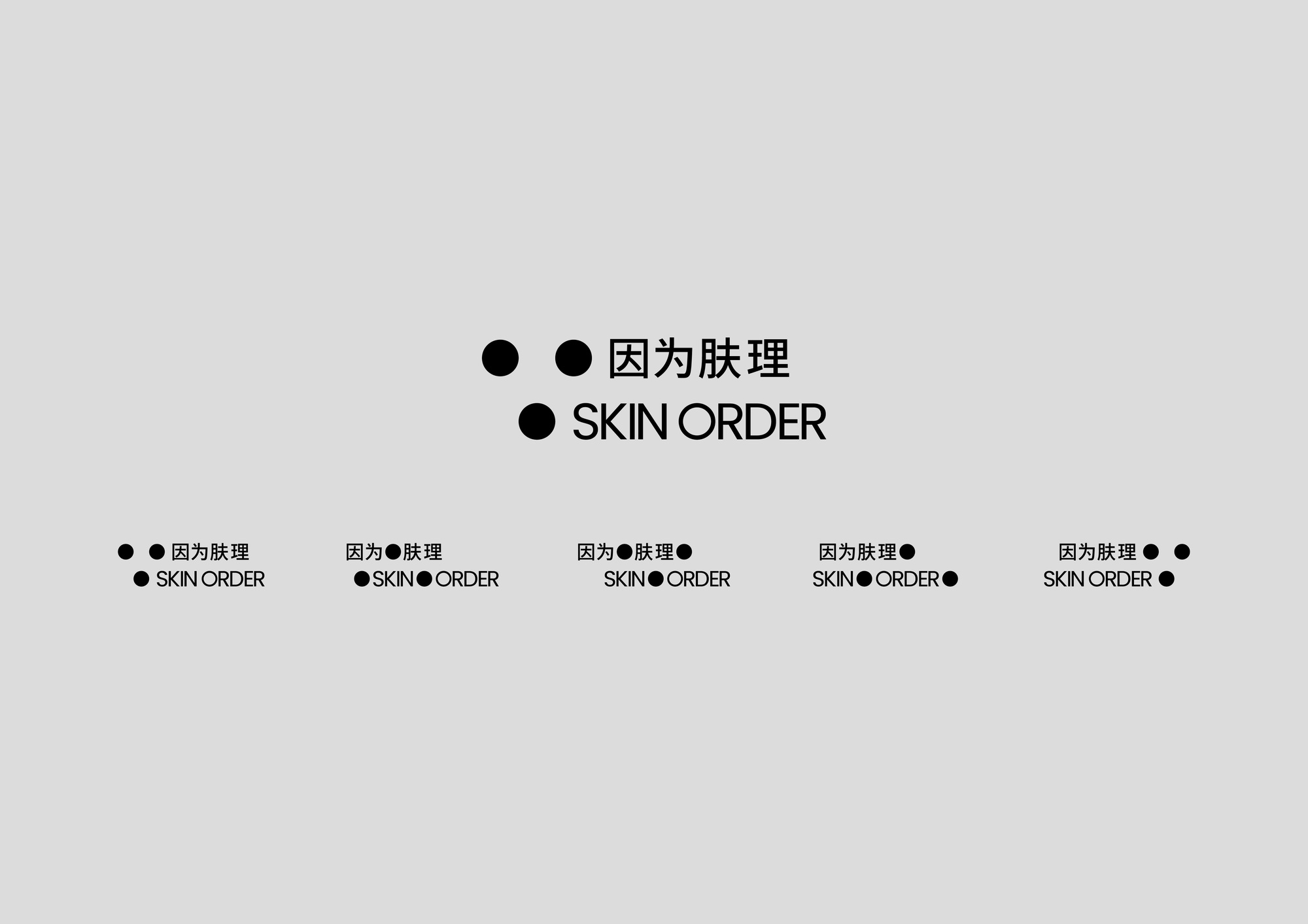
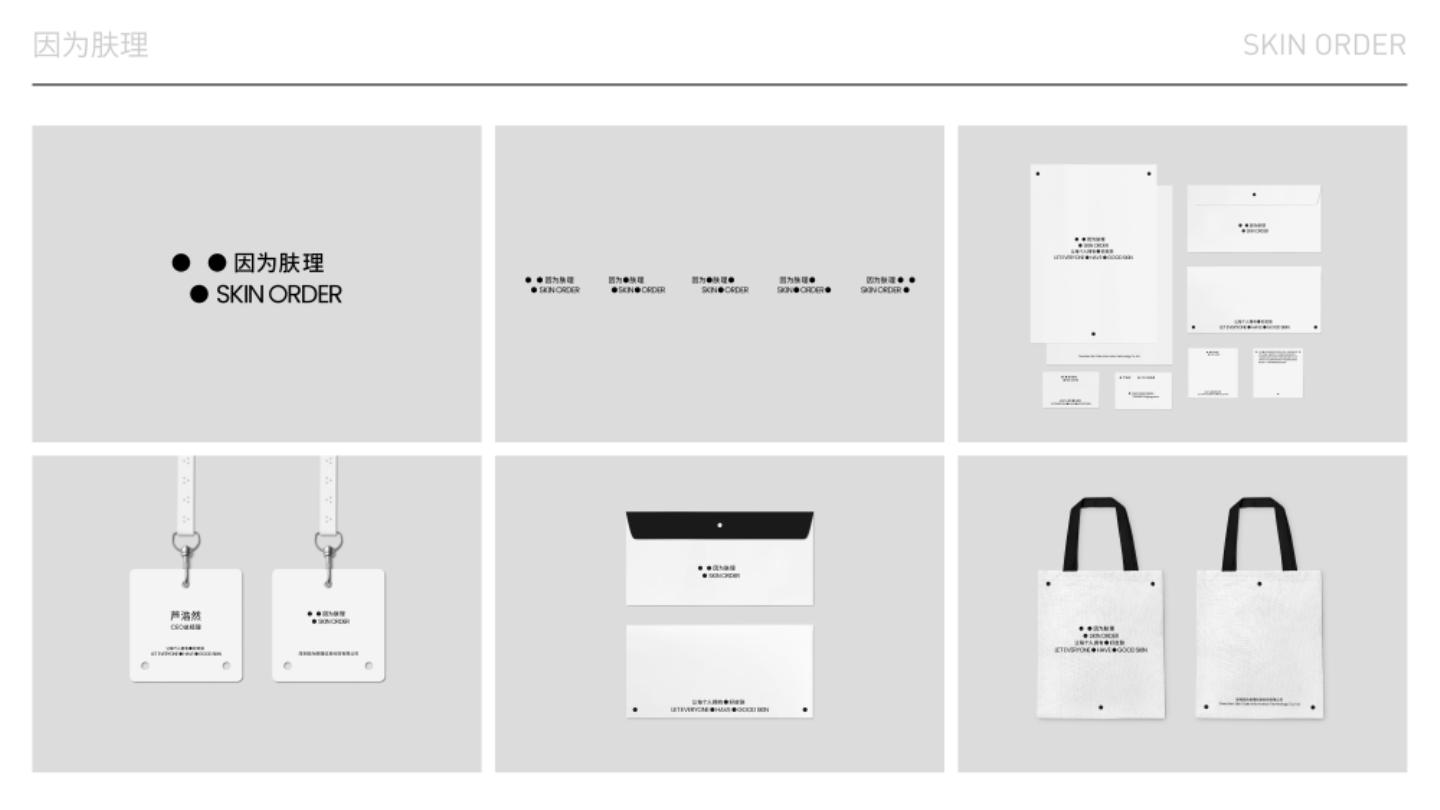
因为肤理 SKIN ORDER-LOGO变体 Logo Variants
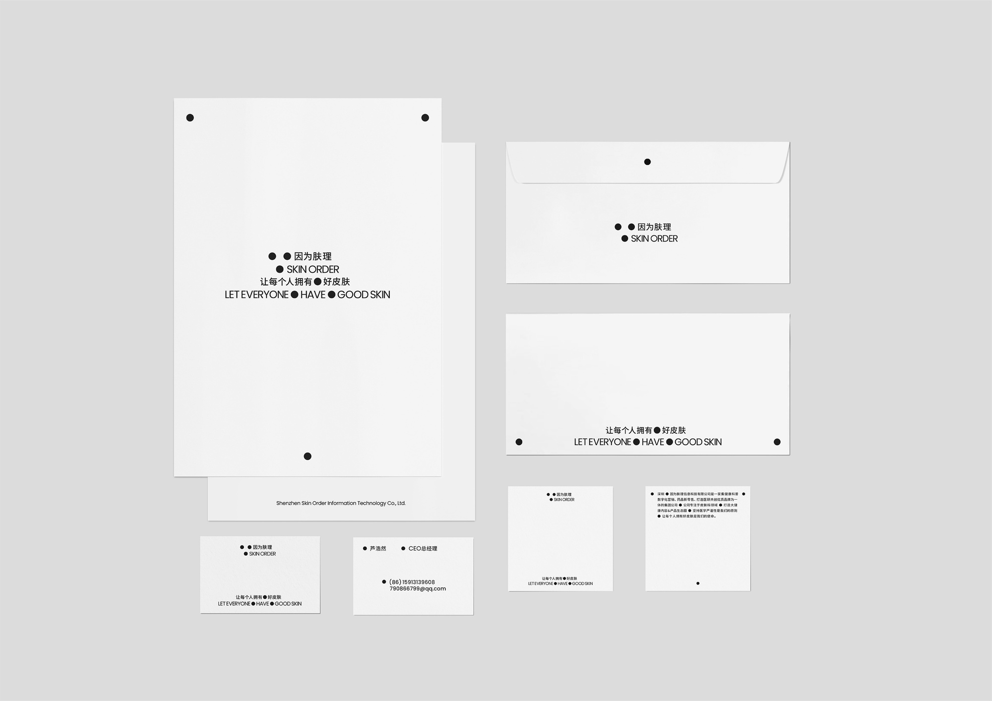
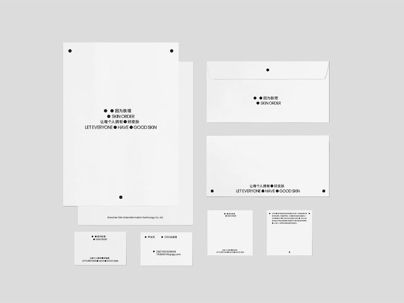
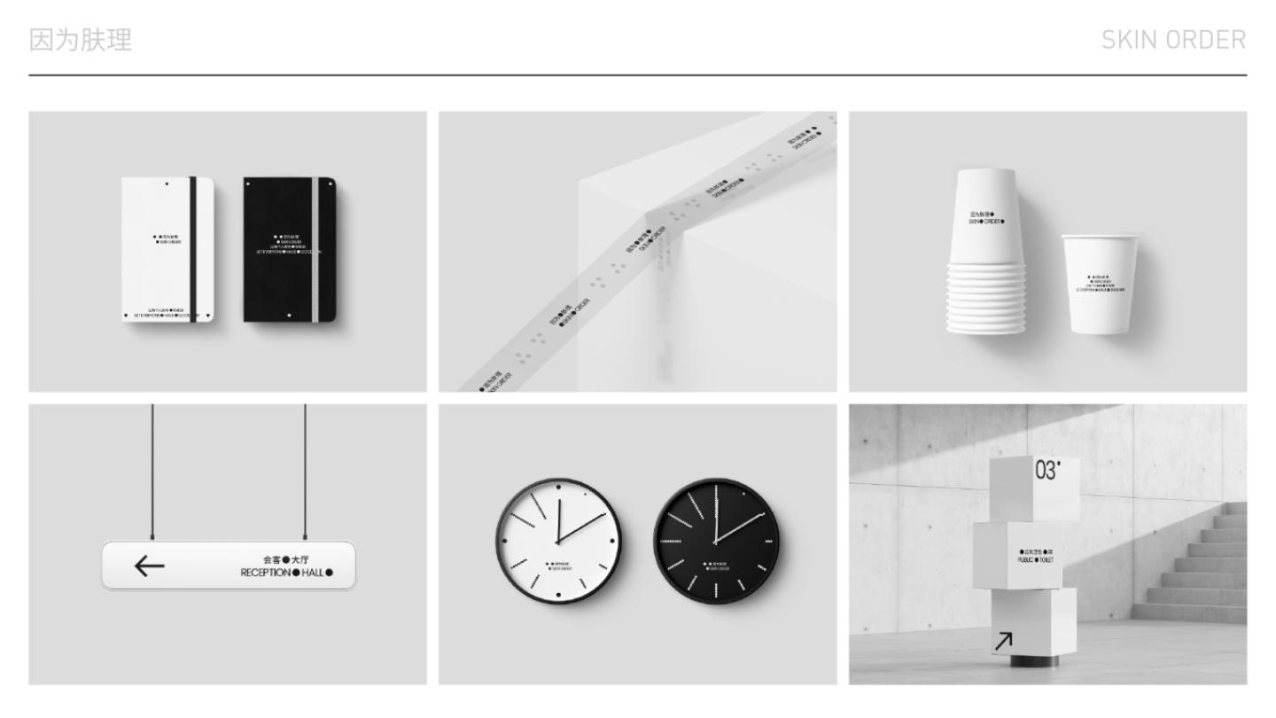
因为肤理 SKIN ORDER-物料集合 Materials Collection
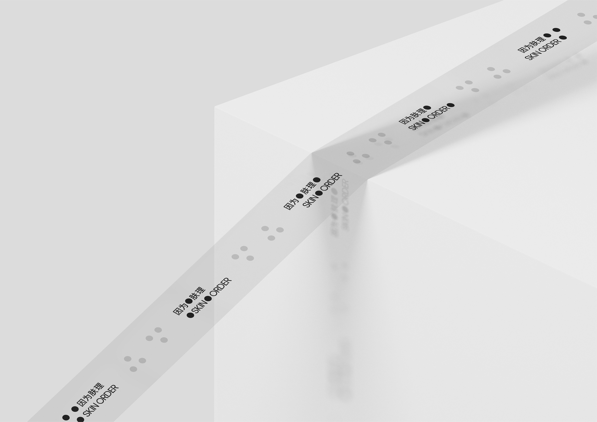
因为肤理 SKIN ORDER-胶带 Adhesive Tape
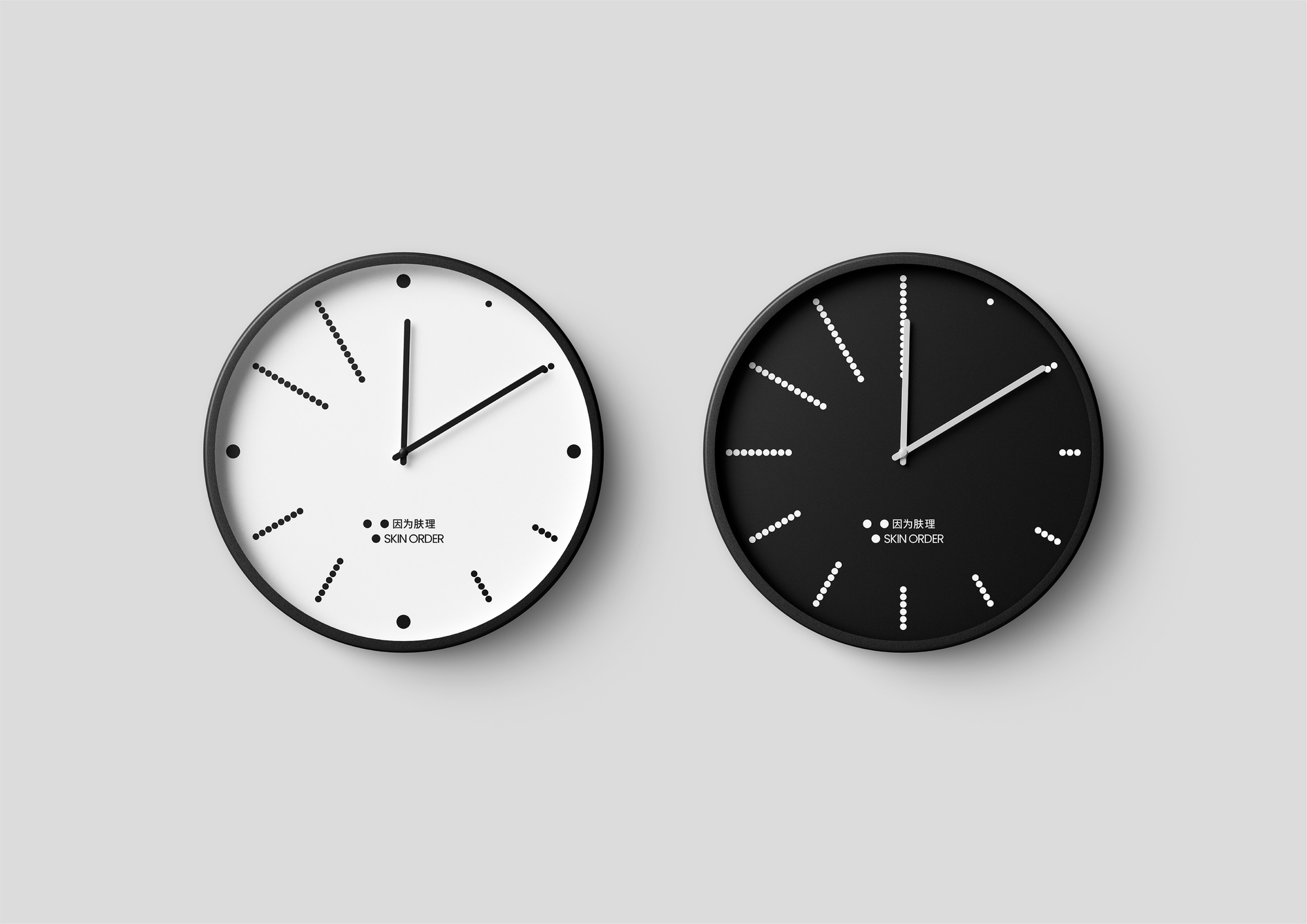
因为肤理 SKIN ORDER-时钟 Clocks
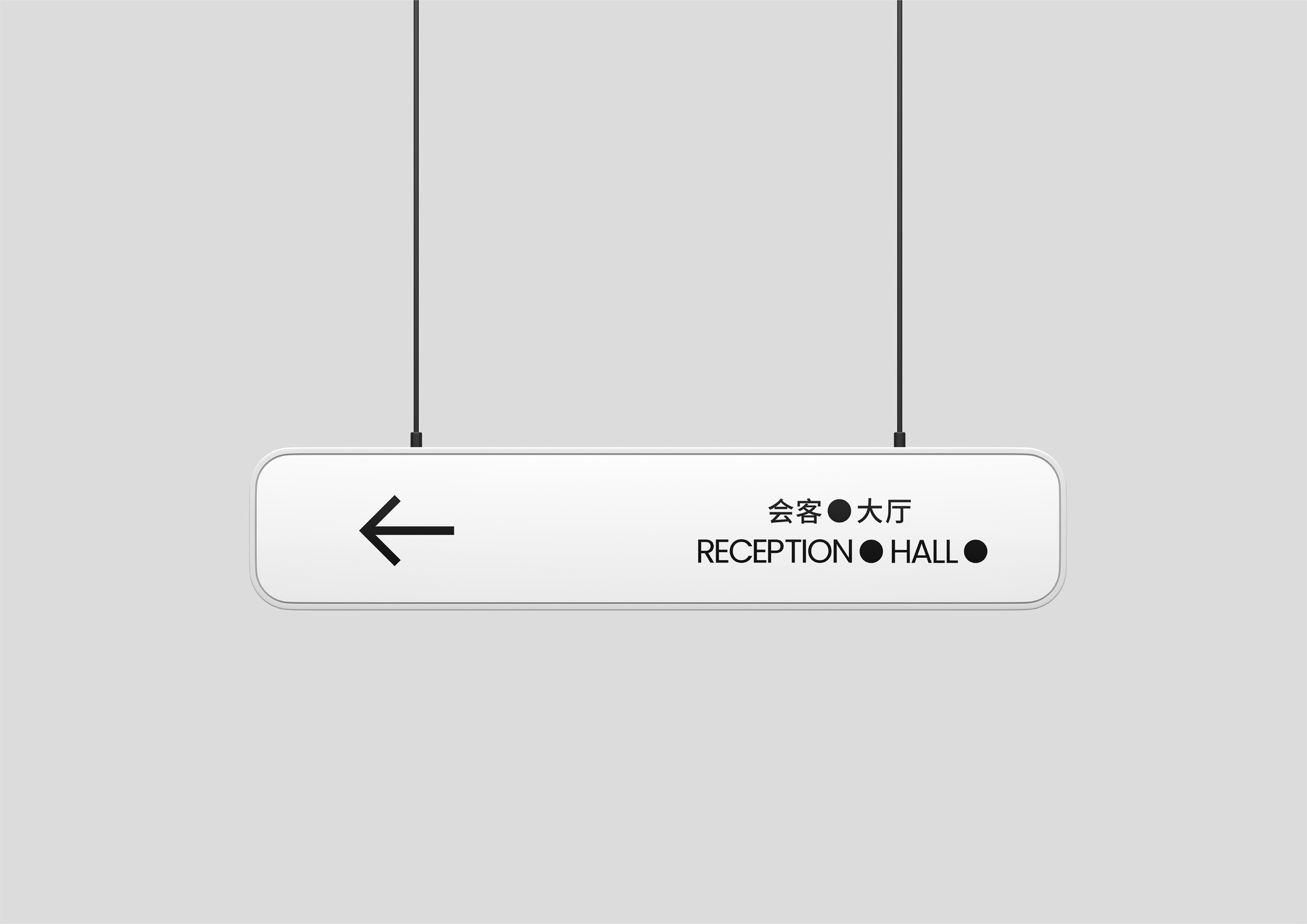
因为肤理 SKIN ORDER-悬挂式导视牌 Hanging Guide Sign
因为肤理 SKIN ORDER-作品视频 Works Video
因为肤理 SKIN ORDER-LOGO动态 Motion LOGO
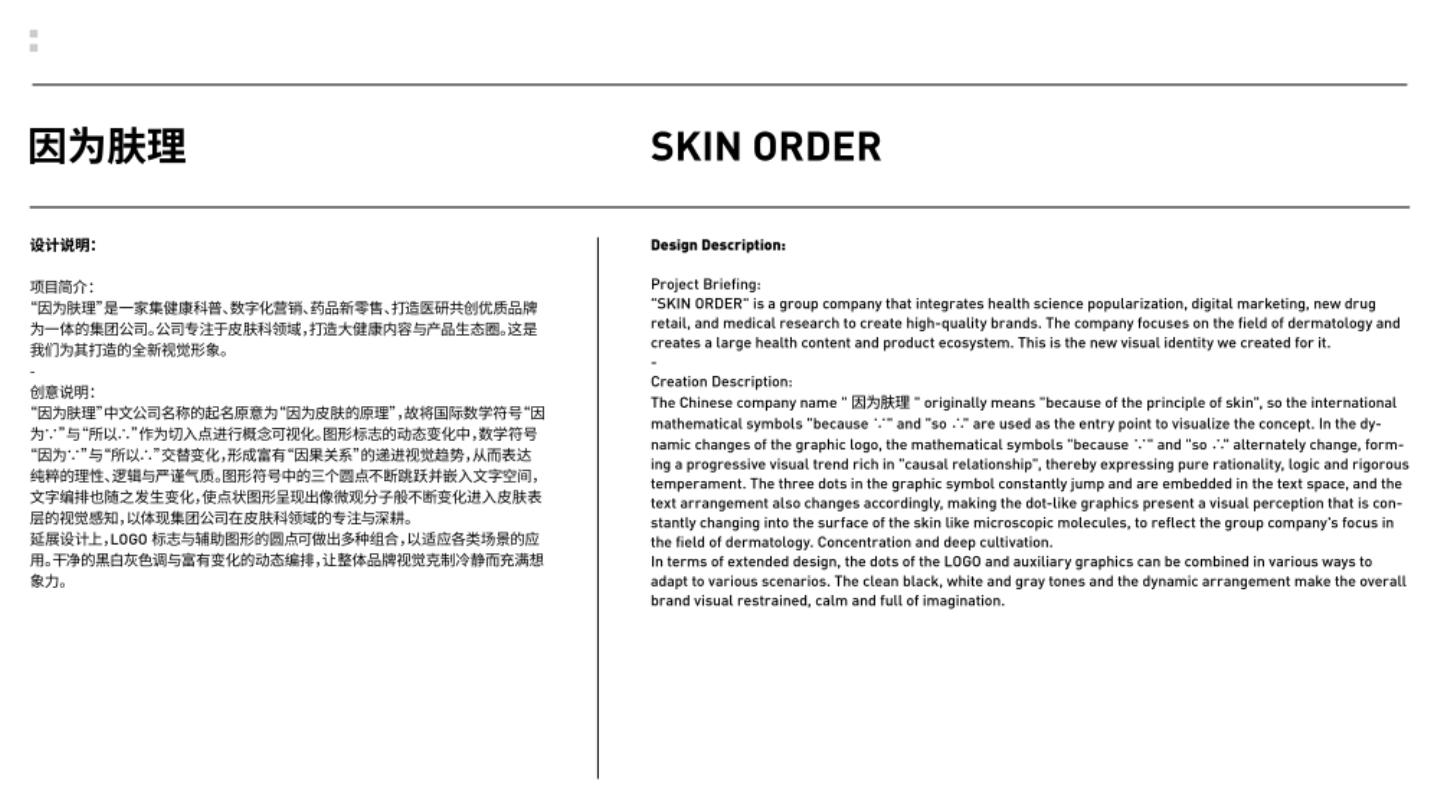
因为肤理 SKIN ORDER
“因为肤理”中文名意为“因为皮肤的原理”,将国际数学符号“因为∵”与“所以∴”作为概念原型。图形的动态变化中,三个圆点不断跳跃并嵌入文字空间产生交替变化,形成富有“因果关系”的递进视觉趋势,呈现微观分子般不断变化进入皮肤表层的视觉感知。理性严谨的视觉体现集团公司在皮肤科领域的专注与深耕。
SKIN ORDER means ‘because of the principle of skin’ in Chinese. The international mathematical symbols ∵ and ∴ are used as the conceptual prototype. In the dynamic changes of the graphic, the three dots keep jumping and embedded in the text space to produce alternating changes, forming a progressive visual trend rich in ‘cause and effect relationship’, presenting the visual perception of the constant changes of microscopic molecules into the surface of the skin. The rational and rigorous vision reflects the group company's focus and deep cultivation in the field of dermatology.
在品牌设计过程中,首先需要对公司专注于皮肤科领域并集多种业务于一体的定位进行深入剖析,最终从品牌名称中获取概念原型“因为∵”“所以∴”。图形延展产生动态变化,使这两个数学符号交替变化,塑造出具有强烈“因果关系”的视觉趋势,以此传达公司在专业领域所秉持的理性、逻辑与严谨态度。
设计上突破了传统品牌设计的静态思维,通过动态变化的图形标志和文字编排,创造出具有互动性和故事性的视觉效果,进一步强化视觉符号的逻辑性。
In the brand design process, we first need to conduct an in-depth analysis of the company's positioning of focusing on the field of dermatology and integrating multiple businesses, and finally obtain the conceptual prototypes "because ∵" and "so ∴" from the brand name. The graphic extension produces dynamic changes, making these two mathematical symbols change alternately, creating a visual trend with a strong "causal relationship", so as to convey the rationality, logic and rigorous attitude of the company in the professional field.
The design breaks through the static thinking of traditional brand design, and creates interactive and story-telling visual effects through dynamically changing graphic logos and text arrangement, further strengthening the logic of visual symbols.
新视觉设计团体,热衷于探索视觉设计的新可能性。D&AD Awards Next Designer,Young Guns 22 Winner。 A new visual design group, keen to explore new possibilities in visual design. D&AD Awards Next Designer, Young Guns 22 Winner.

