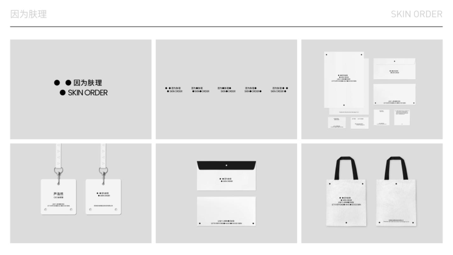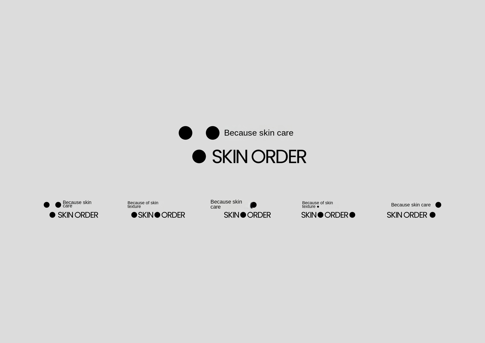
Because skin texture SKIN ORDER-LOGO variant Logo Variants
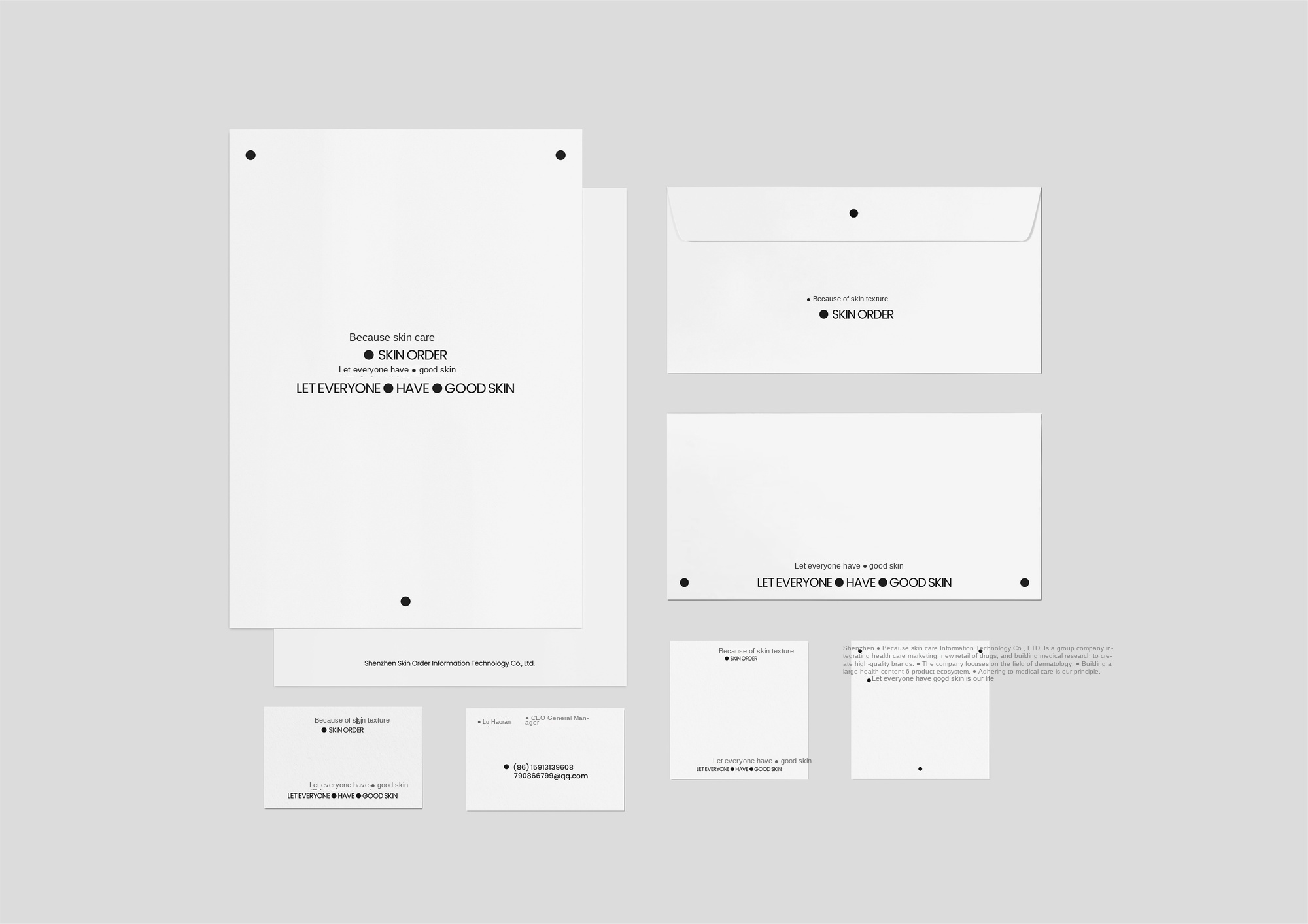
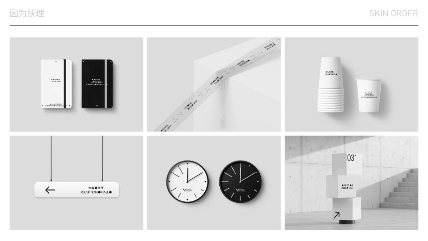
Because skin care SKIN ORDER-material collection Materials Collection
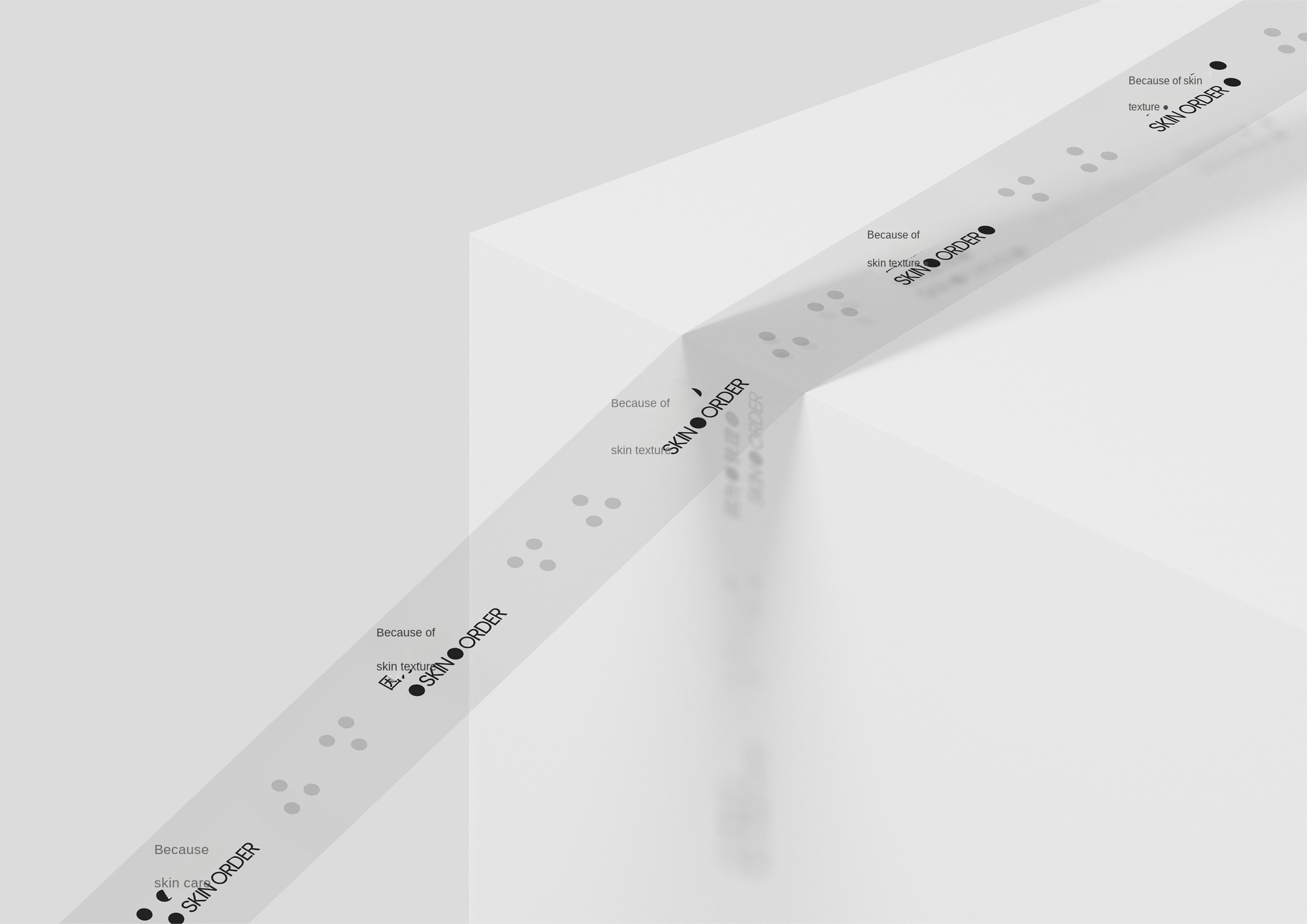
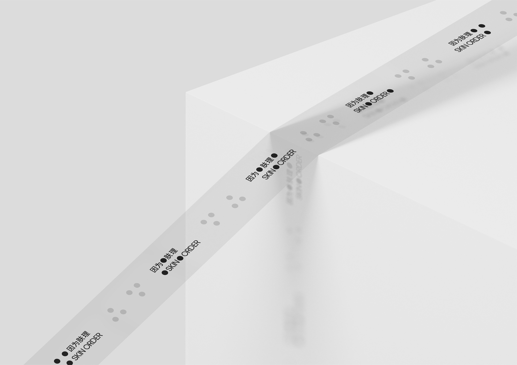
Because skin texture SKIN ORDER-Tape Adhesive Tape
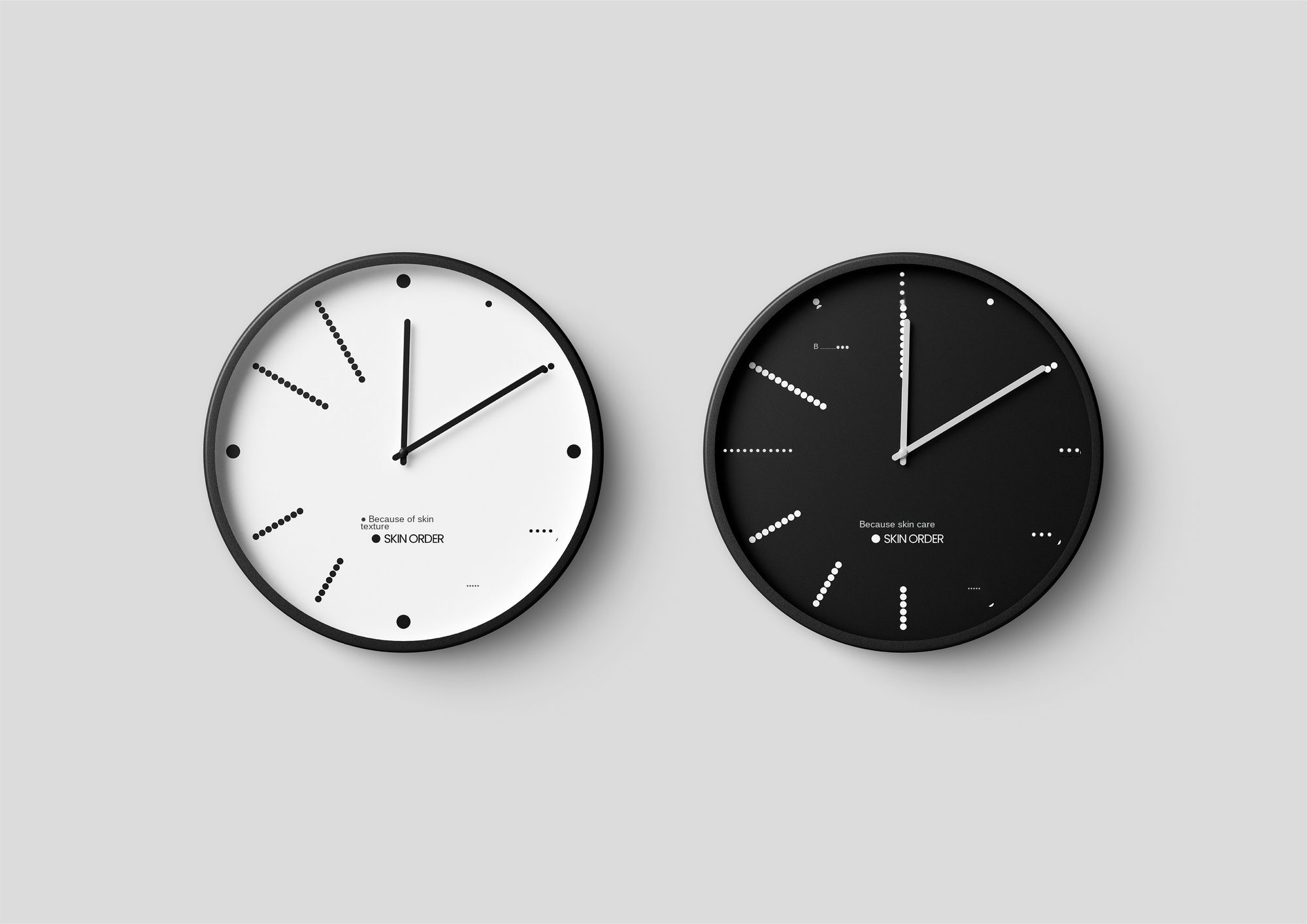
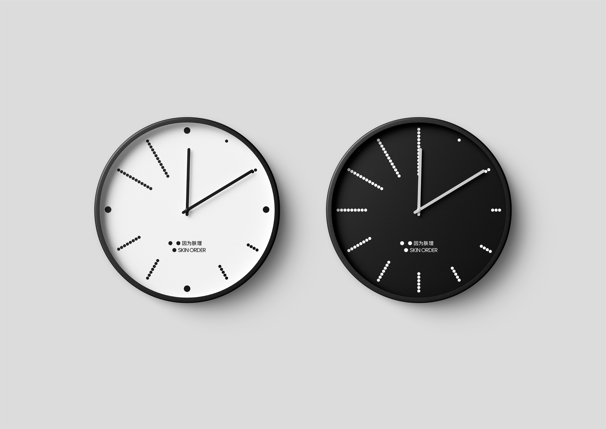
Because skin care SKIN ORDER-clock Clocks

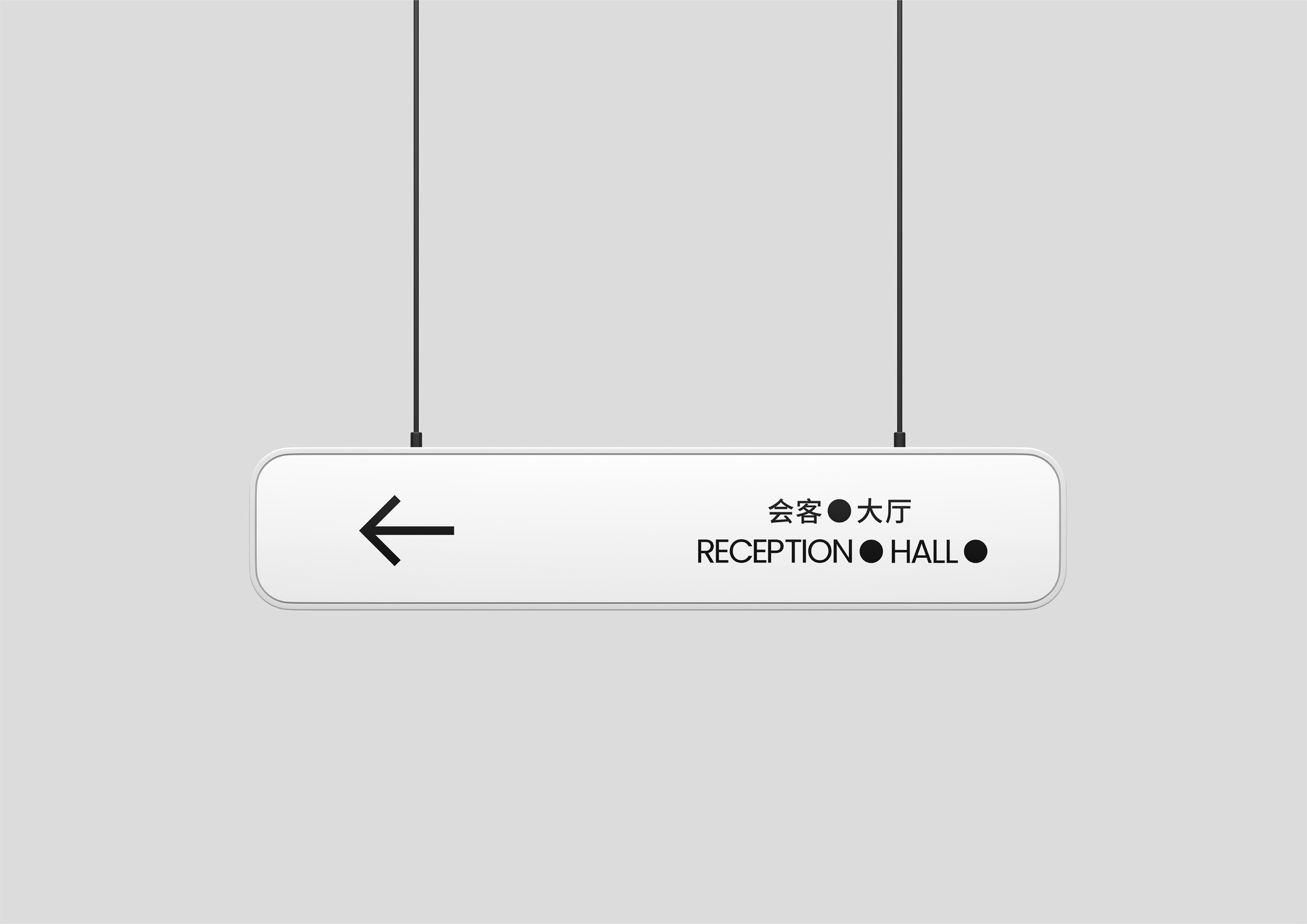
Because skin care SKIN ORDER-hanging guide card Hanging Guide Sign
Because SKIN ORDER-Works Video Works Video
Because skin texture SKIN ORDER-LOGO dynamic Motion LOGO
Because skin care SKIN ORDER
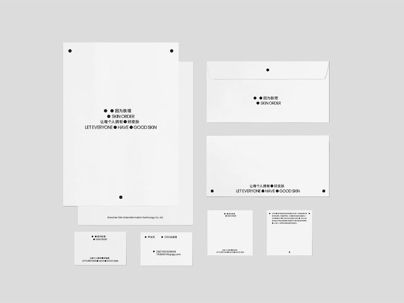
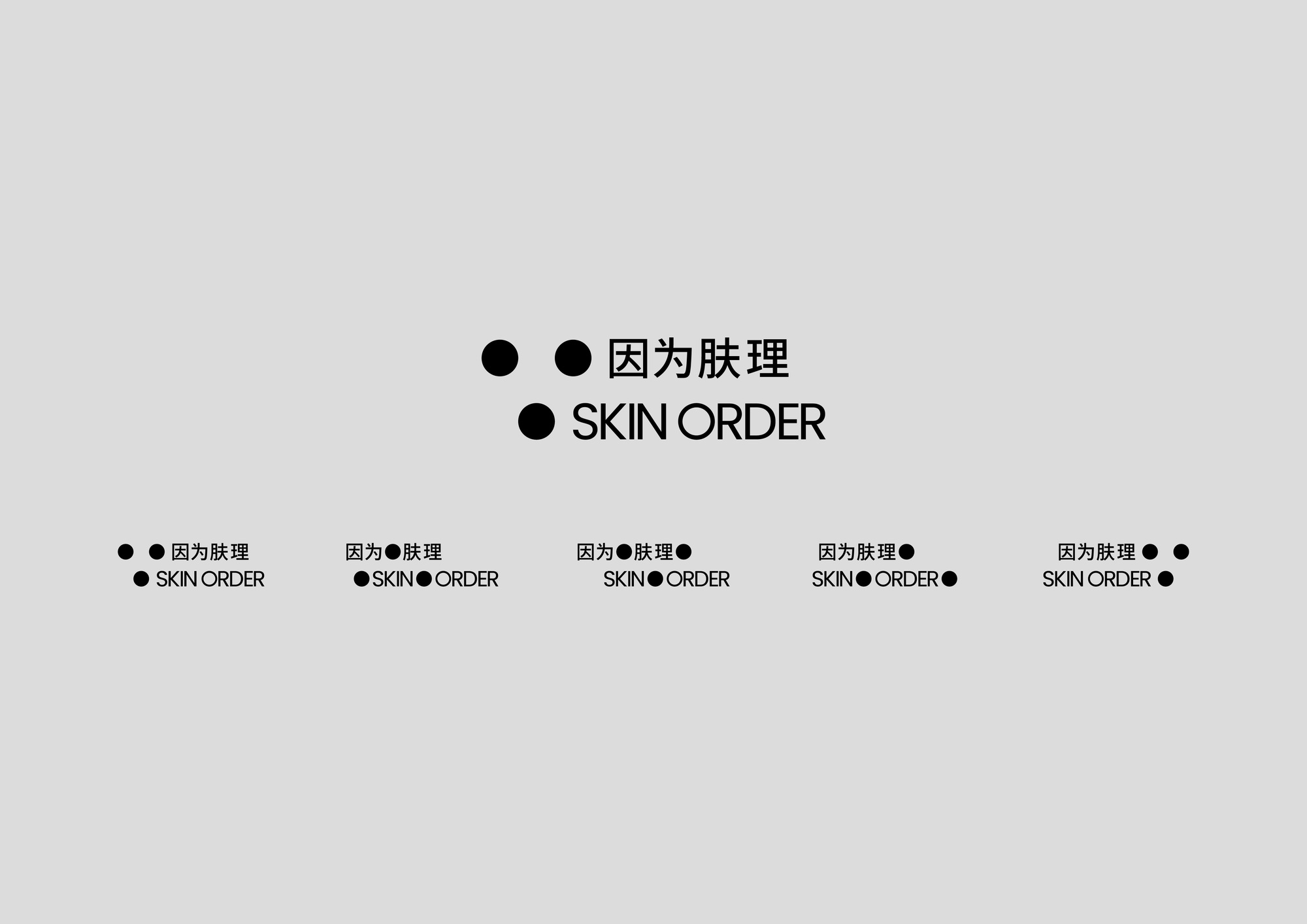
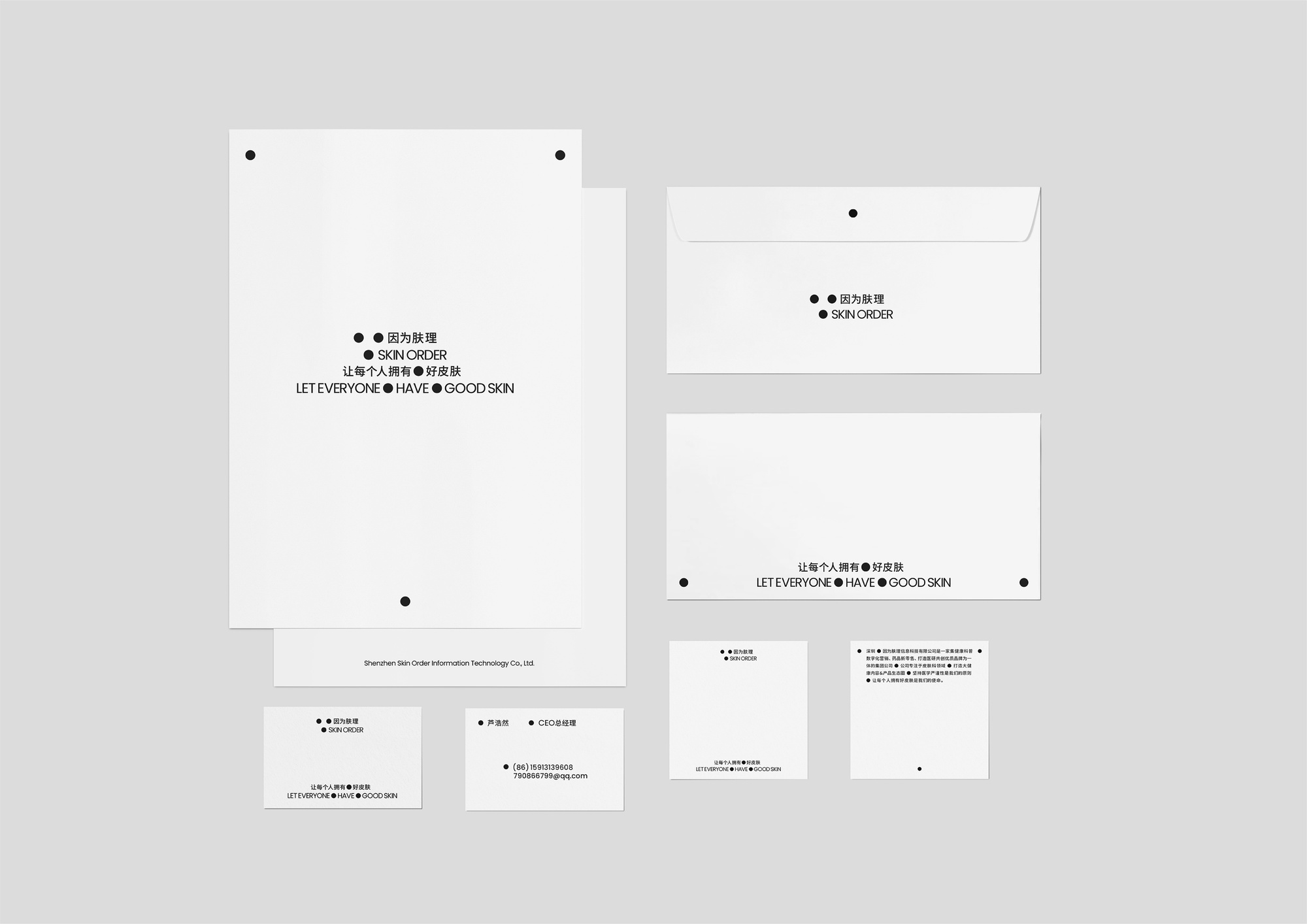
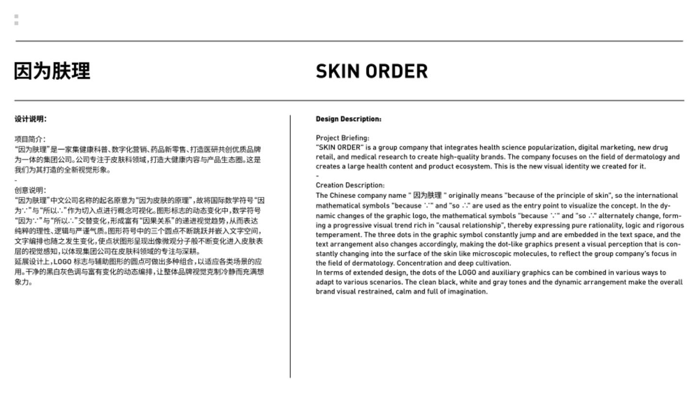
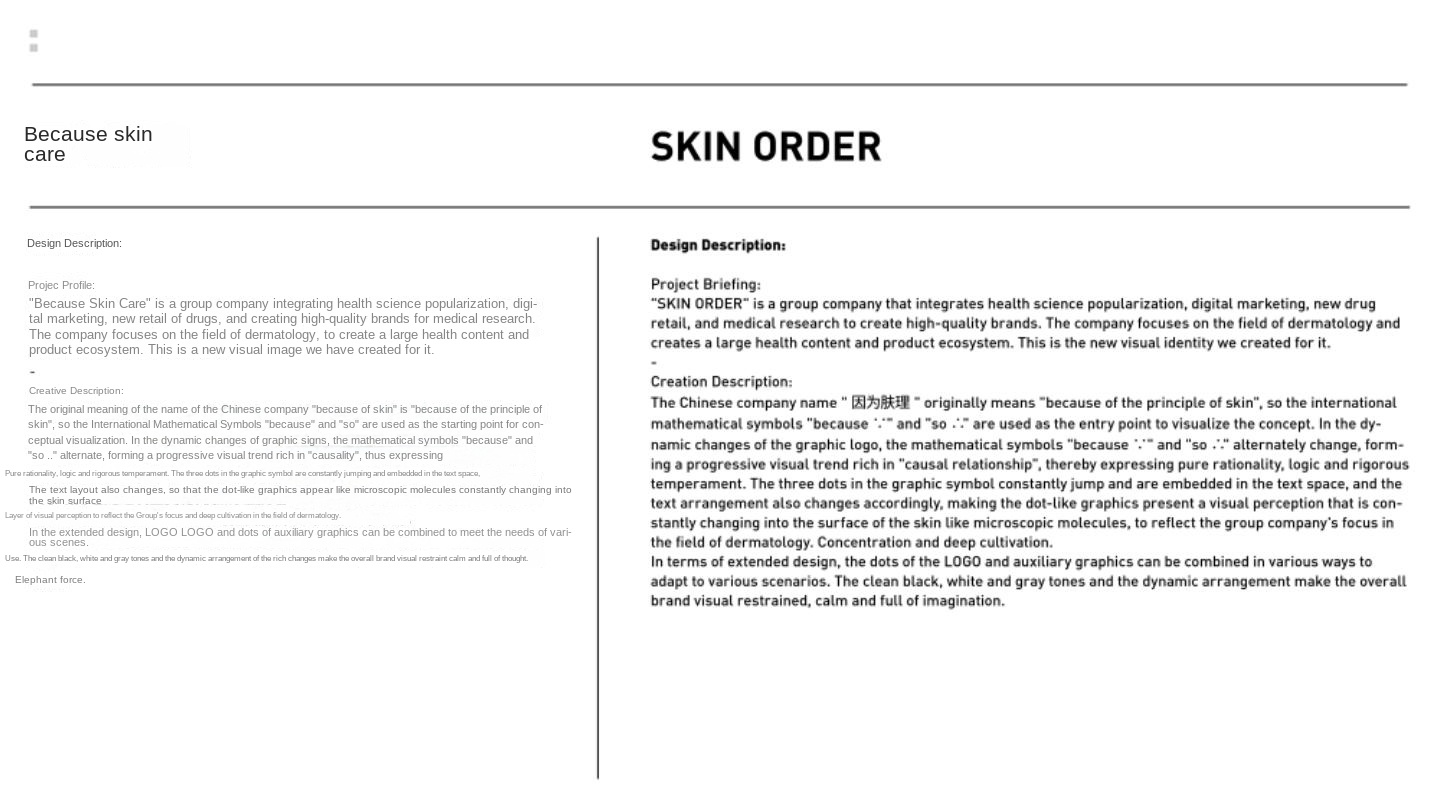
The Chinese name of "because of skin care" means "because of the principle of skin", and the international mathematical symbols "because ∵" and "so ∴" are used as conceptual prototypes. In the dynamic changes of graphics, the three dots are constantly jumping and embedded in the text space to produce alternating changes, forming a progressive visual trend full of "cause and effect", presenting the visual perception of micro-molecules constantly changing into the skin surface. The rational and rigorous vision reflects the focus and deep cultivation of the group company in the field of dermatology.
SKIN ORDER means 'because of the principle of skin' in Chinese. The international mathematical symbols ∵ and ∴ are used as the conceptual prototype. In the dynamic changes of the graphic, the three dots keep jumping and embedded in the text space to produce alternating changes, forming a progressive visual trend rich in 'cause and effect relationship', presenting the visual perception of the constant changes of microscopic molecules into the surface of the skin. The rational and rigorous vision reflects the group company's focus and deep cultivation in the field of dermatology.
In the process of brand design, it is first necessary to make an in-depth analysis of the company's positioning of focusing on dermatology and integrating various businesses, and finally obtain the concept prototype "because ∵" and "so ∴" from the brand name ". Graphic extension produces dynamic changes, so that the two mathematical symbols alternate, creating a strong "causal" visual trend, in order to convey the company in the professional field to uphold the rational, logical and rigorous attitude.
The design breaks through the static thinking of traditional brand design, creates interactive and storytelling visual effects through dynamically changing graphic signs and text arrangement, and further strengthens the logic of visual symbols.
In the brand design process, we first need to conduct an in-depth analysis of the company's positioning of focusing on the field of dermatology and integrating multiple businesses, and finally obtain the conceptual prototypes "because ∵" and "so ∴" from the brand name. The graphic extension produces dynamic changes, making these two mathematical symbols change alternately, creating a visual trend with a strong "causal relationship", so as to convey the rationality, logic and rigorous attitude of the company in the professional field.
The design breaks through the static thinking of traditional brand design, and creates interactive and story-telling visual effects through dynamically changing graphic logos and text arrangement, further strengthening the logic of visual symbols.
New visual design group, keen to explore the new possibilities of visual design. D & AD Awards Next Designer,Young Guns 22 Winner.
A new visual design group, keen to explore new possibilities in visual design. D&AD Awards Next Designer, Young Guns 22 Winner.
