


video


两岸家书 letters from taiwan strait
1
2
3
4

5
设计团队通过复刻时代背景中的信件资料,将《两岸家书》纪录片每一集的故事提要制作成图文档案,构成了六集影像的纸本再现。这一过程不仅是对电视节目内容的纸质记录,更是通过封装形式、材料选择、文本设计、排印布局及元素整合,打造出能够在线下传递故事质感的载体,让观众在纸本载体中感知到故事的厚重与情感,从而在节目之外延续那份触动与共鸣。
The design team recreated the letter materials from the historical context to produce visual and textual archives for each episode summary of the Letters Across the Strait documentary, forming a paper-based reproduction of the six-part series. This process not only serves as a printed record of the television content but also creates a tangible medium that conveys the depth and emotion of the stories through packaging, material selection, text design, typography, and the integration of various elements. This allows the audience to experience the weight and emotion of the stories through the physical medium, extending the emotional impact and resonance beyond the program itself.
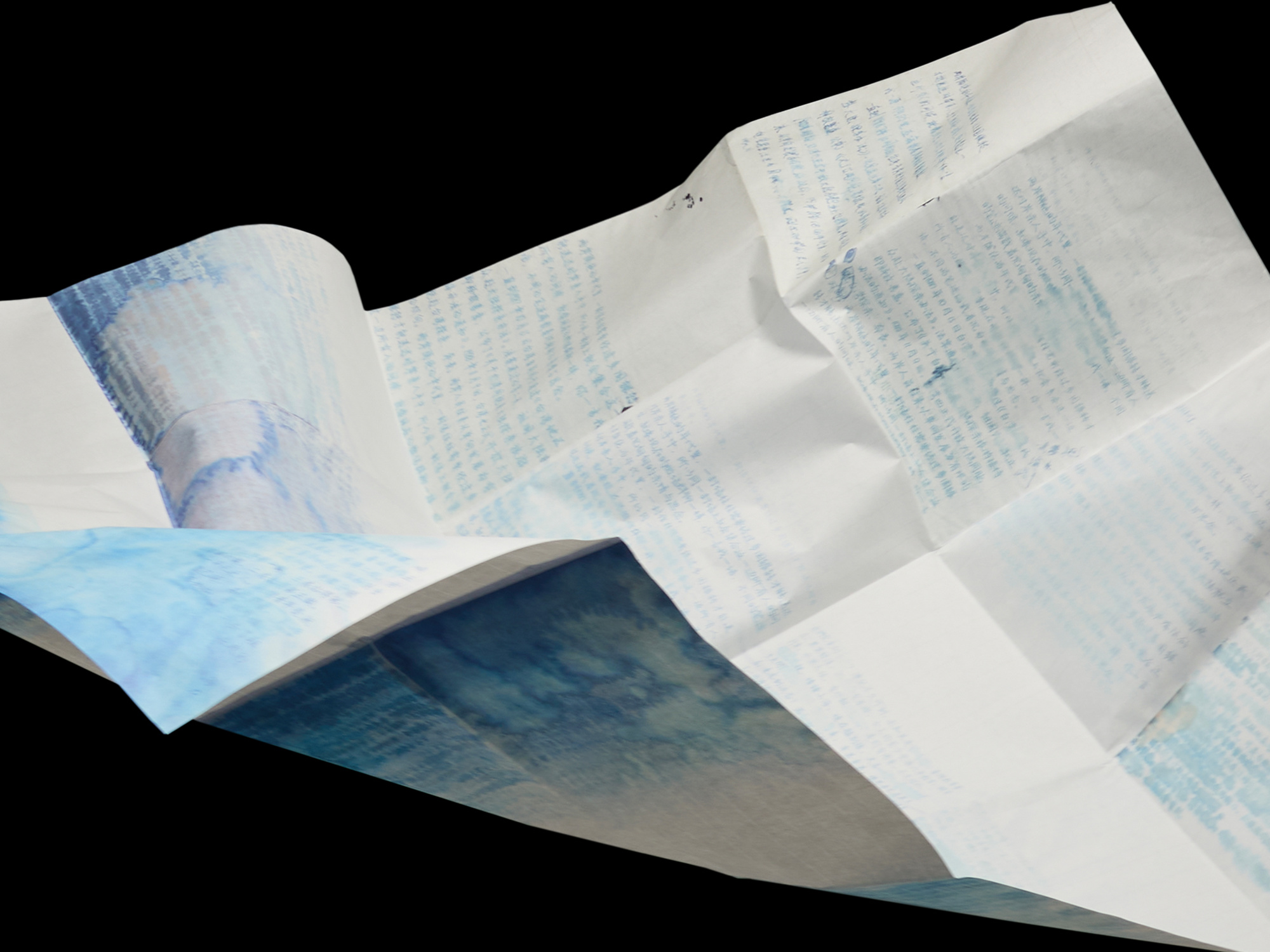
将这些档案资料与纸质海报、创作草稿和便笺本一同打包,组成《两岸家书》项目的视觉系统。其中,由105g水洗纸制成的便笺本每一页底纹都记录了主视觉创作过程中不同设计尝试的效果,将“草稿”转化为“草稿纸”,最终每一页字迹晕染都有所不同的便笺本,以此希望观众在书写时能够与《两岸家书》的理念产生共鸣。纸质海报则使用55g仿宣纸材质,通过层层对折,当完全展开时,仿佛重现了一封封家书汇聚成海,海报正反面双面呈现,正面为主视觉,背面在透光时可看到6集故事中不同家书的内容。这种设计使观众通过纸质海报进一步更立体感受到“两岸家书、思念成海”的触感与情感的交织构思。
From 105g washed paper, has a unique background on each page, recording different design attempts during the creation of the main visual. This turns "drafts" into "draft paper," with each page featuring varying degrees of ink diffusion. The intention is for viewers to connect with the core concept of Letters Across the Strait as they write.The paper poster, made from 55g imitation rice paper, unfolds layer by layer. When fully opened, it evokes the imagery of letters merging into the sea. The poster is double-sided: the front presents the main visual, while the back reveals excerpts from different letters in the six-episode series when viewed against the light. This design allows viewers to experience the tactile and emotional layering of the concept "Letters Across the Strait, longings merging into the sea" through the texture and interaction of the poster.
纪录片《两岸家书》主视觉通过300多年之间两岸之间往来书信字句的概念进行层叠晕染,最终汇聚成思念的大海,是海水,也是泪水,在一封封书信背后,泪水轻轻滑过信笺,模糊了字迹的轮廓,晕染出思念的痕迹,形成了另一种波澜壮阔的广袤,那滴象征着宝岛的晶莹泪珠,亦是眼含思念的情感印迹。设计团队提炼并重新整理了纪录片中所有真实人物的家书资料,从清晰到模糊,从动情到落泪……每一字、每一句、每一行、每一段,都承载着浓浓的思念与滴落的泪水,最终汇成了一望无际的海洋。那一滴晶莹的泪珠,象征着宝岛,也承载着眼中满含思念的情感印记。海报采用古代宣纸工艺,重现了300多年两岸书信往来的质感,并将更多书信影像印刷在海报背面,形成千言万语,汇聚成深邃的海的寓意。设计作品摒弃政治因素,着重表达因历史原因而不得不分别的台湾海峡同胞之间深厚的情感。
The main visual for the documentary Letters Across the Strait uses the concept of overlapping and fading words from letters exchanged across the Taiwan Strait over the past 300 years, ultimately converging into a vast sea of longing. It is both seawater and tears—behind each letter, tears gently glide over the paper, blurring the contours of the handwriting and leaving traces of longing. This creates another expansive and stirring scene. The glistening teardrop, symbolizing Taiwan, also serves as an emotional imprint filled with longing and remembrance.
不亦乐乎设计工作室 BY-ENJOY DESIGN,长期探索与实践品牌设计领域里的文化属性与商业价值,主要围绕视觉感受、内容创意、传播触达及使用效能等多方面展开设计工作,近年来其作品获得众多国内外主要设计奖项的认可,并在全国范围内成功落地了多个跨领域的品牌项目。其作品曾在东京、纽约、肖蒙、上海、香港、台北等地展出或被收藏,亦多次被海内外主流设计媒体刊物及杂志广泛收录与报道。

