


Grid Coffee-1
Grid Coffee-6
Grid Coffee-4
Grid Coffee-2
Grid Coffee-3
Grid Coffee-8
Grid Coffee-5
Grid Coffee凭借「全系单一产地」的定位,迅速成为咖啡品牌中备受瞩目的新星。Grid Coffee每一款咖啡豆均符合 SCA 杯测标准 84 分以上,通过高标准的制作方法,满足进阶消费者对于咖啡风味的要求,赋予日常咖啡更专业的品质。
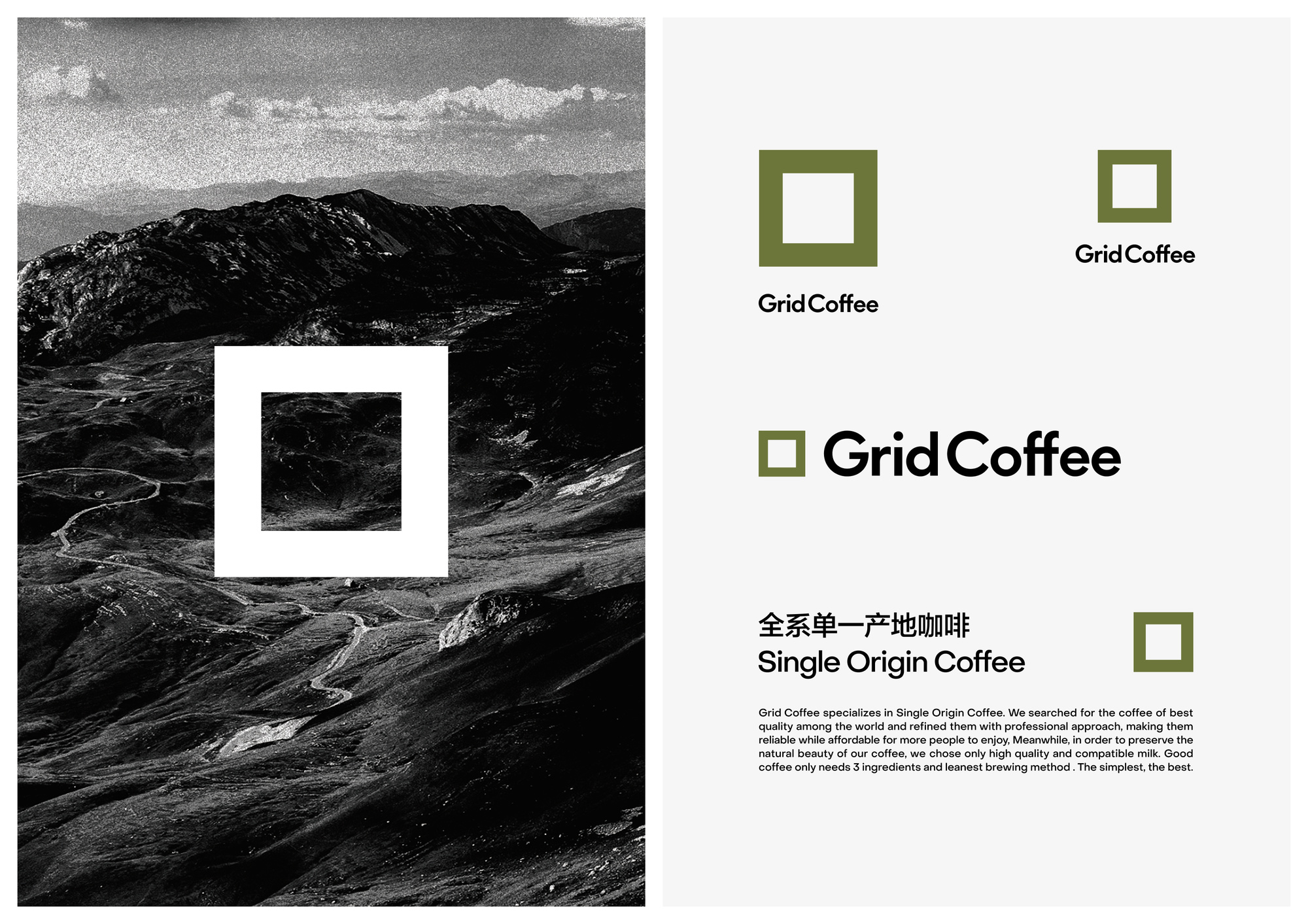
伴随着Grid Coffee的快速扩张。我们的工作是重塑一个能被大众快速识别的新形象。我们简化了原来纵横交错的网格,使用正方形,格子的最小单位,直白且具有装饰性,以传递当代科技所带来的便捷和严谨。
我们期待这个全新的形象能与品牌紧密地联系在一起,以理性和专业的方式为每一杯咖啡建立起更高的标准,成为精品咖啡里最具象征性的标志。
The Chinese coffee market has transitioned from being dominated by instant coffee to evolving into a landscape of diverse consumption scenarios, with freshly ground coffee and retail coffee emerging as the primary categories. Grid Coffee, positioned as a "full-range single-origin" brand, has begun capturing the attention of discerning coffee consumers by employing high-standard preparation methods to infuse daily coffee with a more professional quality.
With plans to launch thousands of stores nationwide amid accelerated market expansion, the brand needs to cultivate a distinctive brand identity to differentiate itself within the saturated coffee retail sector.
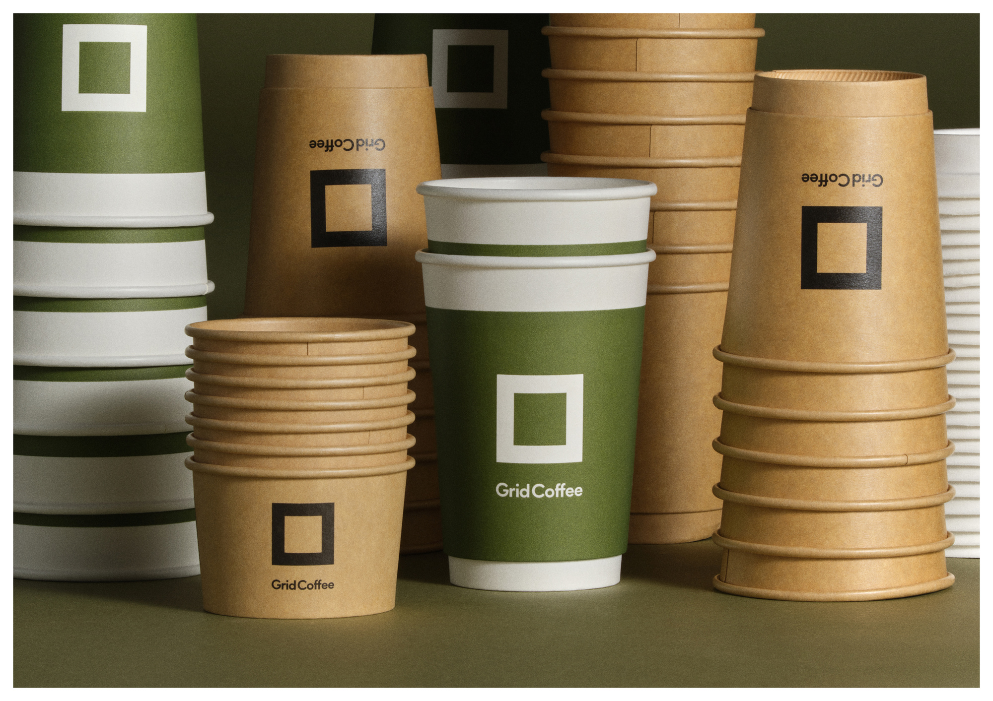
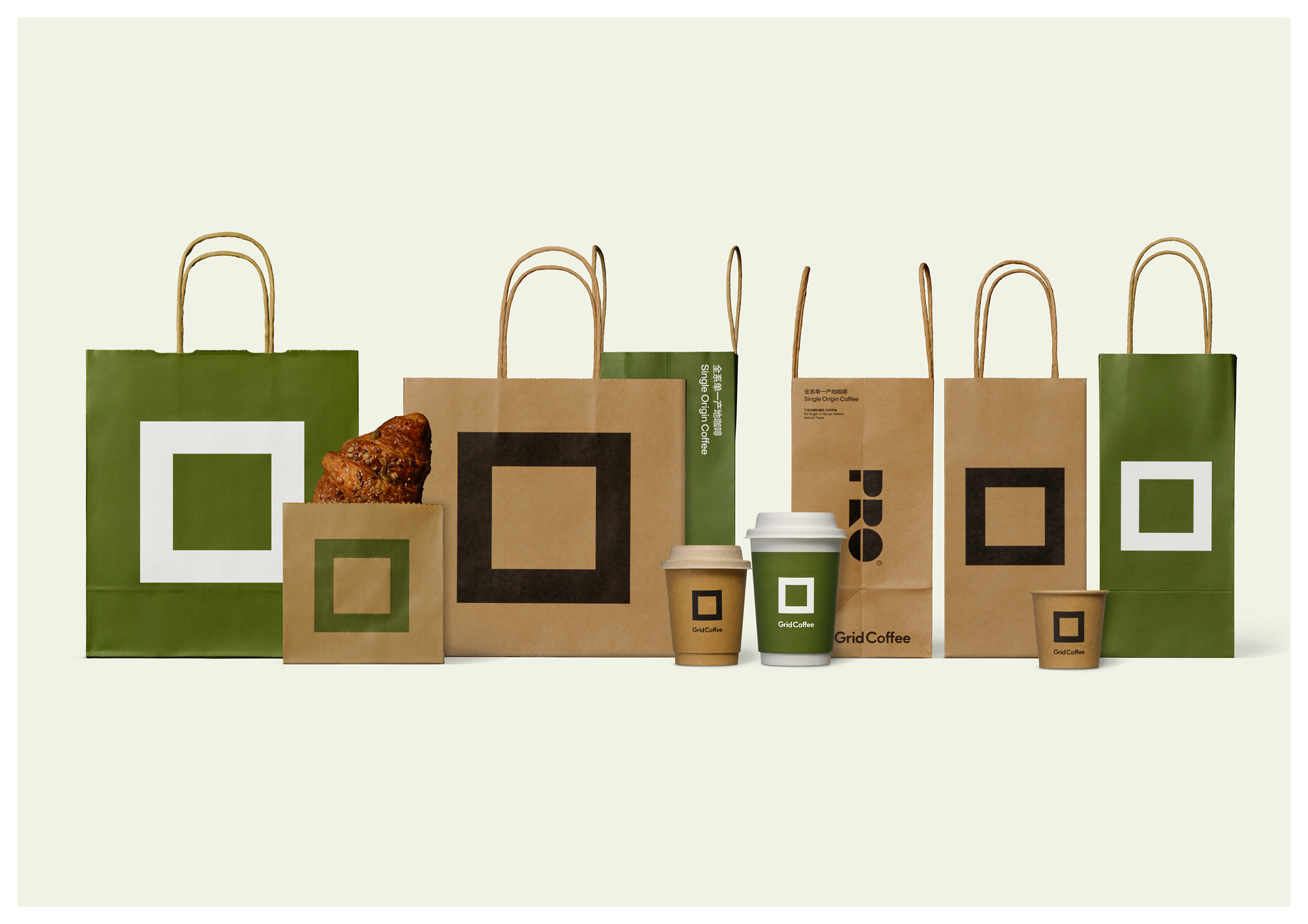
我们简化了原来LOGO中纵横交错的网格,使用原LOGO中的最小单位——一个正方形,直白且具有装饰性。无论是在店铺还是手提袋上,都能被第一眼看到。
面对中国庞大且激烈的饮品市场,我们洞察到品牌需要一个能被快速识别、且易于应用的标志。于是我们便大胆建议品牌启用了原LOGO中最小的一个单位——正方形。新的品牌标识将伴随品牌门店的快速扩张,准确、快速地与消费者建立认知。
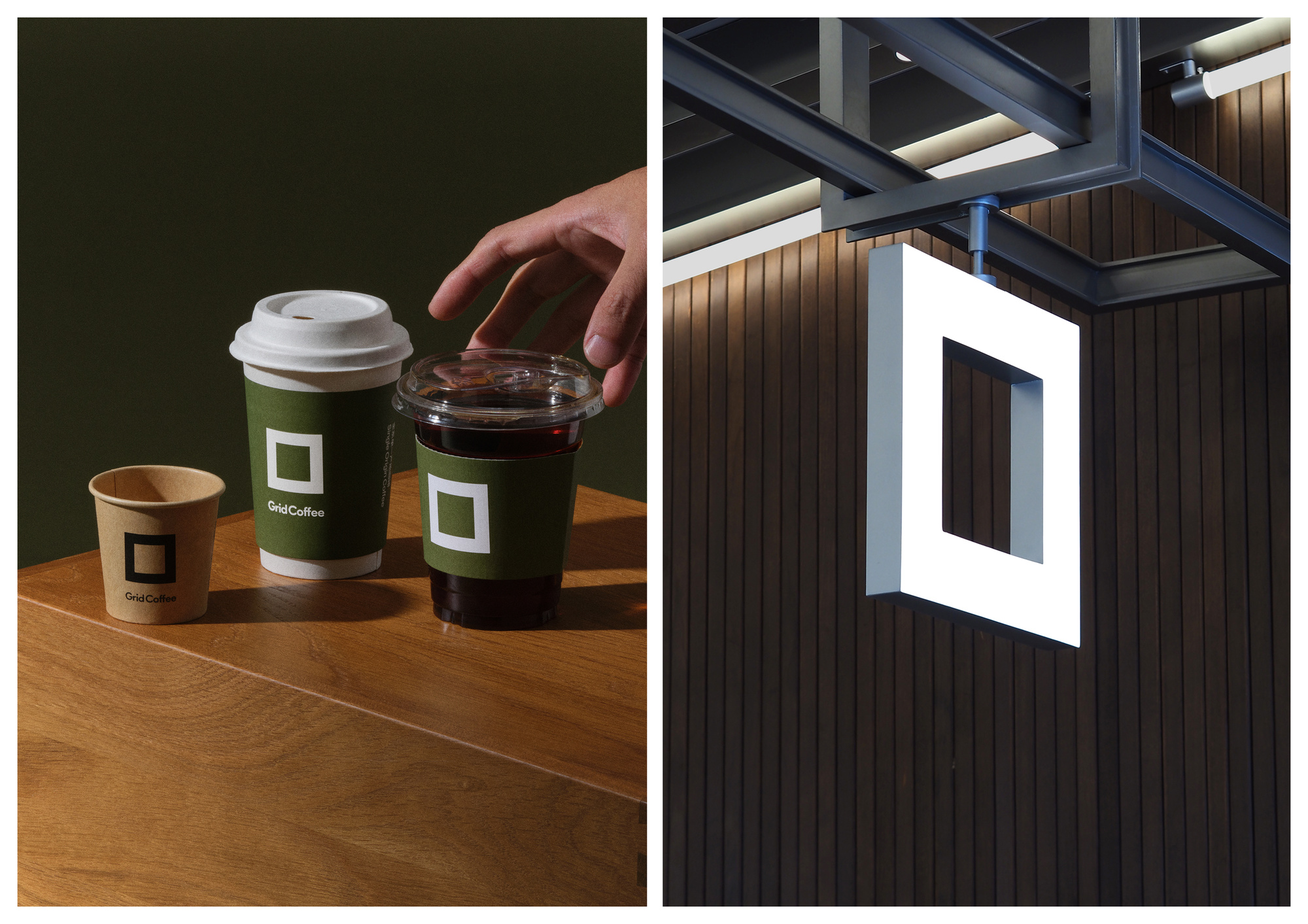
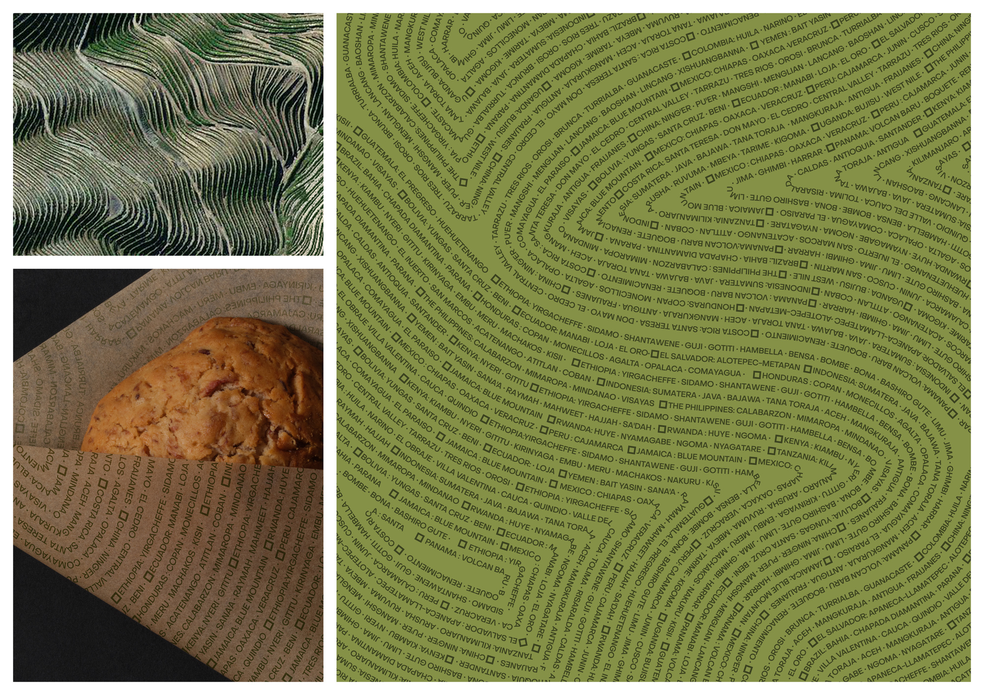
极简直白的logo被应用在包装、冷热饮杯上。为了展现品牌对「全系单一产地」咖啡风味的极致追求,我们设计了一套灵感来源于咖啡产地地形的图形Pattern,用于产品包装上及门店围挡上。
We streamlined the original logo's complex grid structure by adopting its most fundamental element—a single square. This minimalist yet decorative design ensures instant visual recognition across all touchpoints, from storefronts to carry bags.
Facing China's vast and highly competitive beverage market, we recognized the brand's need for a quickly recognizable and easily applicable visual identifier. We boldly recommended adopting the smallest unit from the original logo—the square—as the core element. This refined brand identity will efficiently establish consumer awareness through rapid store expansion, enabling precise and swift brand communication.
The minimalist logo is prominently featured across packaging and cold/hot beverage cups. To embody the brand's uncompromising dedication to "full-range single-origin" coffee flavor profiles, we developed topographic-inspired graphic patterns derived from coffee-growing terrains, strategically applied to product packaging and storefront installations.
UDL是一家多合伙人团队、多学科的设计工作室,提供品牌形象、工业产品、包装、数字艺术、美术指导等多个方向的设计及咨询服务。 我们的设计由好奇心、创造力、爱和技术构成。 UDL is a design and creative studio. We provide design and consulting services to clients from both commercial and cultural fields. You can get to know us through our past works. We design with curiosity, creativity, love, and technology. We strive for excellence.

