


Grid Coffee-1
Grid Coffee-6

Grid Coffee-4

Grid Coffee-2

Grid Coffee-3
Grid Coffee-8
Grid Coffee-5
With the positioning of "the whole series of single origin", Grid Coffee has quickly become a high-profile new star in the coffee brand. Each coffee bean of Grid Coffee meets the SCA cup test standard of 84 points or more. Through high-standard production methods, it meets the requirements of advanced consumers for coffee flavor and endows daily coffee with more professional quality.
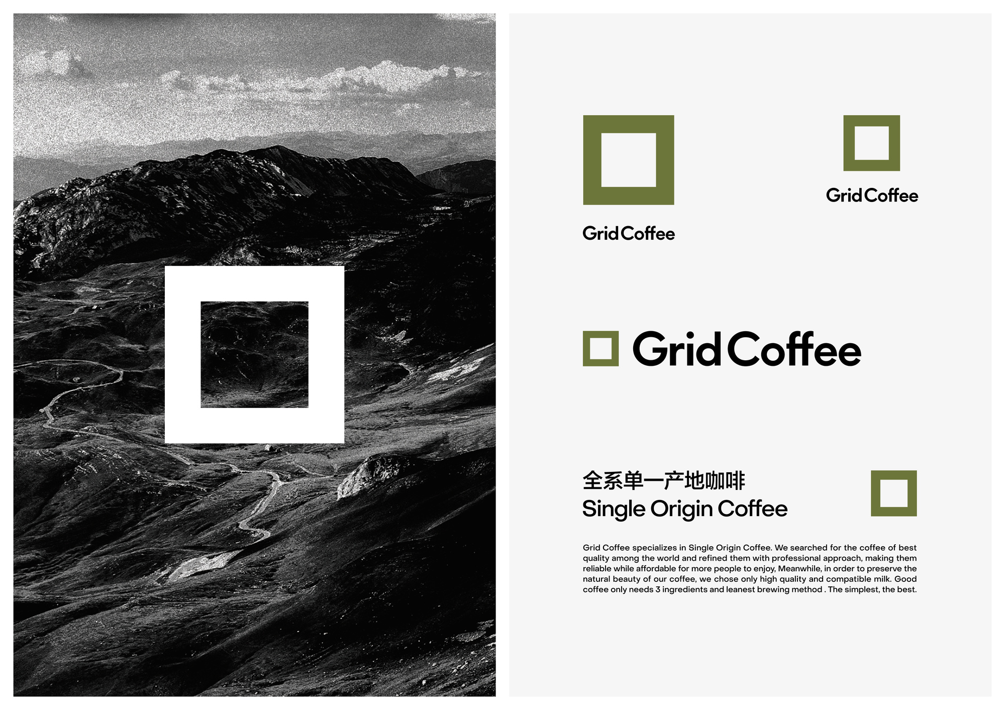
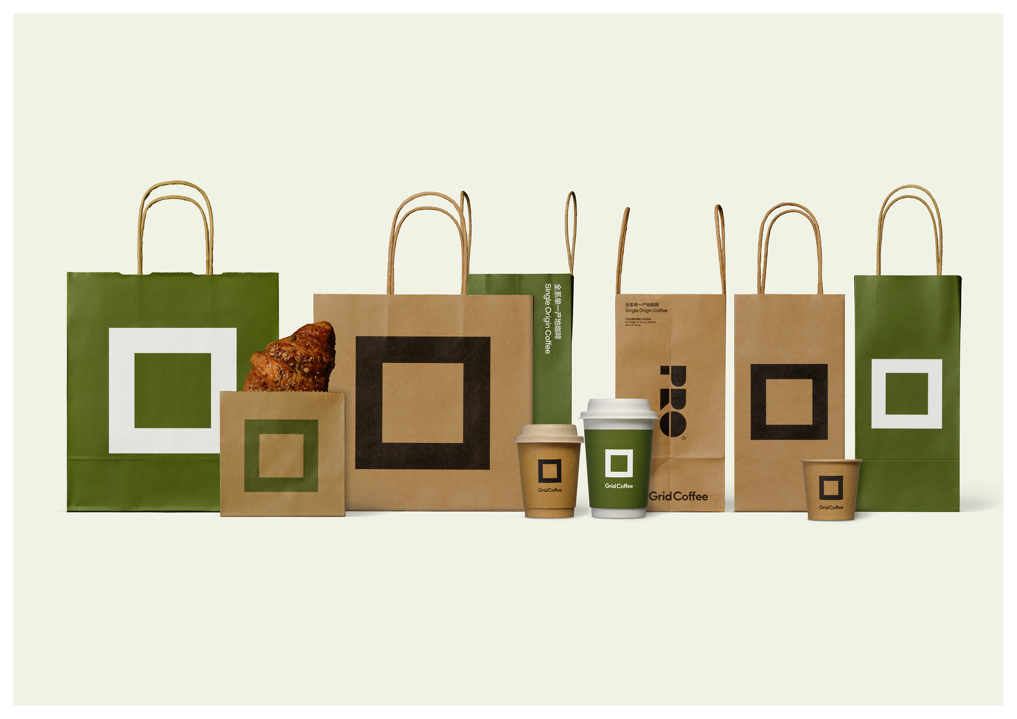
With the rapid expansion of Grid Coffee. Our job is to create a new image that can be quickly recognized by the public. We simplified the original crisscross grid, using squares, the smallest unit of the grid, straightforward and decorative, to convey the convenience and rigor brought by contemporary technology.
We expect this new image to be closely linked with the brand, to establish a higher standard for each cup of coffee in a rational and professional way, and to become the most symbolic symbol of specialty coffee.
The Chinese coffee market has transitioned from being dominated by instant coffee to evolving into a landscape of diverse consumption scenarios, with freshly ground coffee and retail coffee emerging as the primary categories. Grid Coffee, positioned as a "full-range single-origin" brand, has begun capturing the attention of discerning coffee consumers by employing high-standard preparation methods to infuse daily coffee with a more professional quality.
With plans to launch thousands of stores nationwide amid accelerated market expansion, the brand needs to cultivate a distinctive brand identity to differentiate itself within the saturated coffee retail sector.
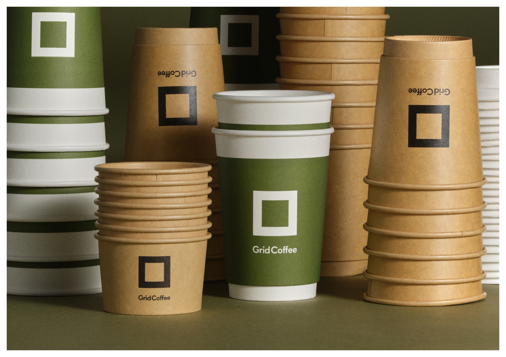
We simplified the criss-cross grid in the original LOGO, using the smallest unit in the original LOGO-a square, straightforward and decorative. Whether it is in the shop or on the handbag, can be seen at first sight.
Faced with the huge and fierce beverage market in China, we saw that brands need a logo that can be quickly identified and easily applied. So we boldly suggested that the brand use the smallest unit in the original LOGO-square. The new brand identity will be accompanied by the rapid expansion of brand stores, accurately and quickly establish awareness with consumers.
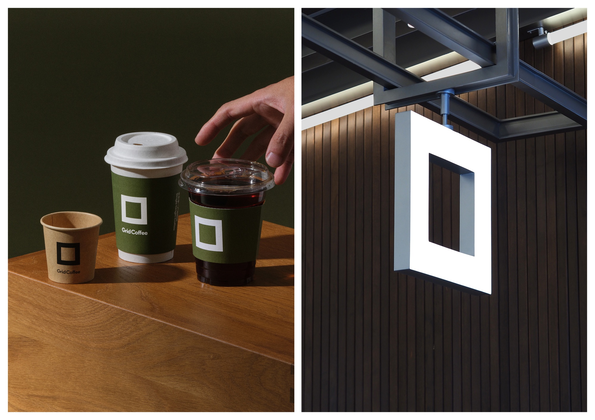
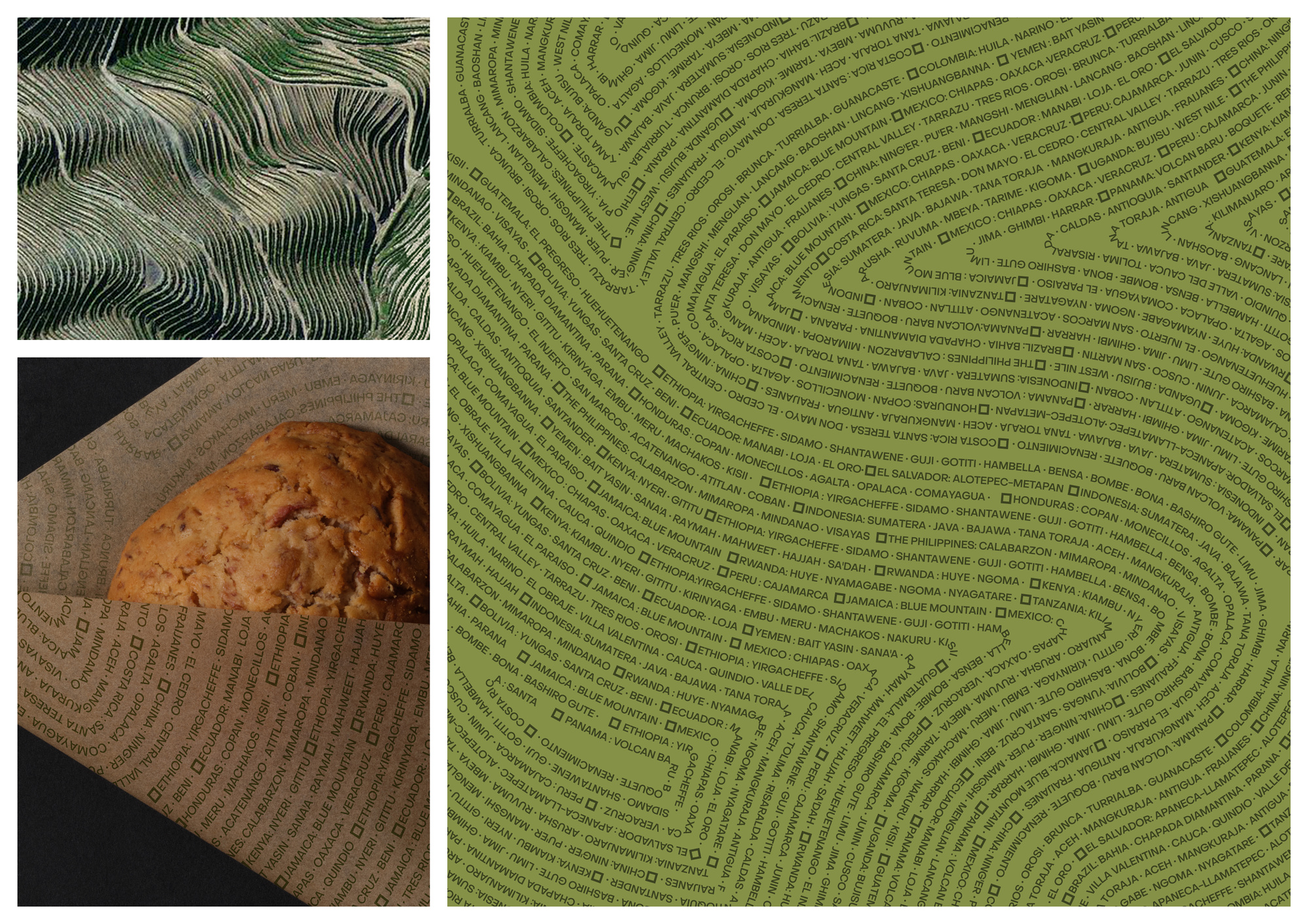
The minimalist and straightforward logo is applied to packaging and hot and cold drinking cups. In order to show the brand's ultimate pursuit of coffee flavor in the "whole series of single origin", we have designed a set of graphic Pattern inspired by the terrain of coffee origin, which is used on product packaging and store enclosure.
We streamlined the original logo's complex grid structure by adopting its most fundamental element-a single square. This minimalist yet decorative design ensures instant visual recognition across all touchpoints, from storefronts to carry bags.
Facing China's vast and highly competitive beverage market, we recognized the brand's need for a quickly recognizable and easily applicable visual identifier. We boldly recommended adopting the smallest unit from the original logo-the square-as the core element. This refined brand identity will efficiently establish consumer awareness through rapid store expansion, enabling precise and swift brand communication.
The minimalist logo is prominently featured across packaging and cold/hot beverage cups. To embody the brand's uncompromising dedication to "full-range single-origin" coffee flavor profiles, we developed topographic-inspired graphic patterns derived from coffee-growing terrains, strategically applied to product packaging and storefront installations.
UDL is a multi-partner team, multi-disciplinary design studio, providing brand image, industrial products, packaging, digital art, art direction and other directions of design and consulting services.
Our designs are made of curiosity, creativity, love and technology.
UDL is a design and creative studio.
We provide design and consulting services to clients from both commercial and cultural fields.
You can get to know us through our past works.
We design with curiosity, creativity, love, and technology.
We strive for excellence.

