


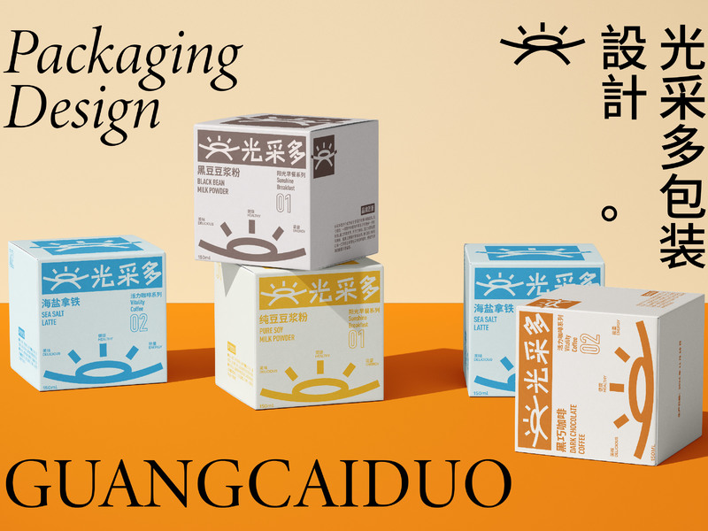
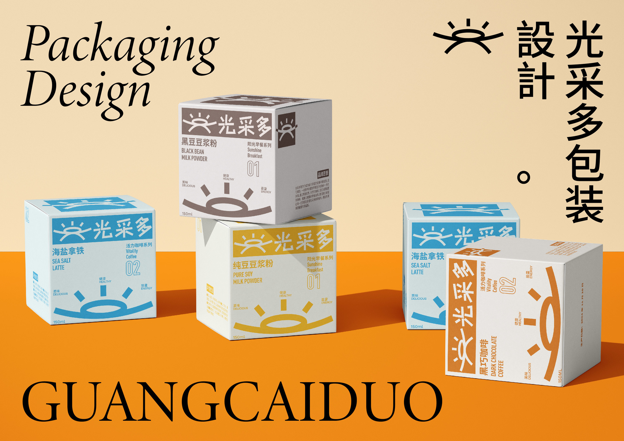
1.作品封面
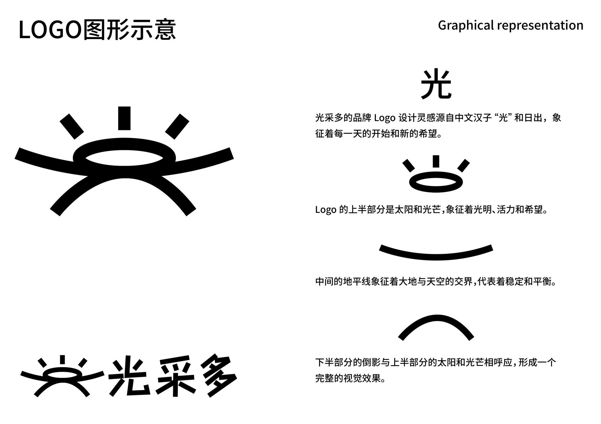
2.LOGO示意

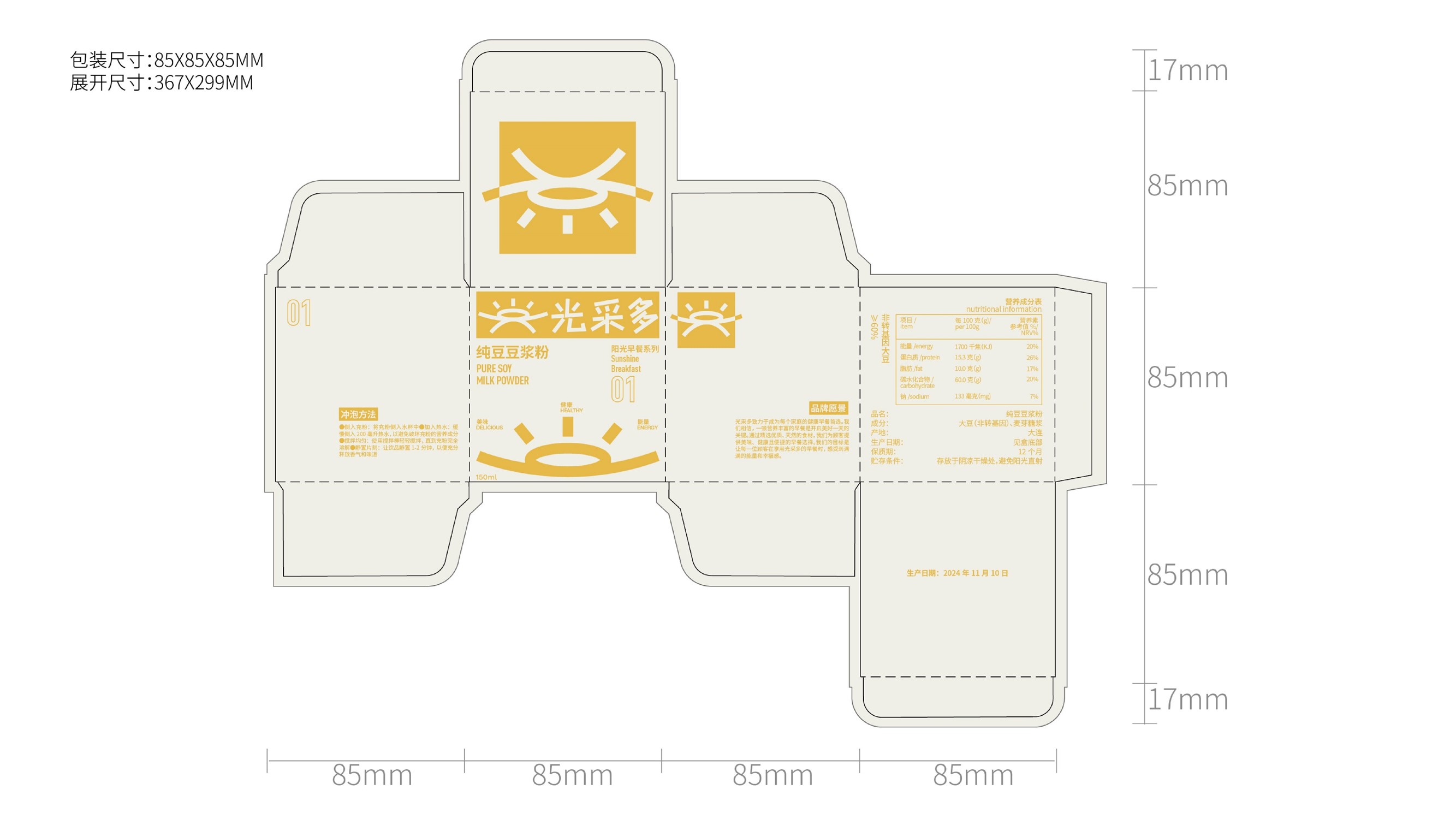
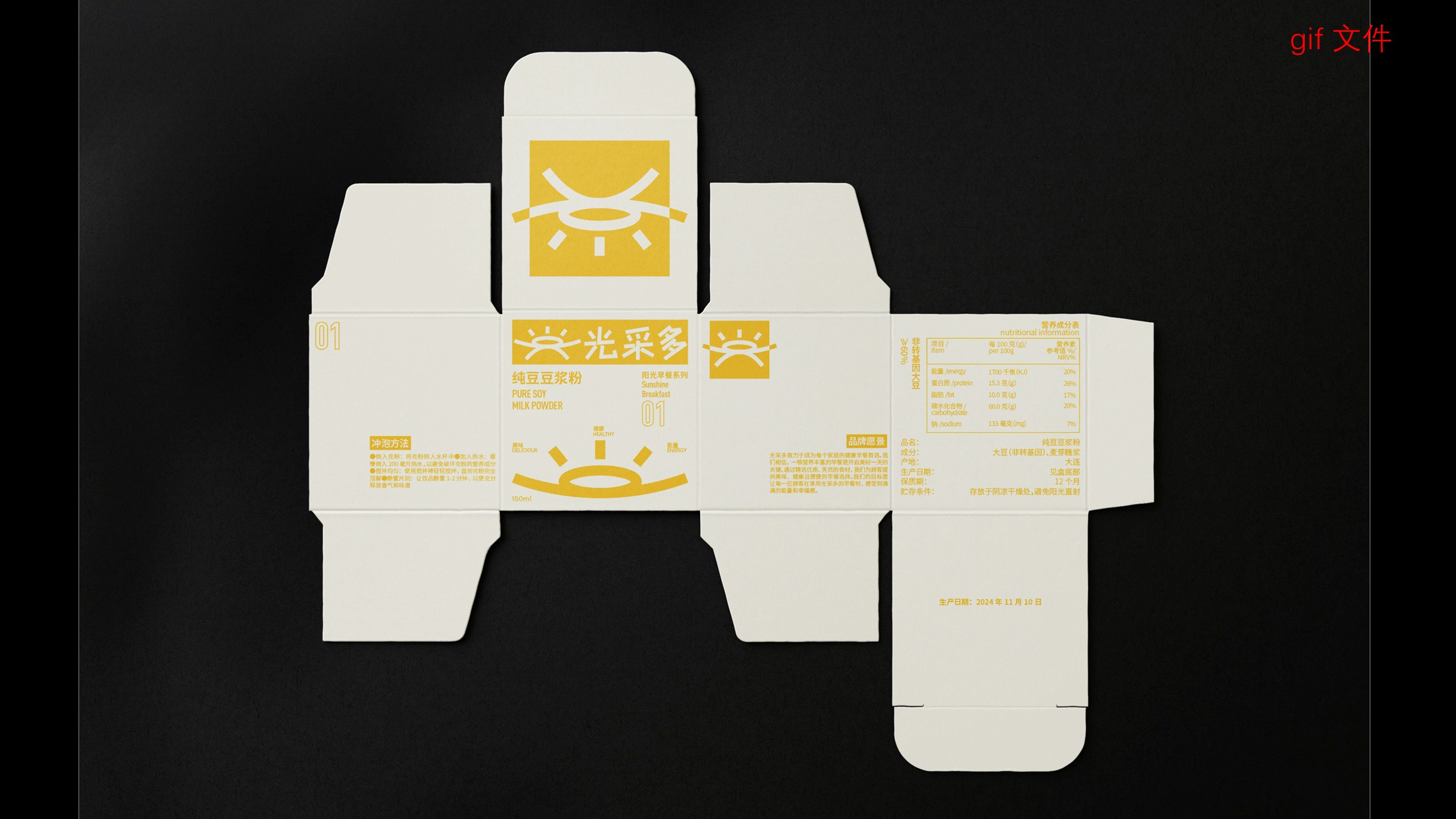
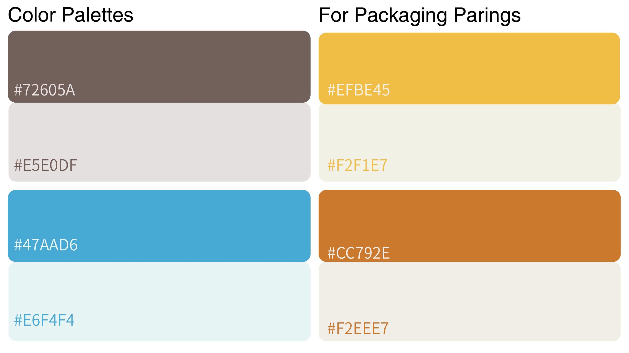
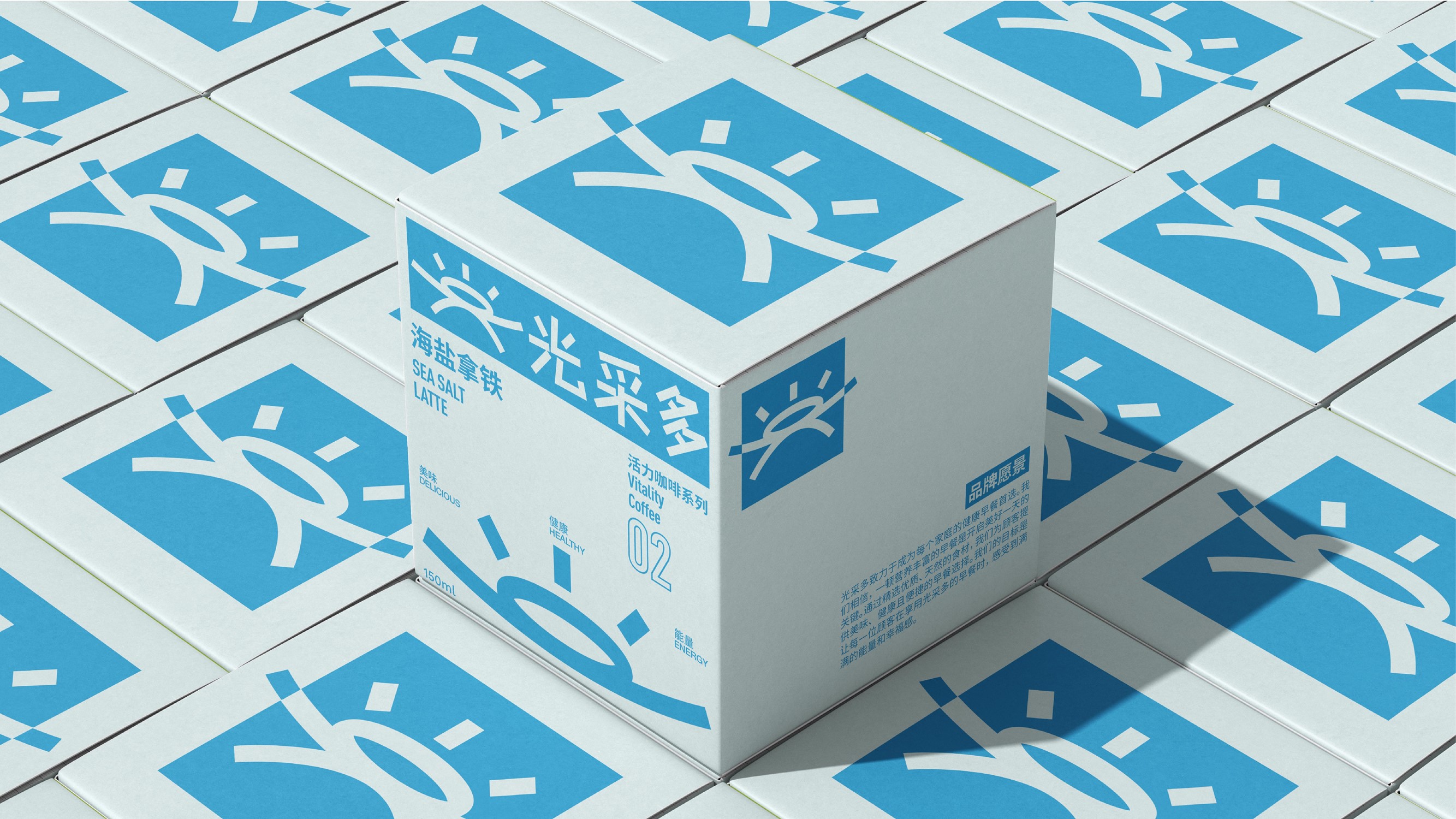
3.平面设计
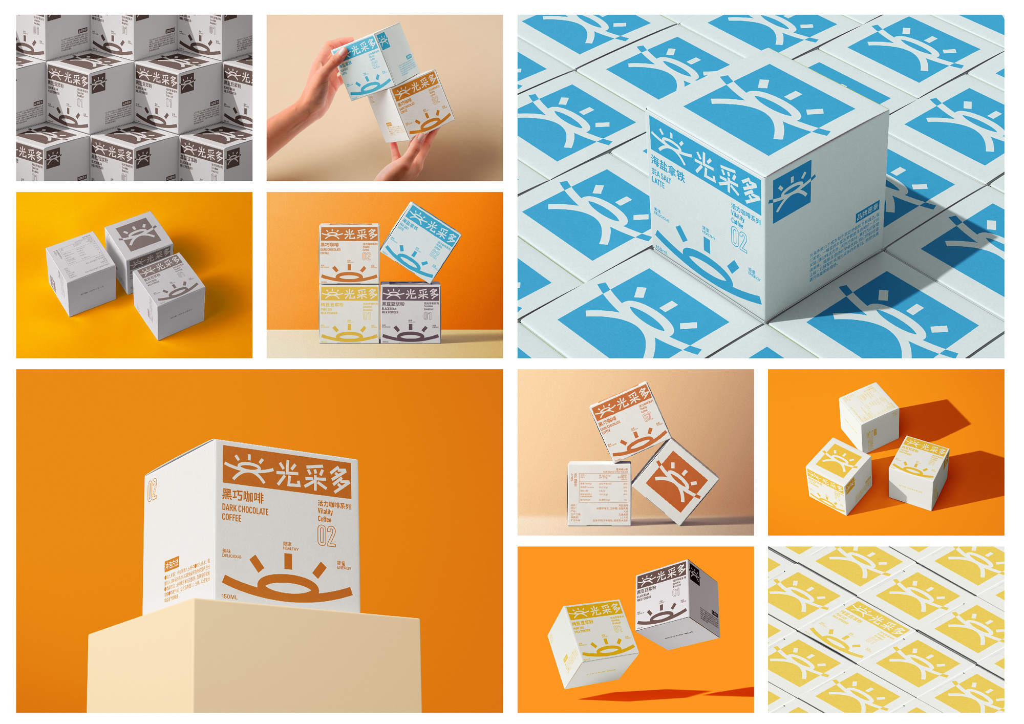
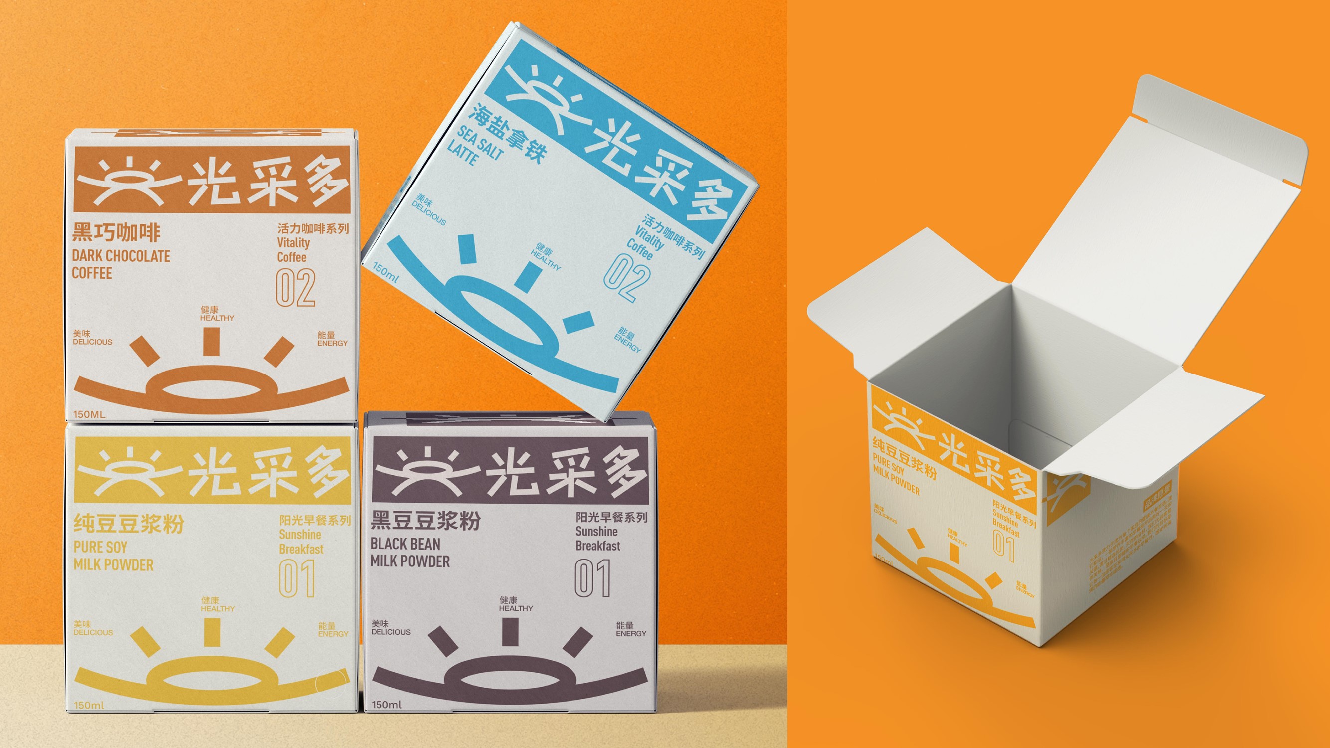
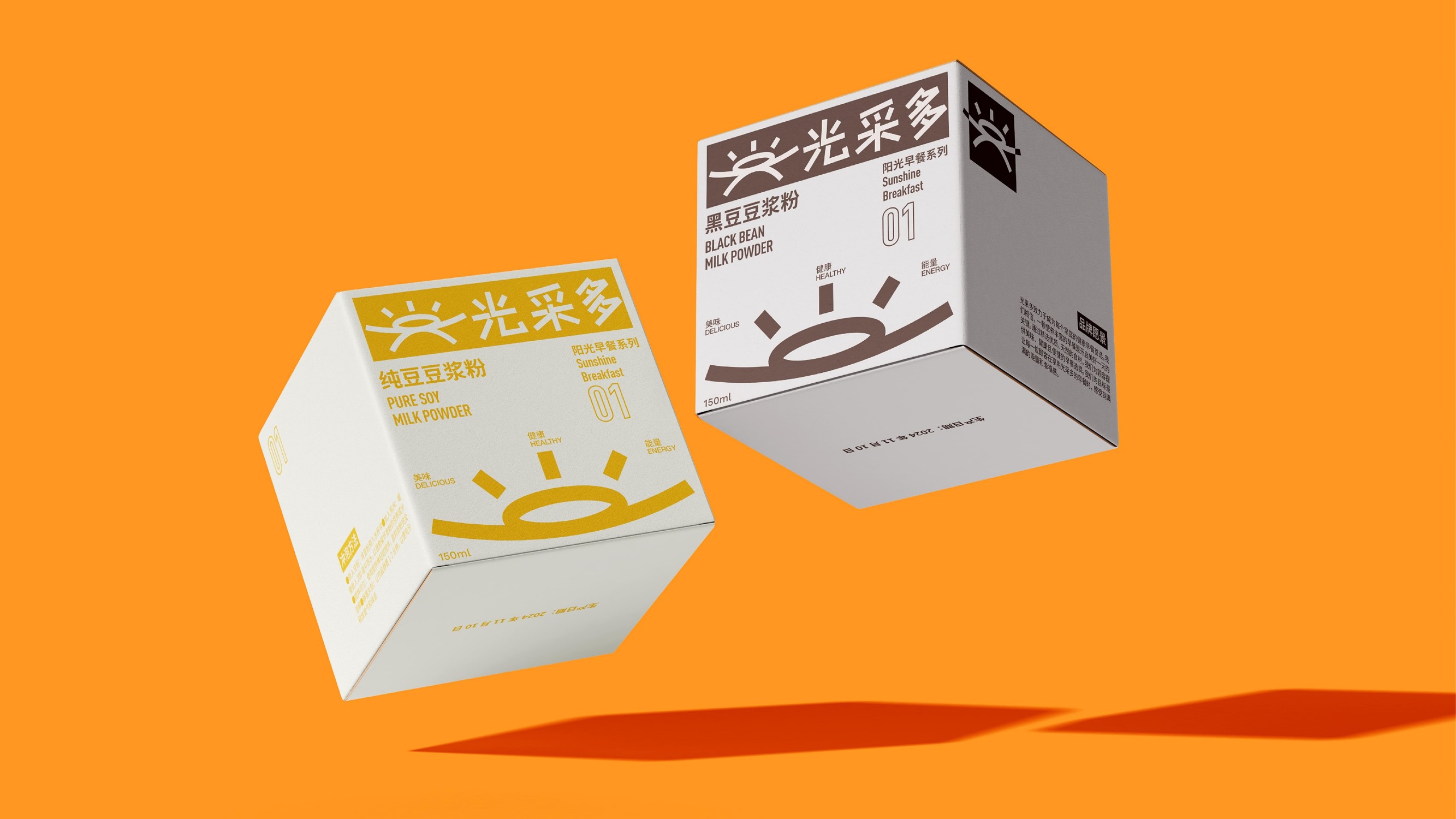
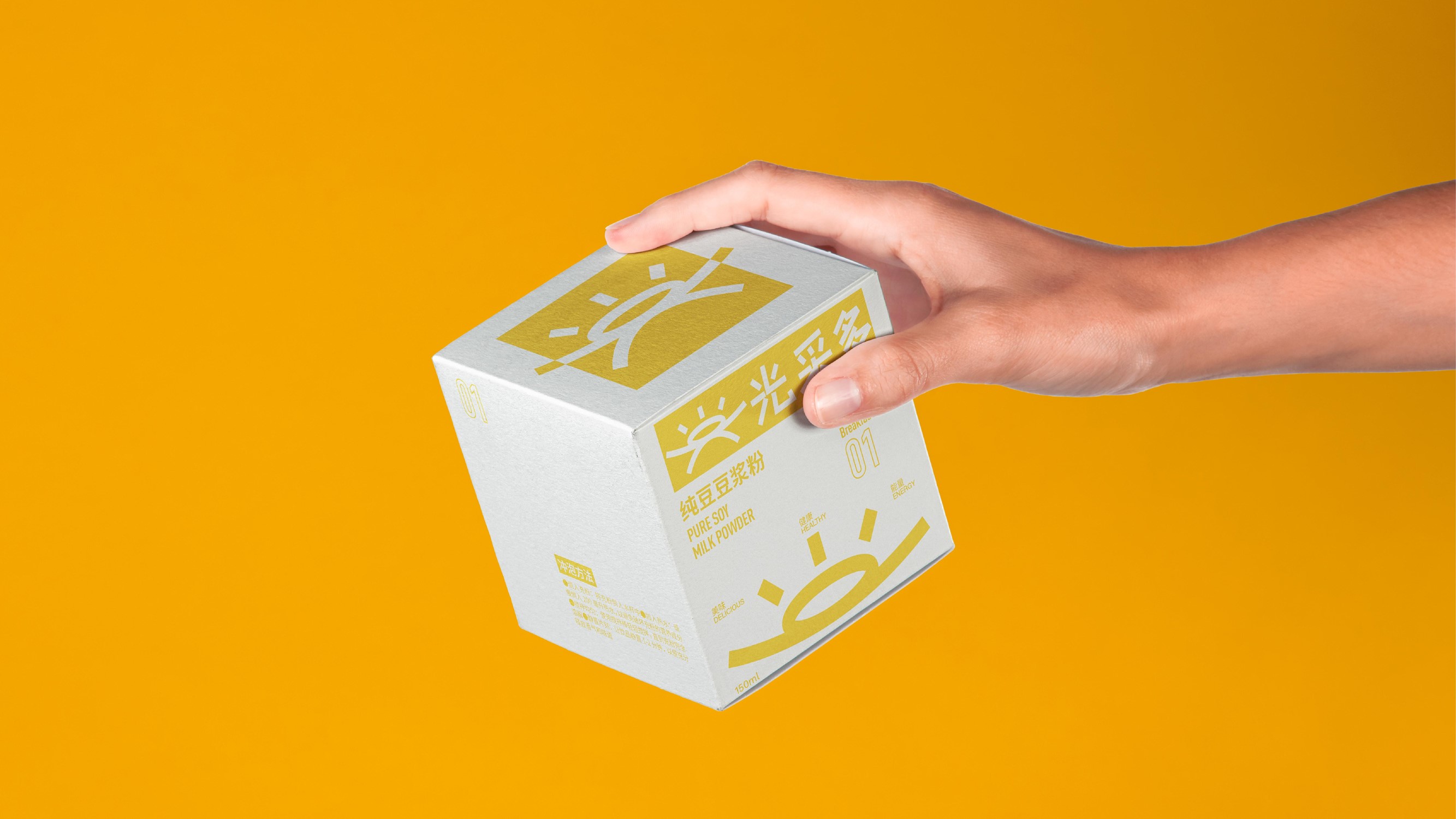
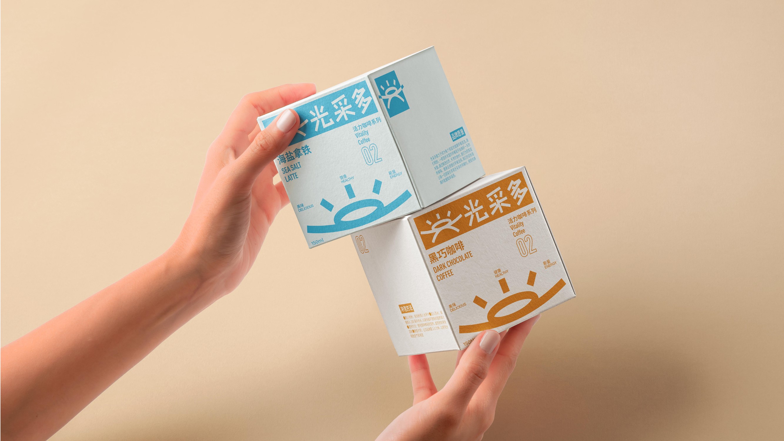
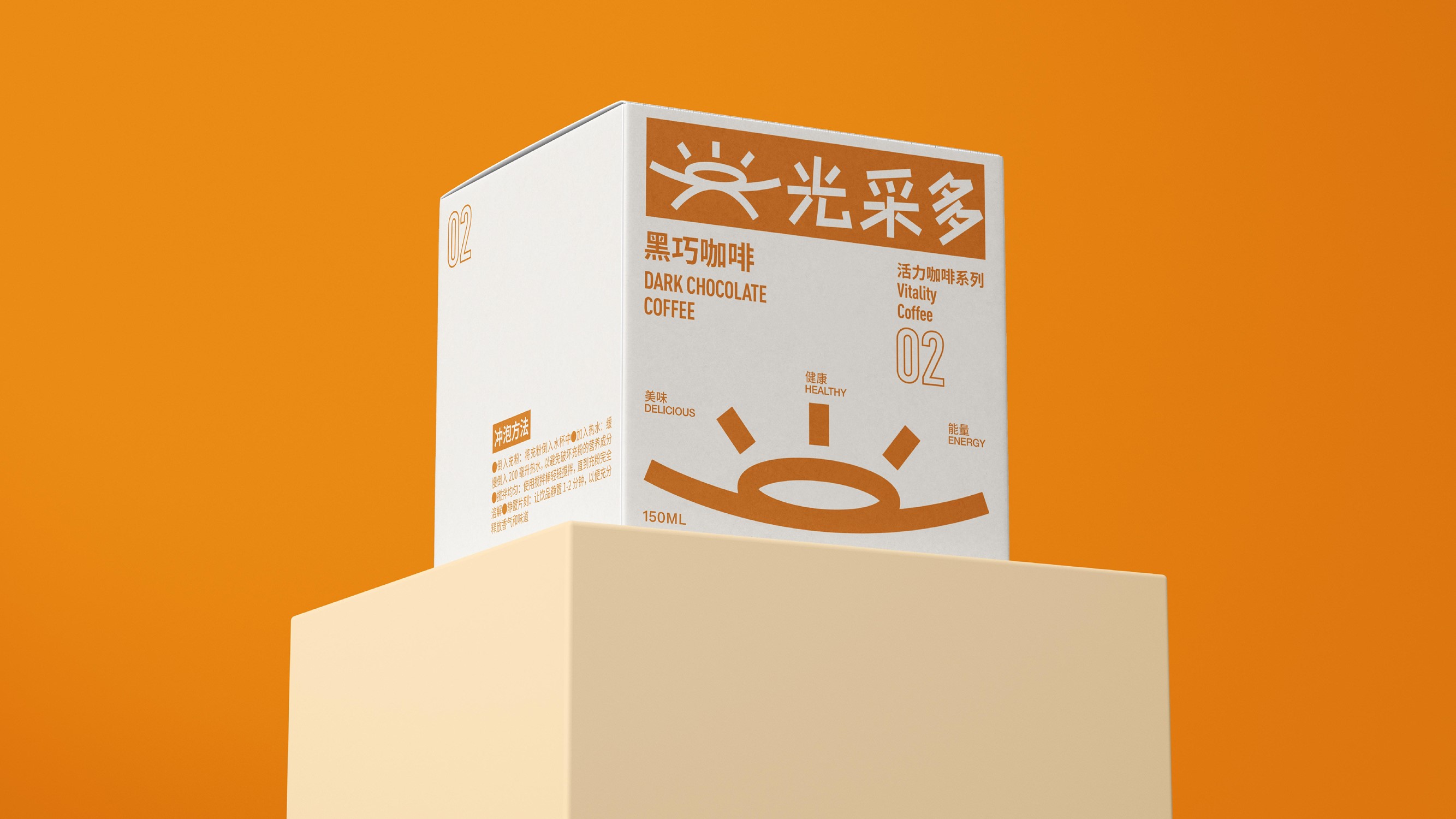
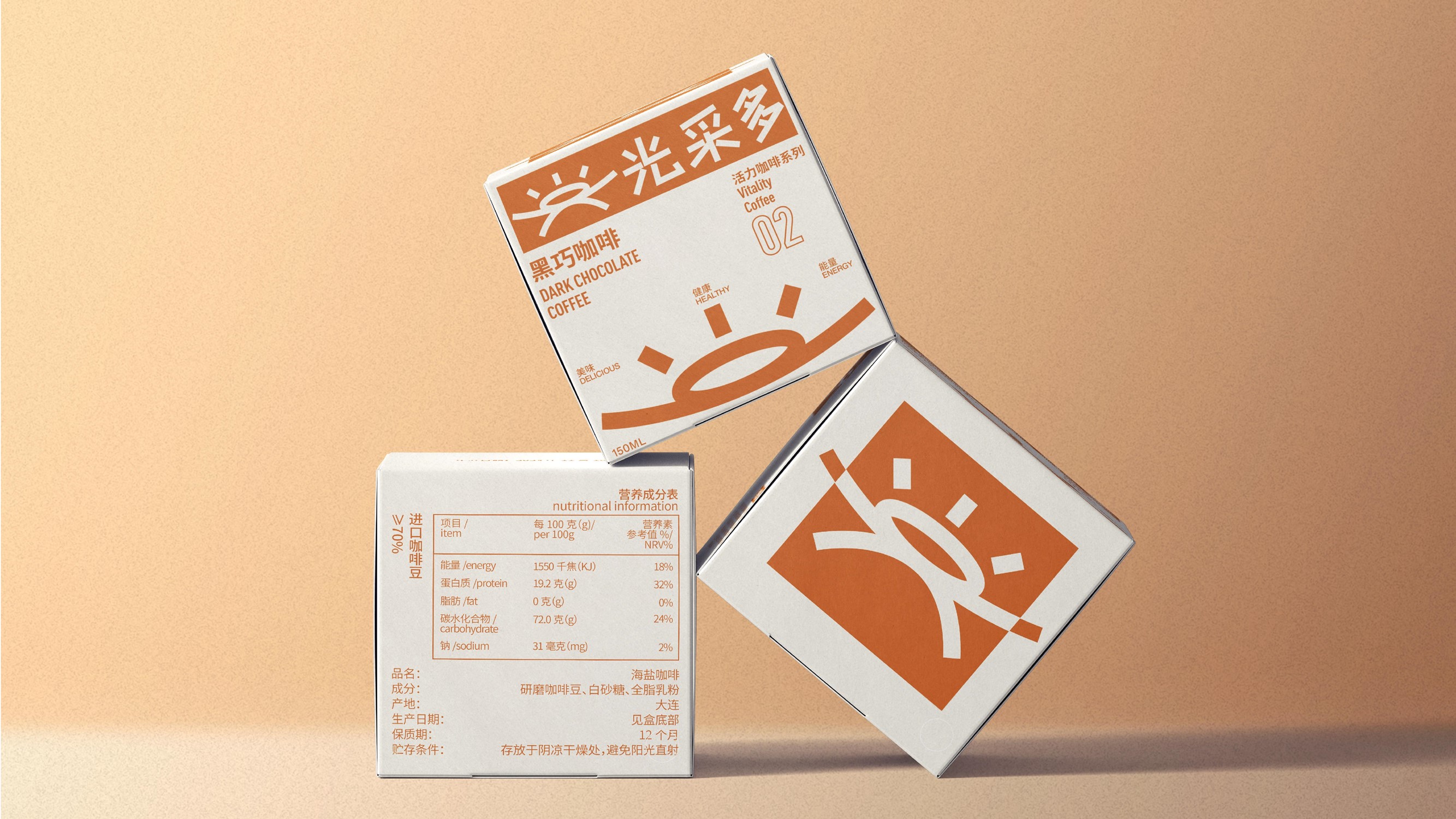
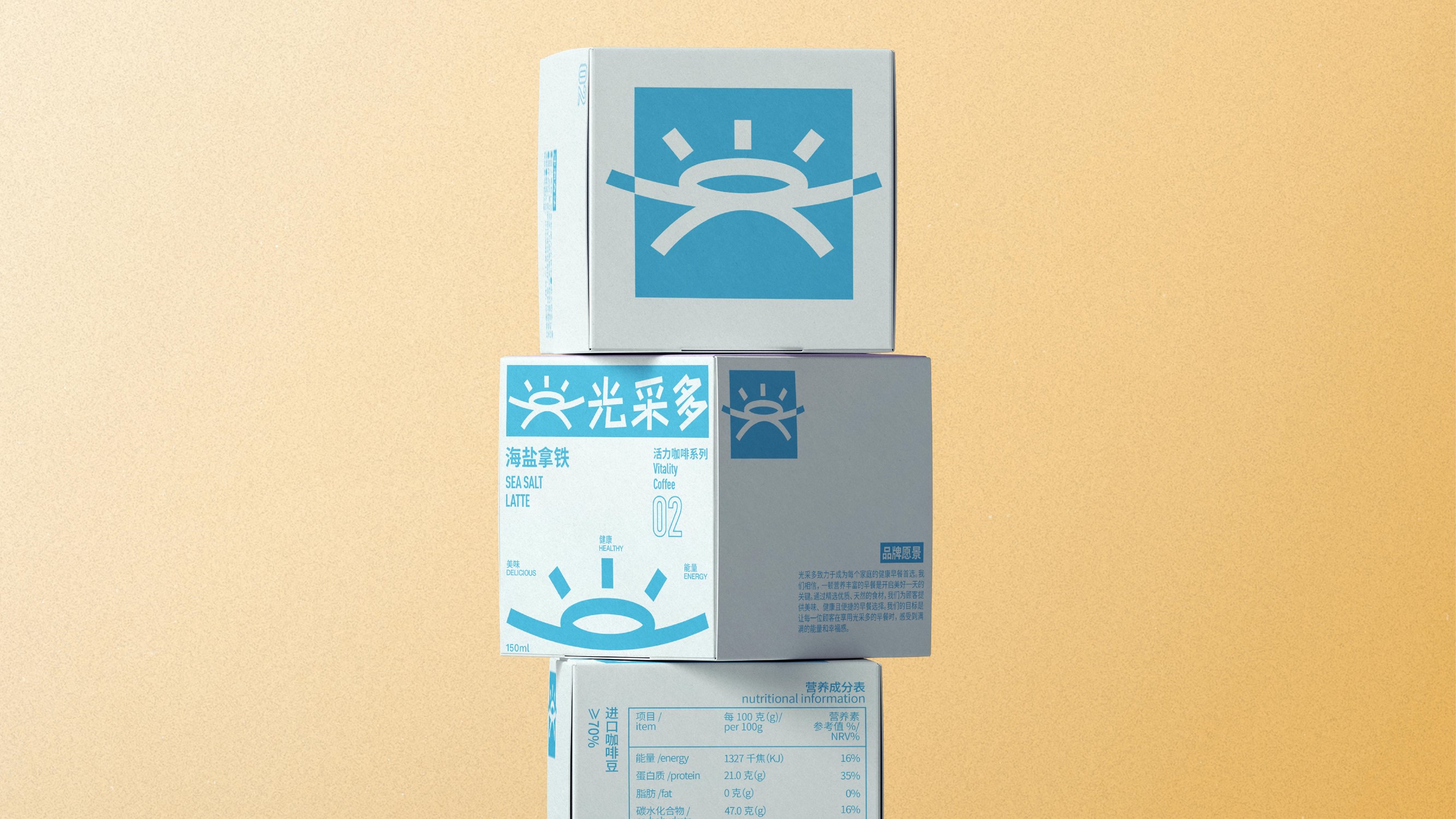
4.应用示例
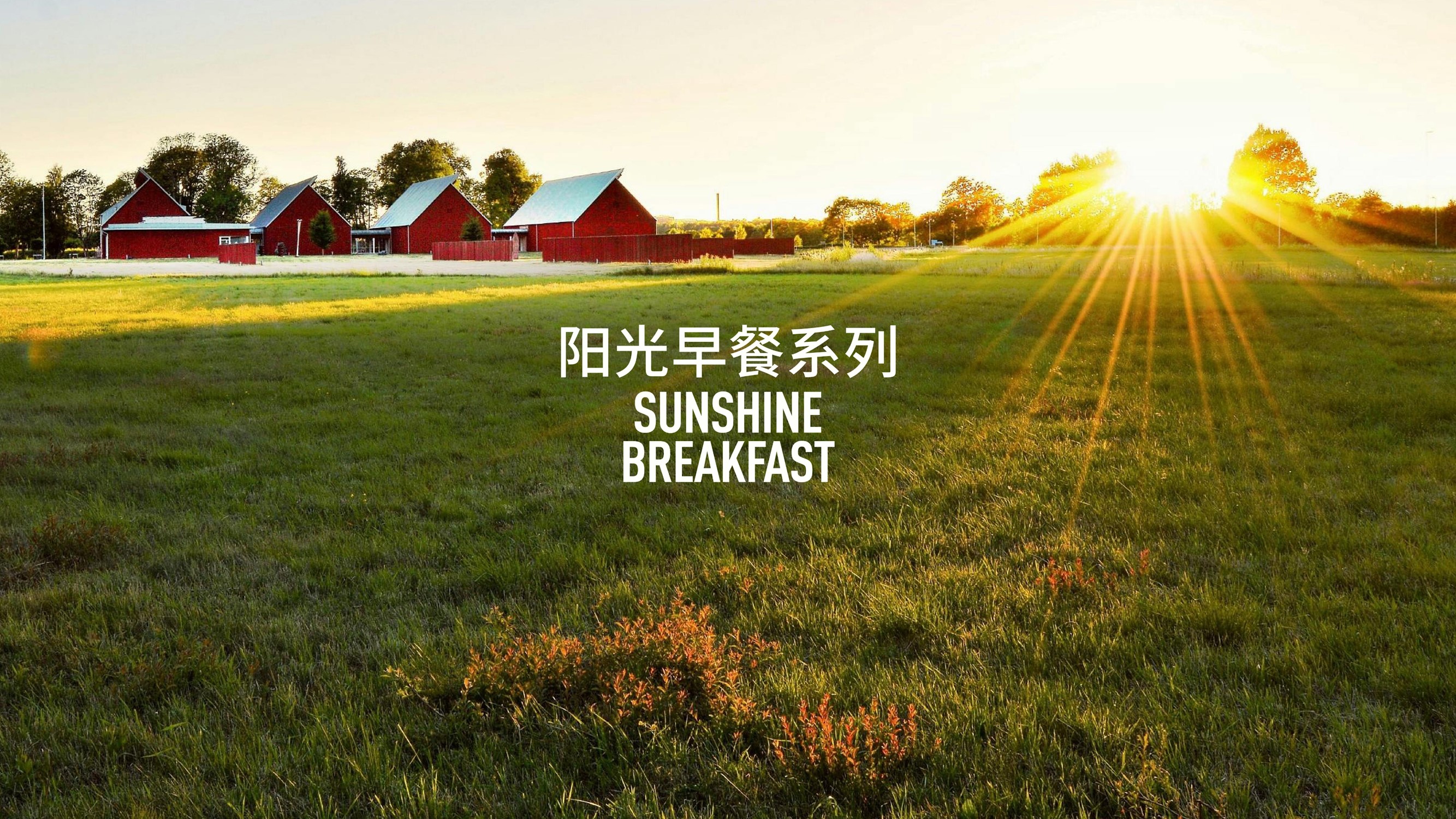
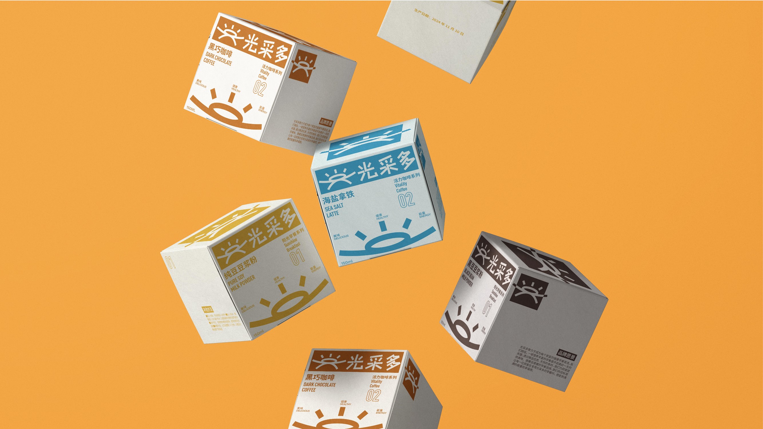
5.产品类别展示

6.光采多 PPT
7.动态演绎
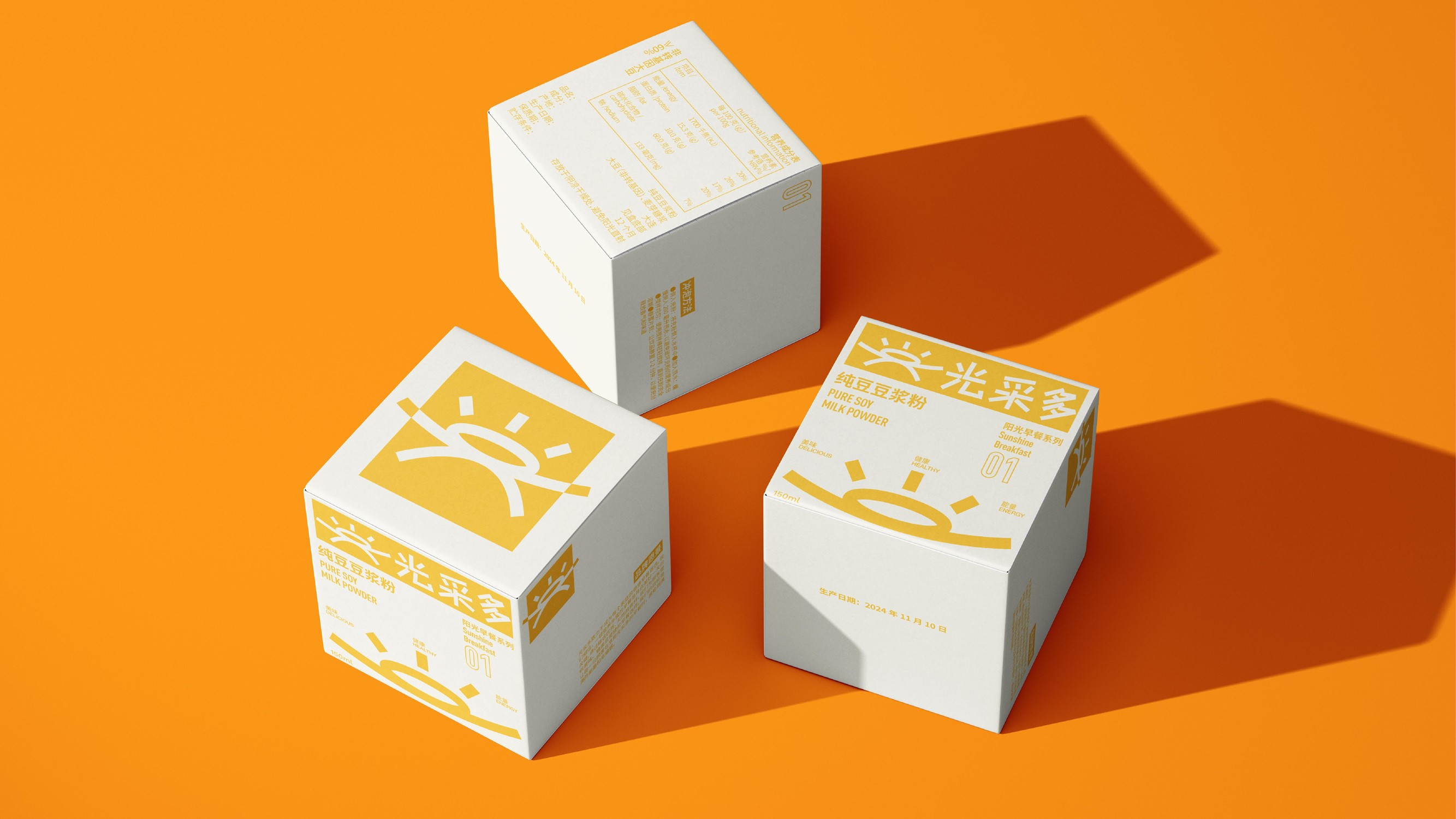
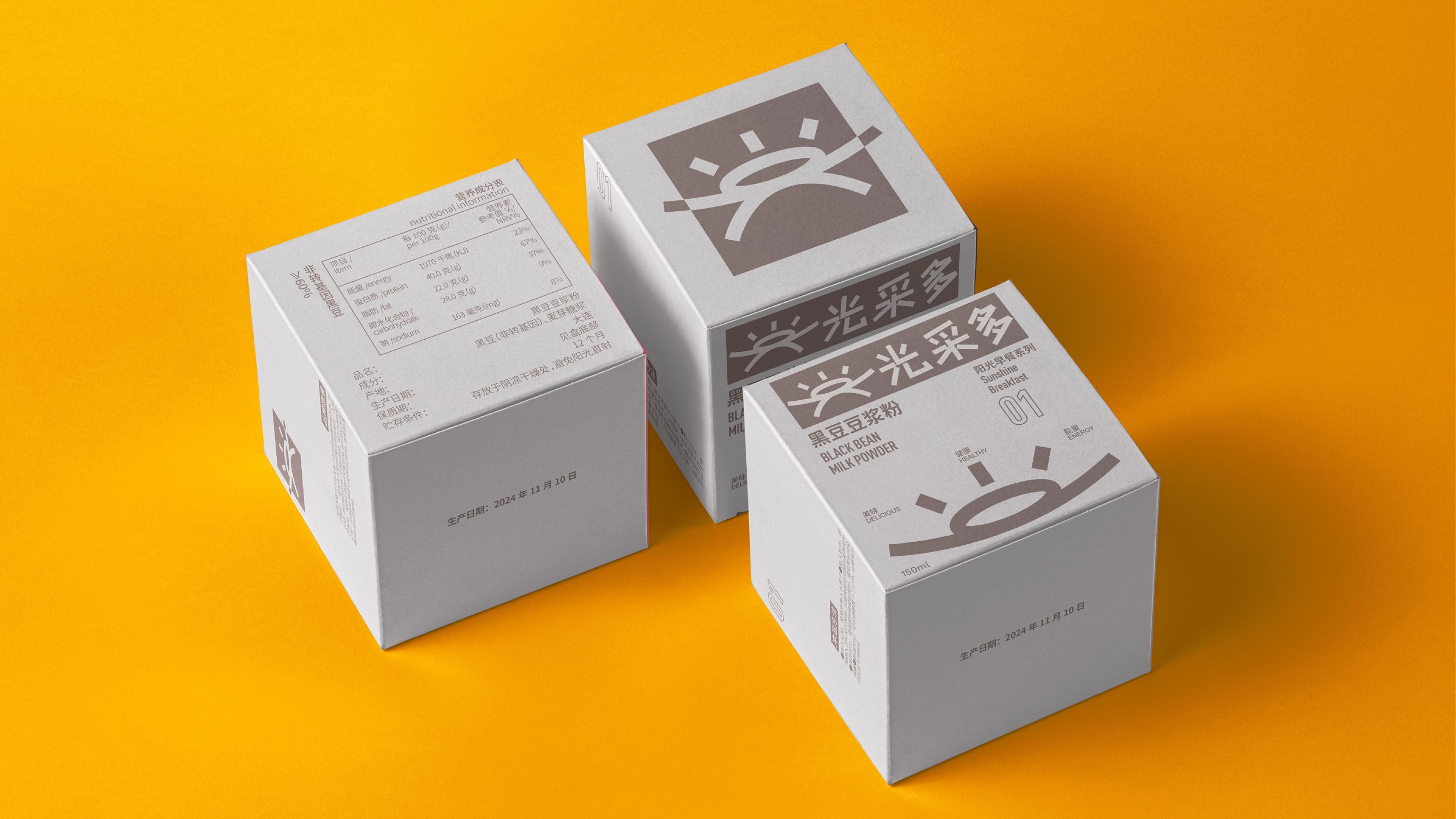
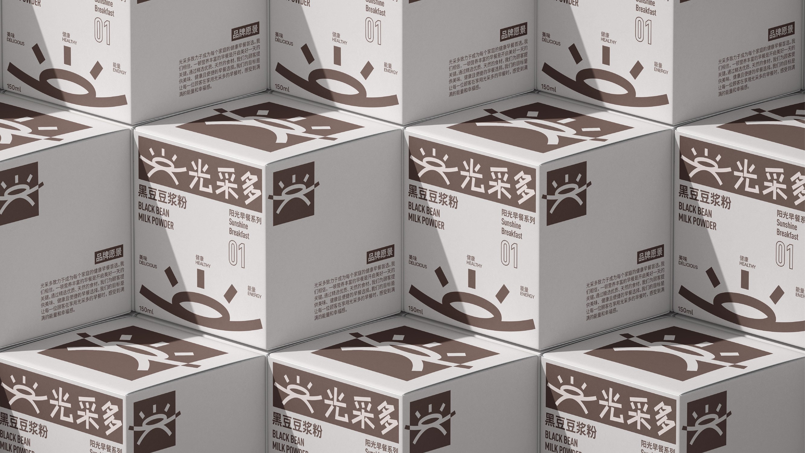
光采多是一个致力于提供健康、便捷的早餐品牌。品牌名称"光采多"寓意着每一天的早餐都能为消费者带来光彩和活力。品牌秉持"健康、美味、能量"的理念,不断创新和提升,让每一个早晨都充满能量和愉悦。
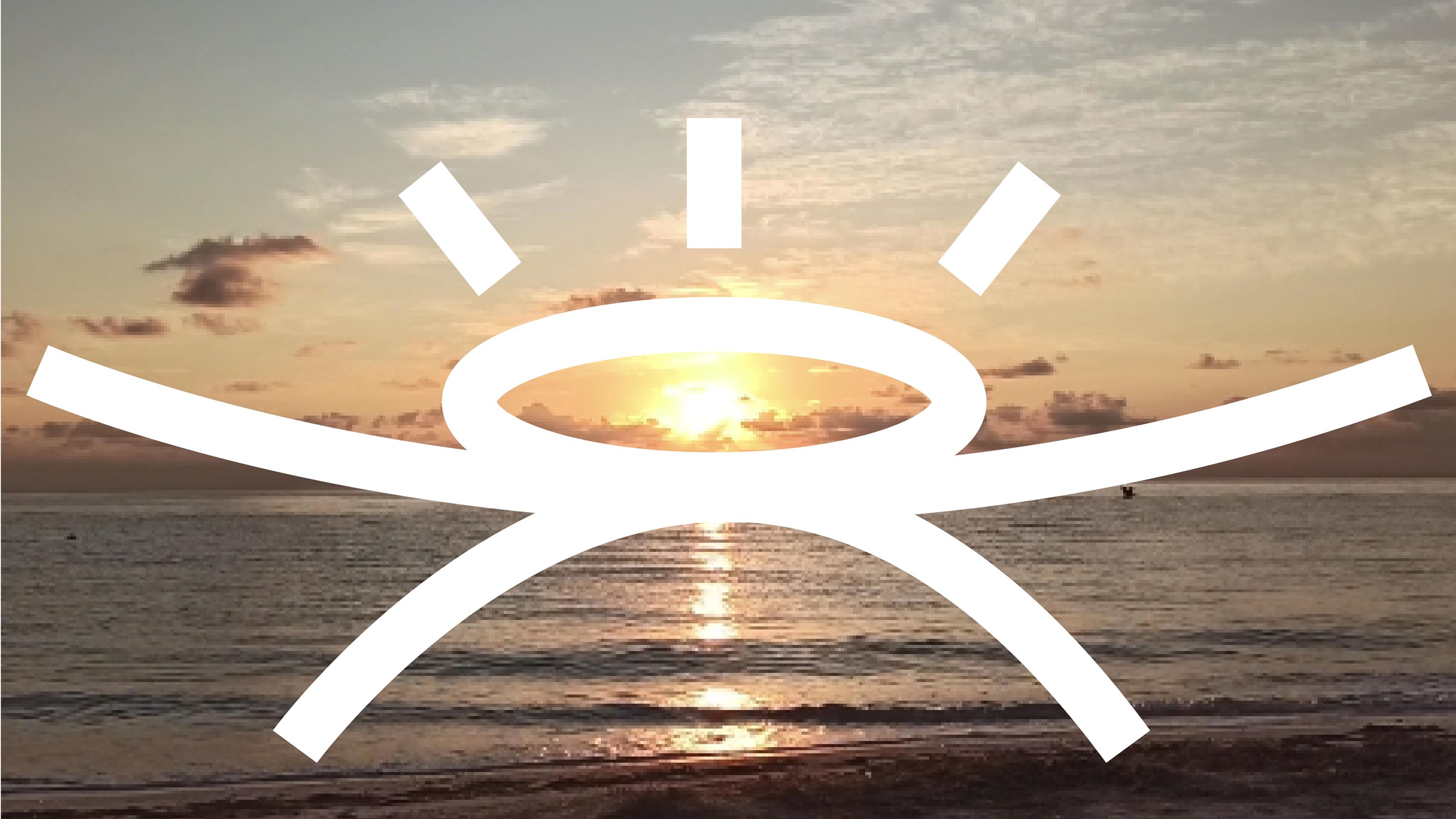
Logo的上半部分是太阳和光芒,象征着光明、活力和希望;中间的地平线象征着大地与天空的交界,代表着稳定和平衡;下半部分的倒影与上半部分的太阳和光芒相呼应,形成一个完整的视觉效果。Logo中的汉字部分采用了卡通化的设计,使其更加亲切和有趣,不仅增加了品牌的亲和力,也使得Logo更具辨识度和吸引力,能够更好地与消费者建立情感连接。
GUANGCAIDUO is a brand dedicated to providing healthy and convenient breakfasts. The brand name "GUANGCAIDUO" means that every day's breakfast can bring brilliance and vitality to consumers. The brand adheres to the concept of "health, deliciousness, energy", and constantly innovates and improves, so that every morning is full of energy and joy.
The upper part of the logo is the sun and rays, symbolizing light, vitality and hope; The horizon in the middle symbolizes the junction of the earth and the sky, representing stability and balance; The reflection of the lower half echoes the sun and light in the upper half to form a complete visual effect. The Chinese characters in the logo are designed with cartoons to make it more intimate and interesting, which not only increases the affinity of the brand, but also makes the logo more recognizable and attractive, and can better establish an emotional connection with consumers.
致力于通过中国汉字,深入挖掘含义,通过设计的方式表达出来。
大三学生,869设计学校学员,曾荣获C-IDEA、靳埭强设计奖、两岸汉字文化创意大赛、俄罗斯金蜜蜂等奖项。

