


1. Work Cover
2.LOGO Schematic

3. Graphic Design
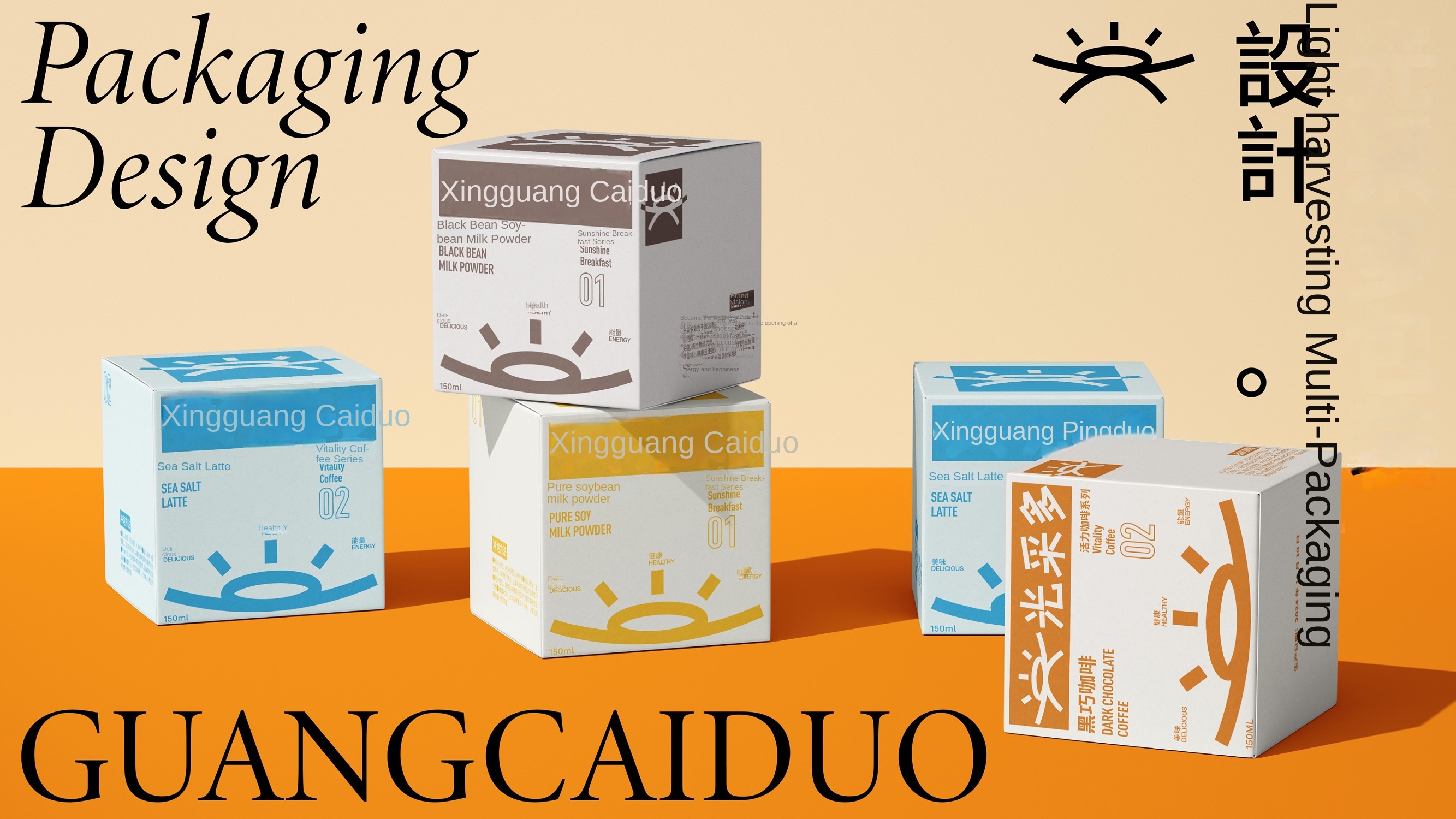
4. Application example
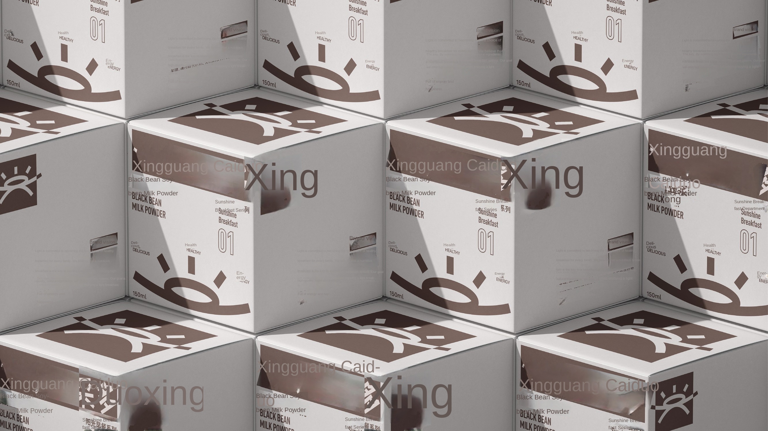
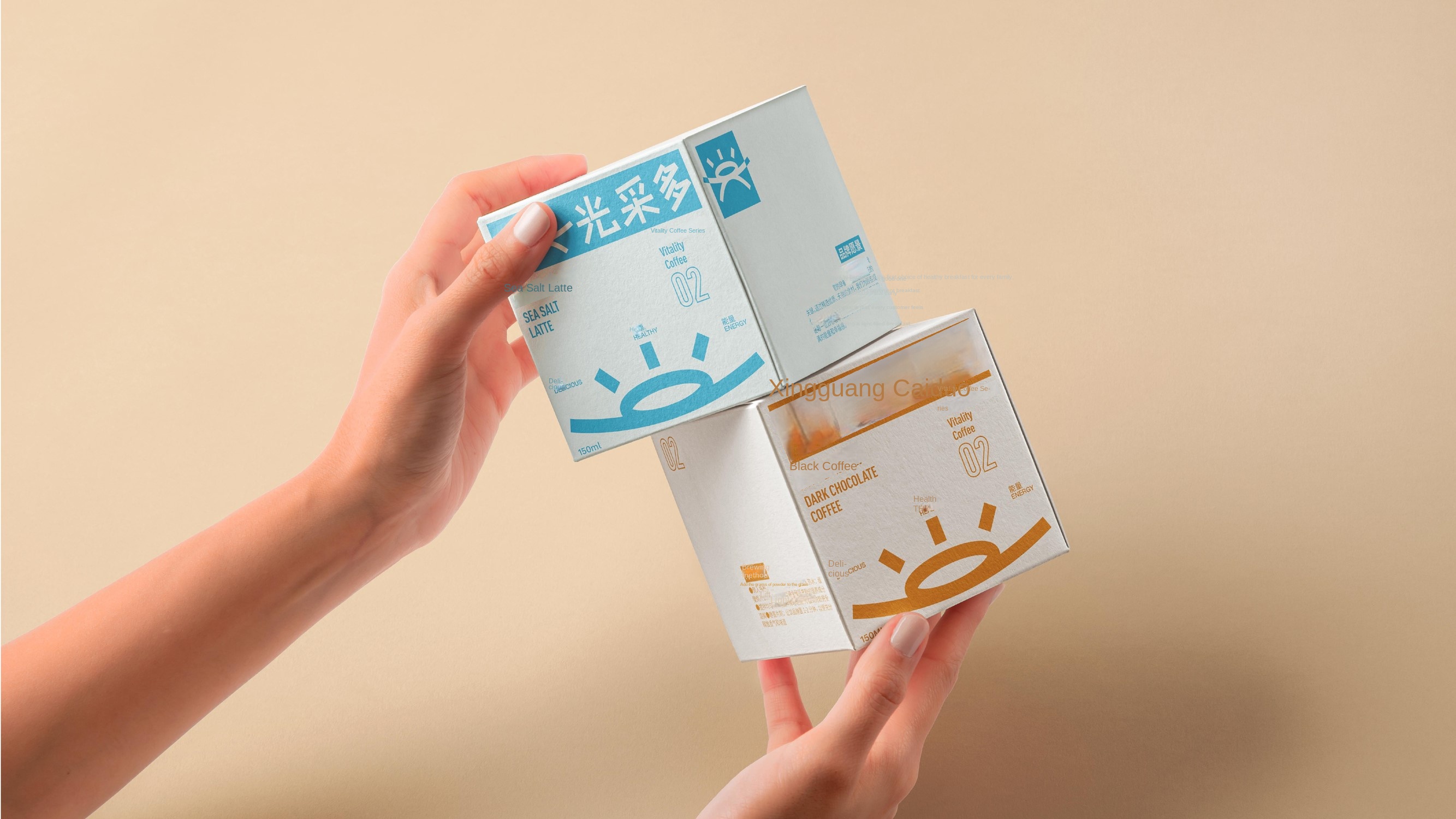
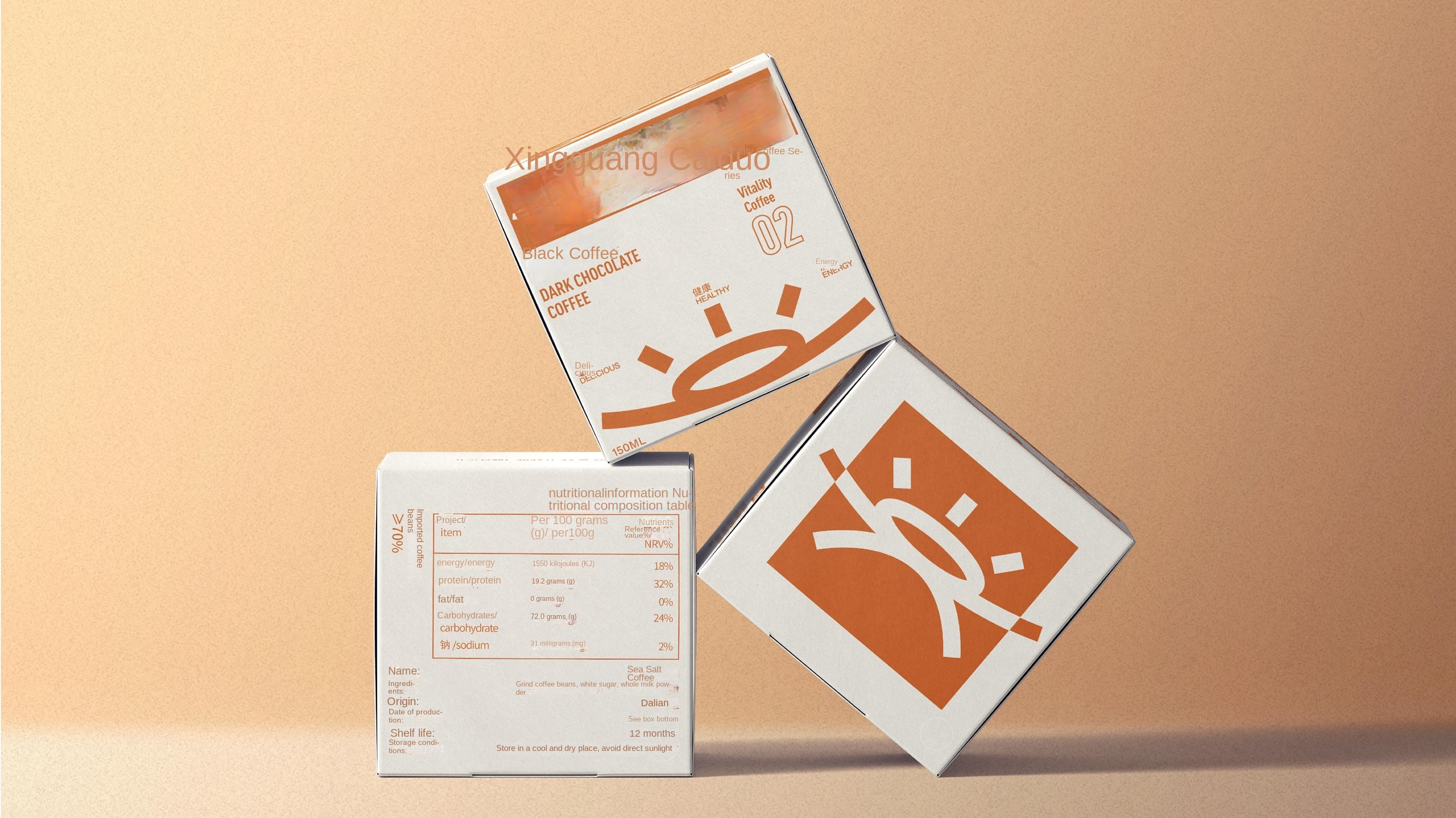
5. Product category display


6. Light more PPT
7. Dynamic deduction
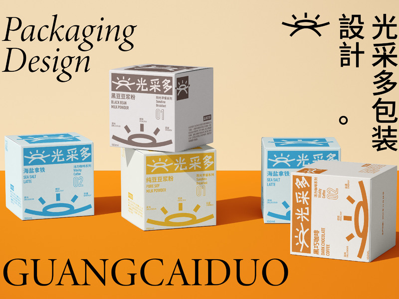
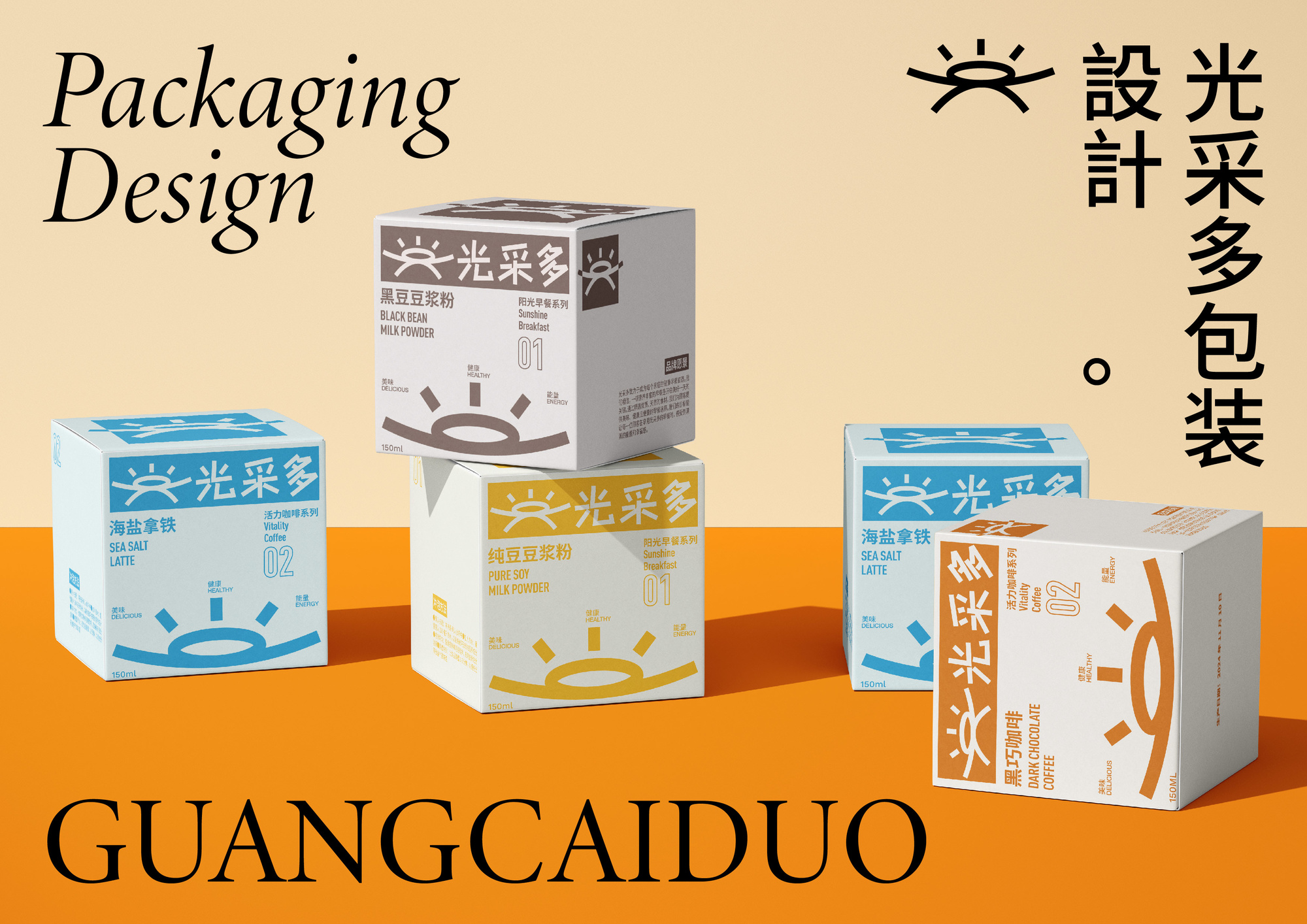
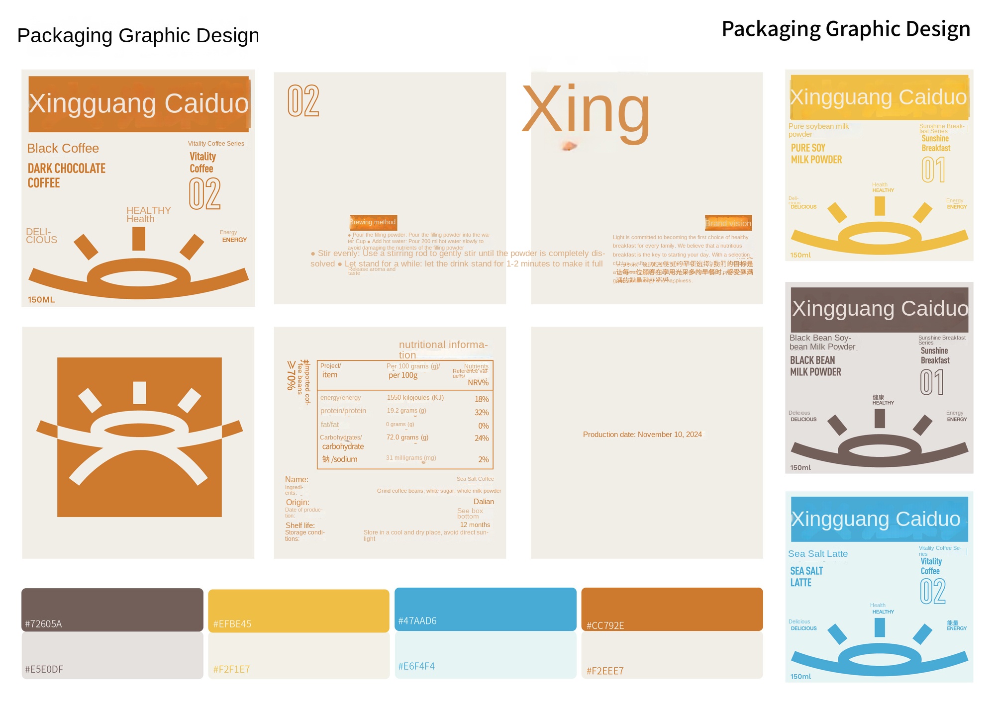
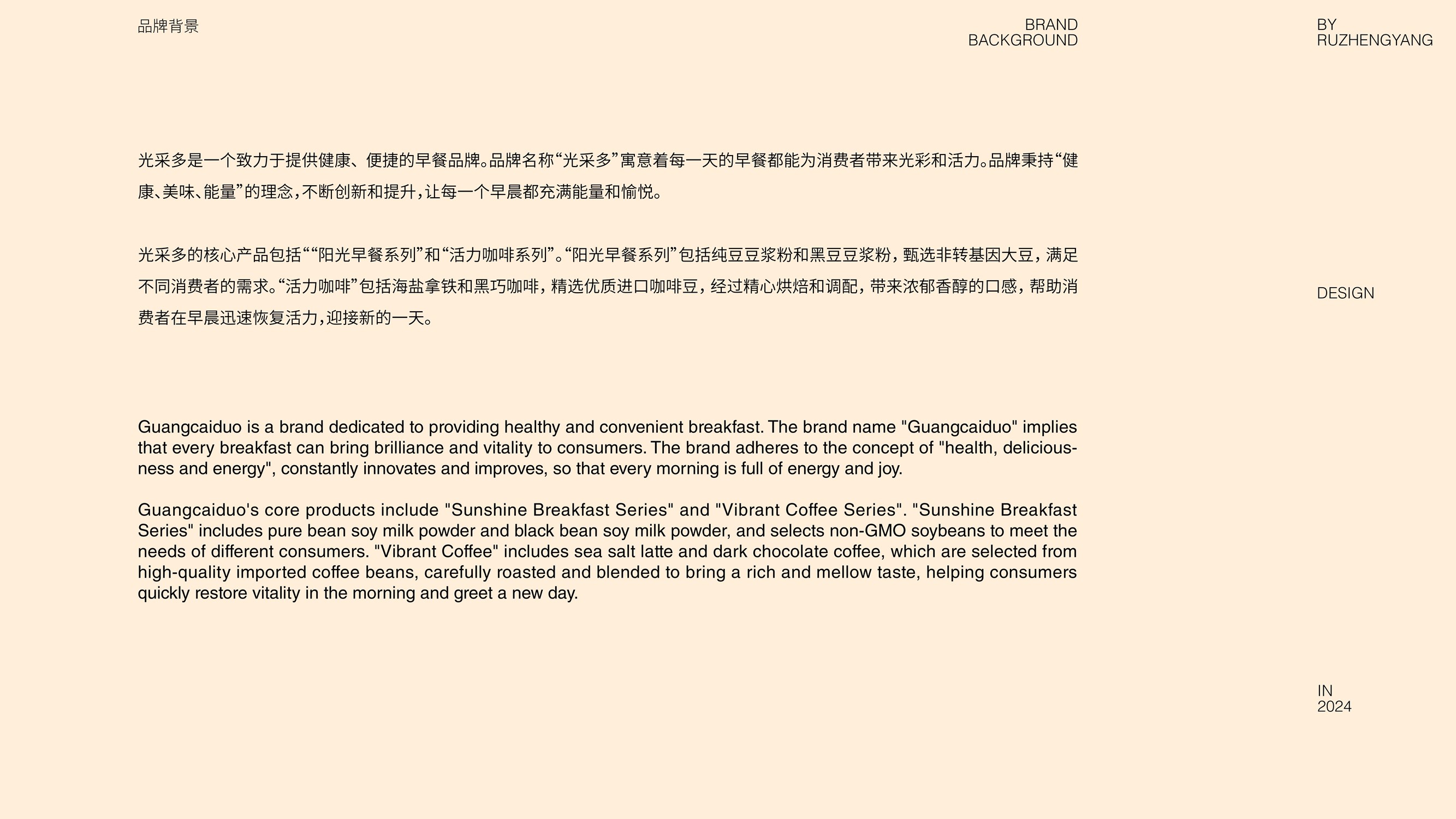
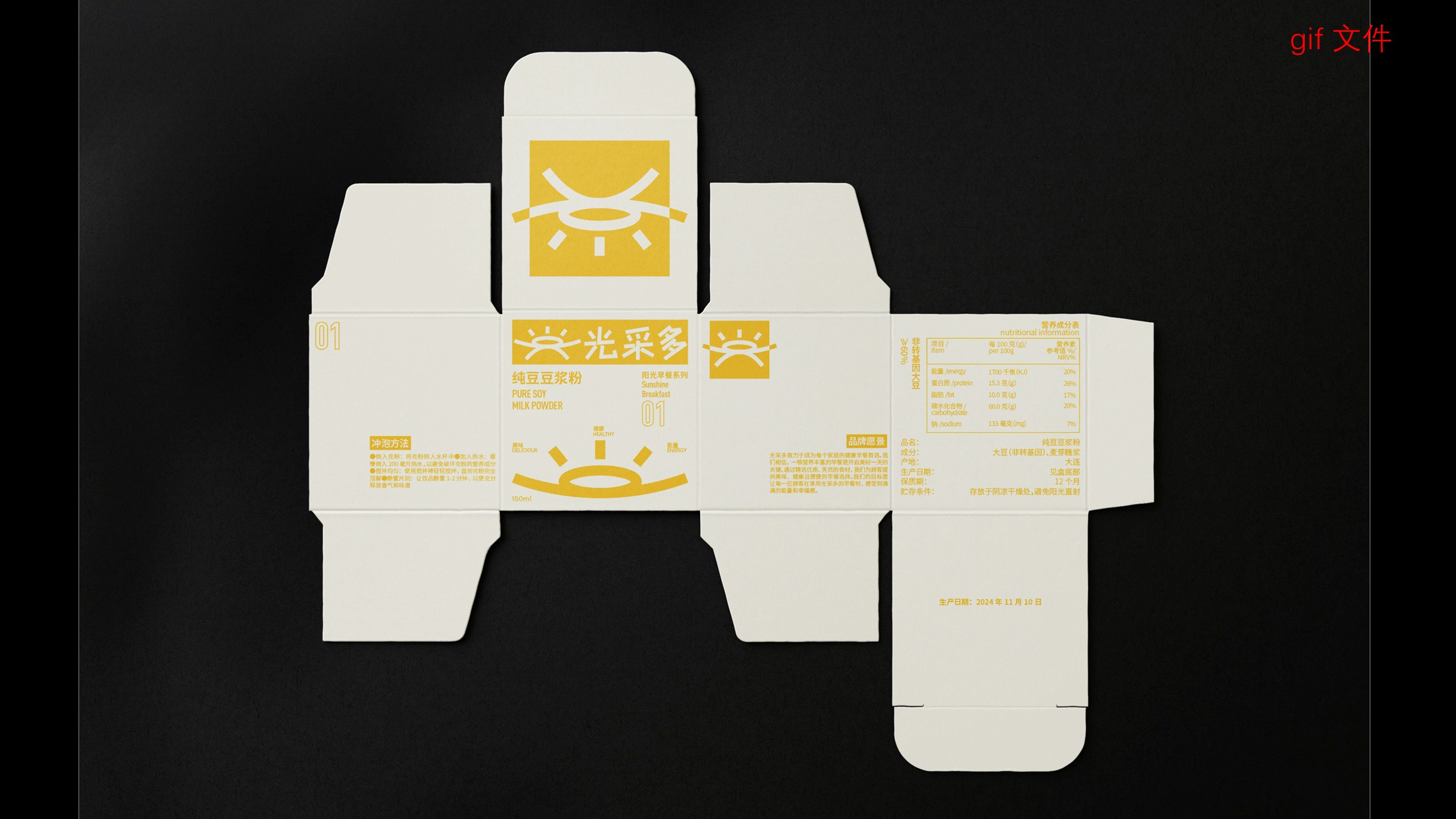
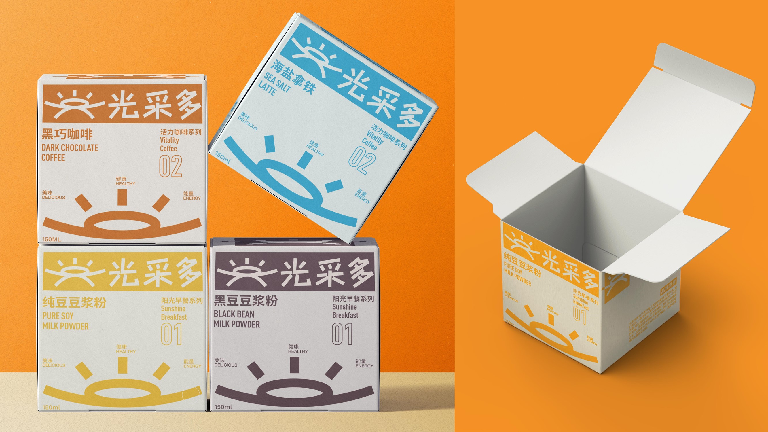
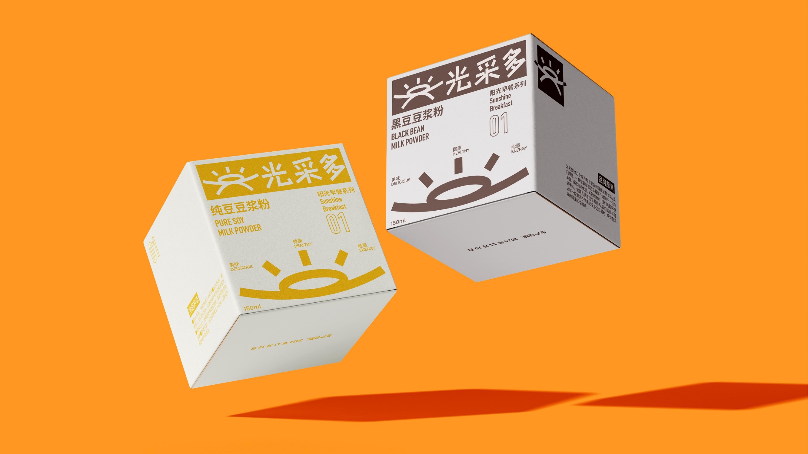
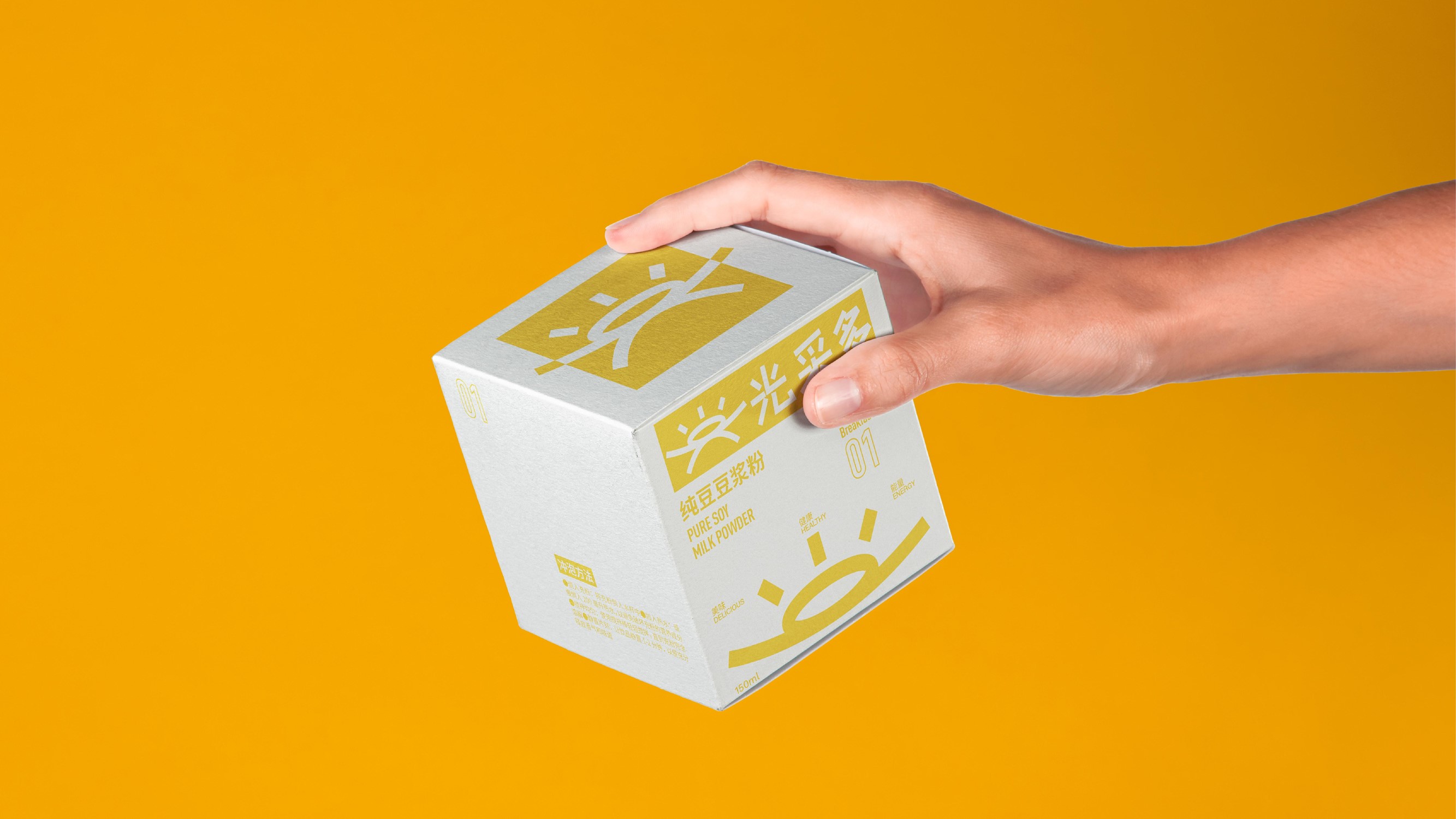
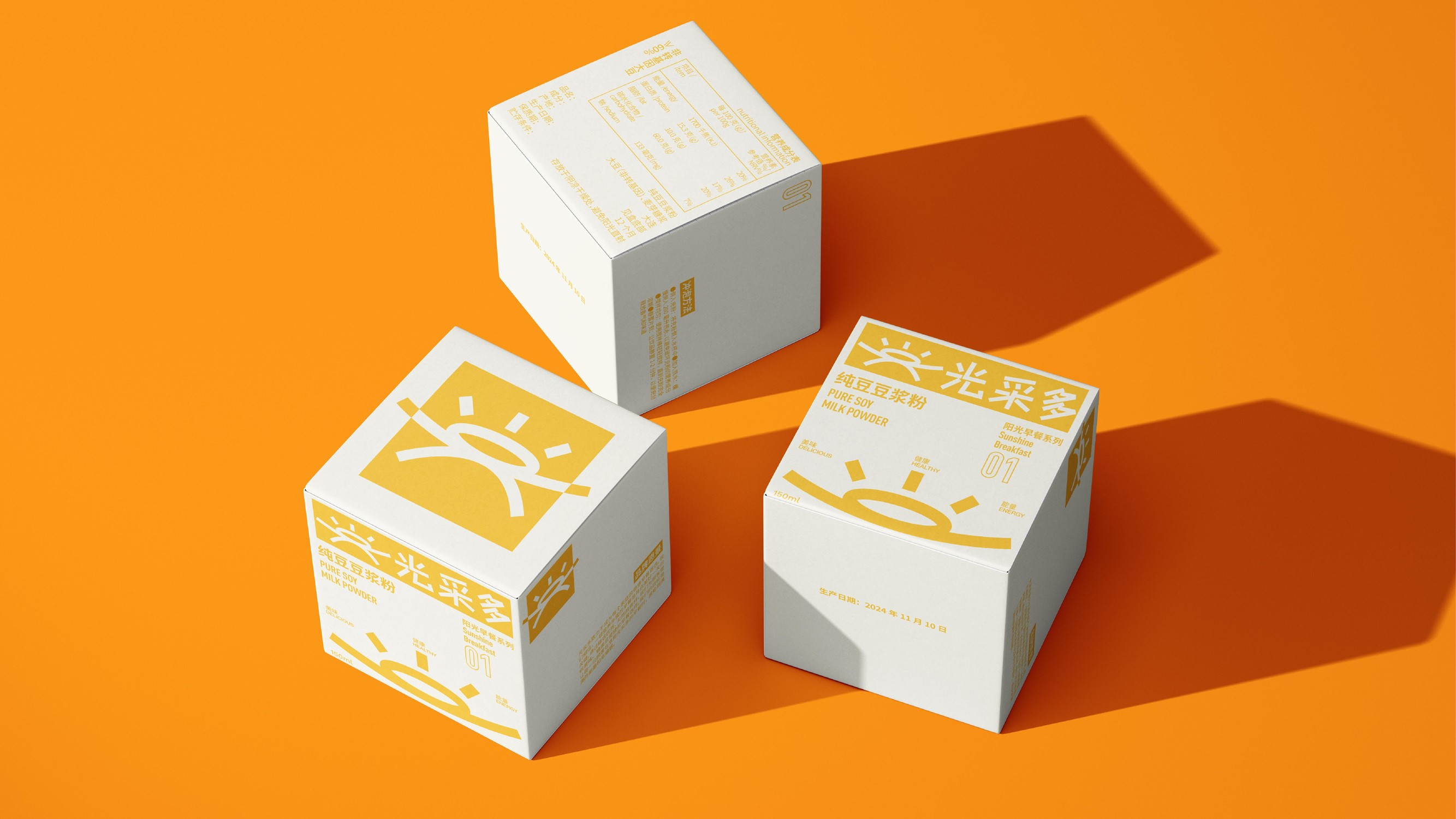
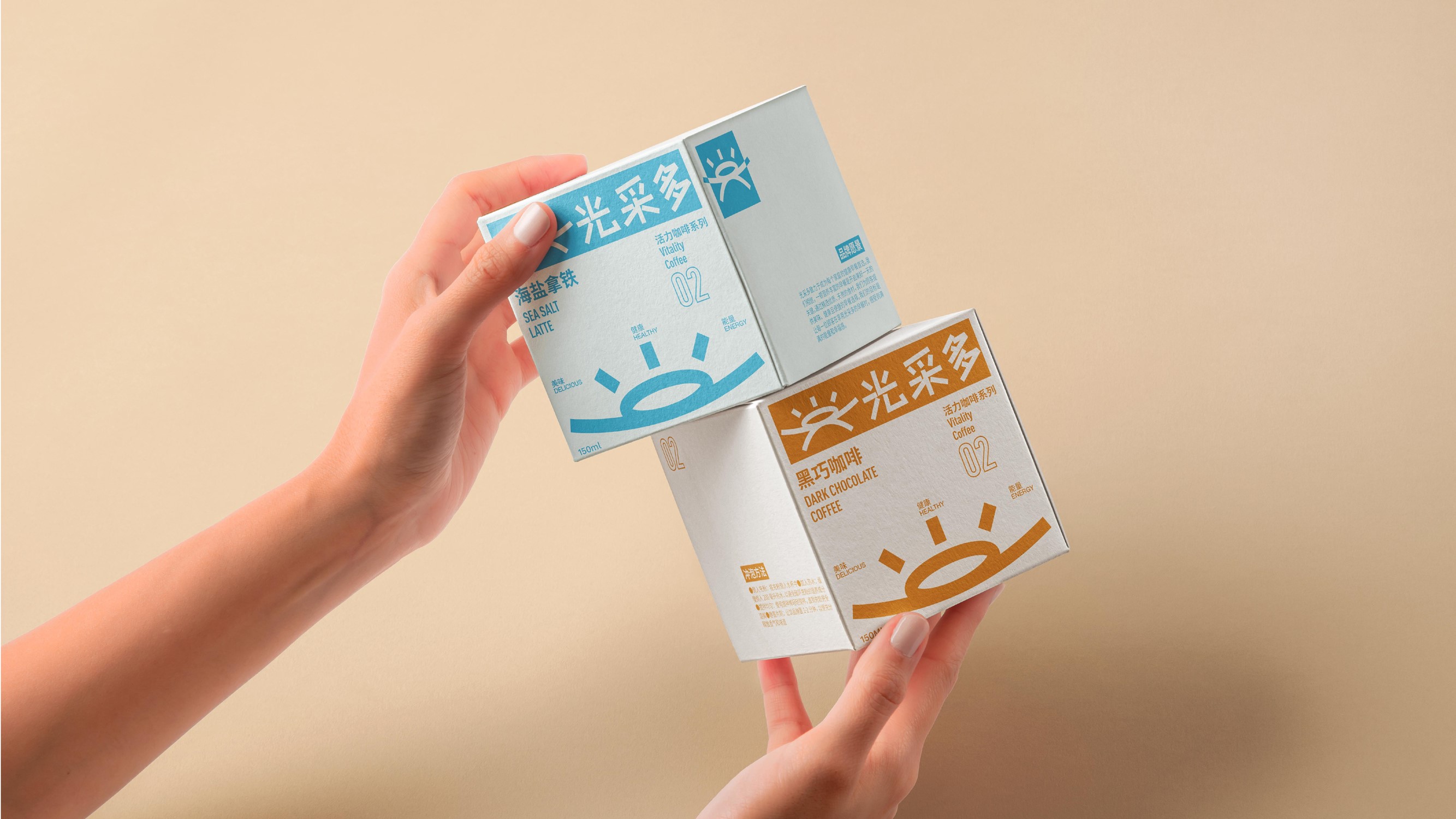
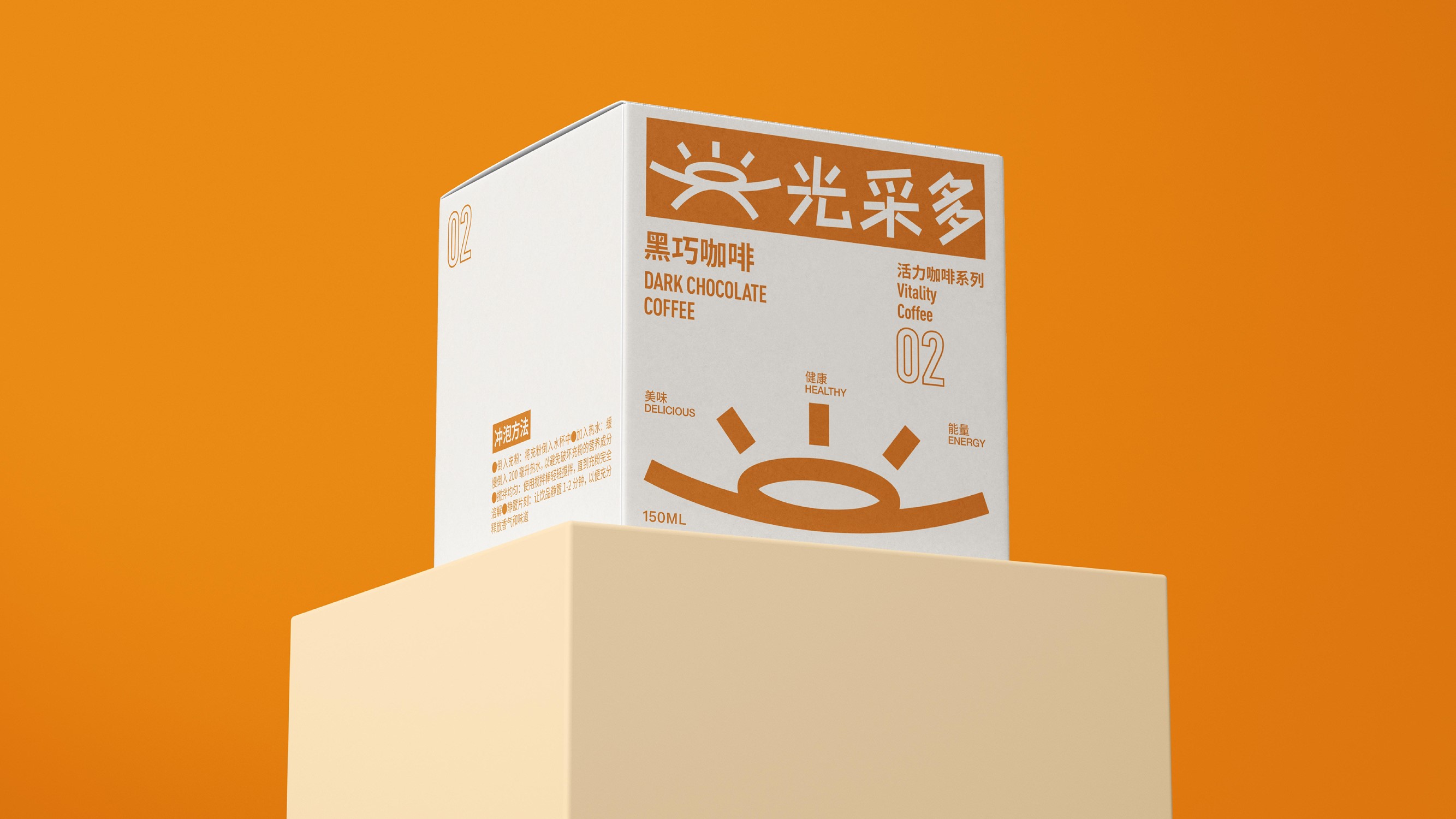
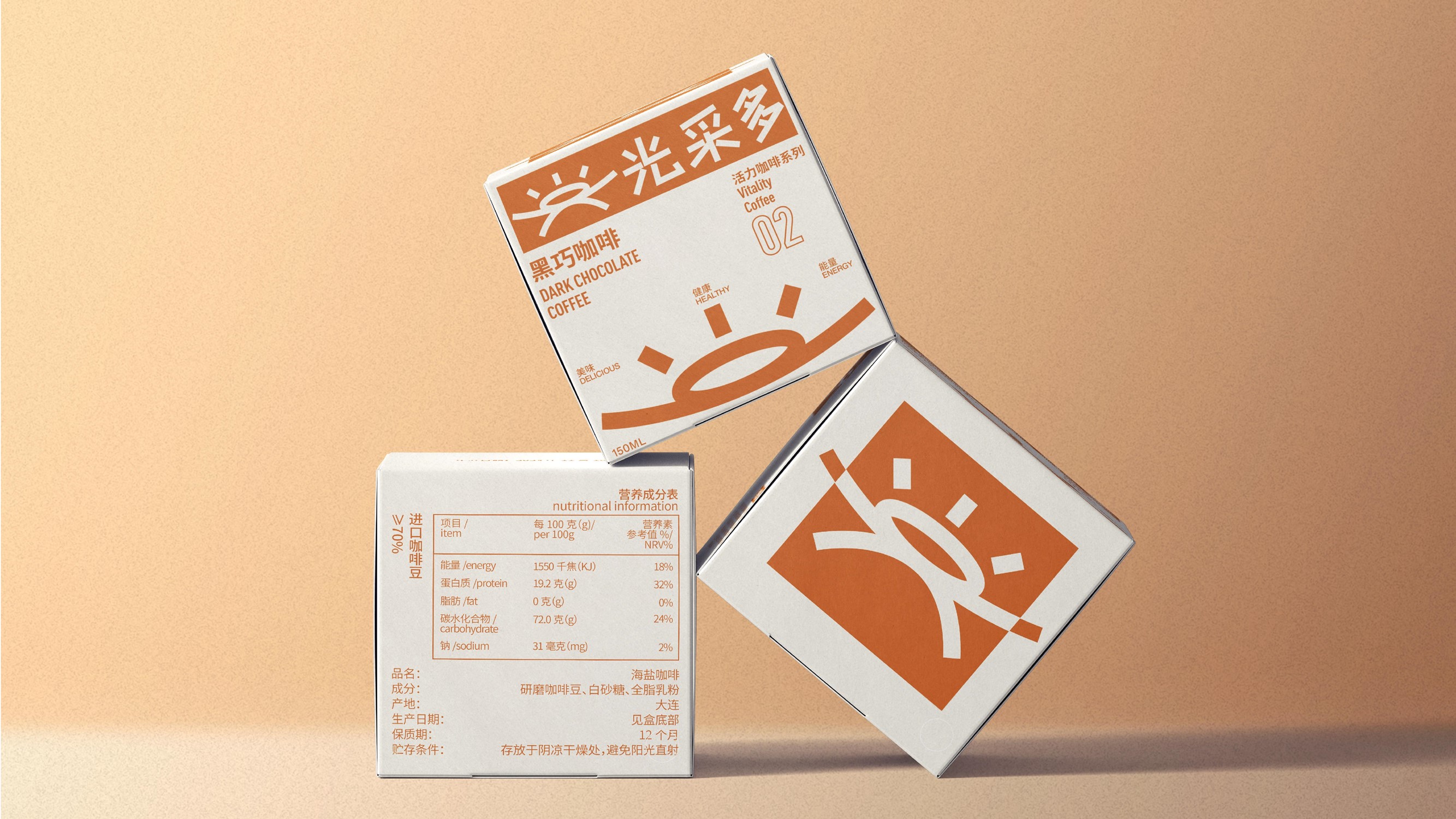
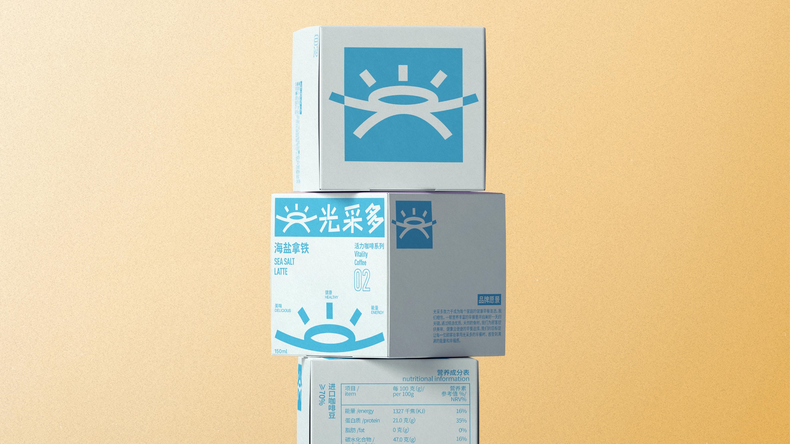
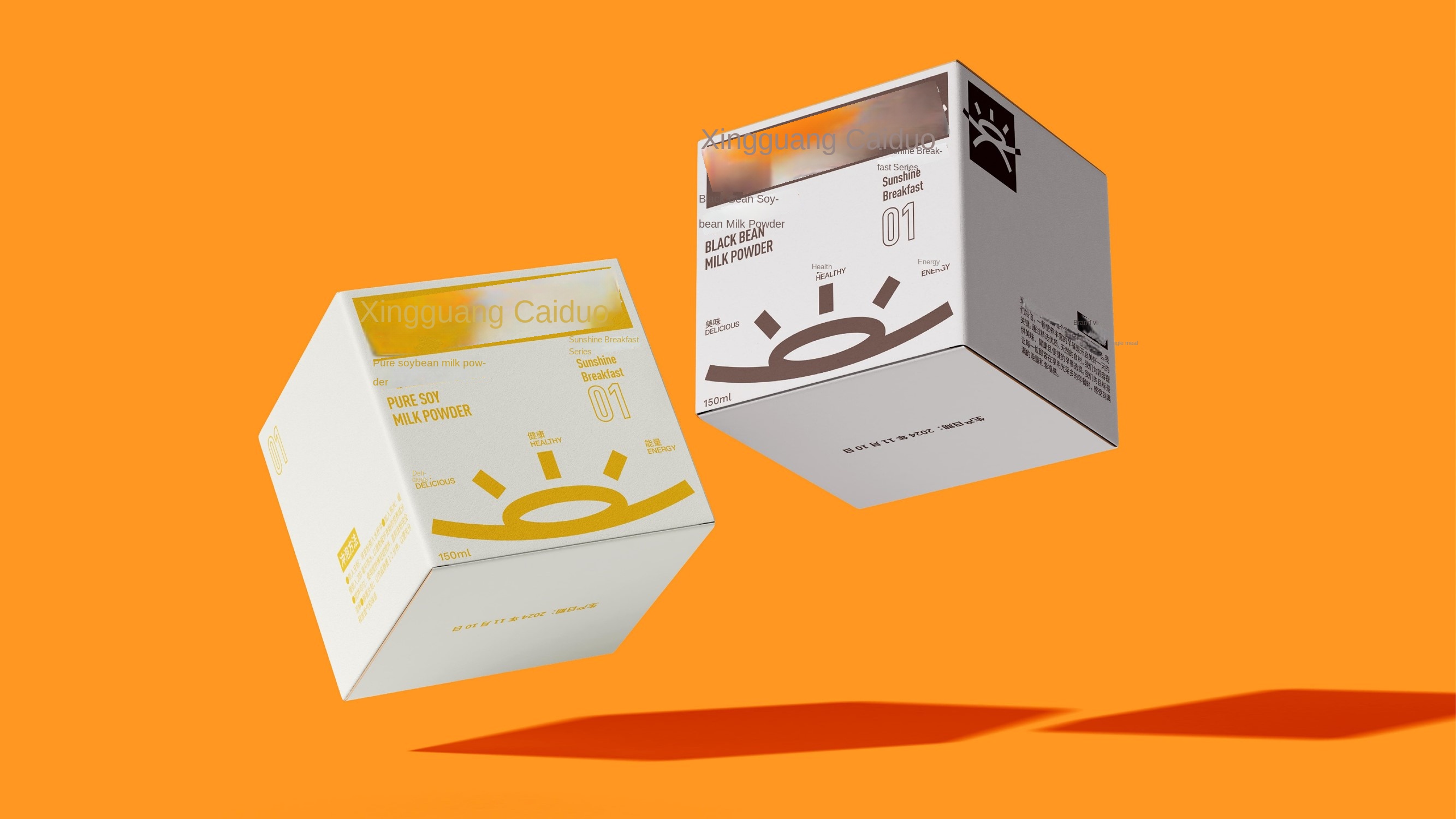
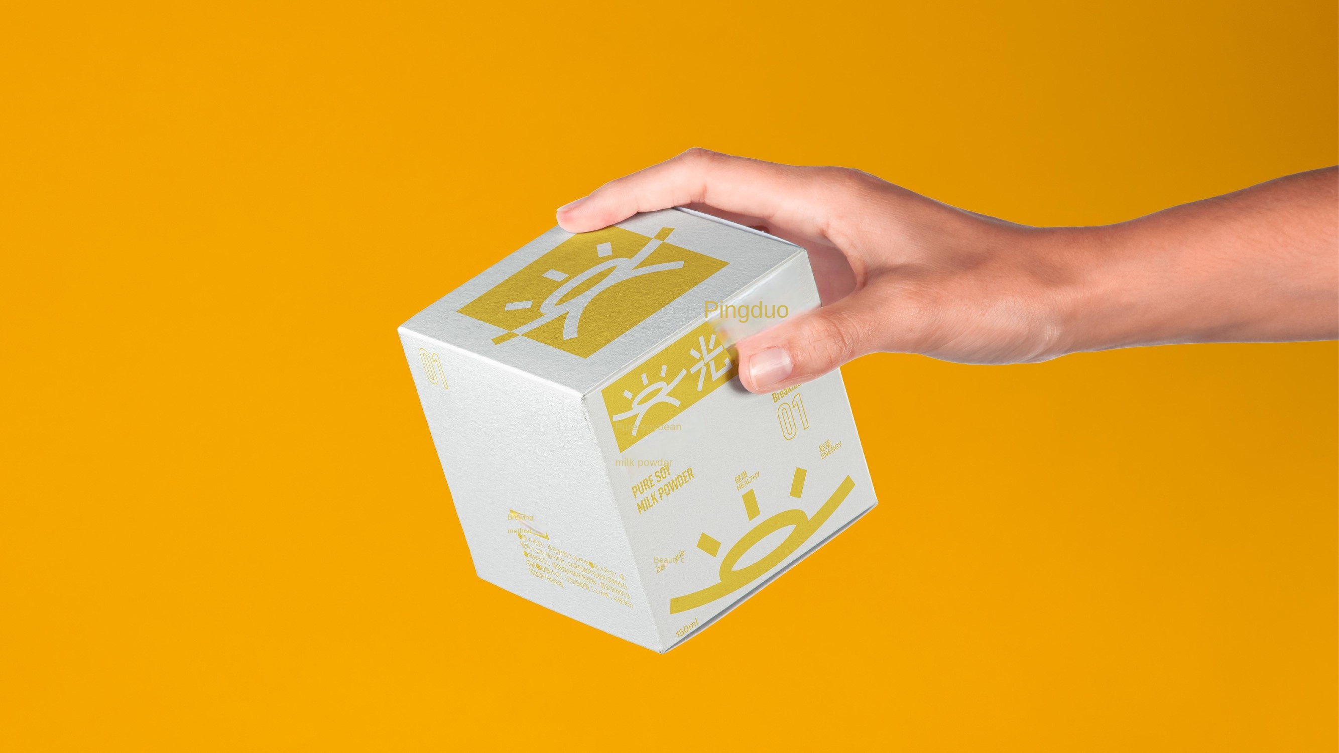
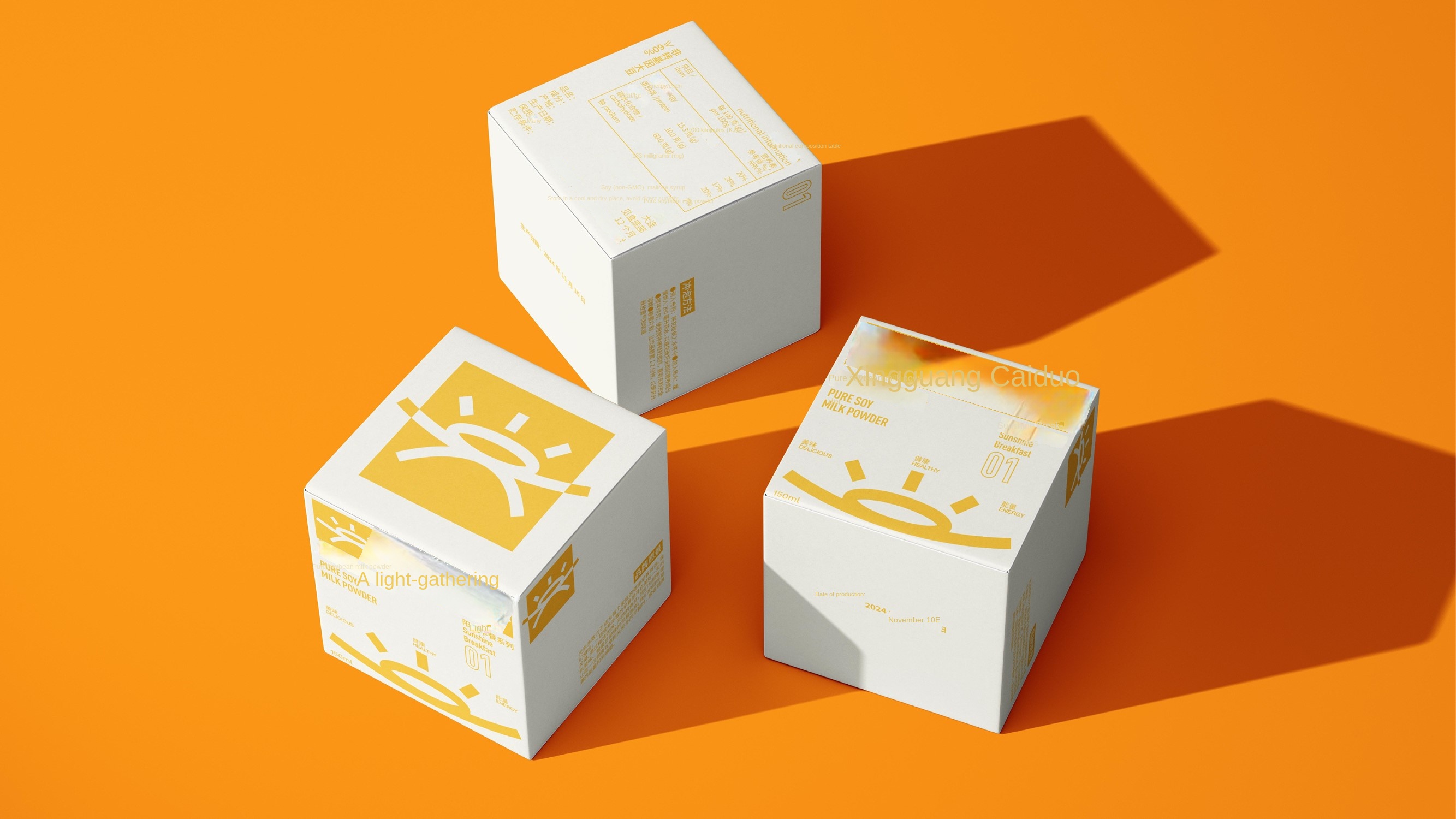
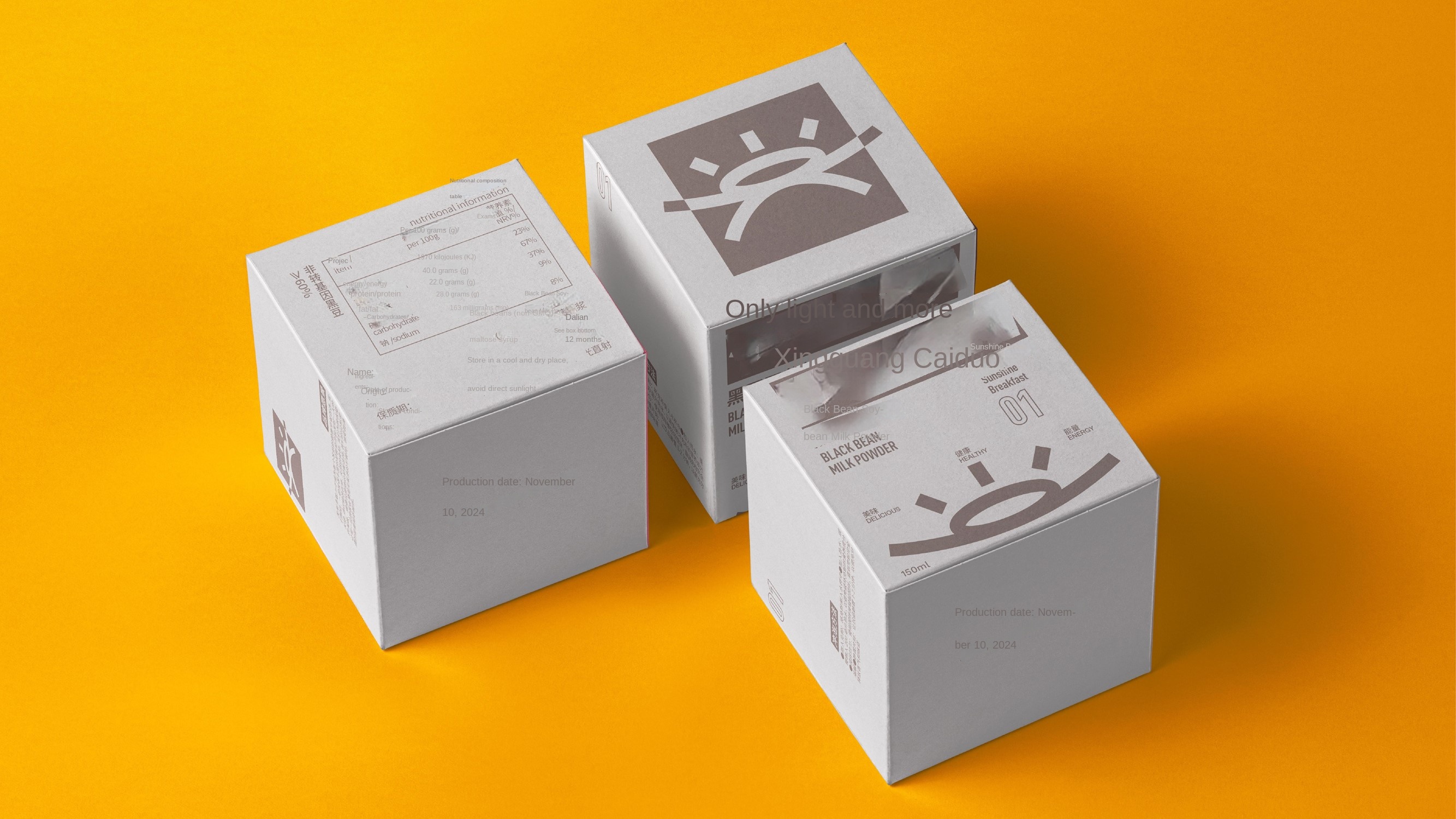
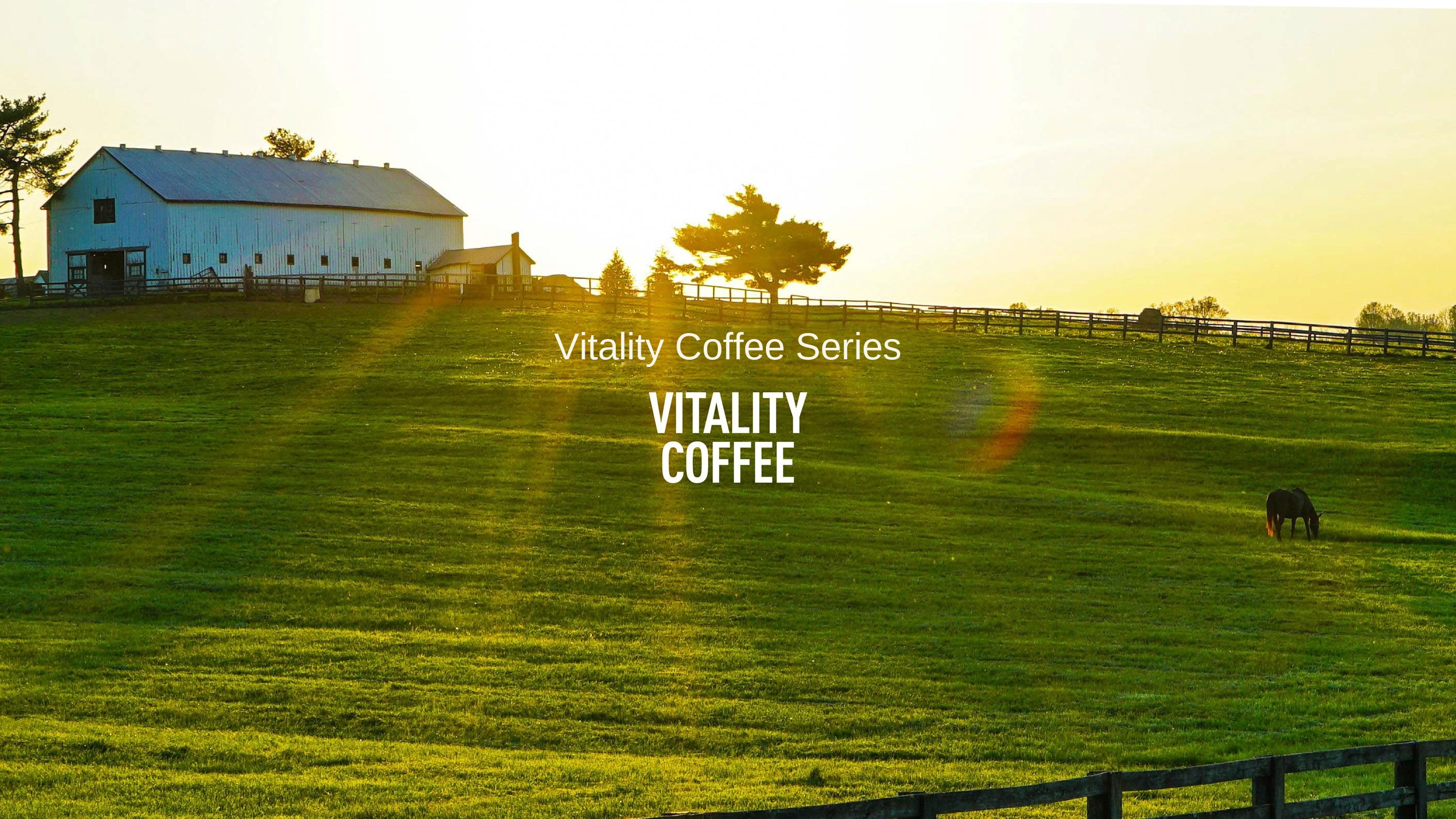
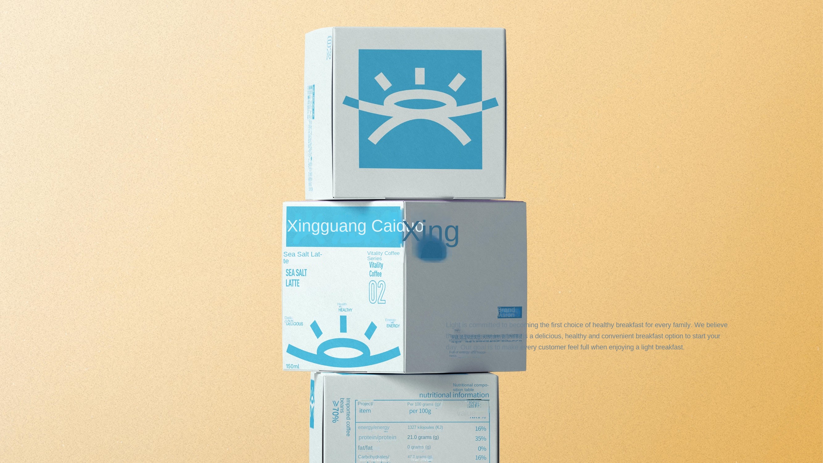
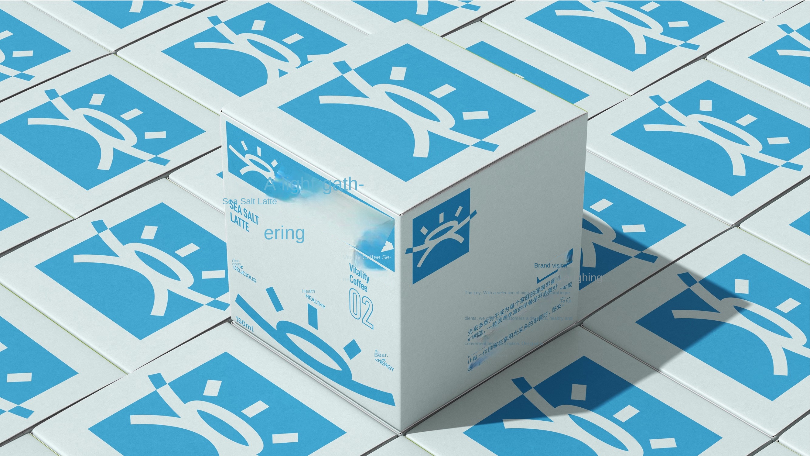
Light is a brand dedicated to providing healthy and convenient breakfast. The brand name "light and more" means that every day's breakfast can bring brilliance and vitality to consumers. The brand adheres to the concept of "healthy, delicious and energy", and constantly innovates and improves, so that every morning is full of energy and pleasure.
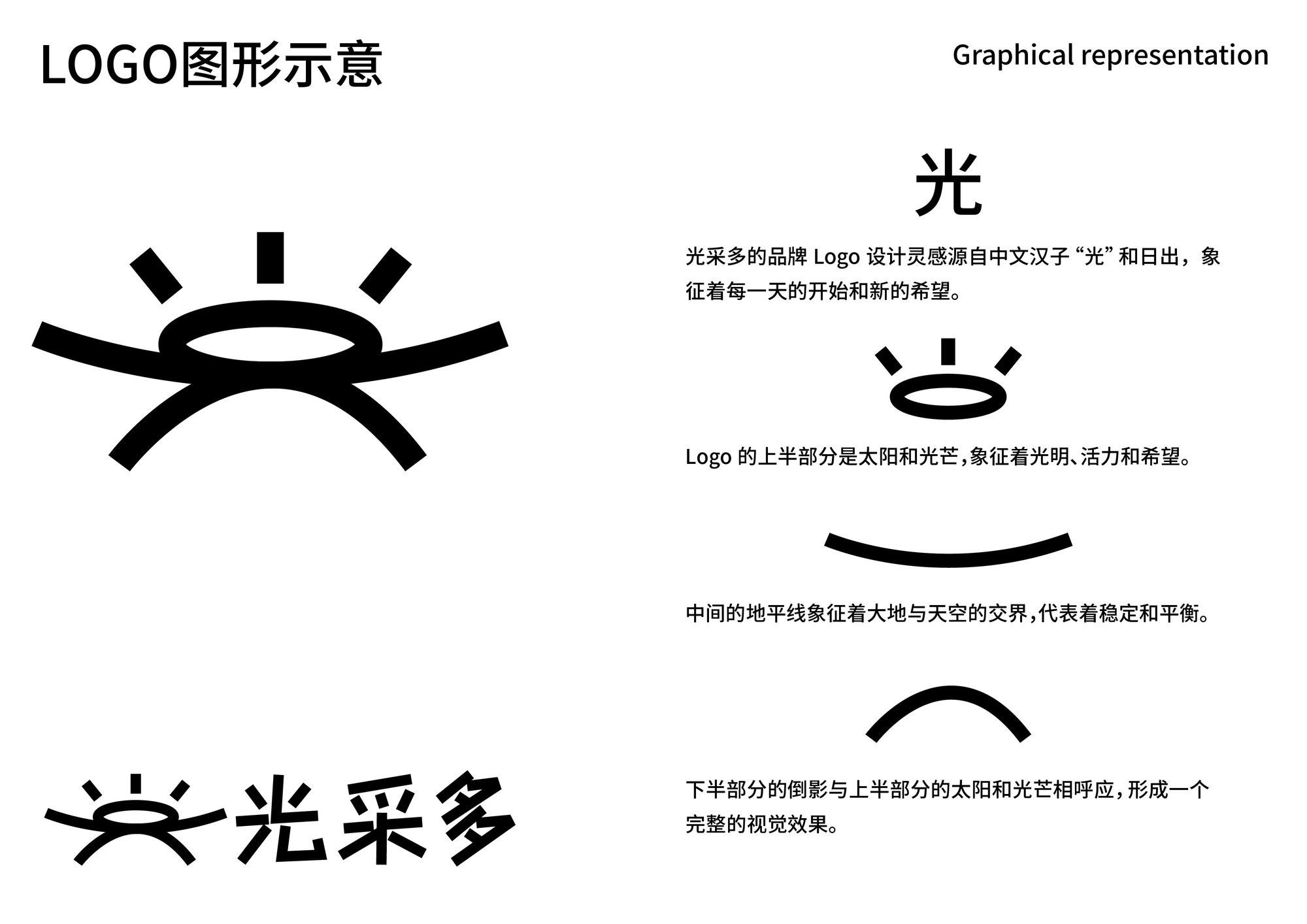
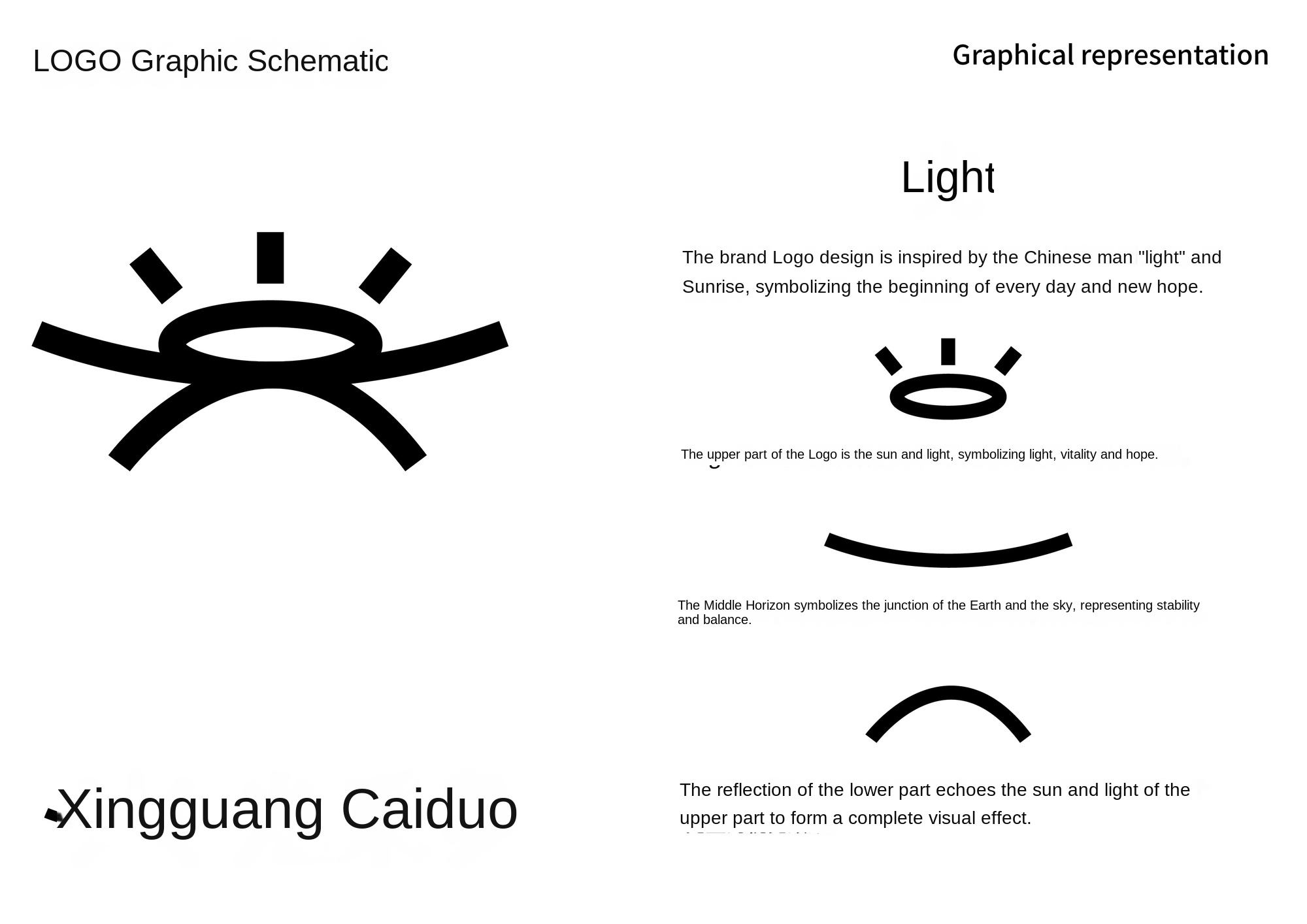
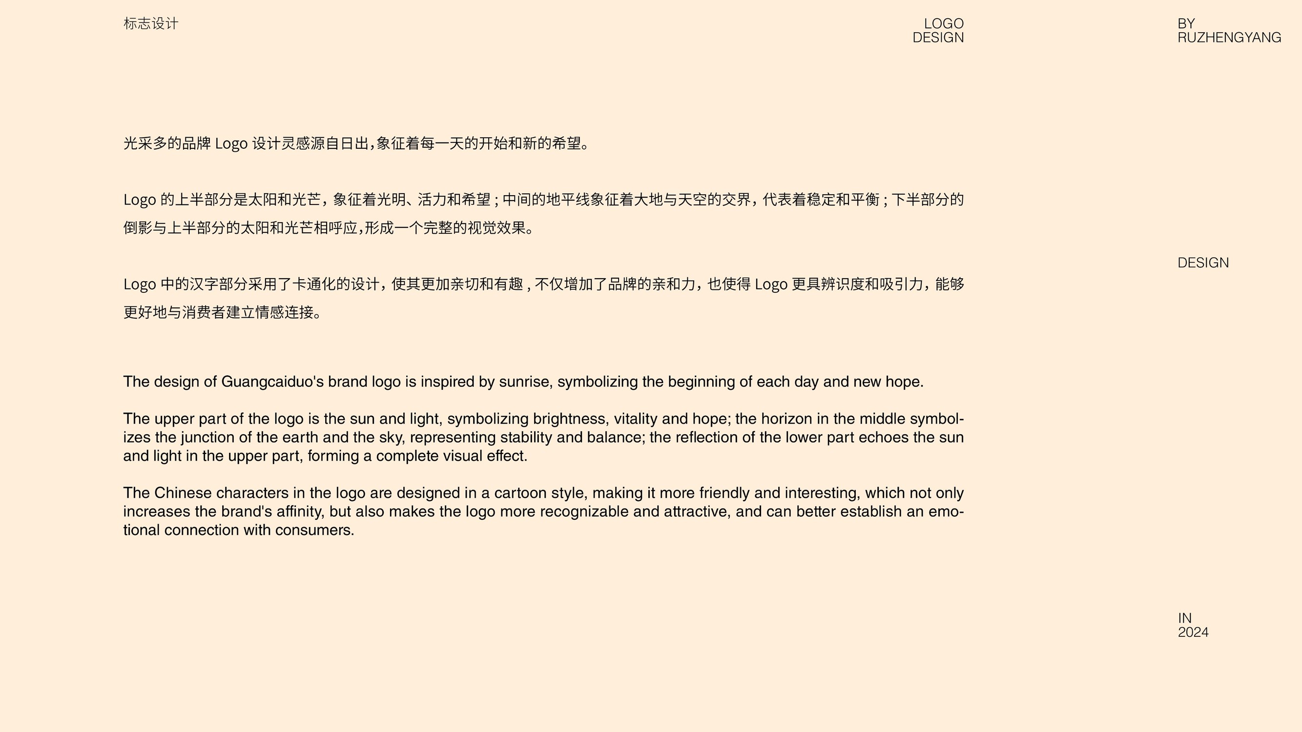
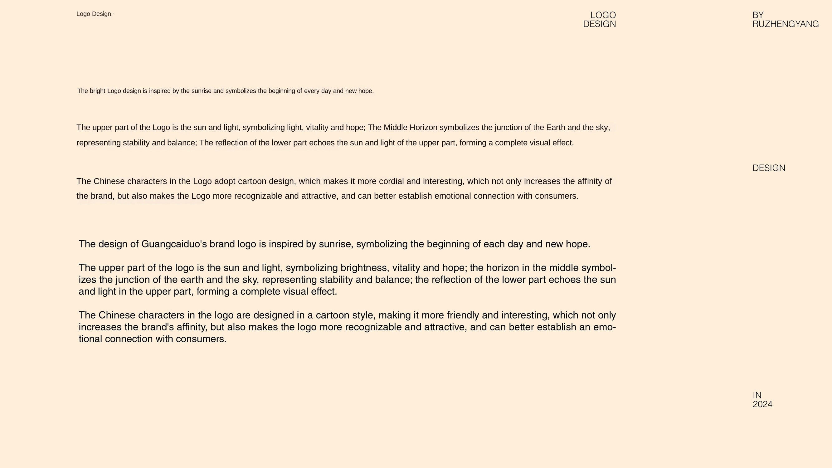
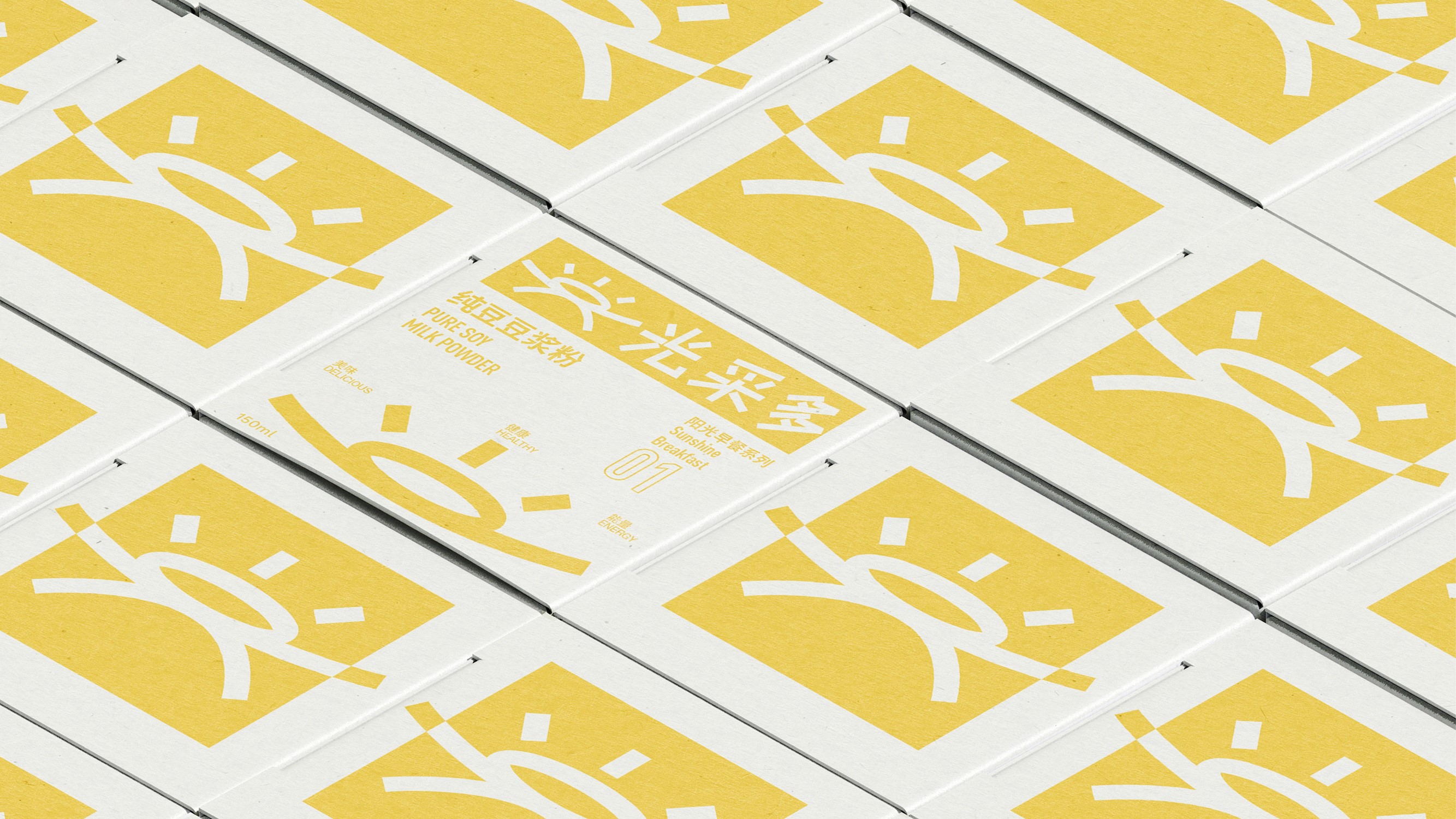
The upper part of the Logo is the sun and light, symbolizing light, vitality and hope; the middle horizon symbolizes the junction of the earth and the sky, representing stability and balance; the reflection of the lower part echoes the sun and light of the upper part, forming a complete visual effect. The Chinese character part of the Logo uses a cartoon design to make it more cordial and interesting, which not only increases the affinity of the brand, but also makes the Logo more recognizable and attractive, and can better establish emotional connections with consumers.
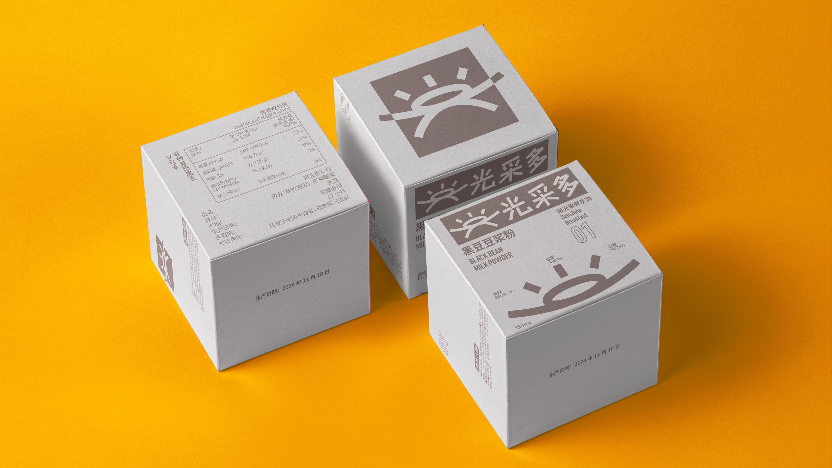
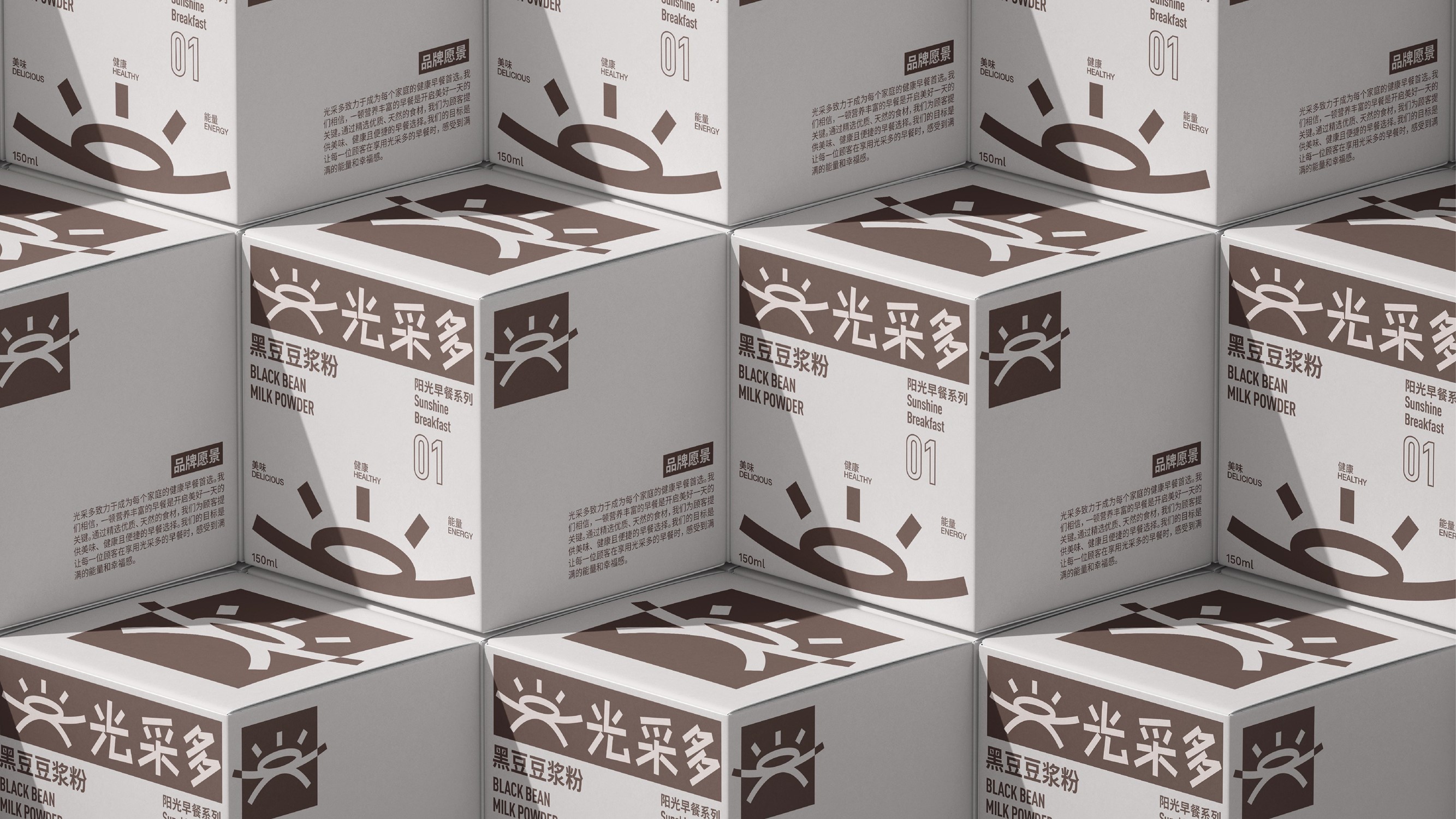
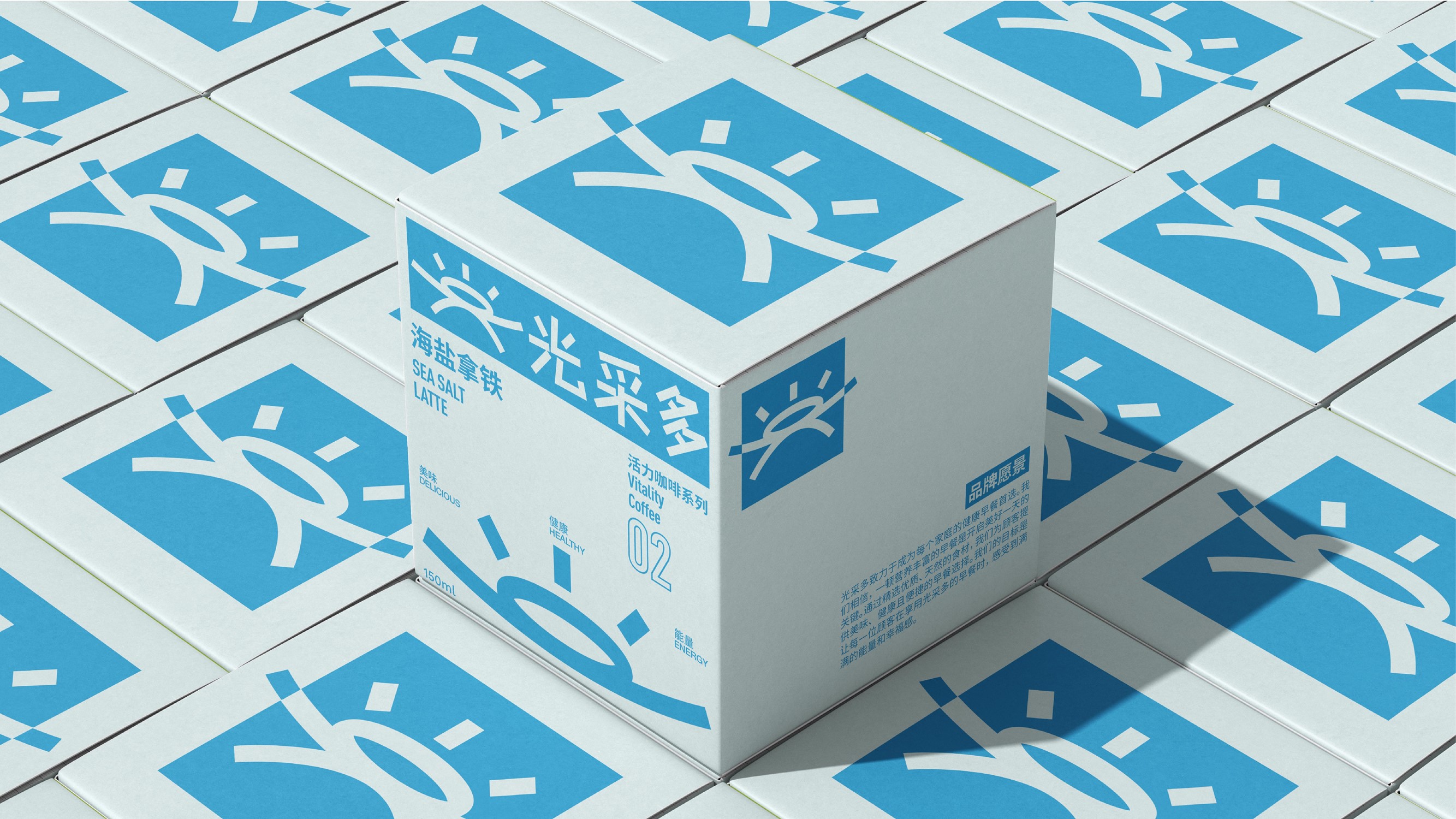
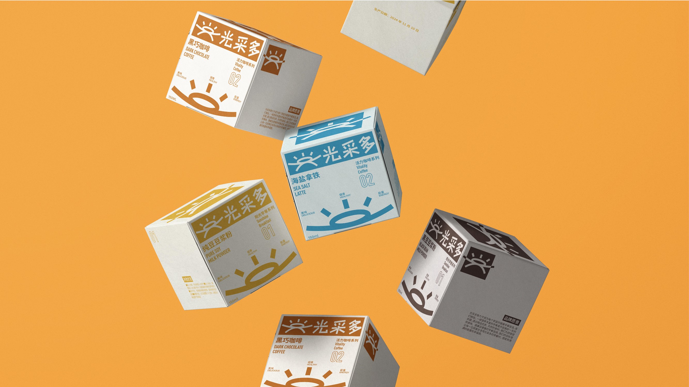
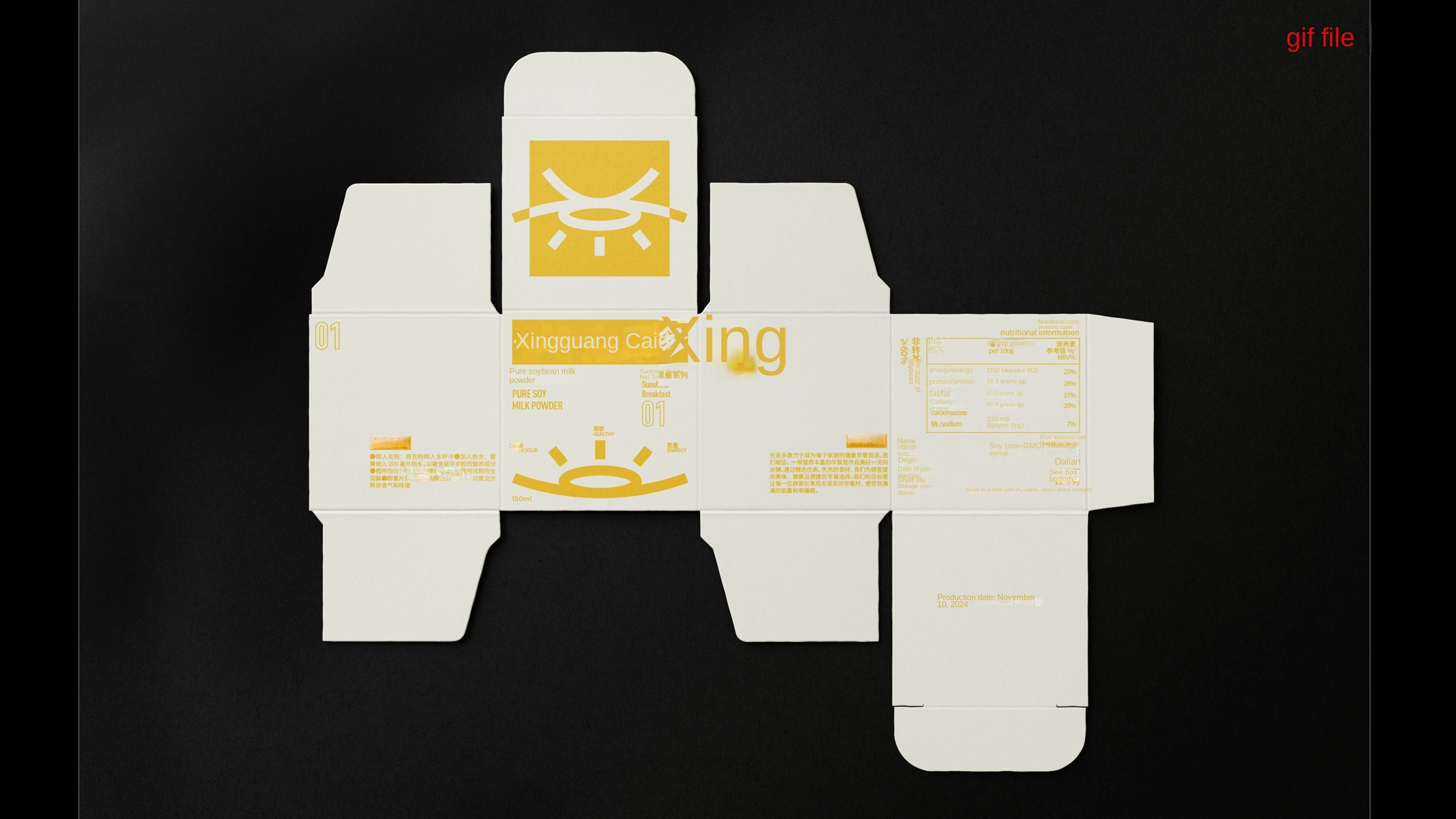
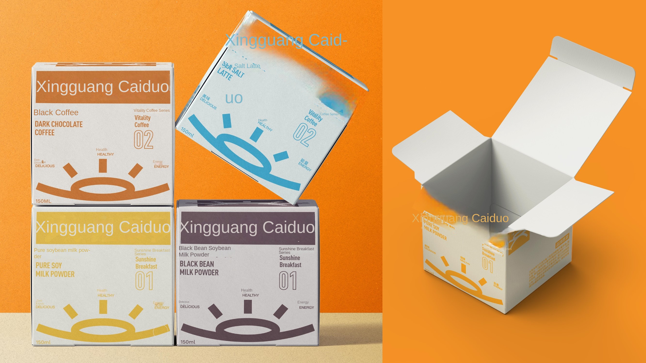
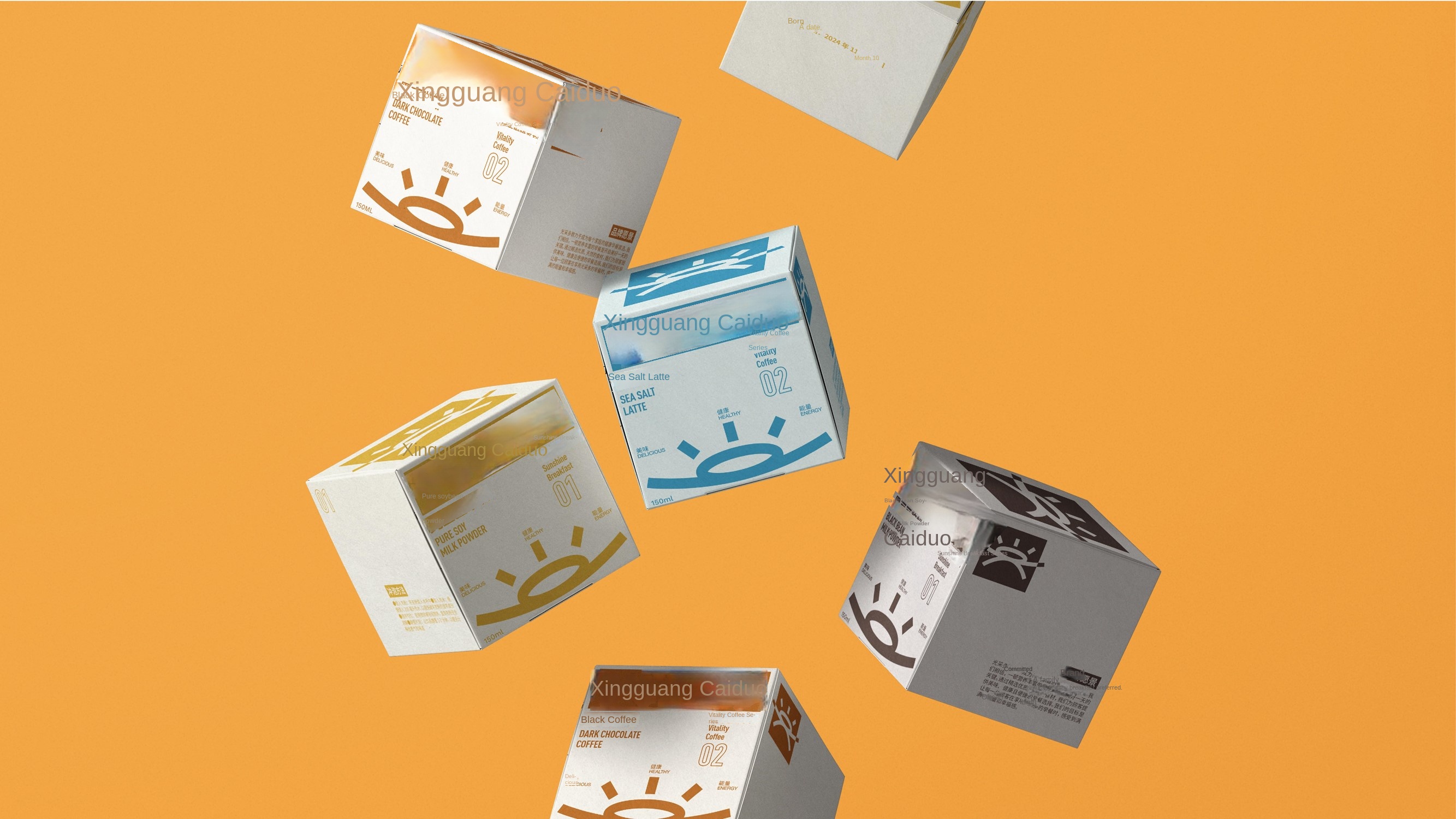
GUANGCAIDUO is a brand dedicated to providing healthy and convenient breakfasts. The brand name "GUANGCAIDUO" means that every day's breakfast can bring brilliance and vitality to consumers. The brand adheres to the concept of "health, deliciousness, energy", and constantly innovates and improves, so that every morning is full of energy and joy.
The upper part of the logo is the sun and rays, symbolizing light, vitality and hope; The horizon in the middle symbolizes the junction of the earth and the sky, representing stability and balance; The reflection of the lower half echoes the sun and light in the upper half to form a complete visual effect. The Chinese characters in the logo are designed with cartoons to make it more intimate and interesting, which not only increases the affinity of the brand, but also makes the logo more recognizable and attractive, and can better establish an emotional connection with consumers.
Committed to through the Chinese characters, in-depth mining meaning, through the design of the way to express.
A junior student and a student of 869 Design School, he has won the C- IDEA and Jin Daiqiang Design Award, the Cross-Strait Chinese Character Cultural and Creative Competition, and the Russian Golden Bee.

