


NEIWAI Orange-Presentation Film
NEIWAI Orange-1
NEIWAI Orange-2

NEIWAI Orange-3

NEIWAI Orange-4
NEIWAI Orange-5
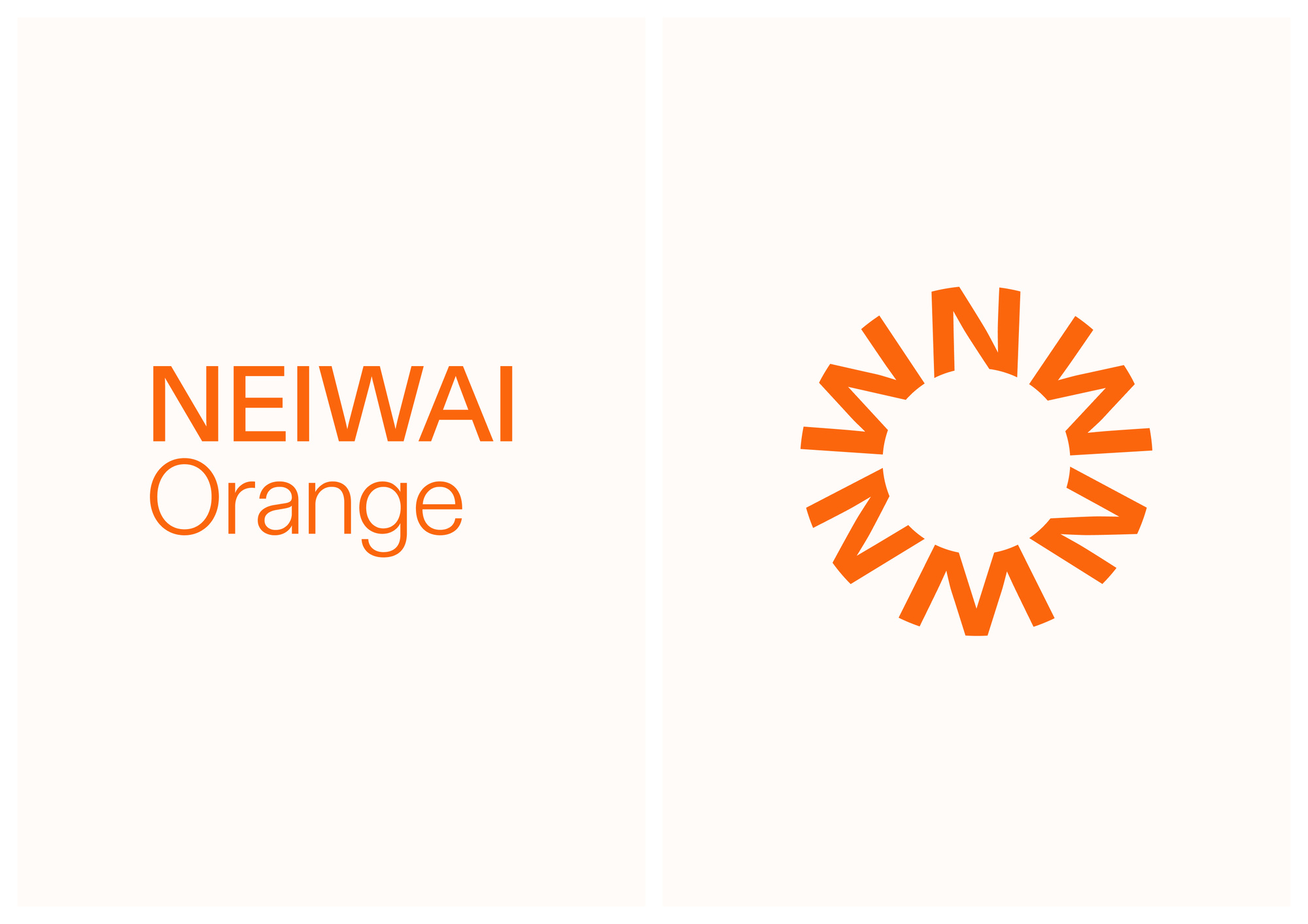
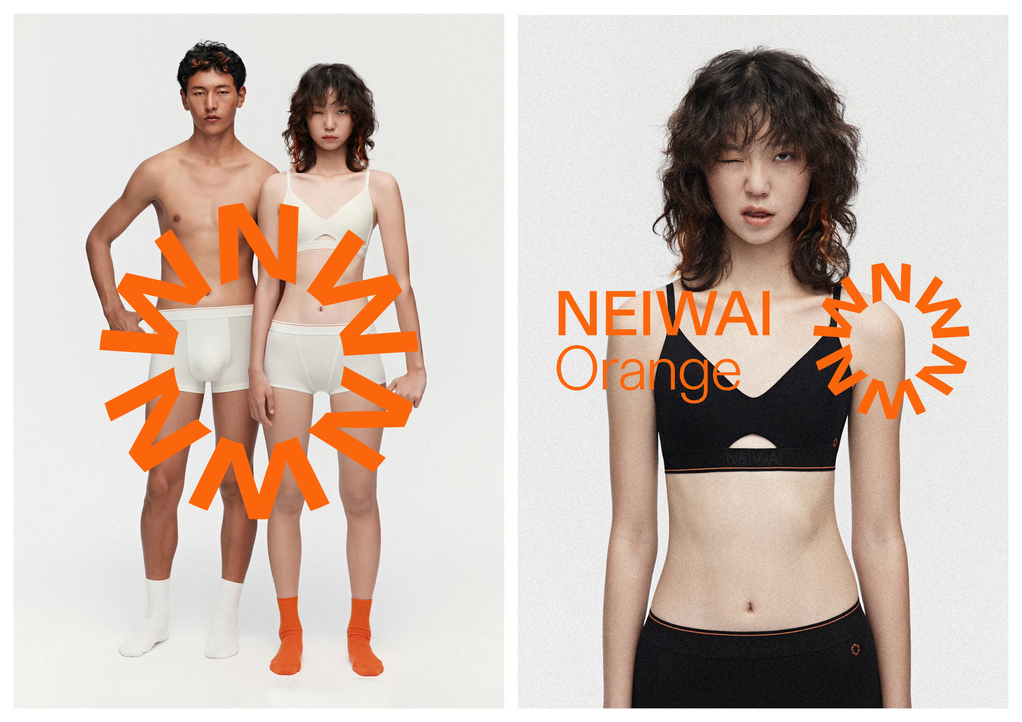
NEIWAI Orange内外橙标是生活方式品牌NEIWAI内外推出的全新子品牌。内外希望帮助女性建立由内(内涵)至外(外衣)的自信态度,主张“做一件让人身心自由的内衣”。有别于NEIWAI内外的女性视角,NEIWAI Orange内外橙标定位在日常生活中都需要的,气质中性的基本款。在相对精简的品类与产品结构之下,依然能体现出探索出更多日常生活的趣味,挖掘更鲜活的穿着感受。
我们挑选了富含活力的橙色,广泛应用于产品、包装、广告和展示中,传达出不受限于单一性别和特定年龄的品牌印象。
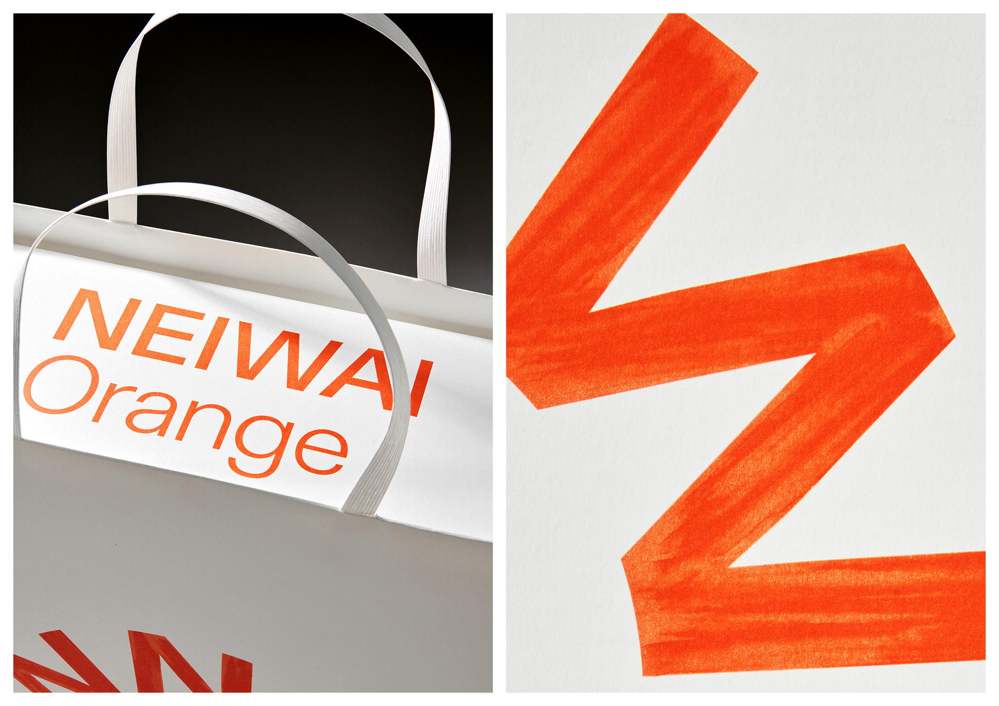
基于品牌主要在线上销售的应用需求,在品牌图标设计上去除了多余的修饰,旨在呈现一个干净且开放的图形。我们希望它能在移动端和网页端上使用时,被精细地展示和清晰地识别。也兼顾线下使用的需求,在被放大时看到其转折的笔触细节,传达出艺术化的细致感受。
随着NEIWAI内外的进一步市场拓展,我们希望NEIWAI Orange内外橙标也能够为消费者提供更多选择,在习以为常的穿衣理念中找寻崭新的创造力。
NEIWAI Orange is a new sub-brand of NEIWAI, a lifestyle brand focused on helping women build confidence through underwear that promotes freedom for both body and mind. NEIWAI Orange offers unisex daily basics, bringing a fun, creative approach to everyday wear.
We chose a vibrant orange color, widely used in products, packaging, advertising, and displays, to convey a brand image that is not limited by gender or age.
As NEIWAI Orange is primarily sold online, the logo design is clean and simple, ensuring clarity and easy recognition across online platforms. Offline, the logo’s details come to life, adding an artistic touch.
我们洞察到在后疫情时期,消费者对购物体验的反馈发生了很大的改变。消费者不再过度追求复杂的开箱所带来的仪式感,而是更青睐于让人轻松且无负担的购物体验。我们为品牌设计鲜活的视觉形象及轻量的包装耗材呼应了时代的改变。
NEIWAI Orange内外橙标的LOGO是一个由多组字母NW组成的圆。圆形源自于 Orange 的 O,同时也是一颗橙子的轮廓。NEIWAI Orange 内外橙标是中国女性内衣品牌 NEIWAI内外推出的全新子品牌,缩写字母 NW 的使用便于与消费者建立认知。NEIWAI Orange 希望在相对精简的产品品类下,依然能挖掘出更鲜活的穿着体验,我们选取了具有生命力的书写肌理,来呼应这一品牌愿景。
当然我们使用了橙色作为唯一的品牌色,不仅仅源于名字中的Orange,同时也在传达一种明快的、具有蓬勃生命力的品牌情绪。
We, along with NEIWAI Orange, have observed significant changes in consumer feedback regarding shopping experiences in the post-pandemic era. Consumers no longer seek the elaborate ritual of complicated unboxing; instead, they prefer a more effortless and unburdened shopping experience. The vibrant brand visuals and lightweight packaging materials reflect this shift in consumer behavior.
The NEIWAI Orange logo consists of a circle made up of multiple sets of the letters "NW." The circle is inspired by the "O" in "Orange" and also represents the shape of an orange. NEIWAI Orange is a new sub-brand launched by NEIWAI, a Chinese women's lingerie brand, and the use of the acronym "NW" helps establish recognition with consumers. NEIWAI Orange aims to uncover a more vibrant wearing experience within a relatively streamlined product range. To reflect this brand vision, we chose a lively, textured writing style.
Of course, orange is used as the sole brand color, not only because of its presence in the name "Orange" but also to convey a bright, energetic brand mood full of vitality.
UDL是一家多合伙人团队、多学科的设计工作室,提供品牌形象、工业产品、包装、数字艺术、美术指导等多个方向的设计及咨询服务。 我们的设计由好奇心、创造力、爱和技术构成。 UDL is a design and creative studio. We provide design and consulting services to clients from both commercial and cultural fields. You can get to know us through our past works. We design with curiosity, creativity, love, and technology. We strive for excellence.

