


NEIWAI Orange-Presentation Film

NEIWAI Orange-1

NEIWAI Orange-2

NEIWAI Orange-3


NEIWAI Orange-4

NEIWAI Orange-5
NEIWAI Orange Inside and Outside Orange Label is a brand new sub-brand launched by lifestyle brand NEIWAI inside and outside. Internal and external hope to help women establish a confident attitude from the inside (connotation) to the outside (coat), and advocate "making a person's body and mind free underwear". Different from the female perspective inside and outside NEIWAI, the orange logo inside and outside NEIWAI Orange is a basic model with neutral temperament that is needed in daily life. Under the relatively streamlined category and product structure, it can still reflect the interest of exploring more daily life and digging out a more vivid wearing experience.
We have selected a vibrant orange color that is widely used in products, packaging, advertising and display to convey brand impressions that are not limited to a single gender or a specific age.
Based on the needs of the application that the brand mainly sells online, the brand icon design has been removed from the redundant decoration, aiming to present a clean and open graphics. We want it to be finely displayed and clearly identified when used on mobile and web. It also takes into account the needs of offline use, and when it is enlarged, it can see the details of its turning strokes, conveying an artistic and detailed feeling.
With further market expansion inside and outside of NEIWAI, we hope that the orange label inside and outside of NEIWAI can also provide consumers with more choices and find new creativity in the clothing concept they are used.
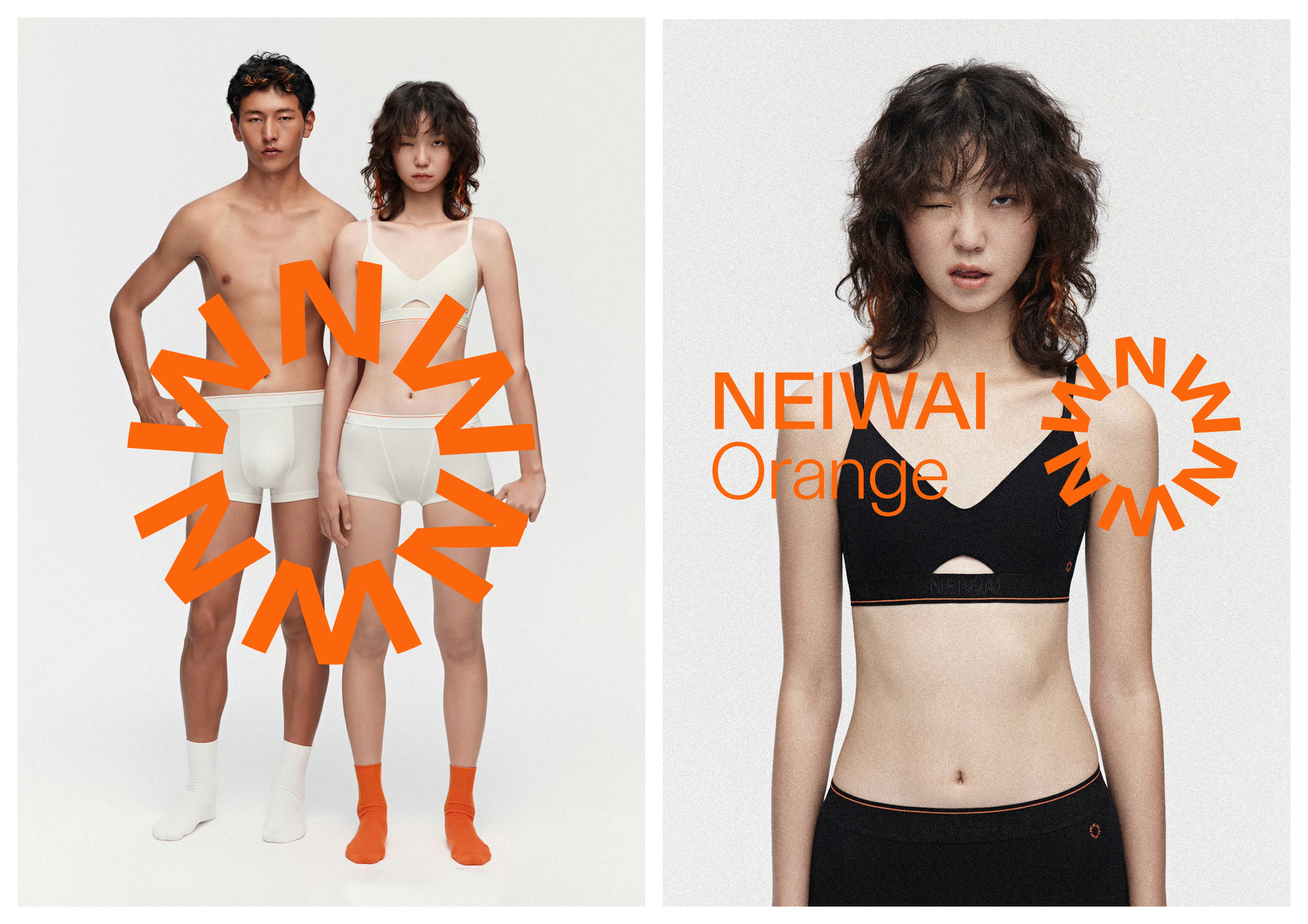
NEIWAI Orange is a new sub-brand of NEIWAI, a lifestyle brand focused on helping women build confidence through underwear that promotes freedom for both body and mind. NEIWAI Orange offers unisex daily basics, bringing a fun, creative approach to everyday wear.
We chose a vibrant orange color, widely used in products, packaging, advertising, and displays, to convey a brand image that is not limited by gender or age.
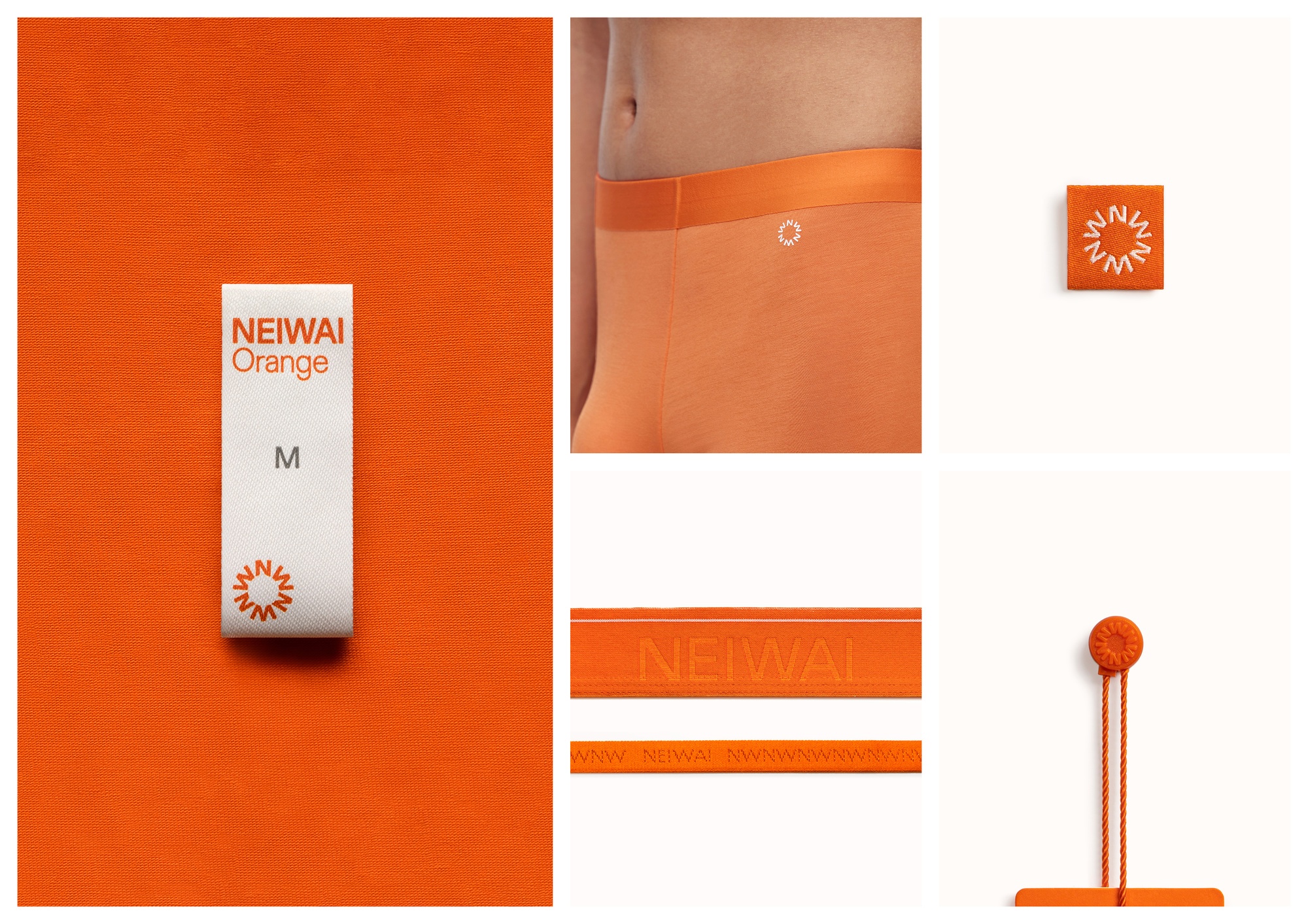
As NEIWAI Orange is primarily sold online, the logo design is clean and simple, ensuring clarity and easy recognition across online platforms. Offline, the logo's details come to life, adding an artistic touch.
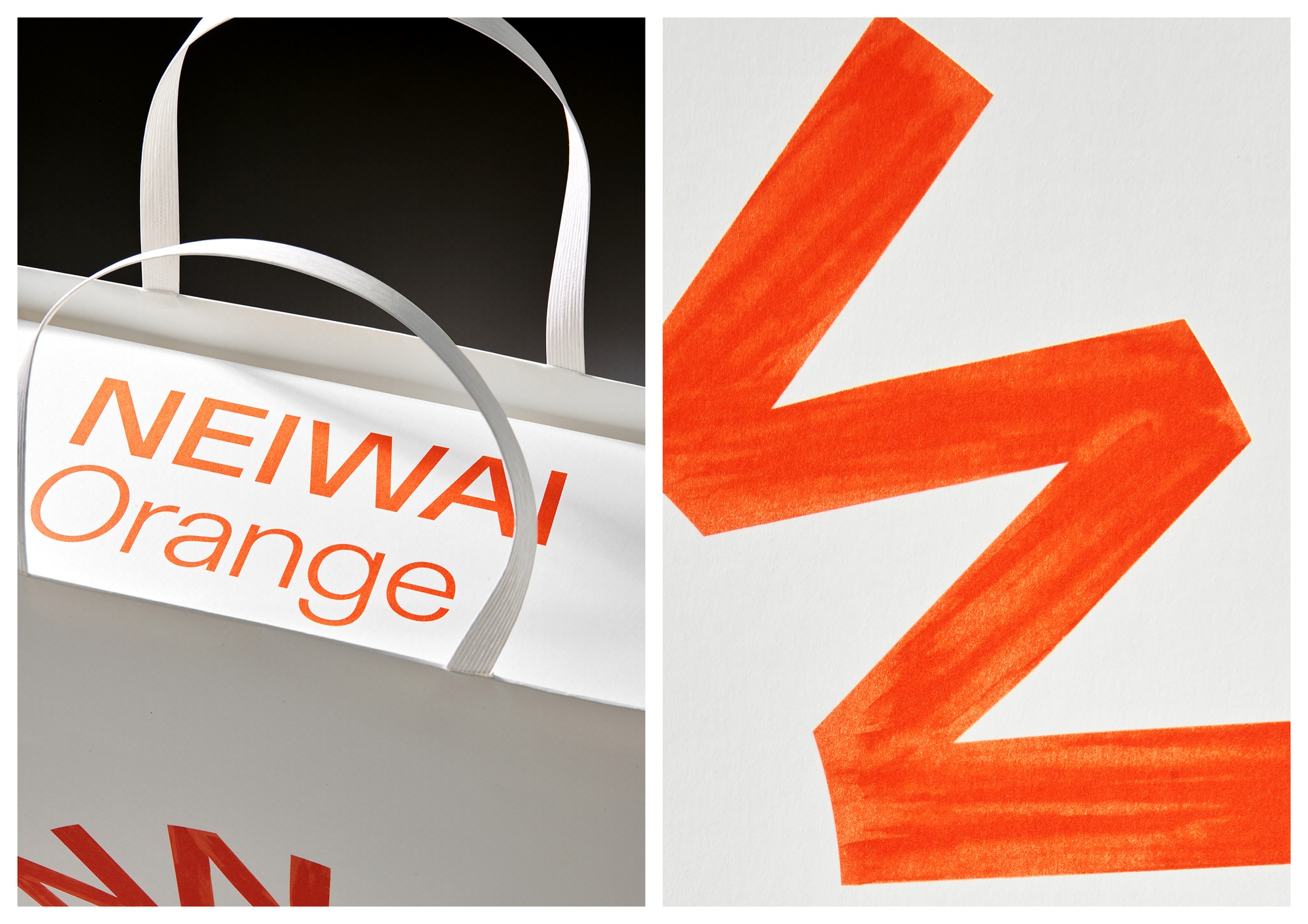
We have insight that consumer feedback on the shopping experience has changed considerably in the post-epidemic period. Consumers no longer excessively pursue the sense of ritual brought by complex unpacking, but prefer a relaxed and unburdened shopping experience. We design a vivid visual image and lightweight packaging consumables for the brand to echo the changes of the times.
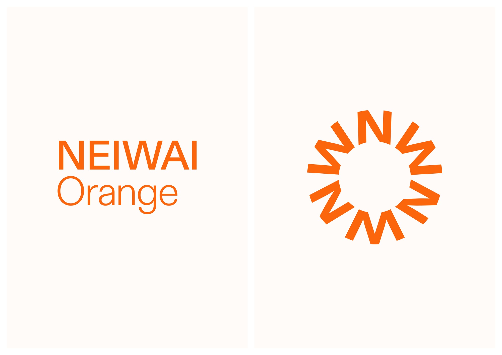
The LOGO of NEIWAI Orange is a circle composed of multiple sets of letters NW. The circle is derived from the O of Orange and is also the outline of an orange. NEIWAI Orange Inner and Outer Orange Label is a brand-new sub-brand launched by Chinese women's underwear brand NEIWAI. The use of the abbreviated letter NW is convenient to establish cognition with consumers. NEIWAI Orange hopes to dig out a more vivid wearing experience under a relatively streamlined product category. We have chosen a vital writing texture to echo this brand vision.
Of course, we use orange as the only brand color, not only from the name of Orange, but also to convey a lively, vibrant brand mood.
We, along with NEIWAI Orange, have observed significant changes in consumer feedback regarding shopping experiences in the post-pandemic era. Consumers no longer seek the elaborate ritual of complicated unboxing; instead, they prefer a more effortless and unburdened shopping experience. The vibrant brand visuals and lightweight packaging materials reflect this shift in consumer behavior.
The NEIWAI Orange logo consists of a circle made up of multiple sets of the letters "NW." The circle is inspired by the "O" in "Orange" and also represents the shape of an orange. NEIWAI Orange is a new sub-brand launched by NEIWAI, a Chinese women's lingerie brand, and the use of the acronym "NW" helps establish recognition with consumers. NEIWAI Orange aims to uncover a more vibrant wearing experience within a relatively streamlined product range. To reflect this brand vision, we chose a lively, textured writing style.
Of course, orange is used as the sole brand color, not only because of its presence in the name "Orange" but also to convey a bright, energetic brand mood full of vitality.
UDL is a multi-partner team, multi-disciplinary design studio, providing brand image, industrial products, packaging, digital art, art direction and other directions of design and consulting services.
Our designs are made of curiosity, creativity, love and technology.
UDL is a design and creative studio.
We provide design and consulting services to clients from both commercial and cultural fields.
You can get to know us through our past works.
We design with curiosity, creativity, love, and technology.
We strive for excellence.

