


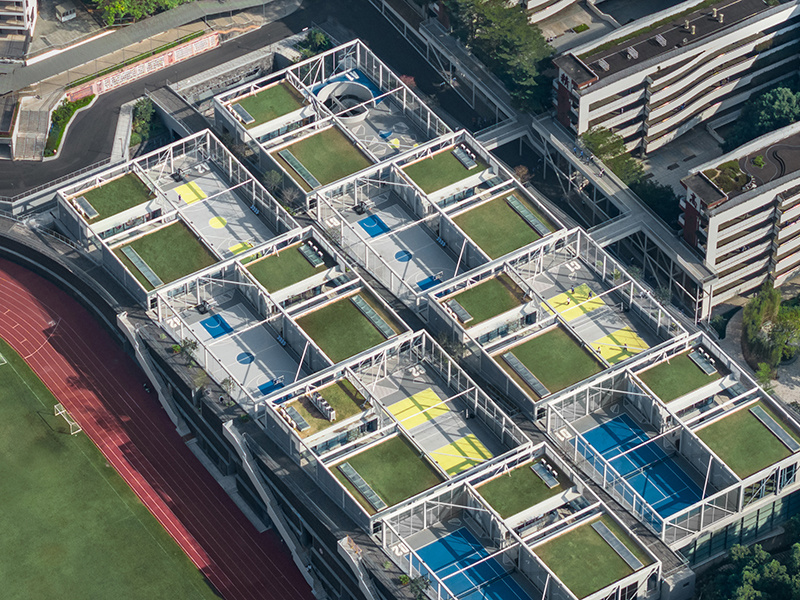

Hongling Senior high school New Art Center Aerial Photography Perspective (Afternoon Light)
In the afternoon sunshine of the setting sun, we overlook the building from a high place, and we can see that each classroom shows a three-dimensional sense under the fresh light, and the green plants on the roof add vitality. The different spatial layout of the side facade of the building shows the progressive level of space, while the ground color and the facade are in harmony.
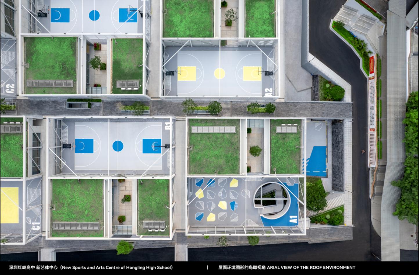
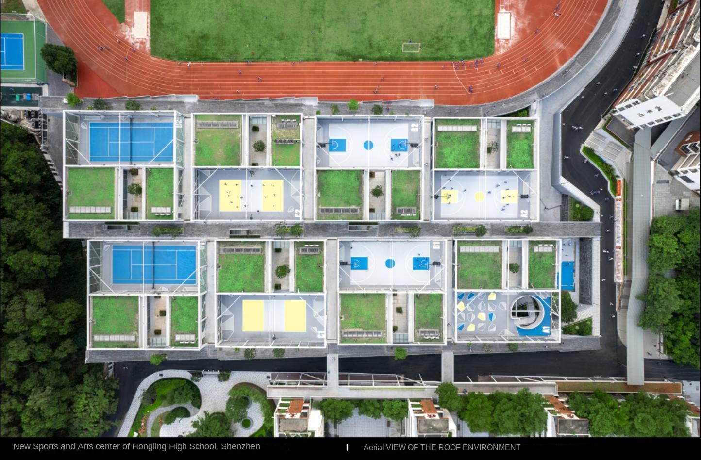
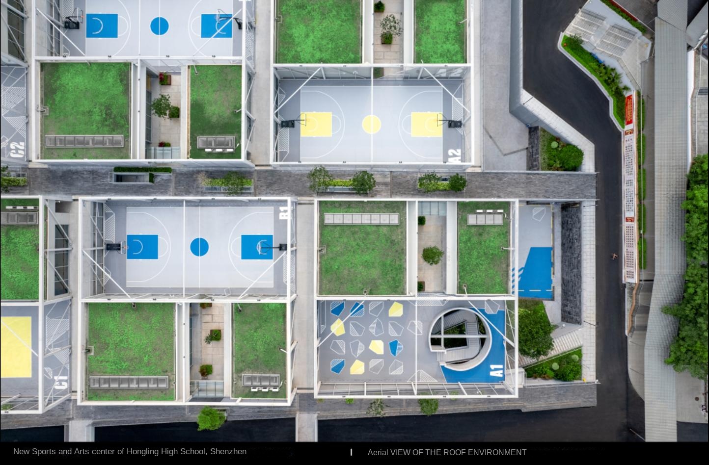
The light gray stadium is in hierarchical contrast with the colors of other dark gray venues and is cleverly integrated into the whole, both partitioned and unified. The color of the space logo and the intensity of the graphic language are just right. It does not rob the visual focus of the space, but emphasizes the rhythm between the space and the interaction of people in its unique way.

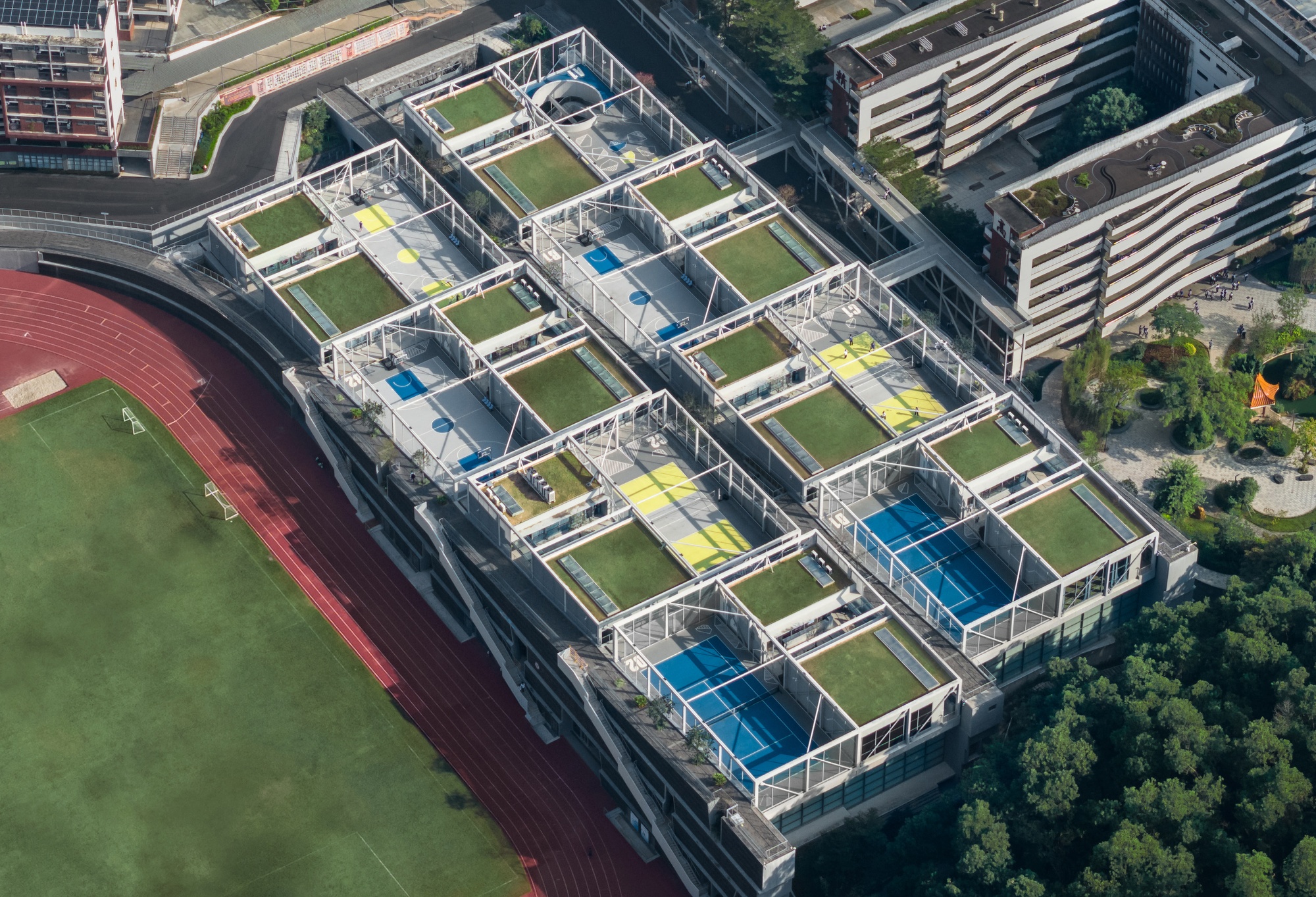
View of the teaching building of Hongling Senior high school New Art and Sports Center (noon light)
In the afternoon sun, our perspective turns to the campus interior and observes the building from the inside of the teaching building. The sports center is like a gently rising hillock and blends in with its surroundings. Space logo in the public area color graphics active, smart design, highlighting the public.
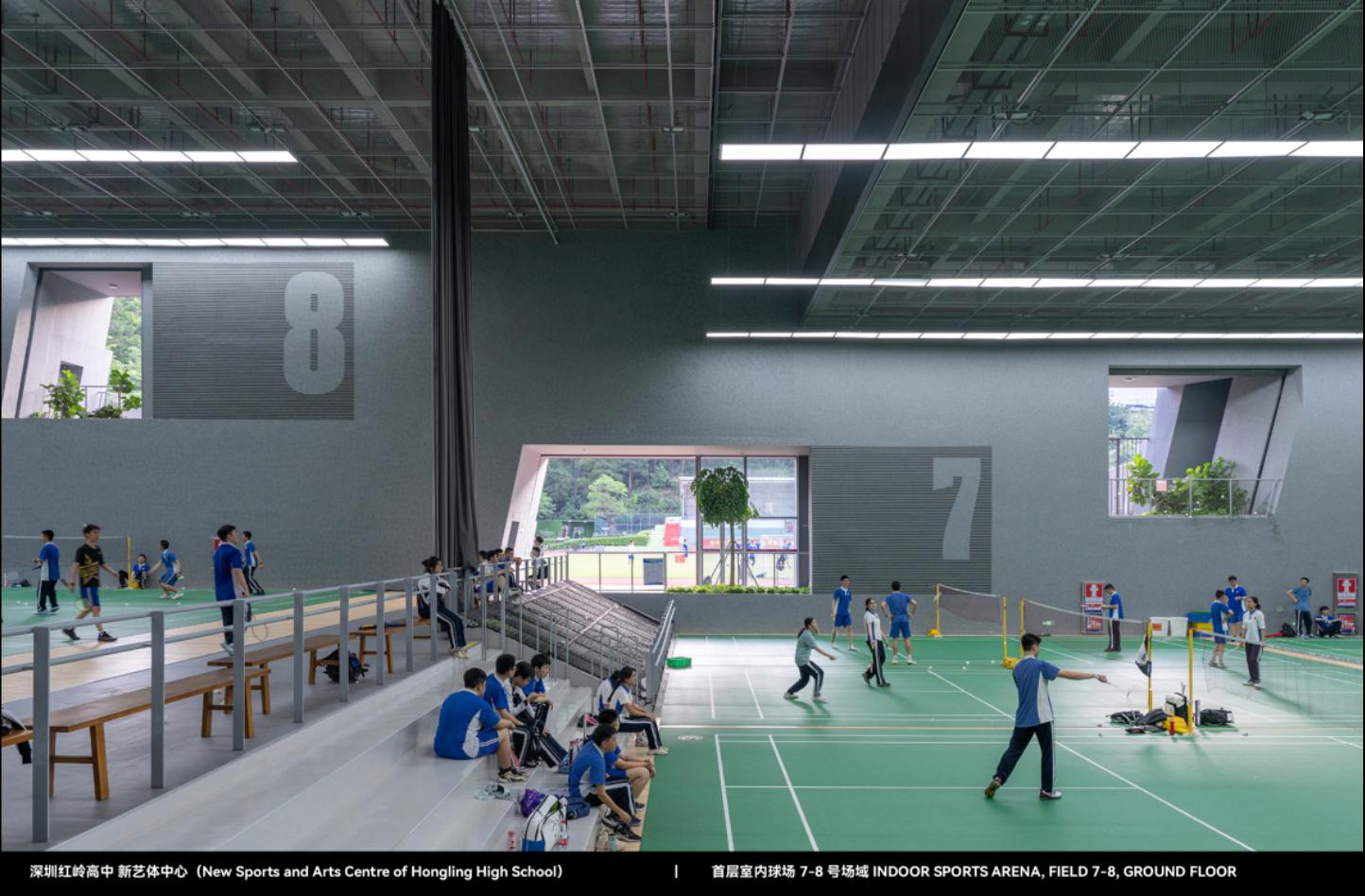
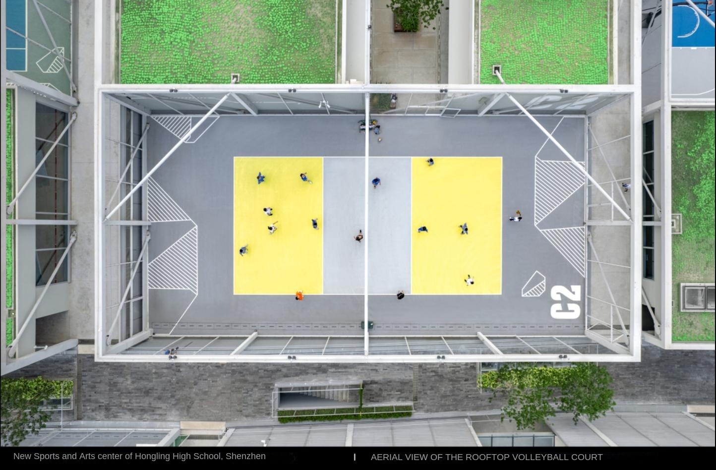
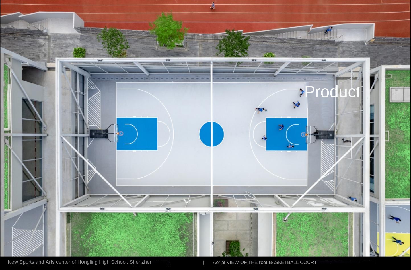
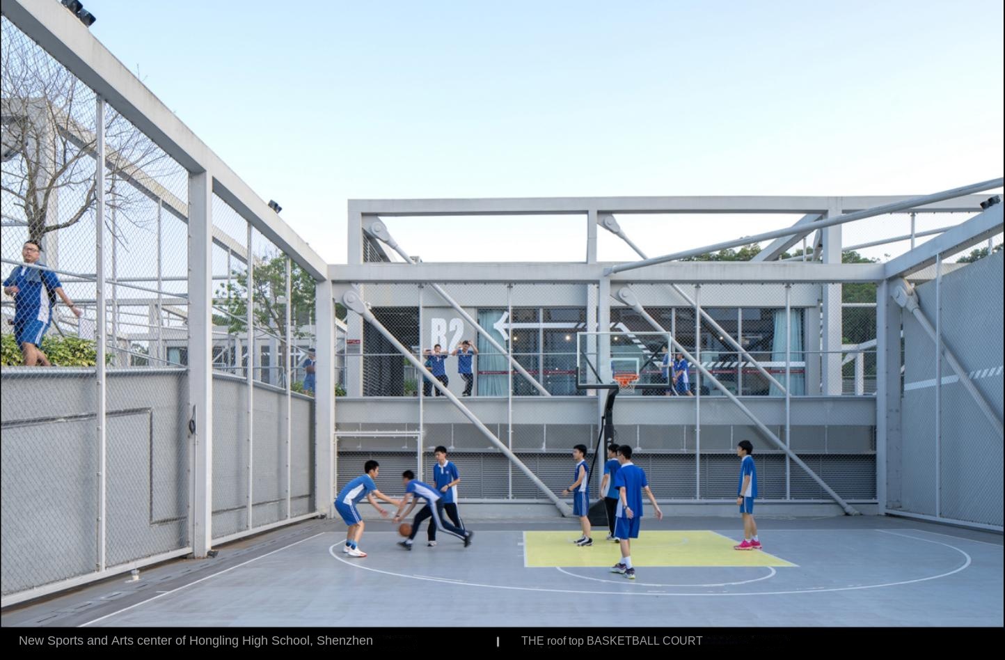
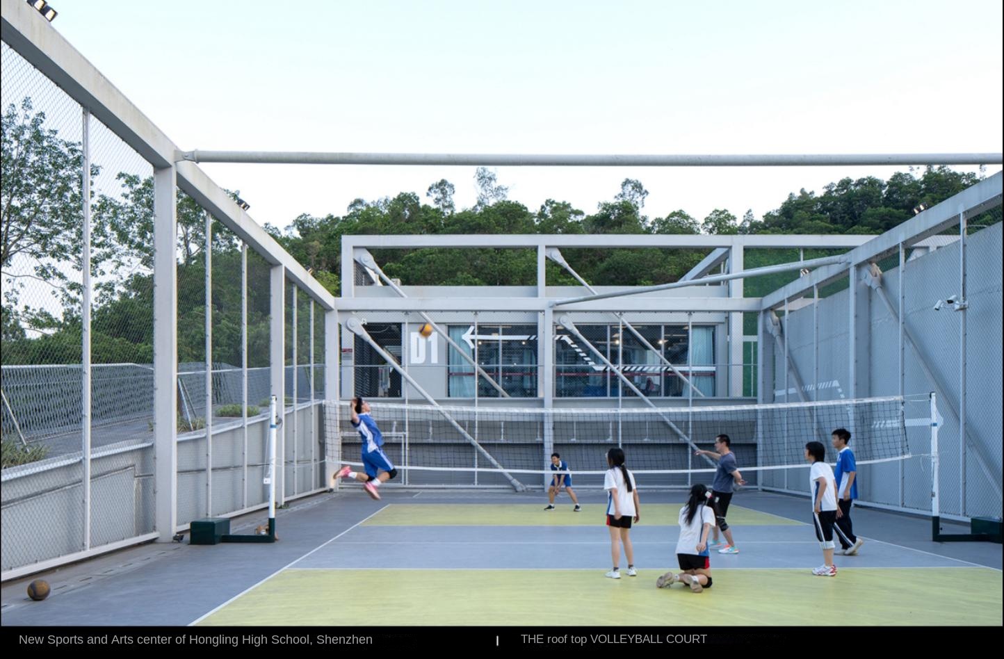
To the motion space, the spatial graphics become convergent and restrained, reducing the interference to the athletes and allowing them to focus on the game. The playground is people-oriented, logo-assisted, and emotional design is avoided. The purpose is to promote sports investment, keep the space simple, and not overemphasize the atmosphere.
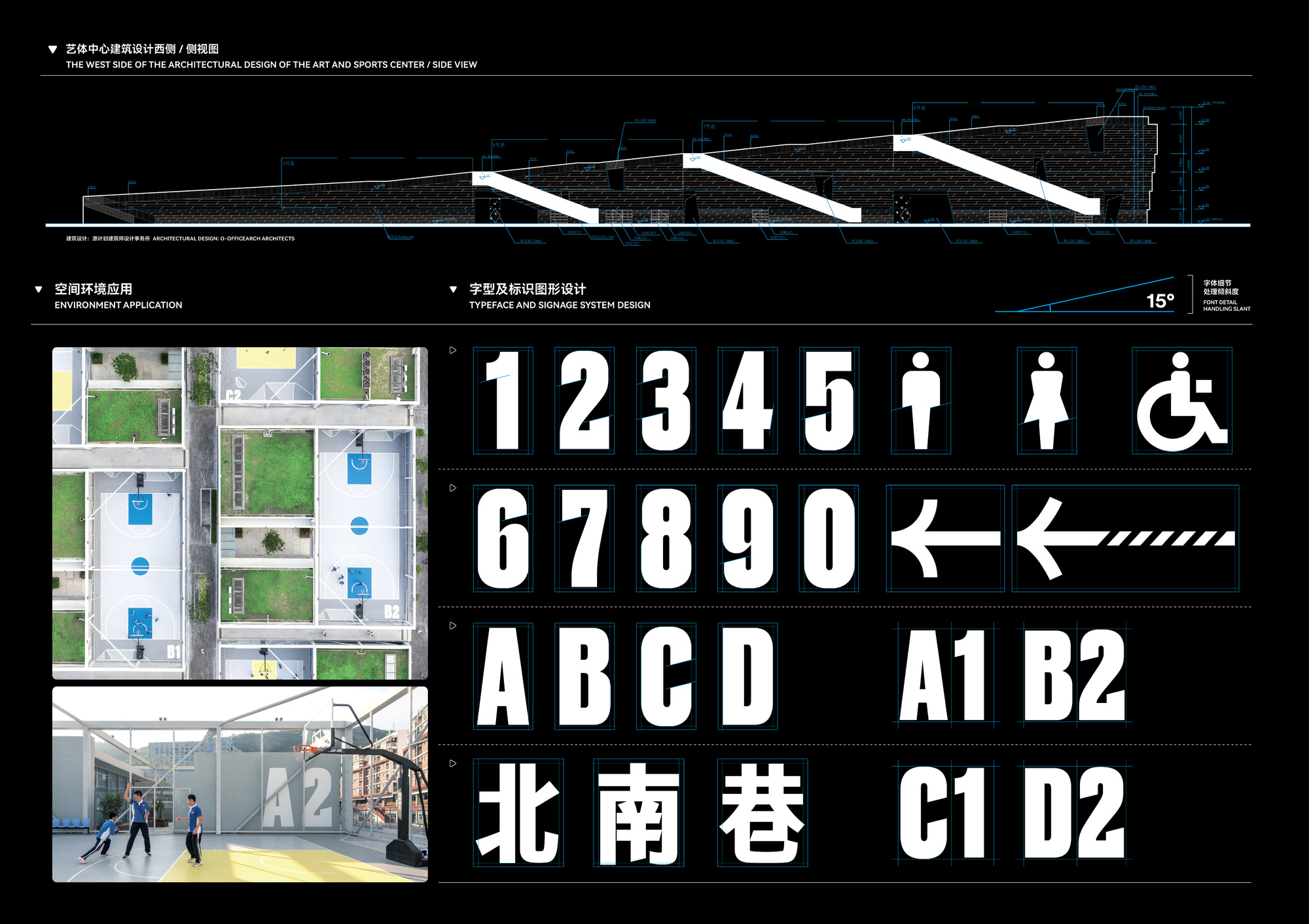
New Arts and Sports Center Logo Design System of Hongling Senior high school
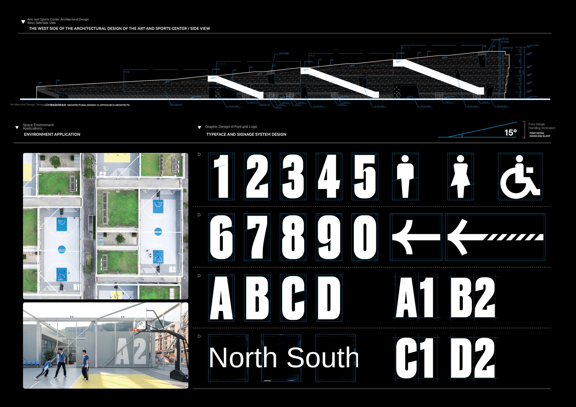
The designer combines the font design with the architectural mountain shape, selects a 15-degree inclination angle, echoes the sports attributes of the stadium, and designs a font system that conforms to the architectural logic, covering numbers, English, icons and Chinese, to ensure the consistency and identification of the logo.
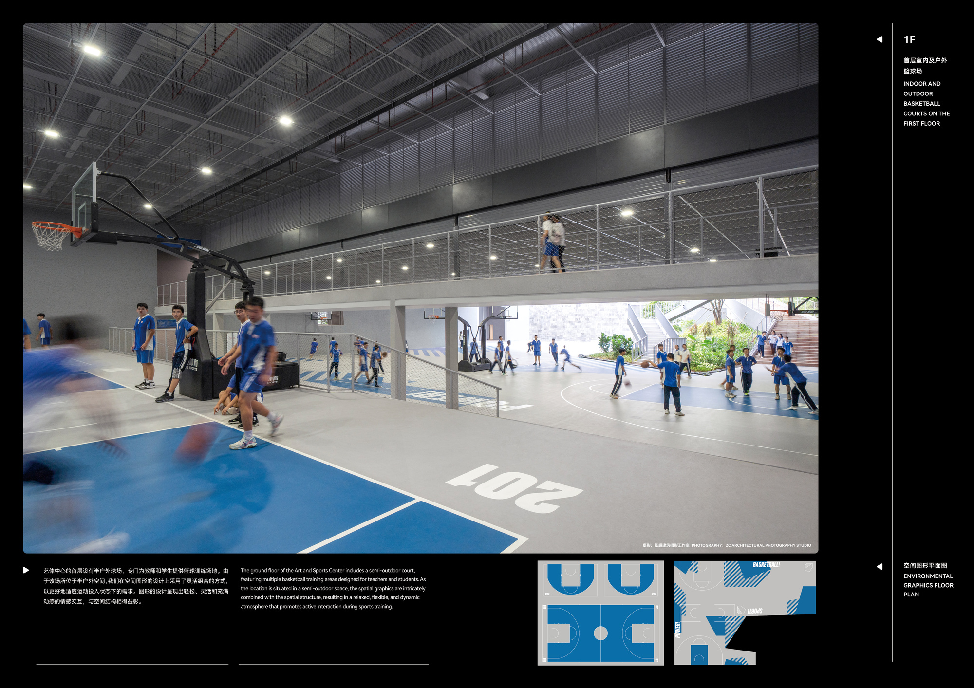
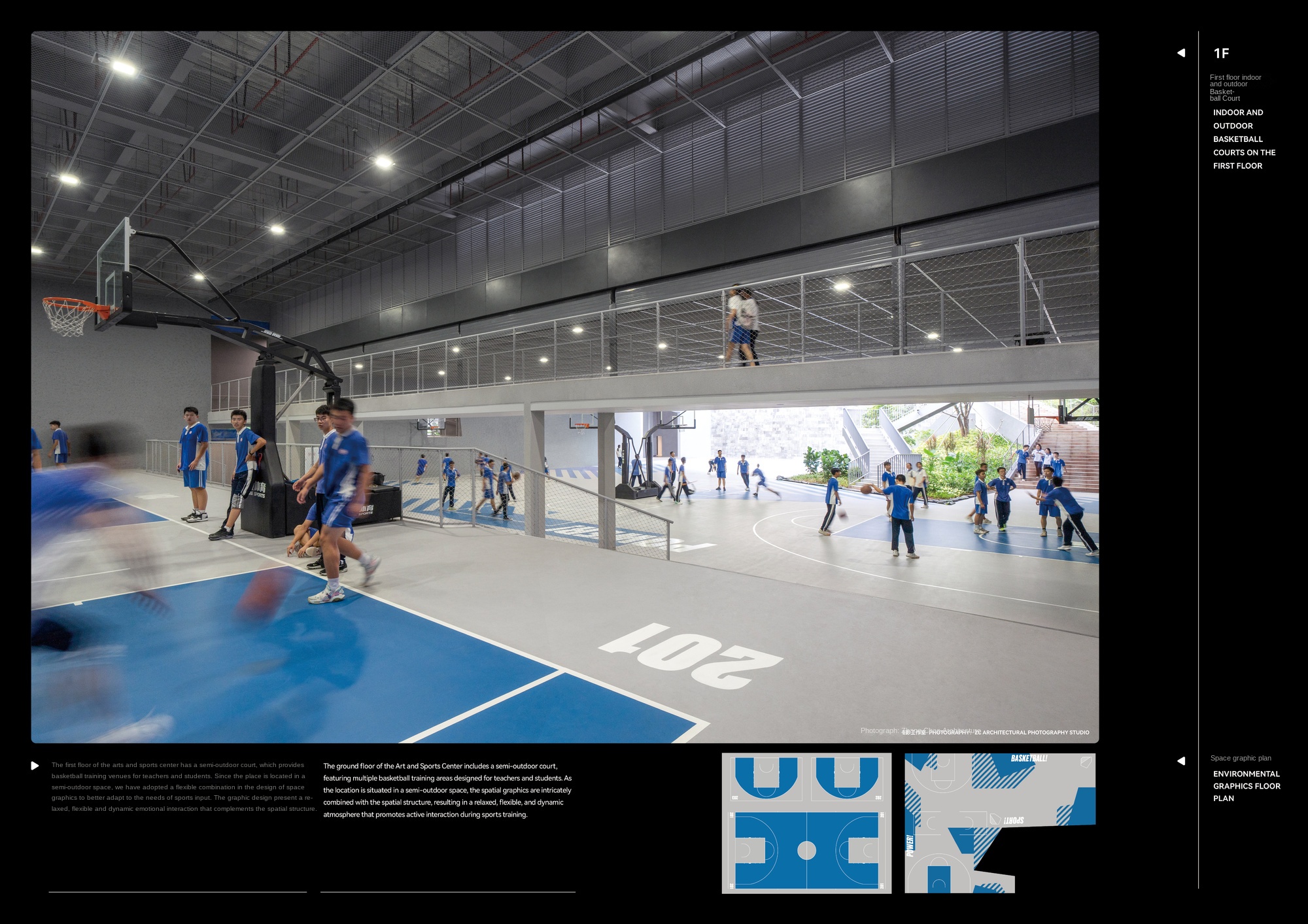
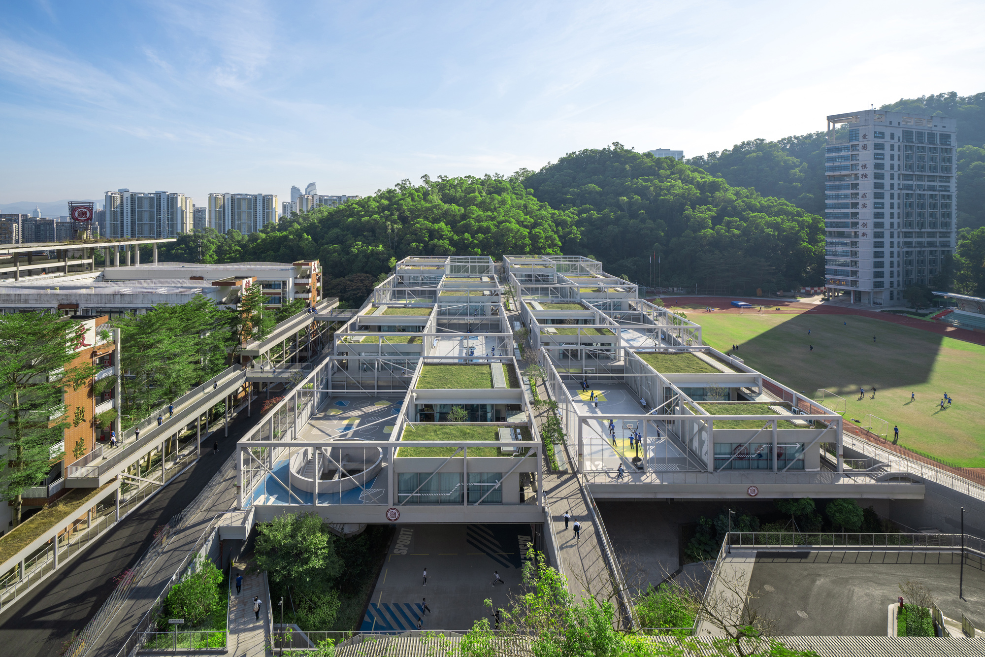
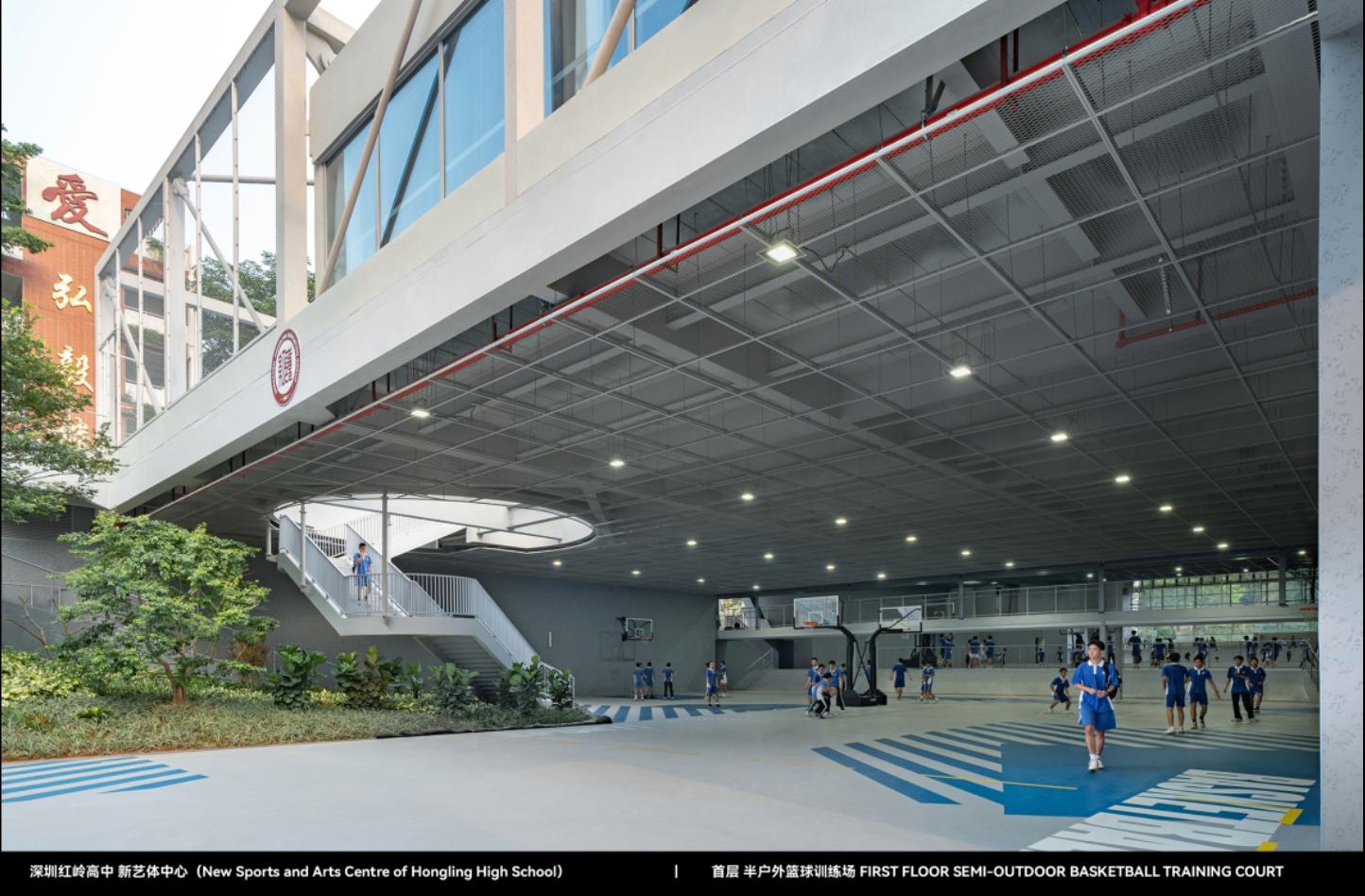
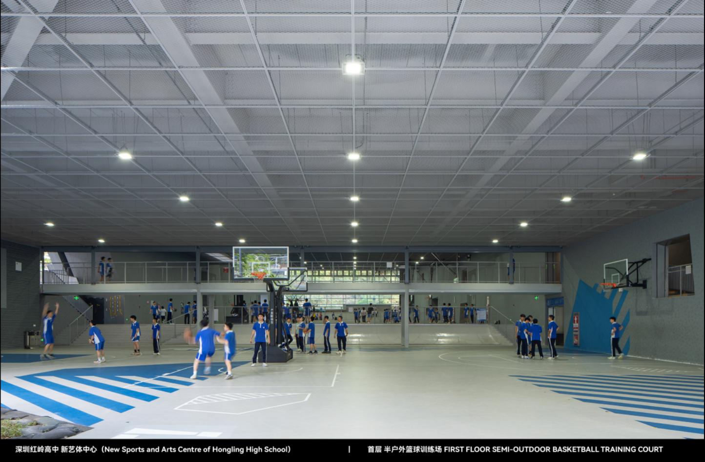
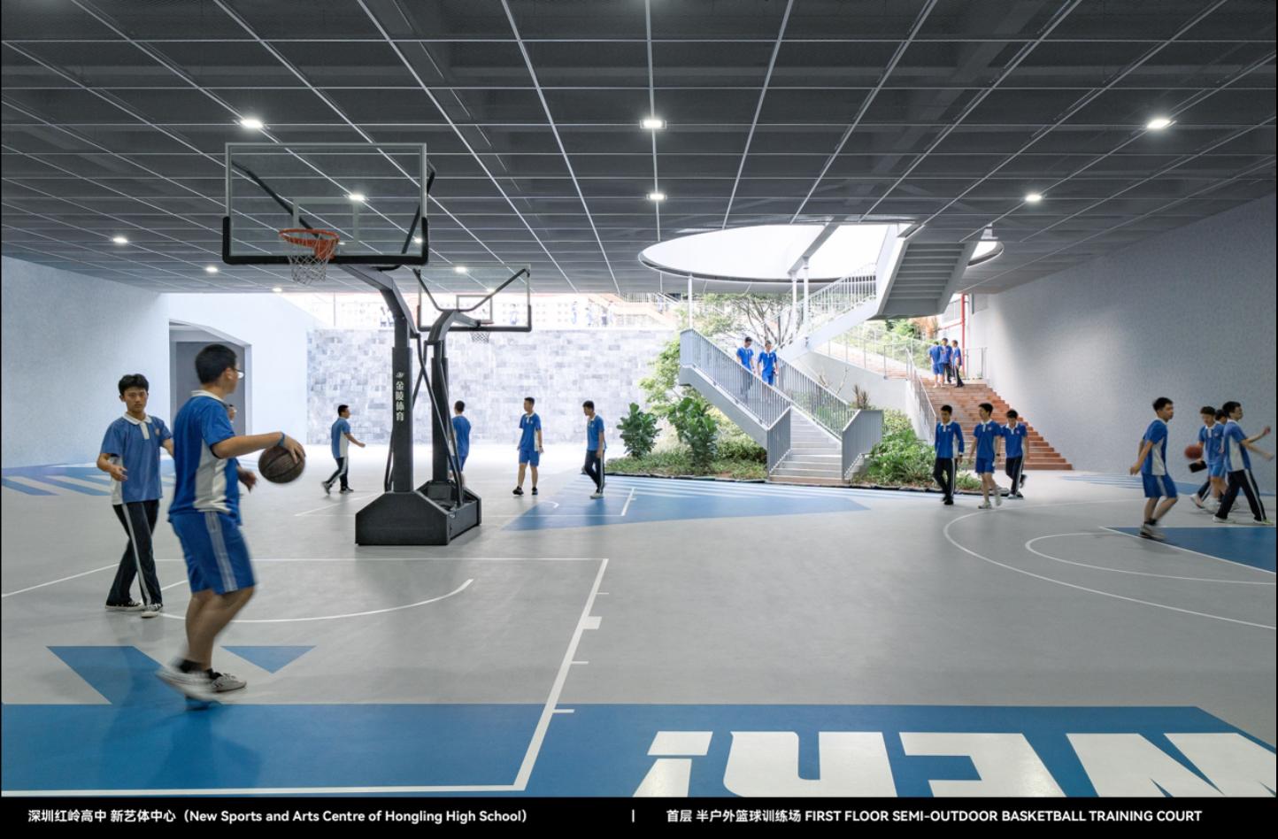
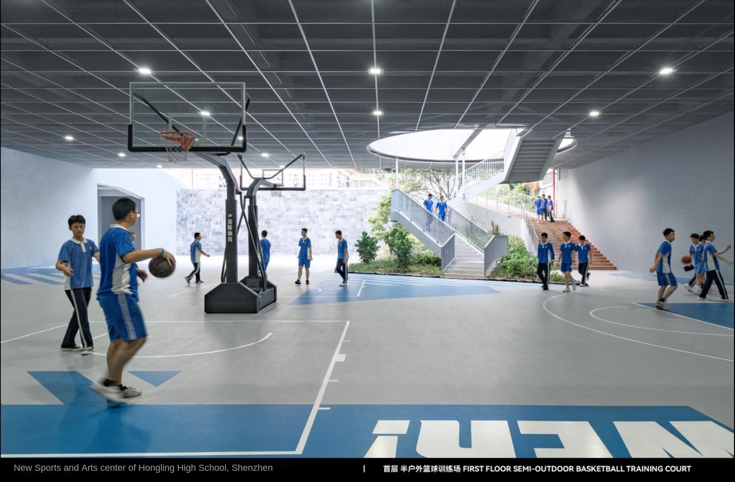
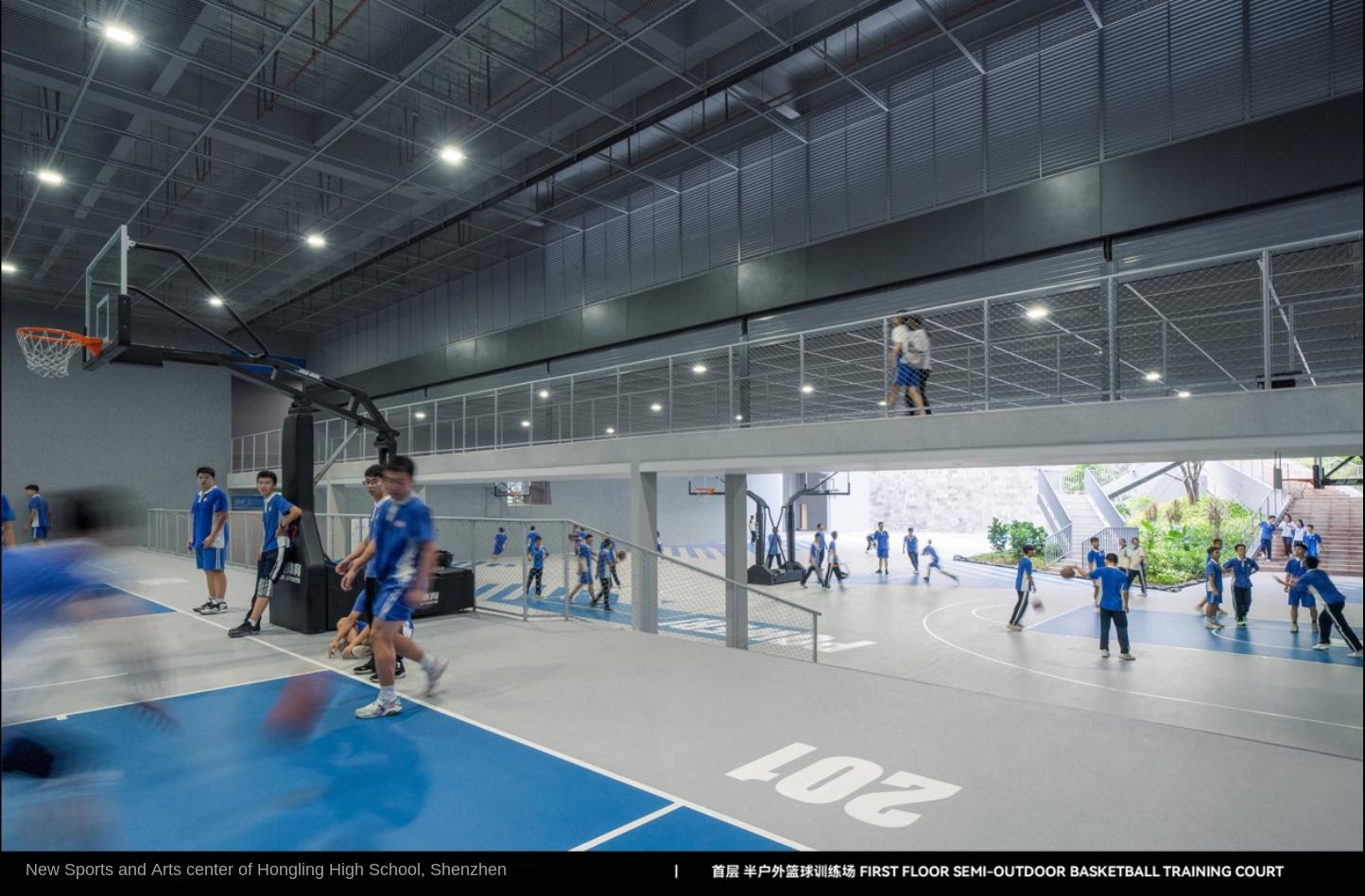
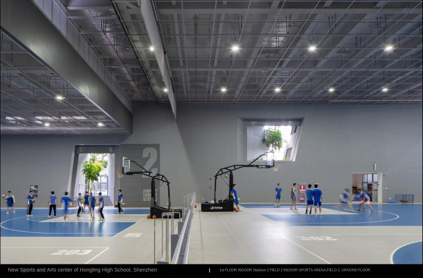
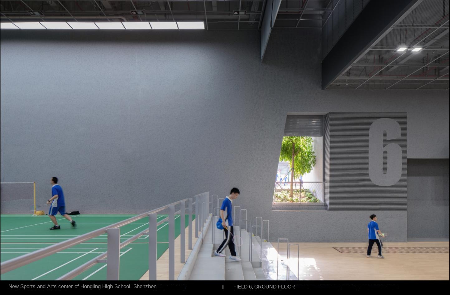
First Floor Indoor and Outdoor Sports Ground, Hongling Senior high school New Art and Sports Centre

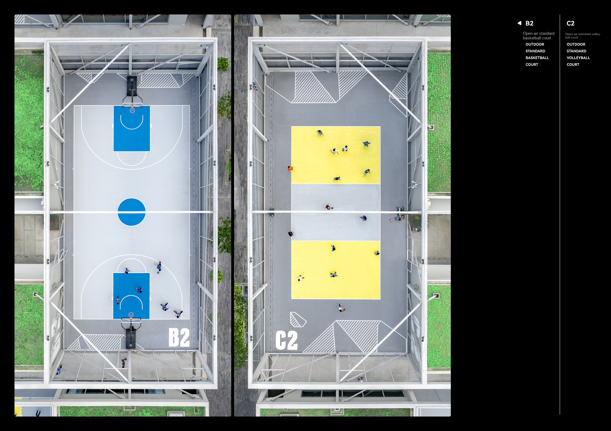
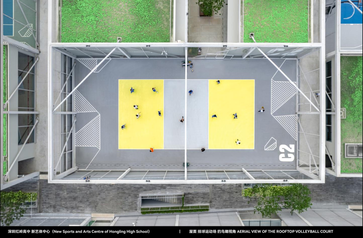
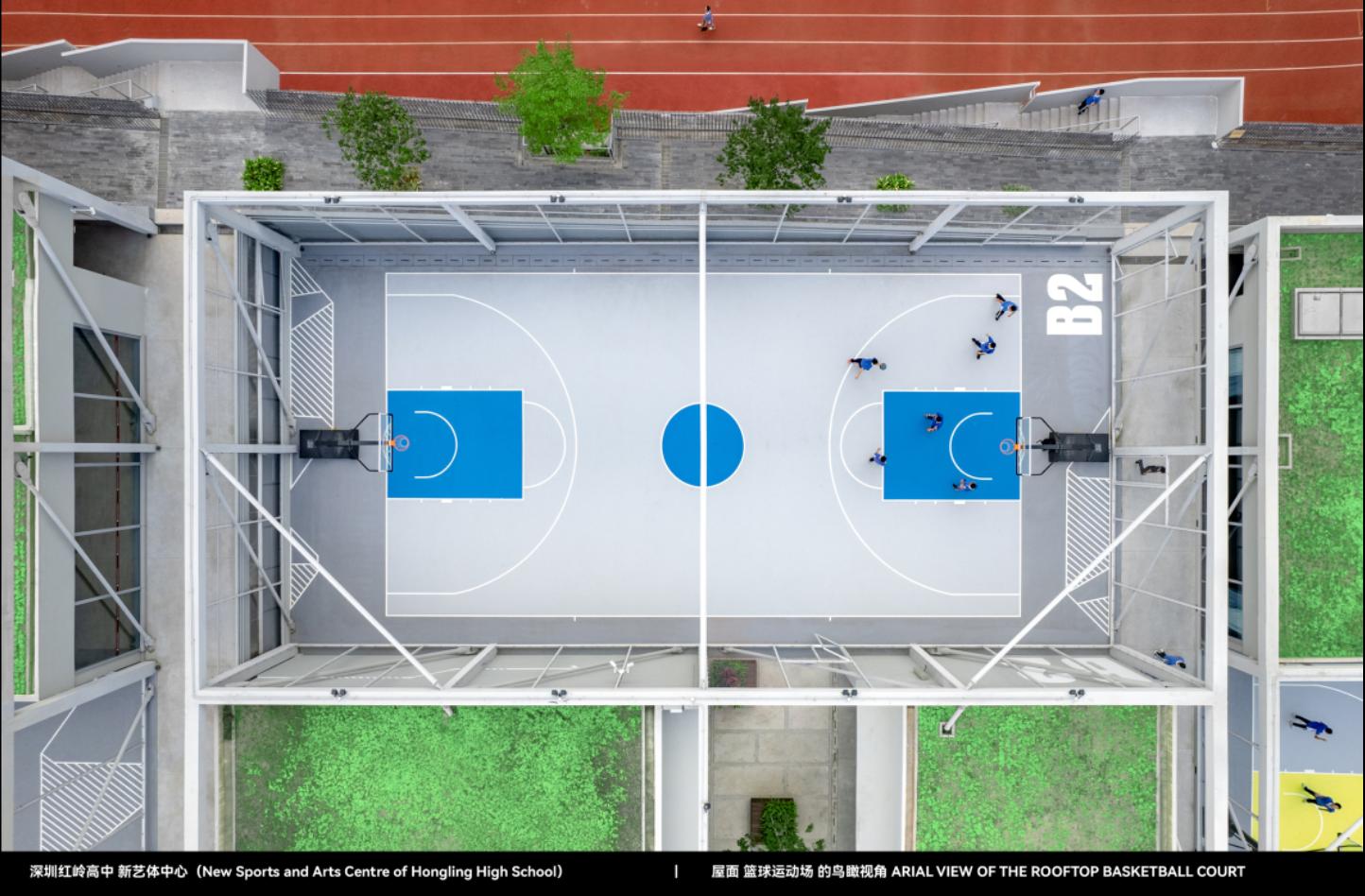
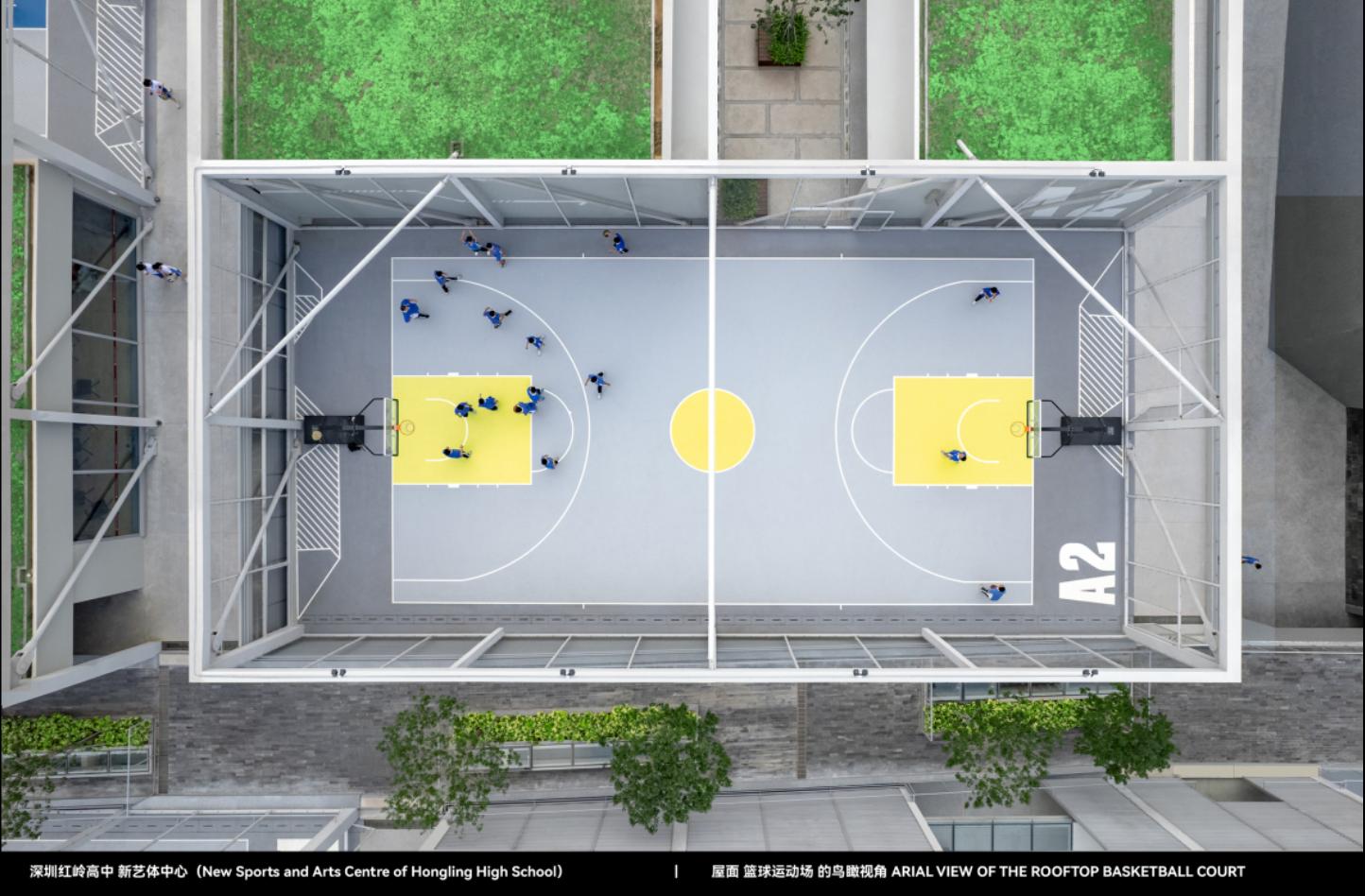
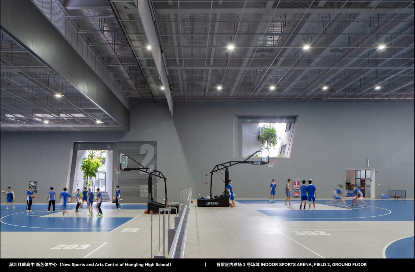
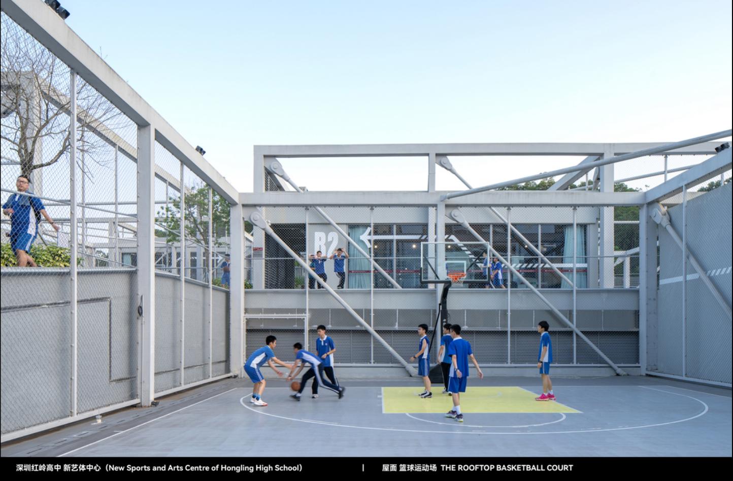
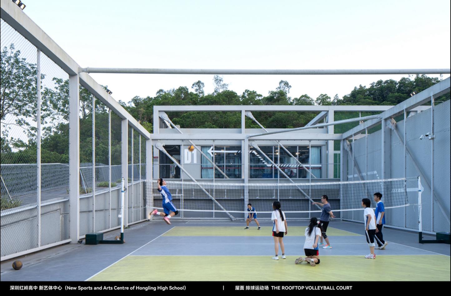
Hongling Senior high school New Art Sports Center Roof Ball Stadium


Red Ridge Supplementary Information, All-round Scene Photography
In this project, color composition is seen as a key element of the spatial experience. In order to enhance the spiritual input of teachers and students in the space, we choose dark gray and light gray to build a progressive visual tone, and at the same time use medium yellow and cobalt blue as auxiliary colors to enrich the visual level of the space. The use of color emphasizes balance to ensure visual clarity and avoid overly complex graphics interfering with the fluency of sports activities.
In addition to color, space graphics play an auxiliary role in the design to highlight the characteristics of environmental graphics. The structure of the figure echoes the stone texture of the building's facade, which makes the building and space form a coherent visual experience inside and outside, and also enhances the spatial perception of teachers and students in the flow.
The graphic design of this environment shapes a more focused and immersive space atmosphere in teaching and sports activities, and strengthens the interactive relationship between space and users. It focuses on the harmony of color and graphics, and emphasizes the emotional communication between space and people, so that teachers and students can achieve a higher degree of fit in visual, psychological and sports experience.
The project has been nominated for the 2024 DFA Asia Most Influential Award/Excellence in the Design of Transmission category and the 2023 Macau Design Award/Environment Graphic Design category.
The design of Chinese campus sports venues has long stayed in a single "red and green color matching" mode, and practicality takes precedence over space experience. Traditional design is mostly carried out by the logo producer and lacks overall planning. This project hopes to break through this habitual thinking, cooperate with the source plan architects, take color as the core language, while ensuring the functionality of the movement space, introduce a visual system with more aesthetic value, and enhance the immersion and participation of the campus field.
We use deep light gray progressive spatial hierarchy to build a calm and peaceful motion tone, and strengthen the sense of motion rhythm through yellow and blue embellishments to avoid complex graphics interfering with the motion state. The graphic design echoes the stone material surrounded by the wool embryo of the building facade, making the space form a natural continuation in vision and touch. The color layout not only optimizes the sports experience, but also provides a more subconscious space atmosphere for teachers and students.
This project responds to the upgrading needs of Chinese campus space, breaks through the stereotype of the existing "red and green sports field", and guides the campus visual system to develop in the direction of more humanistic care with refined design language. In the face of the inherent aesthetic model of educational space for a long time, we use color as a medium to explore the linkage between vision and psychology to promote a more immersive sports environment. This is not only the optimization of the school environment, but also an exploration and practice of the Chinese campus design concept.
Gwangjun.com design studio was founded in Guangzhou in 2016, is committed to design aesthetics and thinking logic to deduce the method, to create small and exquisite design value. The conceptual practice has been reported and concerned by international media such as "Eye on Design" in the United States, "Design Everywhere" in Singapore and so on. The design works have won many awards, including TDC Font Design Award in Tokyo, Japan, Macau Design Award, Hong Kong DFA Asia's Most Influential Design Award, Taipei Gold Point Award, Graphic Design in China (GDC) Design Award and other domestic and foreign design awards.

