


The first sheet
Second sheet
Third

Fourth

Fifth
Large Aircraft Cockpit Special Series Font Video


Special Series Font Works Scheme ppt for Large Aircraft Cockpit
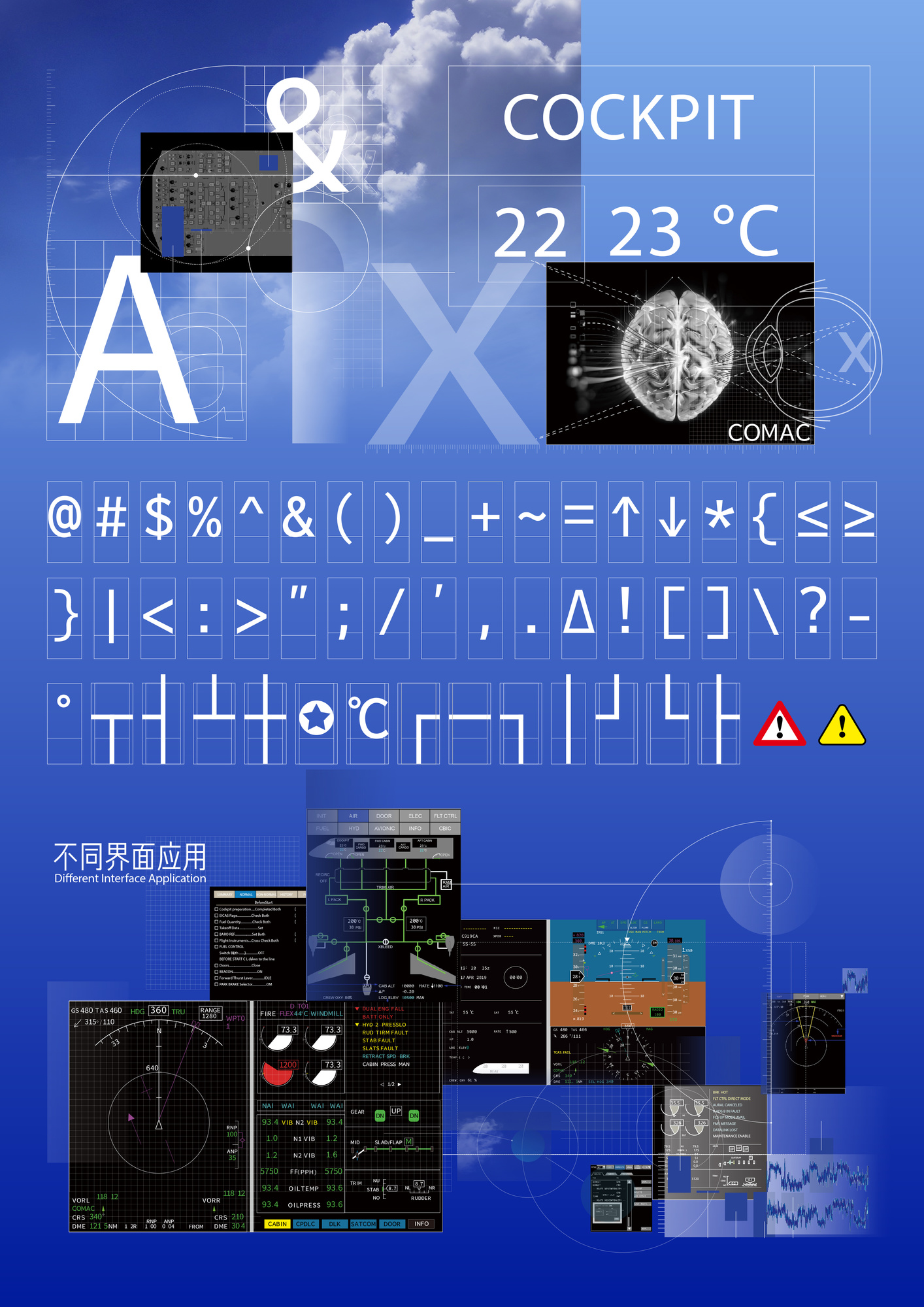
The cockpit is a complex human-computer interaction system with high information density, and the display text is one of the key channels for the crew to obtain the detailed information of the aircraft. The quality of the cockpit display font will affect the speed of the pilot's recognition, interpretation and understanding of the information. Therefore, the readability and legibility of fonts in the cockpit display font design has become an urgent need to pay attention to and focus on the evaluation elements. At present, the application effect of fonts selected in the aircraft display information system is not good. Airline pilots and test pilots have put forward feedback on the problems of poor readability and unsightly appearance of fonts in many models of domestic large aircraft, so as to improve the efficiency of information acquisition and reduce the additional workload. In addition, according to the current application scenarios and usage status of aircraft display information symbols, fonts with single character weight, character width and style can no longer meet the diversified adaptation requirements of different interfaces in flight scenarios.
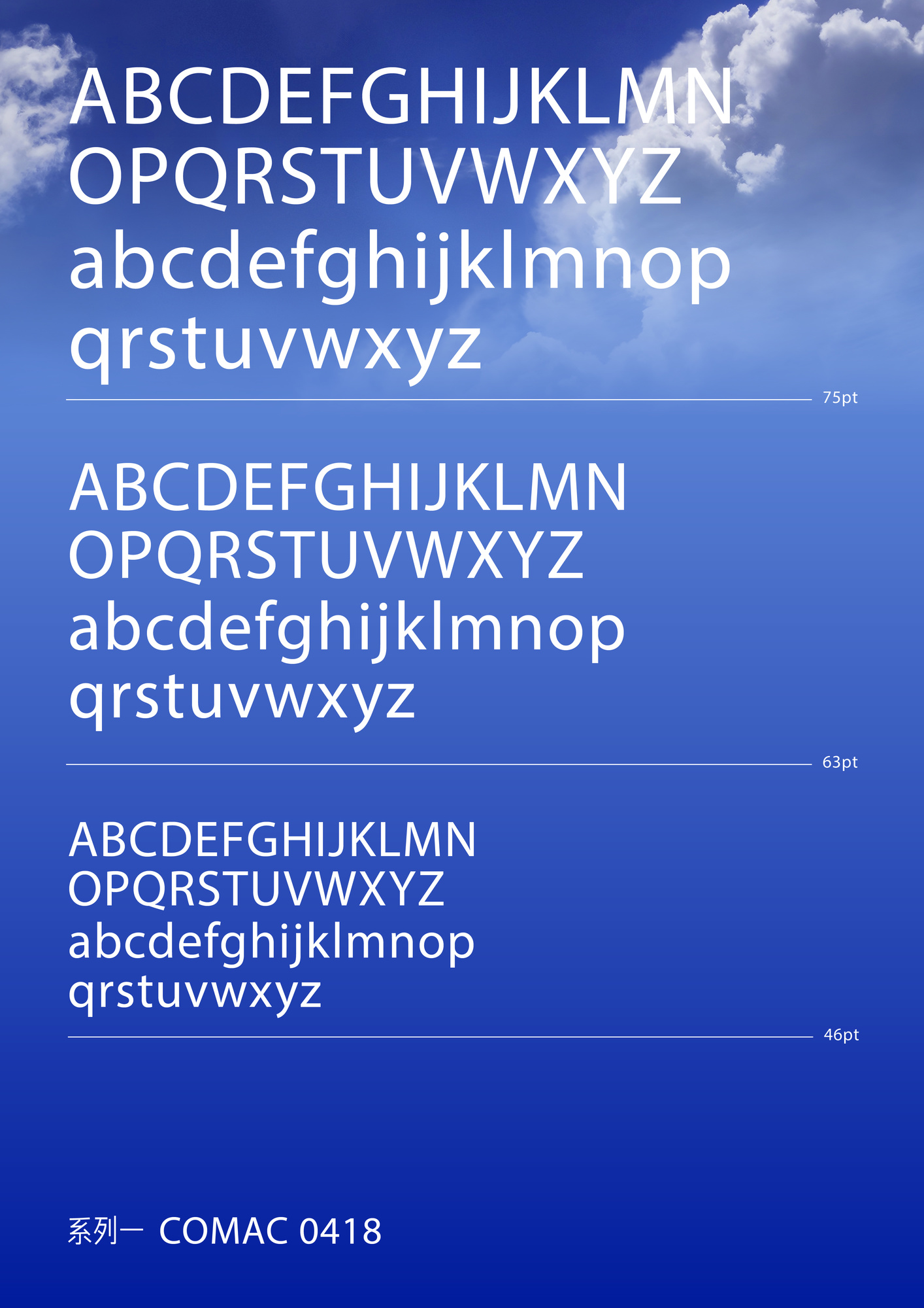
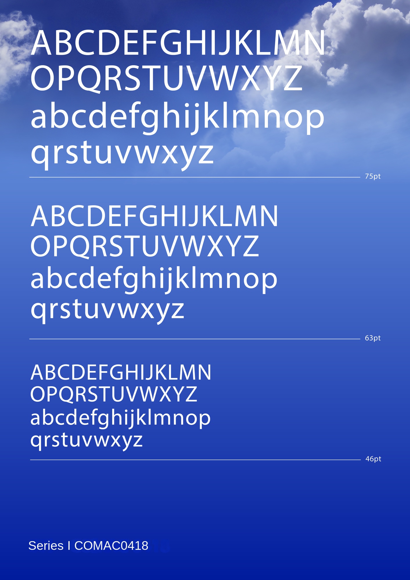
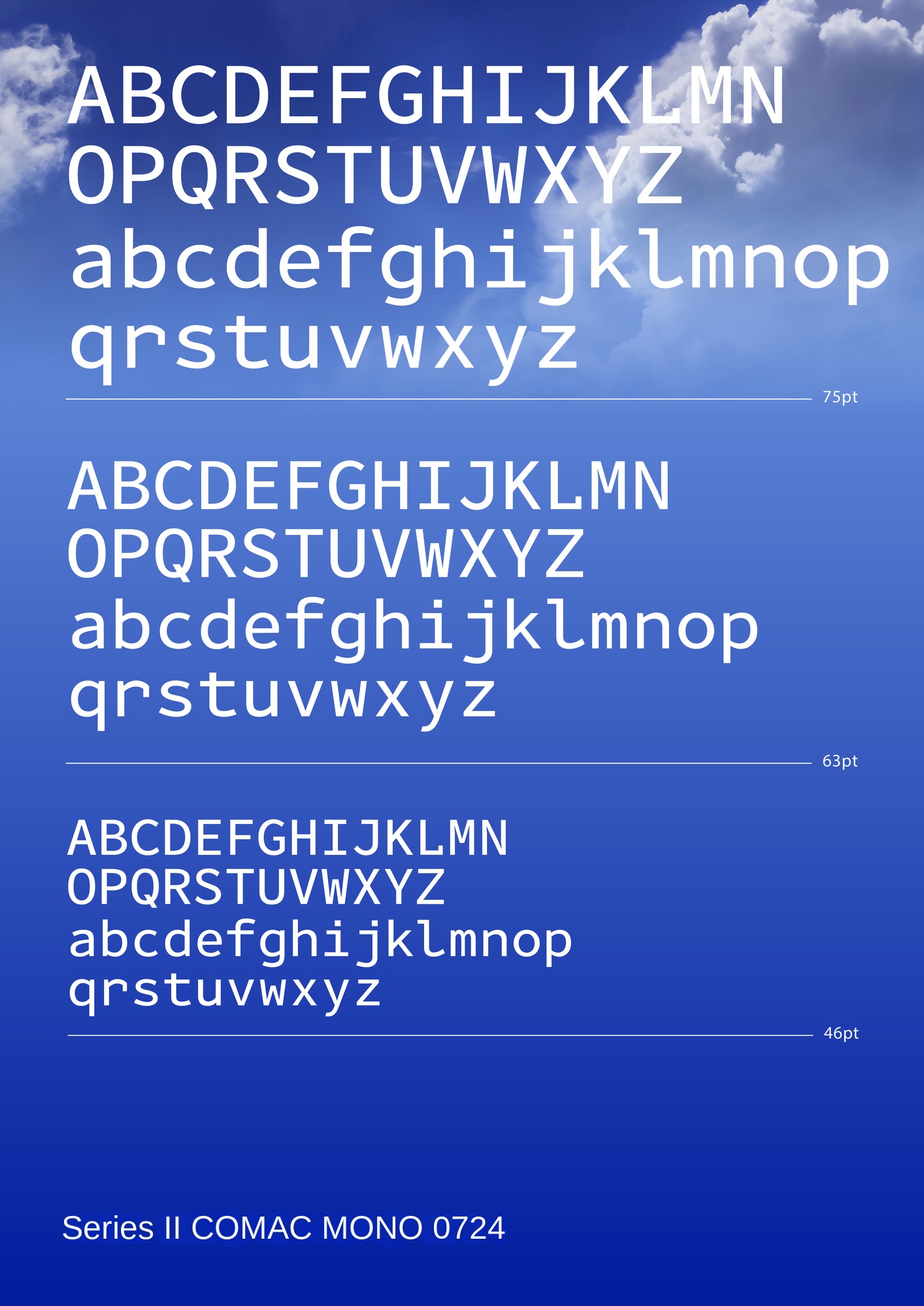
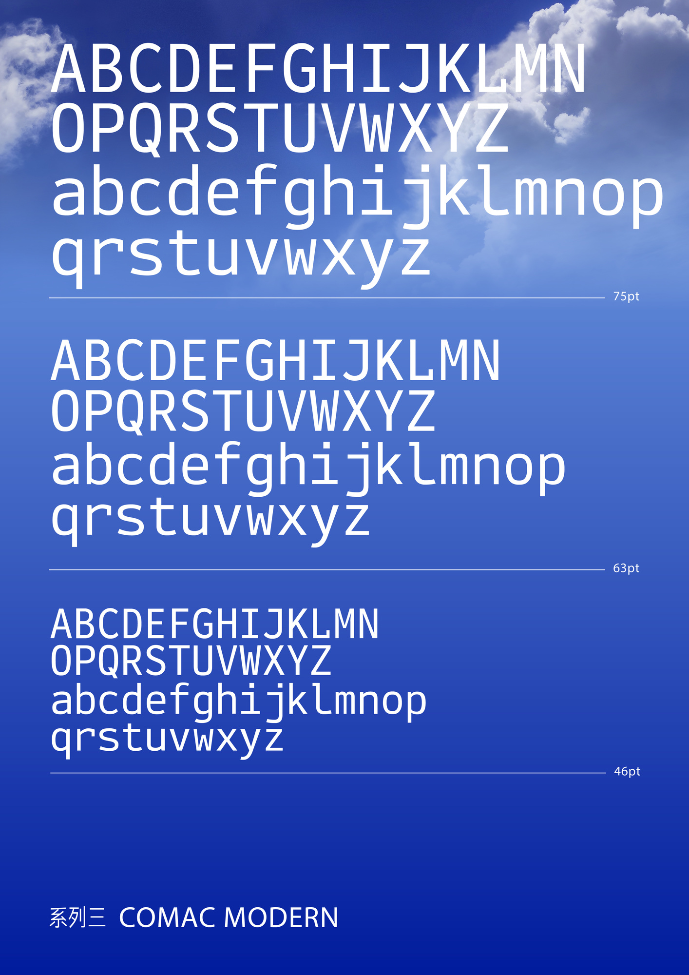
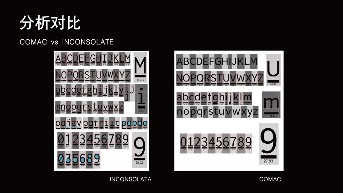
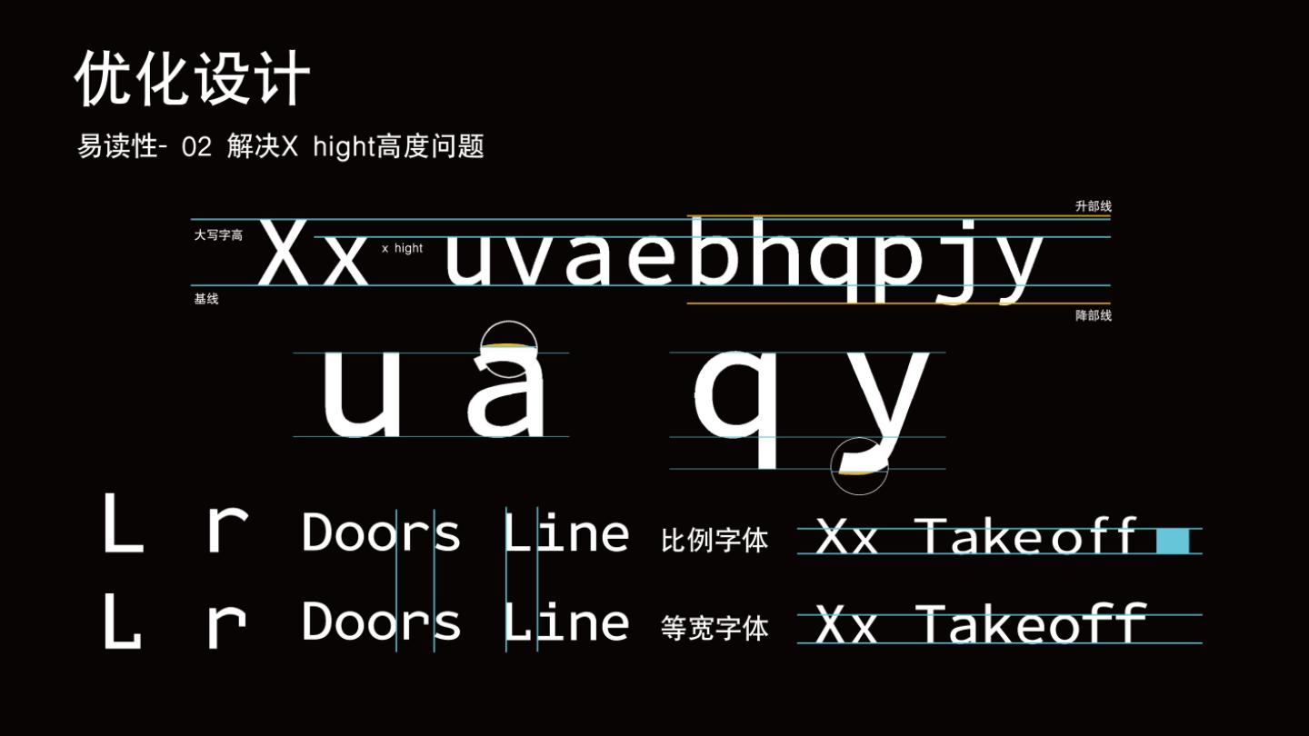
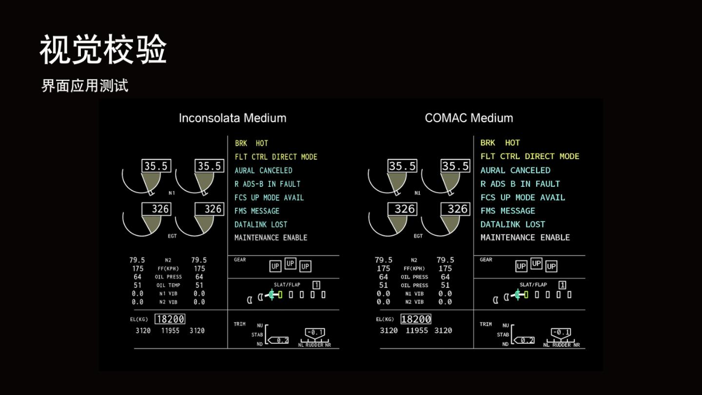
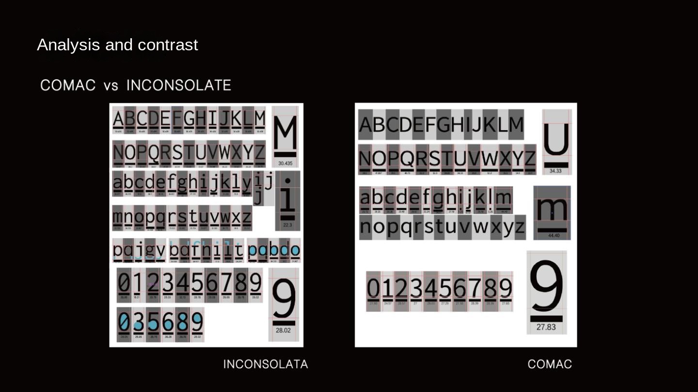
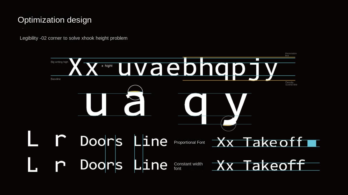
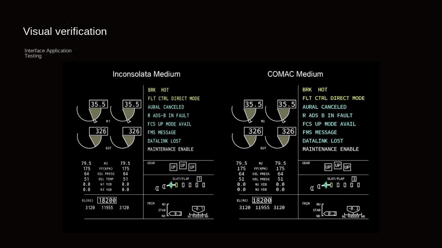
The design team studied the readability of font design elements and human, machine and environment through the display characters in the human-computer interaction interface of the cockpit of the current civil aircraft, and completed the verification of the effective readability of a full set of fonts based on various scenes of the aircraft, and finally formed a set of special fonts for the cockpit of commercial aircraft. This set of fonts contains a variety of word weights and widths, can serve different aircraft models, and can effectively improve the legibility of the font, reduce the cognitive load to reduce the risk of accidents, and meet the pilot's need to quickly and clearly identify each character in the maximum line of sight. Specifically, the font uses sans-serif, which enhances the overall perceptual design of the font on the basis of reducing the cumbersome details, so as to improve reading comfort and reduce visual fatigue. The center of gravity of the font is close to the visual center, slightly higher than the physical center, which is tall and straight and energetic. The visual perception of the whole set of fonts is smooth and comfortable, showing a sense of temperature and technology and orderly formal beauty. In addition, according to the characteristics of different letters, this special font selectively scales the space of the word valley, carefully converts the visual center of gravity between letters, and appropriately refines the width of strokes at the dense places where strokes cross, so that a uniform and sparse breathing space is formed inside the letters, showing the unique temperature and personality of the font as an aesthetic object. For example, the letter S and the numbers 5 and 3 belong to characters with similar structures. In order to improve the anti-confusion properties of such easily confused characters, the size and shape of the lower half of the characters are designed to be clearly distinguished to improve the recognition and recognition of the characters. Secondly, the stroke features of the ascending and descending parts of the lowercase letter are designed to be more obvious, such as the descending part of the lowercase letter p is appropriately extended and the ascending part of the lowercase letter t is appropriately increased. A good contrast is formed by the x height with the upper and lower running lines of lowercase letters to improve the text recognition of edge vision. Finally, the multi-screen display in the cockpit means that the pilot must read the data from different angles and distances. The font is displayed in the 12PTS-24PTS font size with high recognition and legibility.
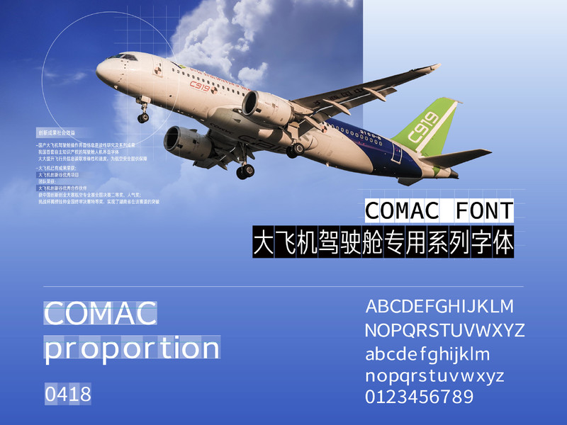
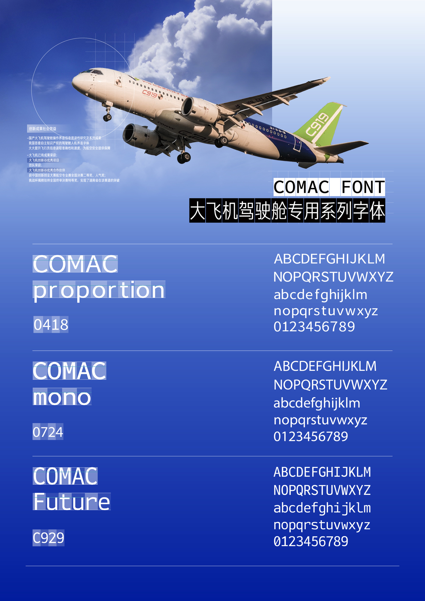
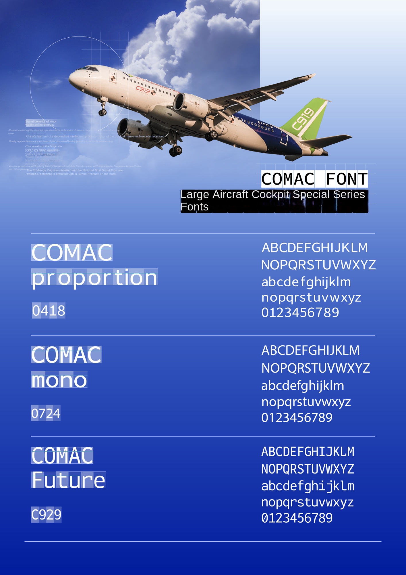
The project was commissioned by the Shanghai Aircraft Design and Research Institute of Commercial Aircraft Corporation of China to design and develop a set of cockpit display fonts with both functionality and aesthetics for domestic large aircraft represented by C919.
After 2 years, Li Shaobo design team launched China's first set of independent intellectual property rights of large aircraft cockpit display font. The typeface is both legible and aesthetic, preventing pilots from being distracted and improving aviation control safety. It fills the gap of the lack of display fonts in the cockpit of autonomous aircraft in our country, and effectively improves the autonomous productivity, brand recognition and international competitiveness of domestic large aircraft.
The project was awarded the CIRP Excellent Project of Commercial Aircraft Corporation of China. The design and research results provide important support for the R & D and manufacturing of domestic large passenger aircraft, and contribute to the independent production and information security of the "big country heavy equipment" products that the country attaches great importance.
Dean of the Academy of Fine Arts of Hunan Normal University, Chairman of Hunan Design Artists Association, Chief Expert of Hunan Chinese Character Culture and Art Research Base, Academic Member of Chinese Character Font Design and Research Center of the Ministry of Education, design fields include fonts, brands, spaces, etc. Presided over the development of Fang Zhengjun's bold font library, Han Yi Ba Man's font library, and the interactive interface of the domestic Kirin operating system. Won the "Huamei Award" for float design on the 70th anniversary of the National Day, the Grand Prize of the Chinese Design Art Exhibition, the Morisawa International Font Design Review Award in Japan, and the German IF Award. His works have been collected by many museums at home and abroad.

