


Light cone song concept video
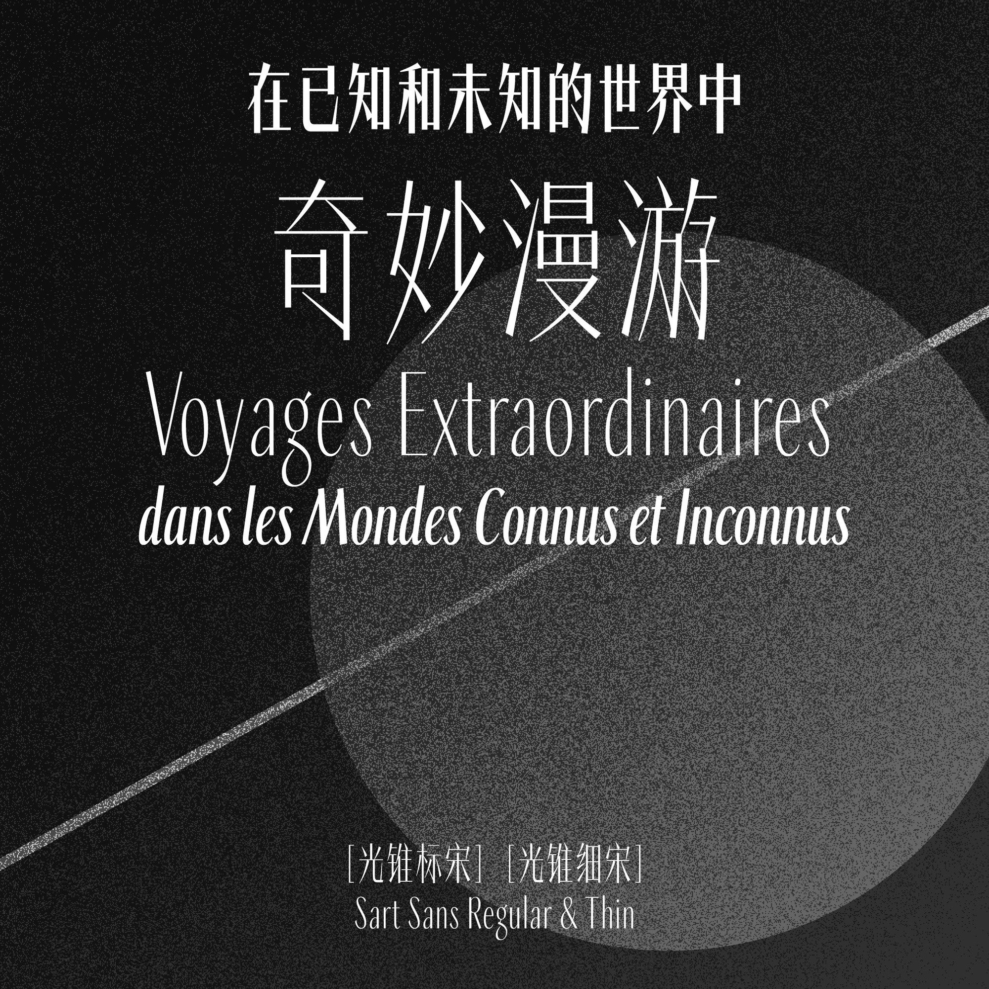
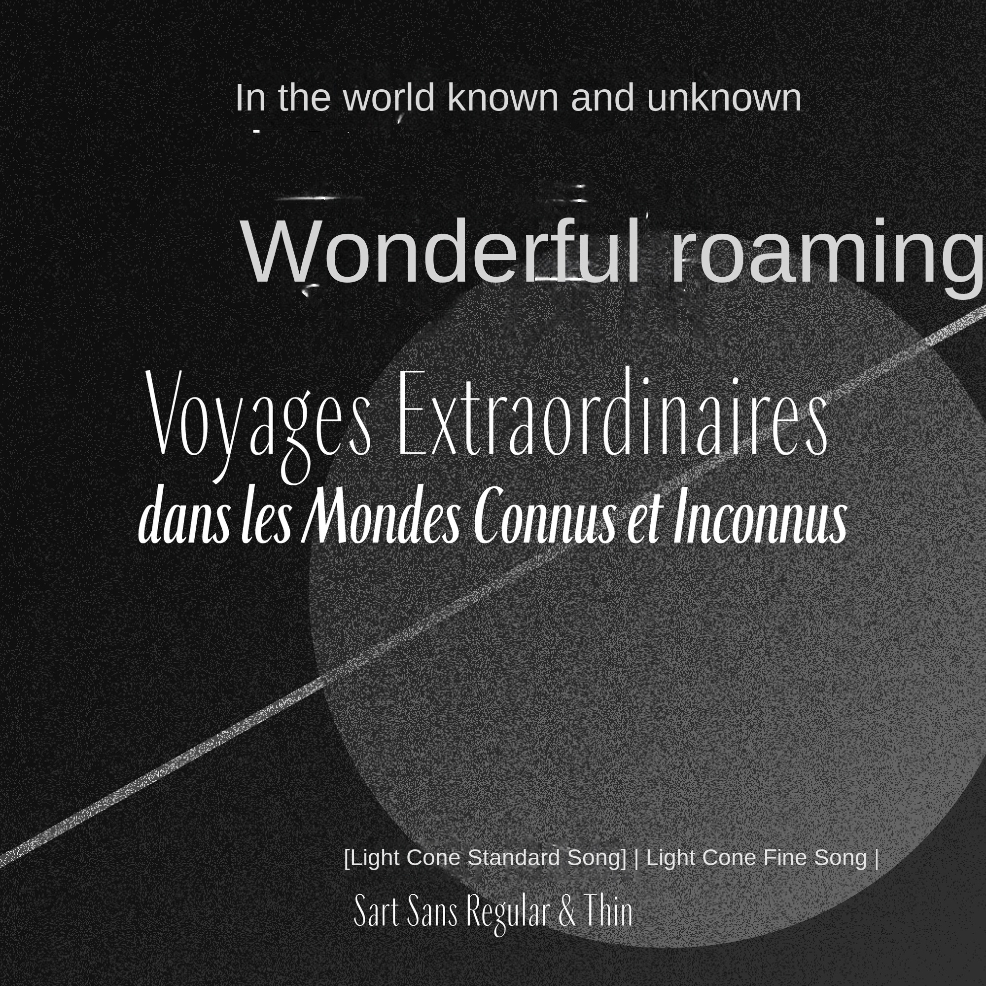
One of the visual concepts of Light Cone Song originated from the general title of Verne's novel, "Wonderful Wandering in the Known and Unknown World", from which the animation was conceived. The film pays homage to some classic concepts in science fiction literature through motion graphic design.


Font Design Details
Show the structure and pen design of the light cone song font.

Font family display
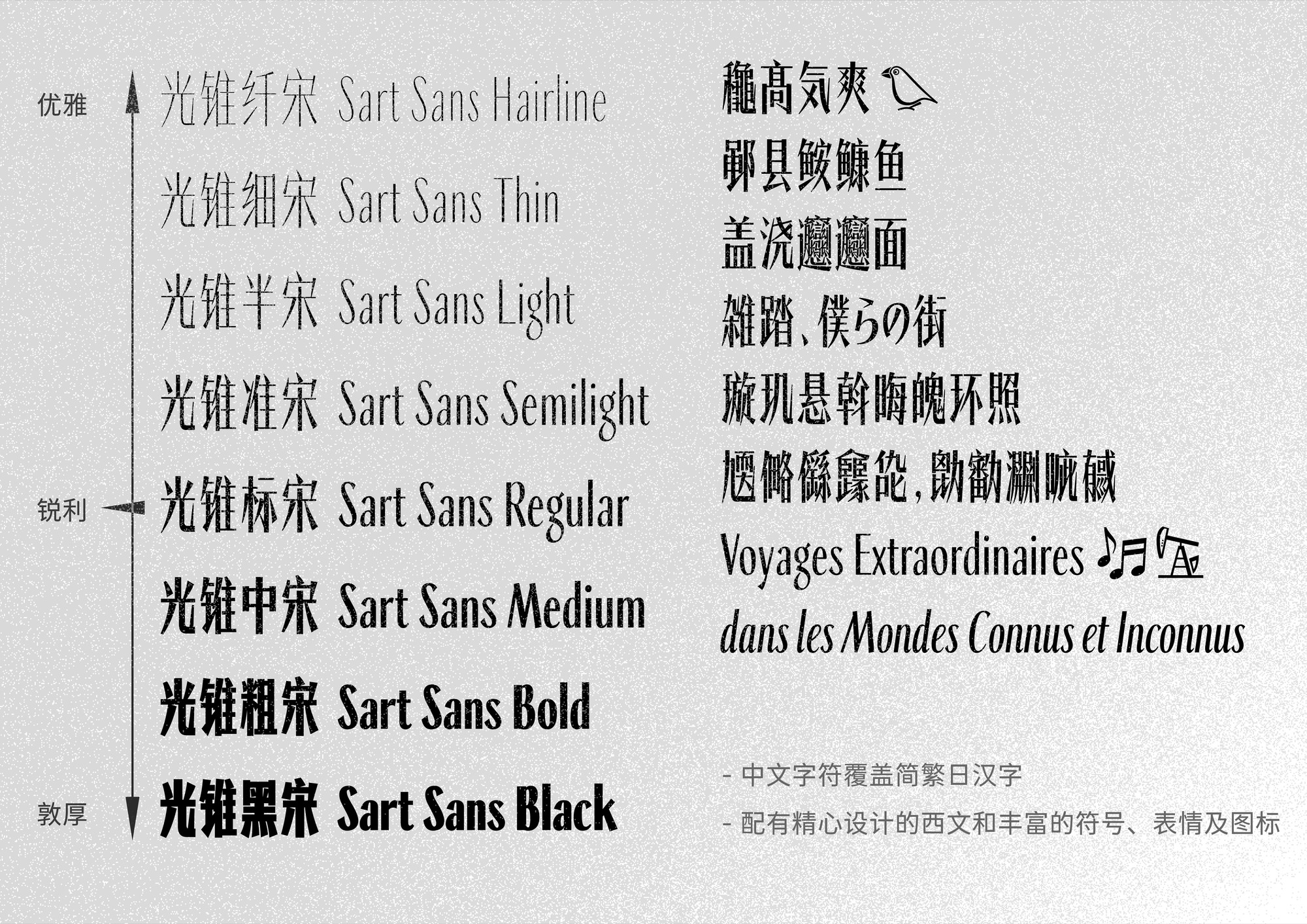
Show the 8-character weight of the light cone song and multi-language support.
Font Application Example
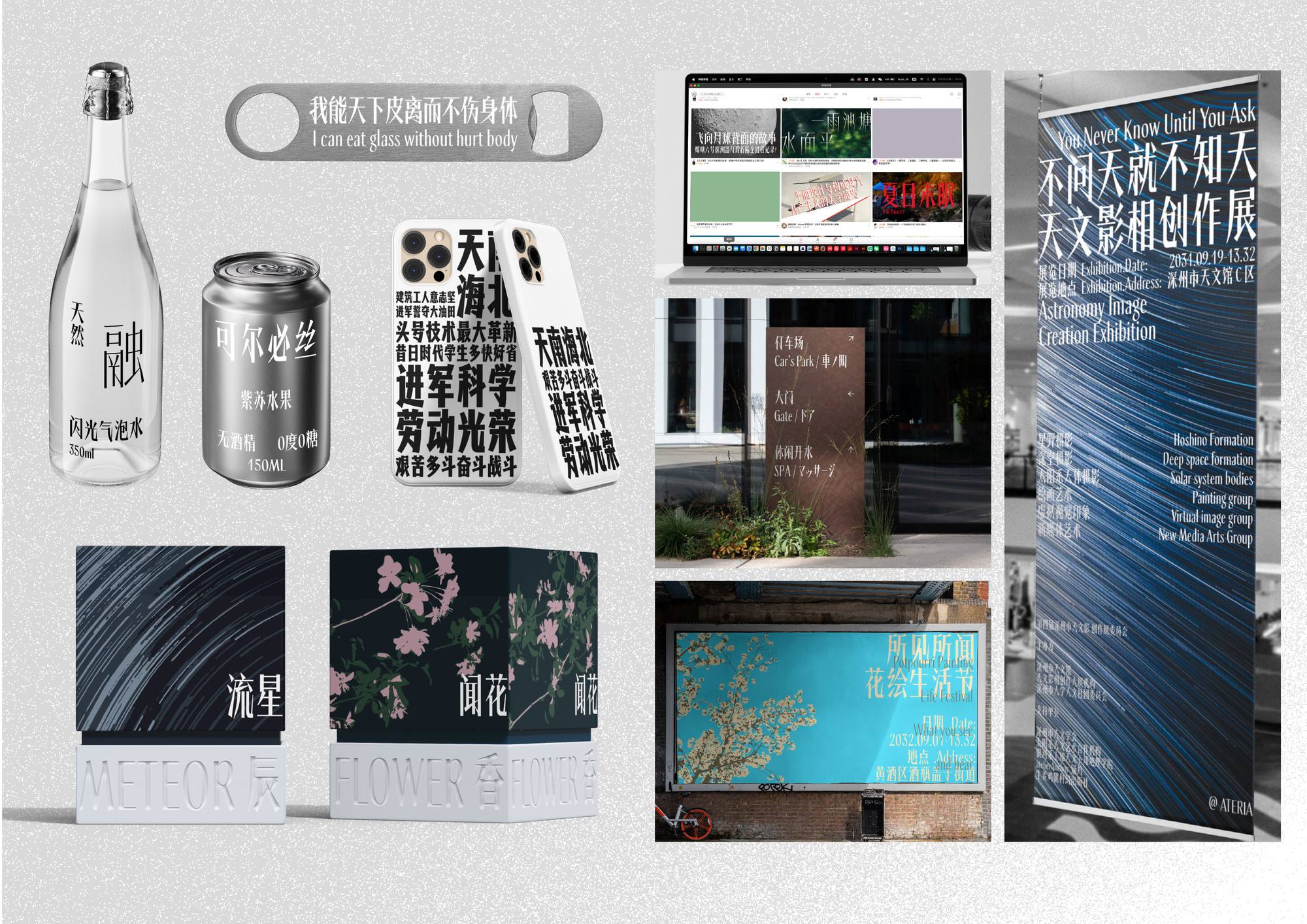
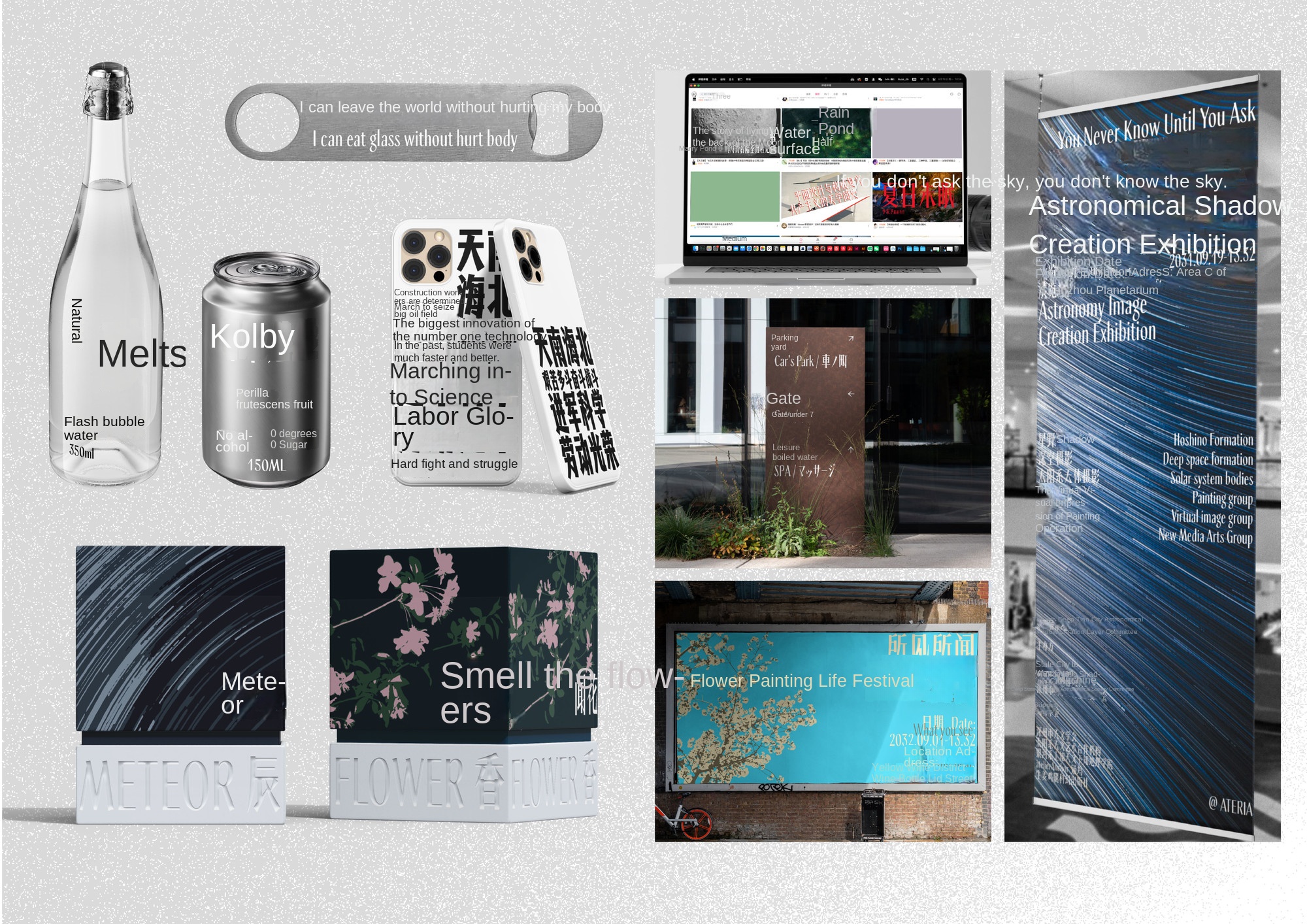
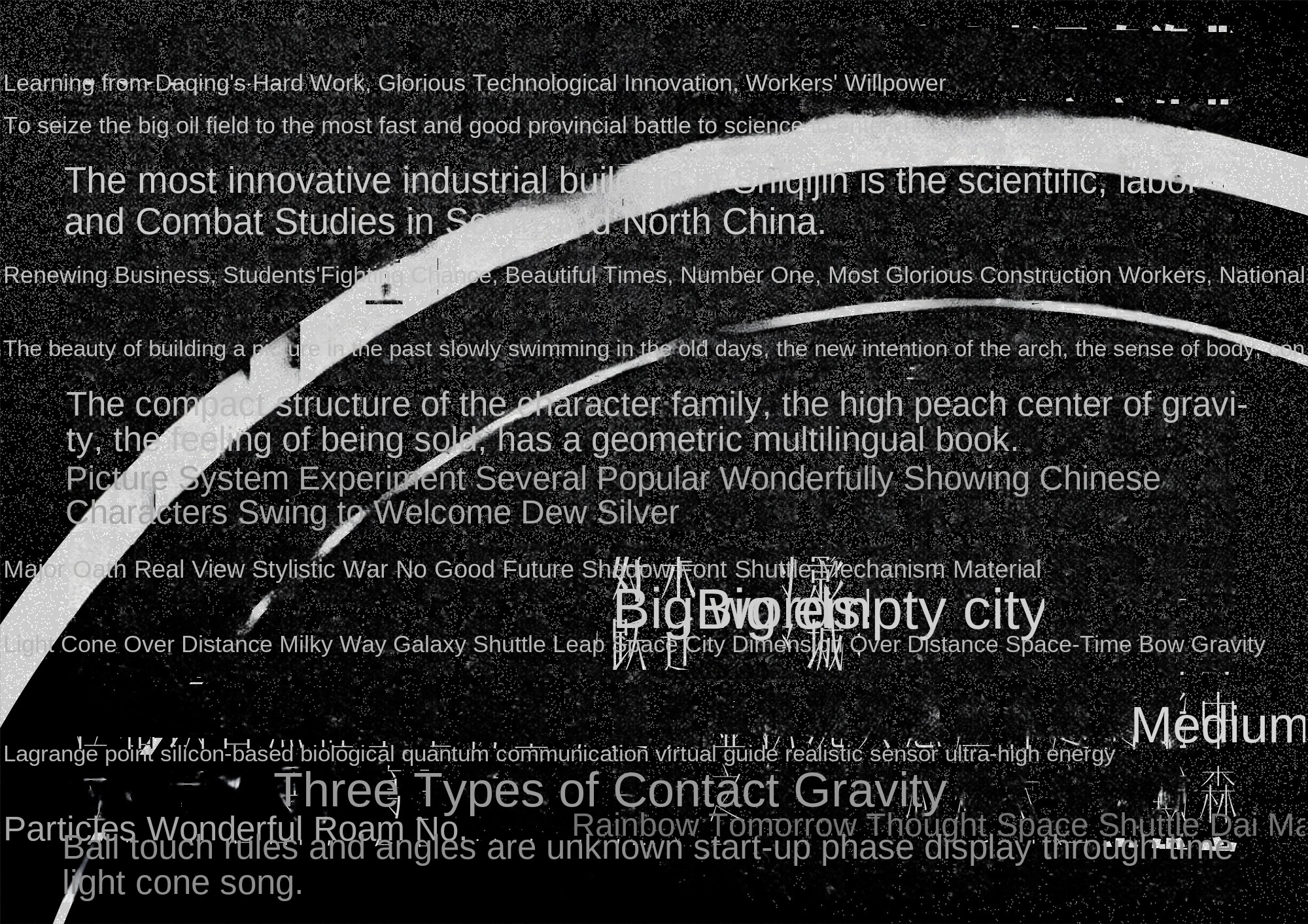
Showing the application direction of the different characters of the light cone song in various media.
Font Poster
Font Extension Design
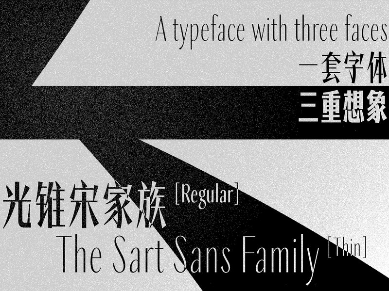
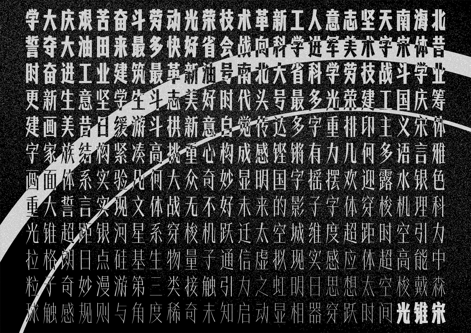
The Light Cone Song is a family of art-style fonts with tall glyphs and minimal strokes. As a modern Song style, its structure is bold and compact, and its center of gravity is as high as possible, giving people a strong visual impression. It is suitable for scenes with a small amount of text such as titles and short sentences, and provides designers with the possibility of multiple expressions. The Chinese characters are slender, long and tall, and the frame width-to-height ratio is 650:1000. The center of gravity has been greatly increased, and there is an obvious trend of tightening up and loosening down. Horizontal and vertical strokes are minimal, while hook strokes are slender and sharp; explore interesting interspersed relationships between strokes. Although the name is "Song style", but part of the knot word way reference regular script, in the strict minimalist geometric glyph into some hand-painted art words of interest.
The Latin alphabet is designed according to the same graphic logic as the Chinese characters, that is, it conforms to the rules of "concise modeling", "sharp curve" and "handwriting interest", emphasizing the inherent differences of different languages, and not pursuing strict consistency in temperament. It is expected that when the two are used together, they can produce just the right tension and create a certain sense of conflict, but they are not separated. The specially designed Spanish-Italian style further emphasizes the sense of smooth writing and will be incorporated into the same font file through OpenType features and orthographies.
The font family includes a total of eight character weights, ranging from thin to thick and interesting. The thinner characters are tall, thin, upright, smart and elegant. The standard characters are extremely heavy and thick, with strong and constitutive aesthetics. The thicker characters are strong and strong, with full signboard feeling. With the change of character weight, the temperament shown by the light cone song extends to three different directions of "honest, sharp and elegant", conveying different visual feelings, but the whole is contained in a set of fonts, and each character weight follows the same design logic. The font family refers to the naming method of Chinese art fonts, and the characters from fine to thick are called "fiber song", "fine song", "half song", "quasi song", "standard song", "middle song", "rough song" and "black song 」. Among them, the contrast between the thickness of the standard song is the strongest, while the fiber song and the black song are weakened, from sharp to elegant and honest.
As far as the technical specifications of font products are concerned, the Chinese character set of the light cone song font contains more than 27000 characters, which conforms to the national standard GB 18030-2022 coded character set implementation level 2, covering simple, complex, Japanese Chinese characters and some variant characters, with almost no missing characters. In addition, the font is equipped with elaborate Latin (including Italian italics), Cyrillic, Greek, Japanese characters, as well as numbers, punctuation, symbols and several emoticons.
In the production process of Chinese characters, the workflow of AI-assisted character creation is integrated, thus accelerating the completion and development of multi-character font families with nearly 30,000 characters.
Light cone song this font was originally called "battle song", named after the 1960 s in my hometown Daqing "oil war", the font is from my visual impression of the slogan art characters at that time.
The discovery and establishment of Daqing Oilfield made New China get rid of the hat of "poor oil country" and gave birth to slogans such as "Daqing Spirit" and "Industry Learn from Daqing", which became synonymous with collectivism and unity and struggle. At that time the slogans are hand-drawn, strong style, is still worthy of designers to learn the object. After the establishment of Daqing City, such slogans also appeared throughout the city. I grew up in Daqing, these slogans in the memory left a deep impression.
After graduating from Senior high school, I came to Shanghai to study and later became a designer. One autumn night, as I was preparing to conceive a new set of fonts, images of my hometown came to mind. The slogan in my memory seems to be narrow and powerful Song characters. I hope to show the appearance of the words in my mind through the simplest shape. In addition to the minimalist stroke shape, sharp and straight stroke, thin literal and high center of gravity, I added exaggerated hook strokes to the font, feeling that such hard movements are enough to summarize the drive of people to develop oil fields. At the same time, this sharp stroke also reminds me of the cold wind on the saartu grassland in winter.
The Latin part of the typeface was hands-on designed shortly after. In my impression, the corresponding pinyin often appeared on the covers, labels and bills of that era. The effect of these letters and Chinese characters together is not coordinated, but with a clear sense of "foreign. So I designed the Latin alphabet to be softer, not as sharp as the Chinese characters. However, the strong contrast of stroke thickness, as well as the minimalist rectangular outline of straight strokes, are consistent with Chinese characters.
When expanding the battle song to family fonts with different thicknesses, I intentionally reduced the thickness contrast of the fonts, so that the fine body can avoid being too sharp like a steel needle, while the bold body looks honest and solid. In the end, the thin body is somewhat elegant, just like Daqing's appearance has transitioned from dry base in the wilderness to a clean and beautiful modern city. The sense of strength in bold is still there, but it has changed from striving hard to playing steadily.
After the design of the entire font family was completely determined, we decided to develop this set of fonts into a real usable font library. We also use artificial intelligence generation technology to improve the efficiency of font production, in order to solve the most difficult problem of Chinese fonts for a long time-large character set. We also want to give this font a new name: the name "light cone" comes from the concept of science fiction, and literally is highly consistent with the font shape. In the extended concept short film, we start with the 1:4:9 black stone tablet representing revelation, move towards micro and macro exploration, and finally run through the triple imagination of past, present and future in the fate of the cone of light.
For me, my hometown of Daqing is far more than a typical textbook representative of the struggle era. The efforts of generations have created today's city, and the future development can be expected. This is my wish for my hometown through this font.
Liu Yuli is a font, book and graphic designer and co-founder of design studio atelierAnchor Anchor Dock. In addition to design work, he is also engaged in the research, writing and translation of fonts and typography culture, and participates in teaching work at Tongji University and Shanghai Institute of Visual Arts. Bachelor of Urban and Rural Planning, Master of Media and Communication, Tongji University. Font design works include Ding Mao dot matrix, network black, battle black, etc., and participated in publishing projects such as arcade game font, Rudd character typography, Rudd design philosophy, re-engraving font design, etc.

